Volume 40 / June 28, 2021
Volume 40
Client
Netflix, Starz, SAG
Scottish Accents & Killer Designs
A deeper look into The Devil in Disguise, Men in Kilts, SAG Awards and an artist spotlight on designer Carol Cai!
John Wayne Gacy: Devil in Disguise
For the first original docuseries on the streaming service Peacock, John Wayne Gacy: Devil in Disguise, we put ourselves in Gacy’s place to set the tone for the series’ title sequence...literally.
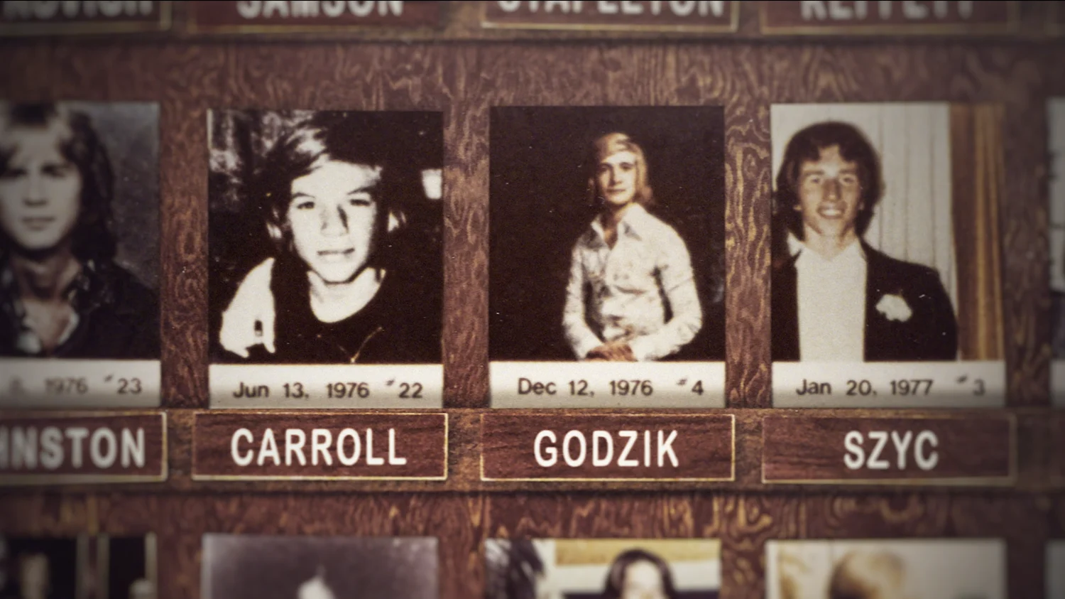
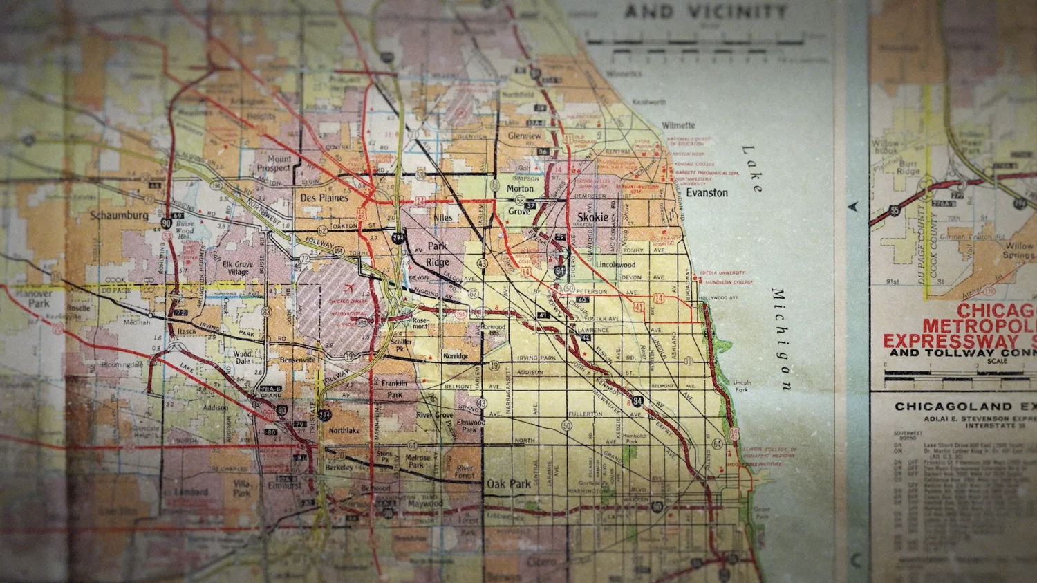
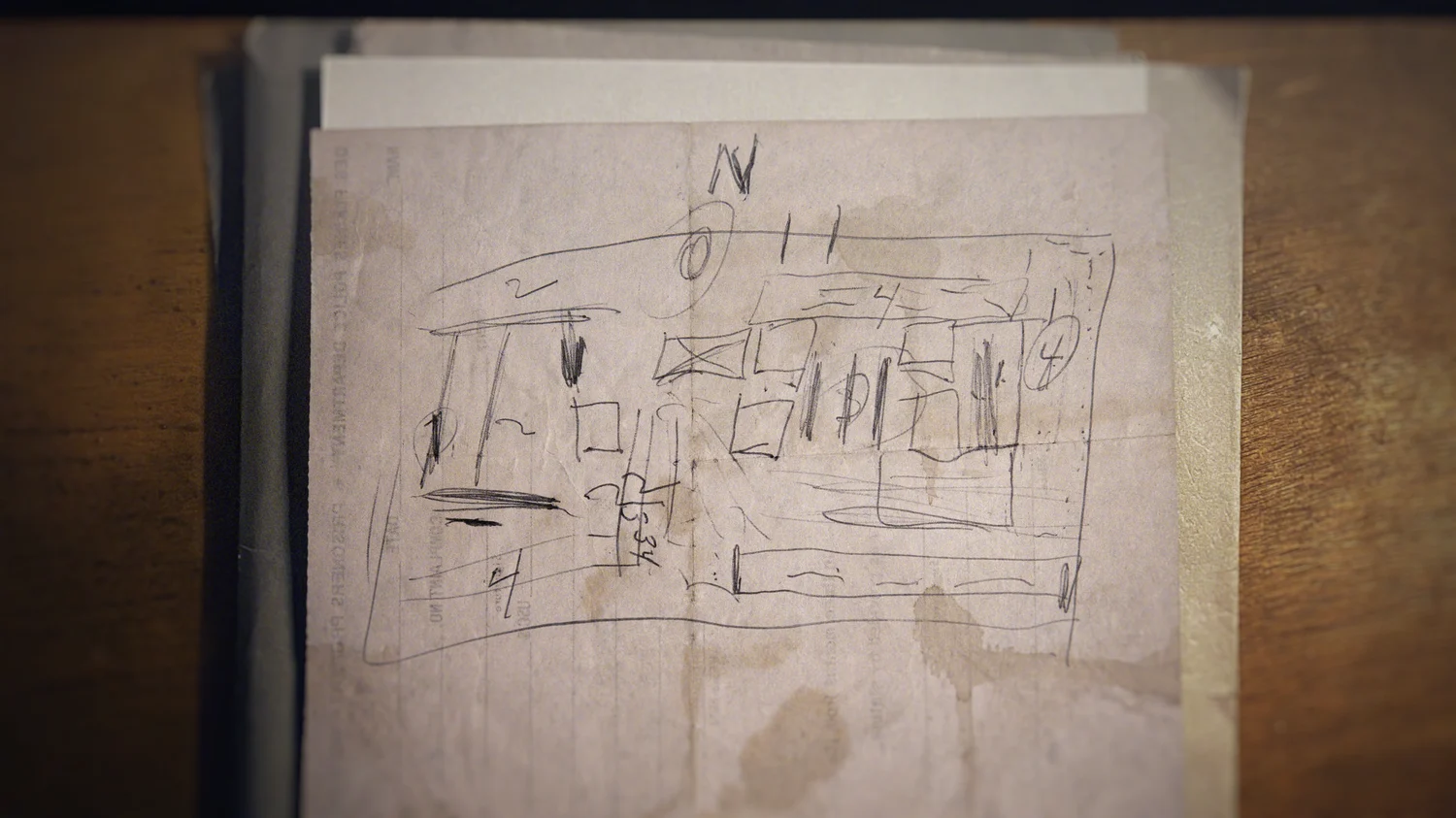
We answered several unique graphic asks including microfiche treatment, in-depth maps, even an illustrated drawing of a crawlspace diagram Gacy himself drew. This multitude of components came together in a way that set the haunting tone for the title as well as individual specialized sequences used in each episode.
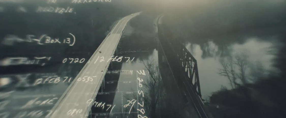

We treated a broad spectrum of documents in the series ranging from era specific to more recent, giving us room to be creative in achieving the look we were going for. To create the headline treatments, we created something of a lightbox treatment using transparent pieces of papers that have this layered feel and exhibit a type of glow. While planning to use several variations of this treatment for the various headlines, the client liked the lightbox look so much we used it standardly throughout the series.
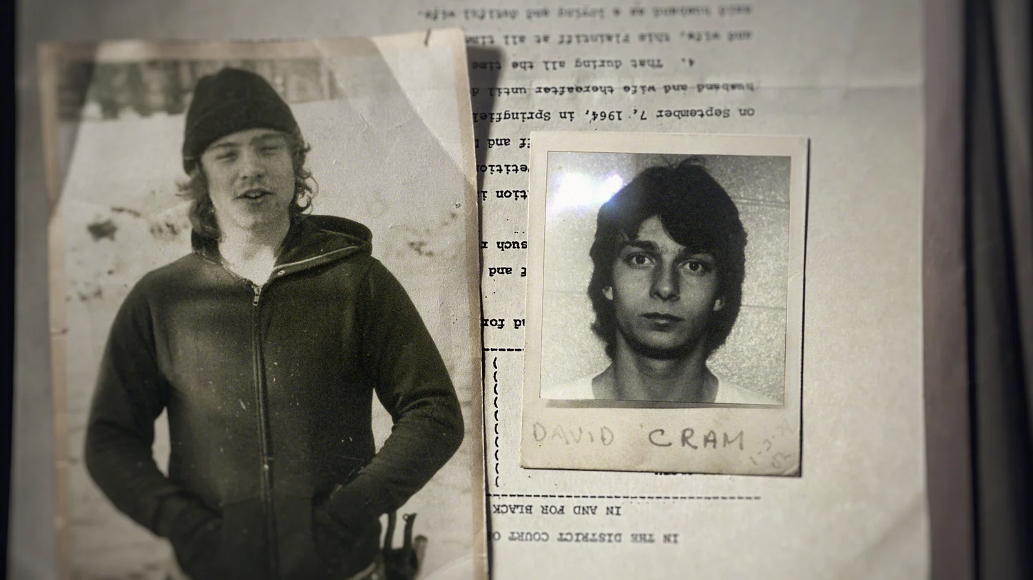
In order to really level up our design work, John Leamy, BigStar’s creative director, manufactured a specific look for the archival photography by shooting vintage personal photo albums. This enabled us to use treatments for the client-provided photos and place them in-scene practically. The photo albums were not the only thing Leamy shot at home, he also set up some particularly haunting elements in his attic, shooting swinging chains and solo chairs in order to provide the perfect graphics to service the story.
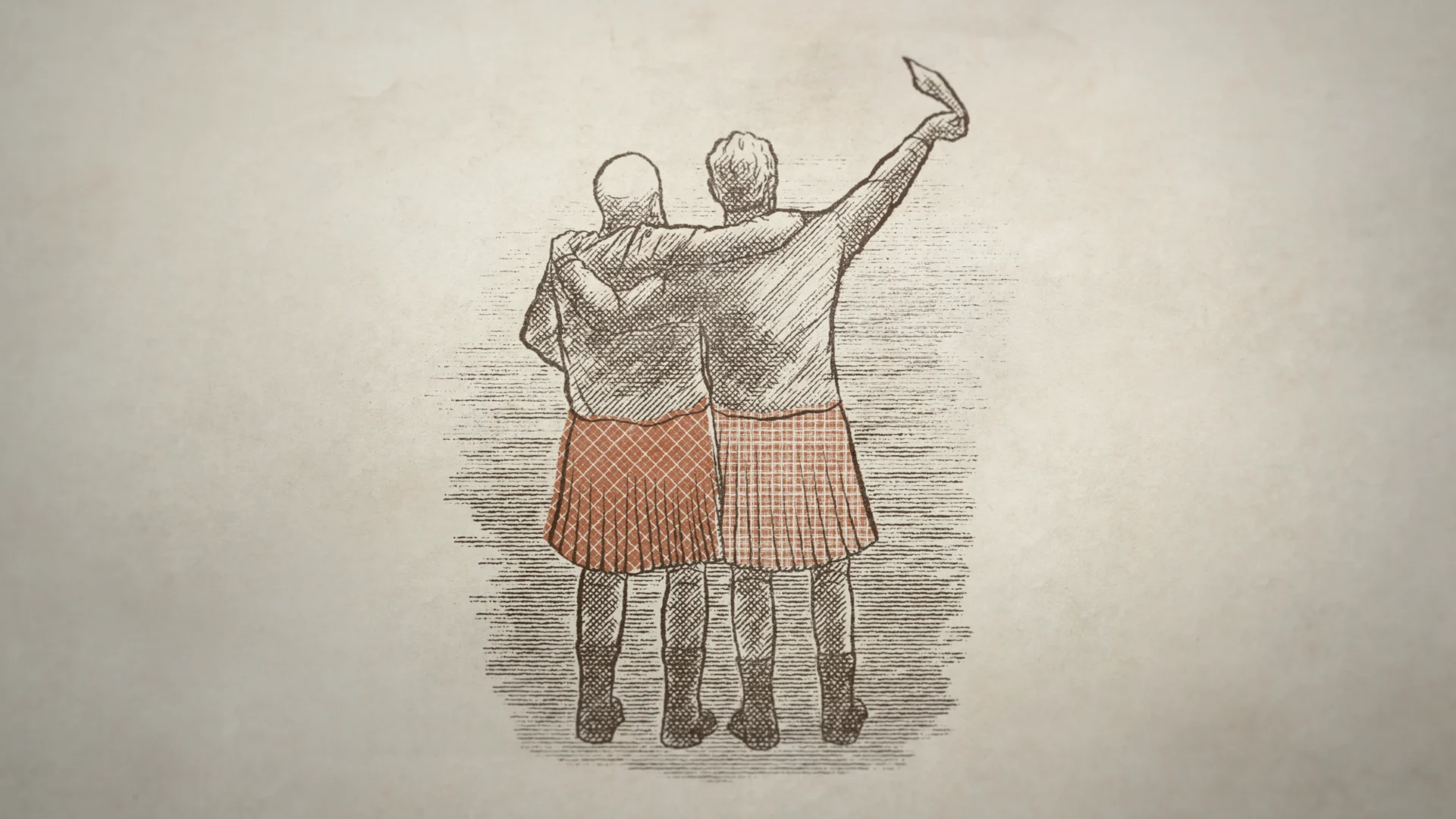
Men in Kilts
Men in Kilts
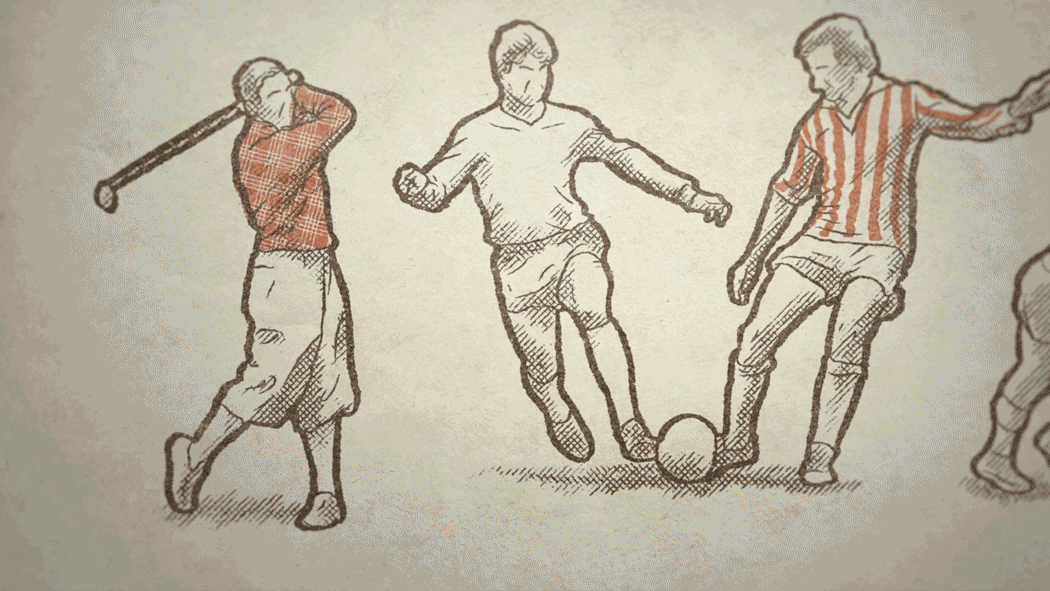
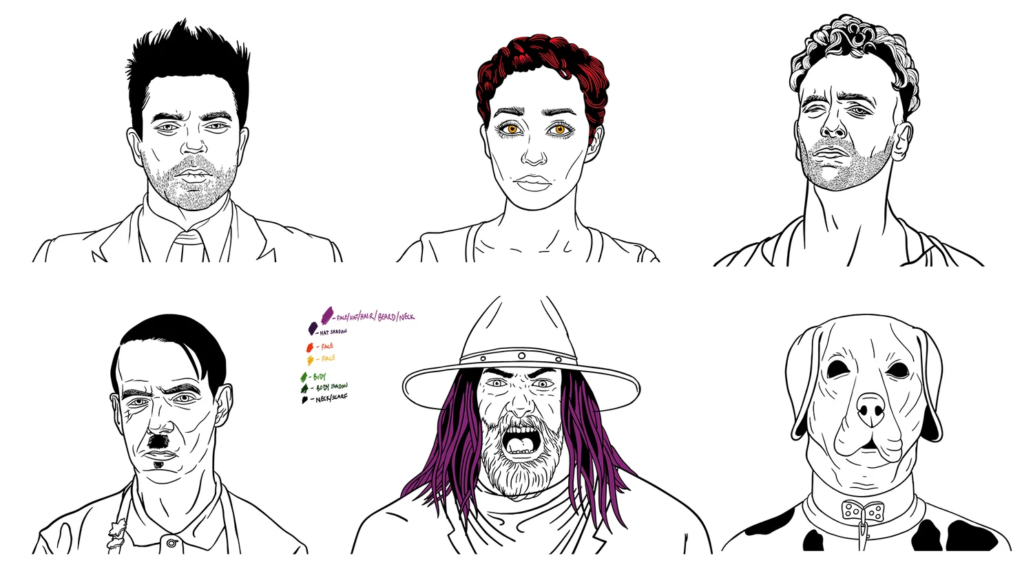
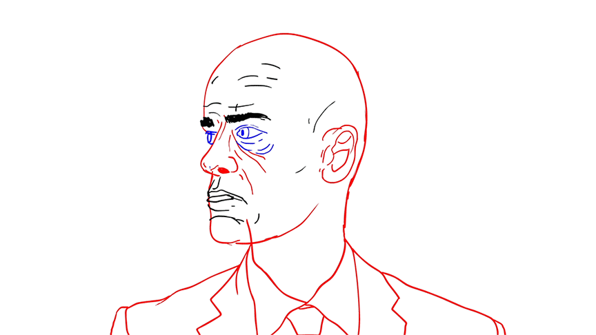
For each episode, it was important to produce a central design element to help visualize the Scottish history being taught by our hosts. Inspired by antique Scottish woodworking art, we produced fully illustrated graphic interstitials we called “historical pods” that provided edutainment throughout the episodes. These one-minute explainers were incorporated into the show to deliver a brief history lesson around the facts that each episode was centered around.
Artist Carol Cai drew each pod based on the script we were provided and then our creative director John Leamy helped find the voice and animation style, resulting in eight sequences delivering history lessons from haggis to the history of witchcraft. It was important for these pods to strike the appropriate balance between delivering relevant information while infusing the jovial nature and humorous personalities of the hosts and the custom illustrative style allowed us to do just that.
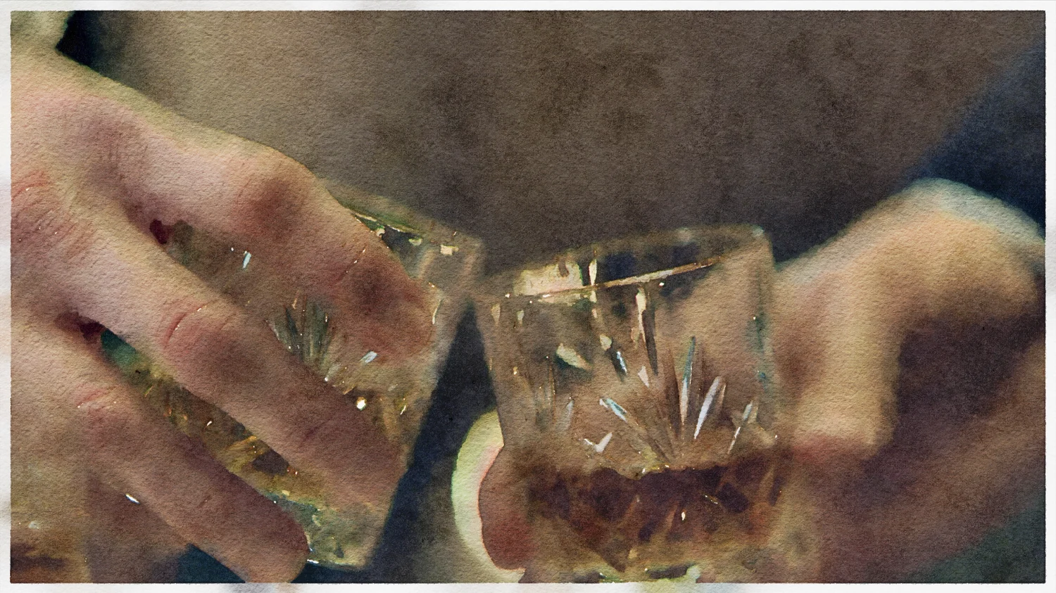
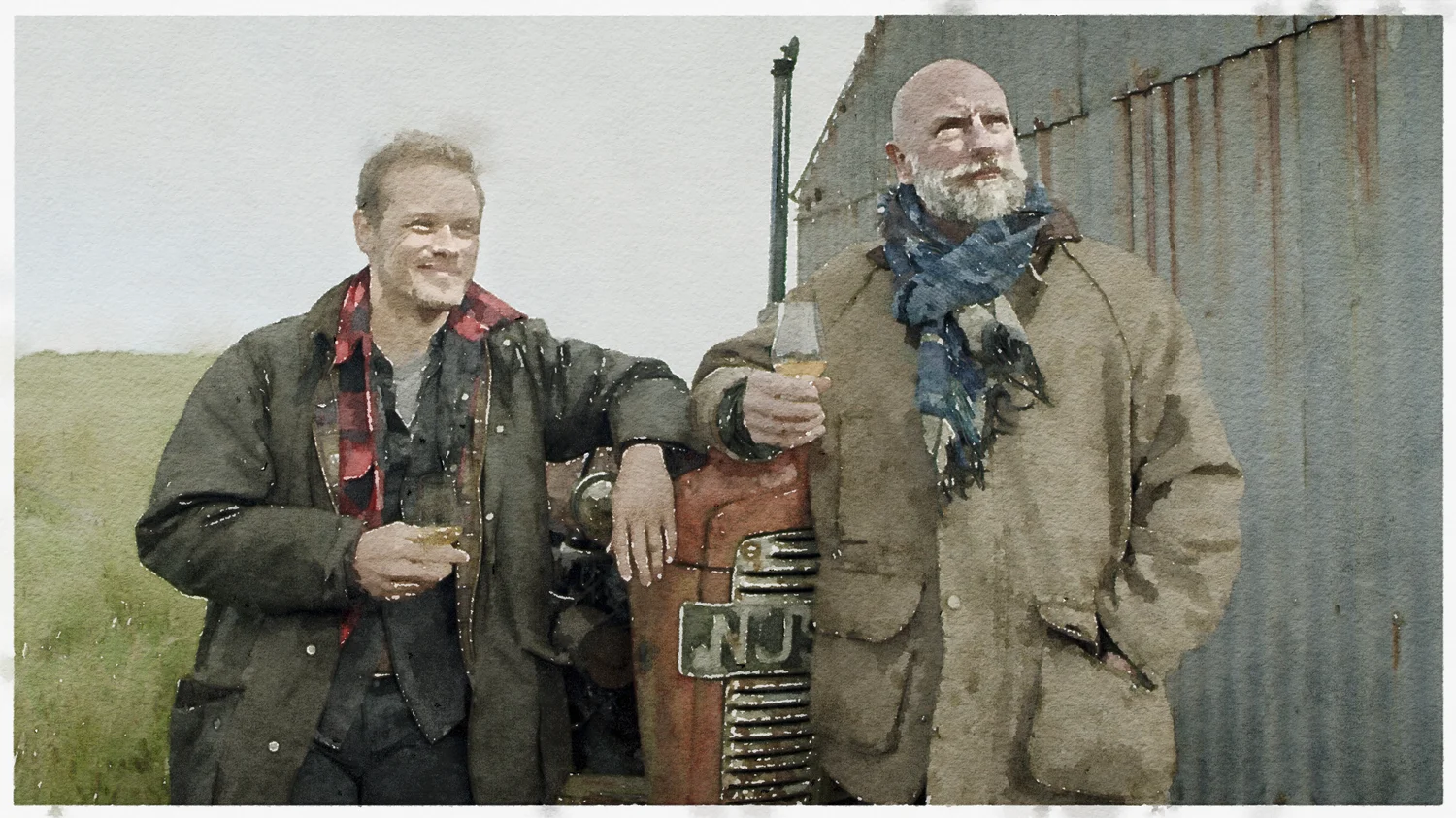
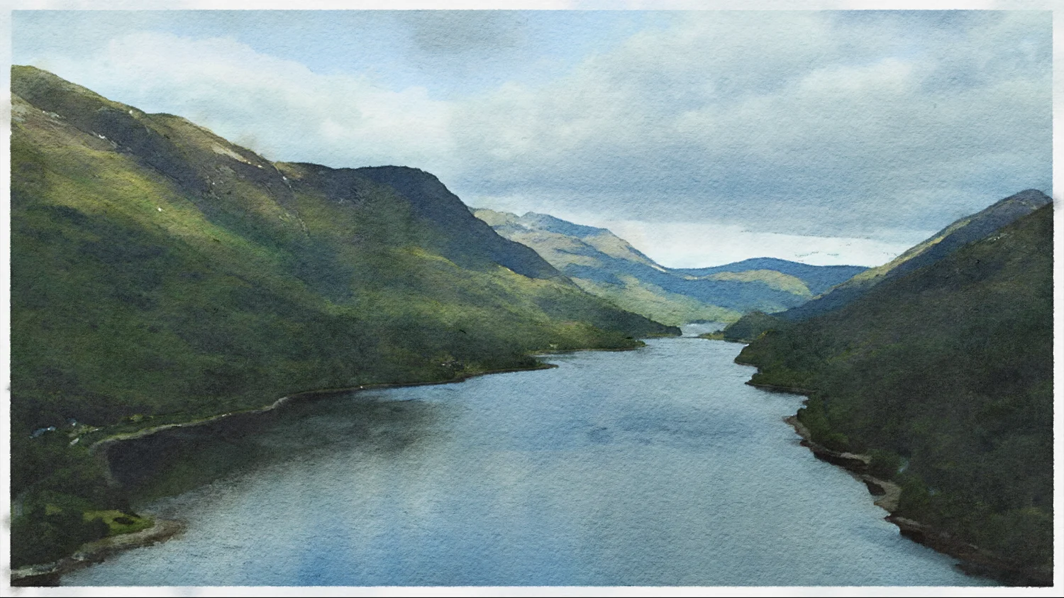
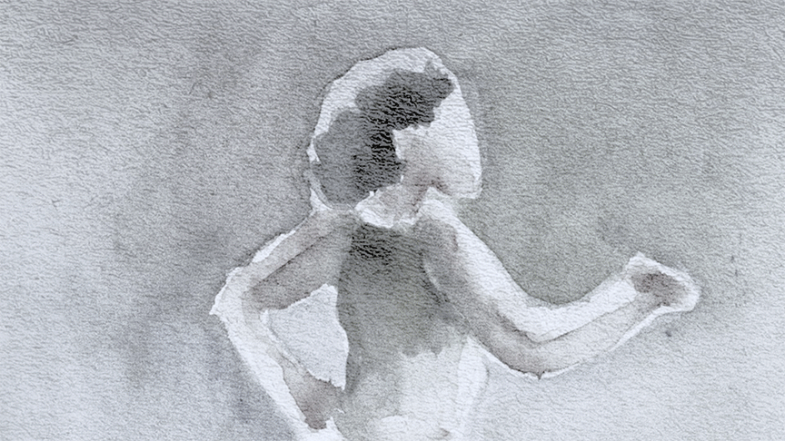
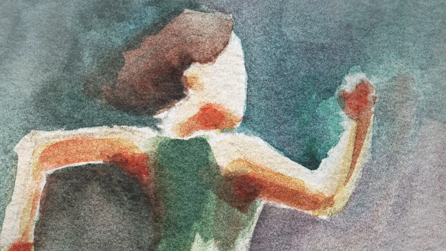
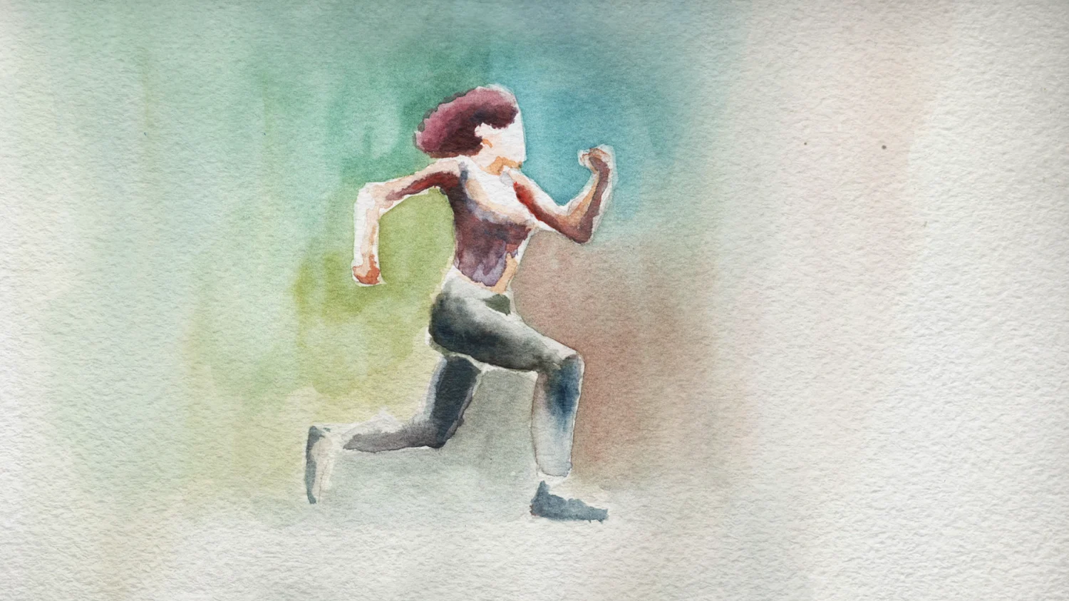
To end-cap various scenes throughout the episodes, we crafted Old English style watercolor plates that beautifully punctuate the scene’s natural conclusion. Whether it’s Sam and Graham sharing a beer or a beautiful pastoral setting, the transition of each end-shot into a watercolor painting adds an emotional footnote that keeps the Scottish setting central to the storytelling.
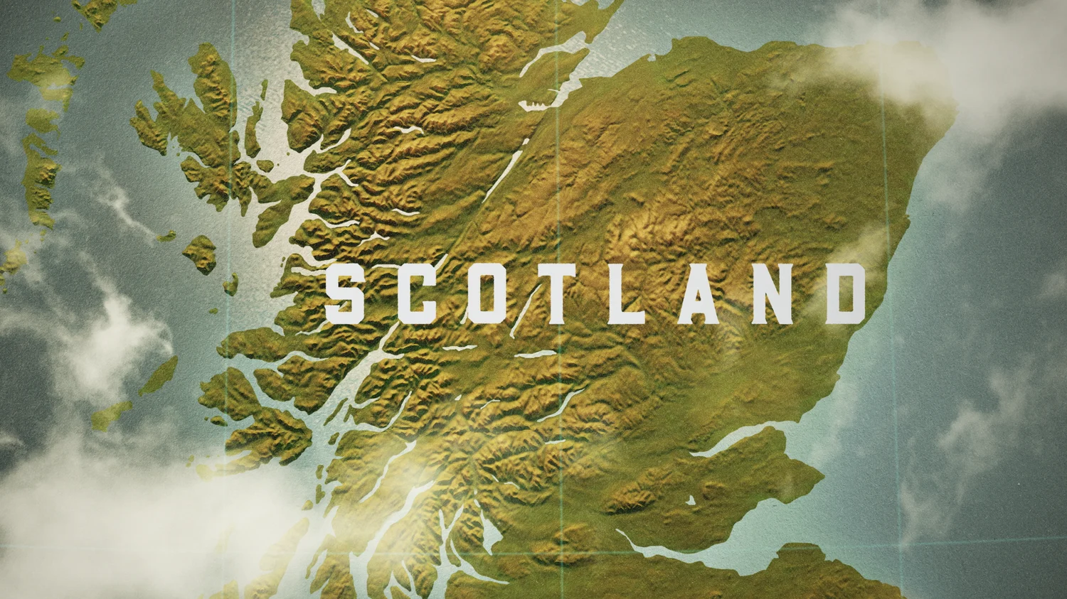
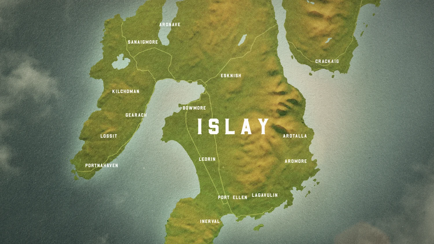
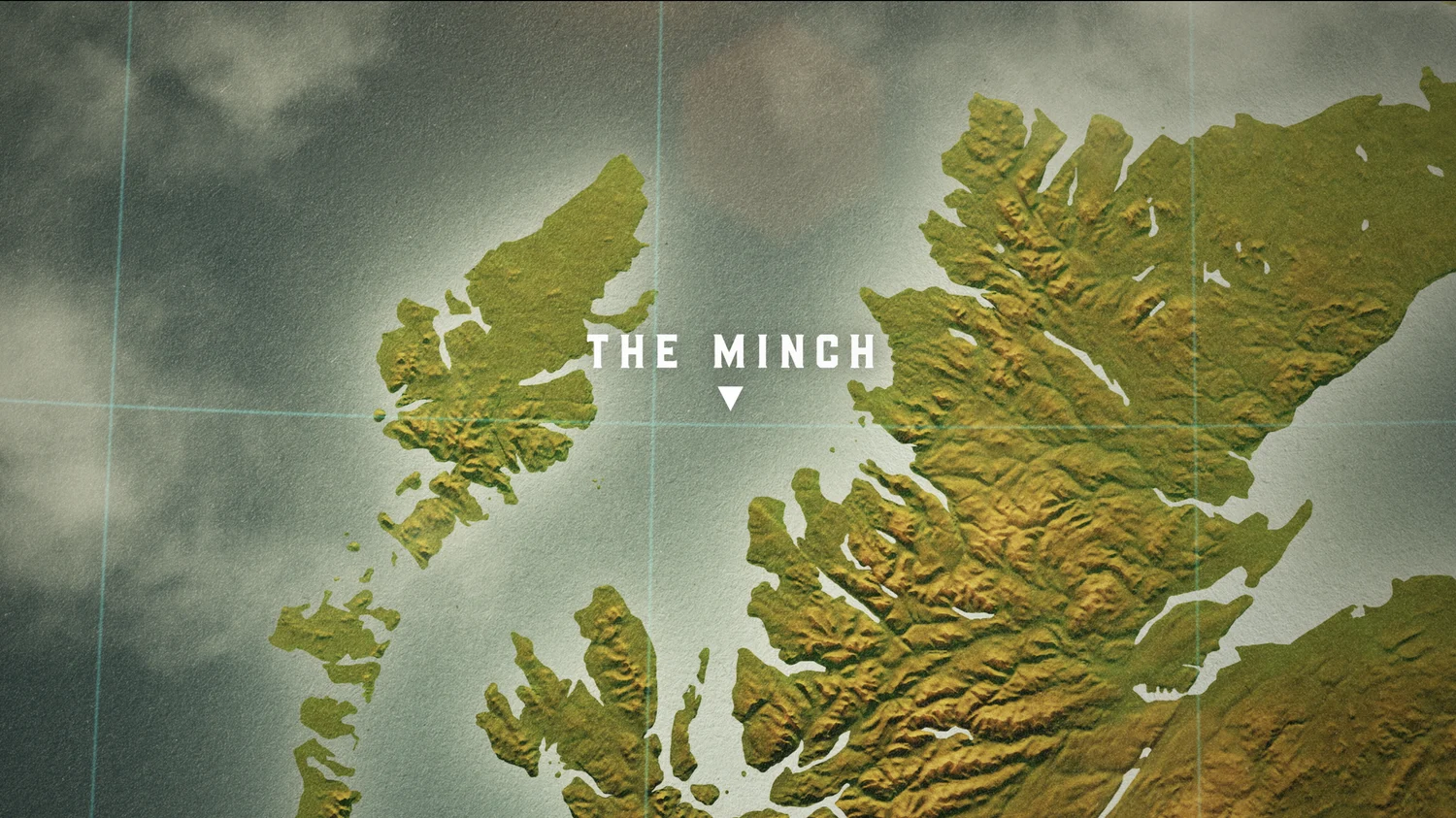
Interwoven through the episodes are 3D maps that establish where our hosts’ journey has taken us while showcasing the topography of Scotland. We used a wide shot of the entire country as a starting point before animating into smaller towns or landmarks to pinpoint our hosts’ location. Creating a specific style in order to make the transition from the larger map of Scotland to the exact coordinates proved to be one of the project’s bigger challenges as the transition needed to be both quick and visually appealing. To solve for this, we built the topographic maps in 3D and then developed the establishing shot of Scotland first, and then developed a custom transitional language that seamlessly moved into each location.

In addition to the maps, historical pods and watercolor end plates, we delivered a custom logo and animated a logo reveal for the opening sequence. We had a blast diving into the world of Scotland along with our two kilt-wearing hosts.
SAG 2021
For the 2021 SAG Awards we got back in the ring with our friends over at Warner Media and put our heads together to up the ante creatively from years’ past and also incorporate the right tone to reflect COVID’s impact on the industry and the world.
To do this, we wanted to graphically create an atmosphere that had the glitz and glamour of the awards show but without the crowds and red carpet.

We wanted to graphically create an atmosphere that had the glitz and glamour of the awards show but without the crowds and red carpet.In past years, we’d focused on various aspects of the awards show - the host, the celebrity, the statue itself- and so this year we wanted to take a fresh approach while also incorporating the COVID-aware factors. We decided to create a fully graphic world filled with design and motion to achieve the feel we were targeting.
Whenever we have a fully graphic and type-driven ask, we call upon our design director Ross Henderson to lead the charge. We pitched four different directions to the client exploring everything from typography, to color, to texture and the one that resonated was driven by big type, gold textures and strong angles.
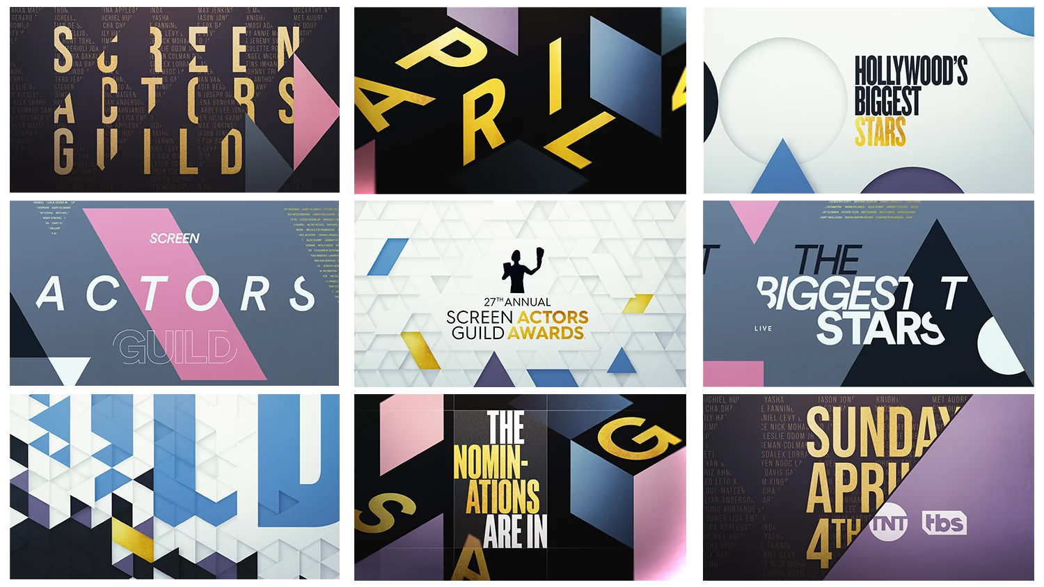
Once we landed on the design, we set about animating the frames with our team of animators. Along with Ross, this team has a natural rapport and quickly and decisively put together the work with a really strong aesthetic. Incorporating the radio edit provided by the client was a smooth process as we added in visuals in-line with the audio. In addition to the predominantly graphic visuals, we incorporated some imagery of the talent into the spot to round out the overall look.
We had a great time revisiting these awards and collaborating with the team at Warner Media to create a fresh look that was also tonally appropriate. The regal, art-deco-esque spot came together with a 22-second fully graphic spot as well as a promo toolkit to be used with their clip driven spots. Buffered by top tags, title cards and pages, buttons and transitions, this robust delivery was the shining star of the 2021 awards season.
Volume 39 / June 28, 2021
BGSTR Artist Spotlight: Carol Cai
BGSTR is proud to extend a special congratulations to Carol Cai, who has just been promoted to Jr. Art Director! Carol has been with the team since 2017 and has been a growing talent ever since.

Q&A with Carol Cai
BGSTR: How long have you been drawing, and did you always want to make it your career?
Carol:
I can't remember how long I've been drawing, because I've been drawing since I could hold the pencil. Everywhere I'd go, I had a sketchbook with me just doodling it out. Did I know that I was always going to want it to be my career? I don't think so. I didn't think that it would get me anywhere, I guess. I had wanted to go to business school and I was applying to college - but then my sister talked me out of it. Best decision ever. So now I'm here!
BGSTR: What were some of your first jobs in the industry, before BGSTR?
Carol:
Before Big Star, I only really had internships. I interned with HBO, and I also worked at another studio agency. They've all been really nice. I think that meeting new people, seeing how they make things, how they create things and being able to learn and steal some of their secrets has been really fun.
BGSTR: What was your role in those internships?
Carol:
For HBO, I worked in design and production. So print media and key art stuff mostly. My other internship was mostly illustration, because that was the only thing I really knew how to do. But I was dabbling in animation and trying to get into After Effects and Adobe to help out some of the projects that they were doing at the moment.

BGSTR: What are your goals in this new role as Art Director?
Carol: I think not only trying to bring my own style into the role as an Art Director, but also bringing some of my different perspectives and being able to lead projects from start to finish is something that I really want to be able to do. That'd probably be my biggest goal at this moment.
We are so excited to cheer Carol on in these goals. Congratulations, Carol! We can't wait to see all the incredible things you do in this new role!