Volume 46 / March 15th 2022
Volume 46
Client
Various
A closer look at our work on the new Netflix series, The Andy Warhol Diaries, Fox Sports' NASCAR race series and the SAG Awards, which aired on TNT on February 27th.

pop art is for everyone
Warhol / Film Design
As specialists in visual storytelling, when the central character of a project is an iconic artist themselves, it’s a priority of ours to let the work take center stage and ensure our design supports the narrative. That’s the approach we presented our longtime friend and collaborator, Andrew Rossi, when he came to us looking for the film design for The Andy Warhol Diaries, a project he’d been working on for the better part of a decade.
Together with executive producer Ryan Murphy, he was bringing The Diaries to Netflix as a six-part miniseries, and we jumped at the chance to have a hand in bringing it to the world.
The Andy Warhol Diaries chronicles the remarkable life of Andy Warhol from the vantage offered by the artist’s own posthumously-published diaries, contemporaneous footage of the pop-art icon and interviews with those who knew him, from John Waters to Rob Lowe.


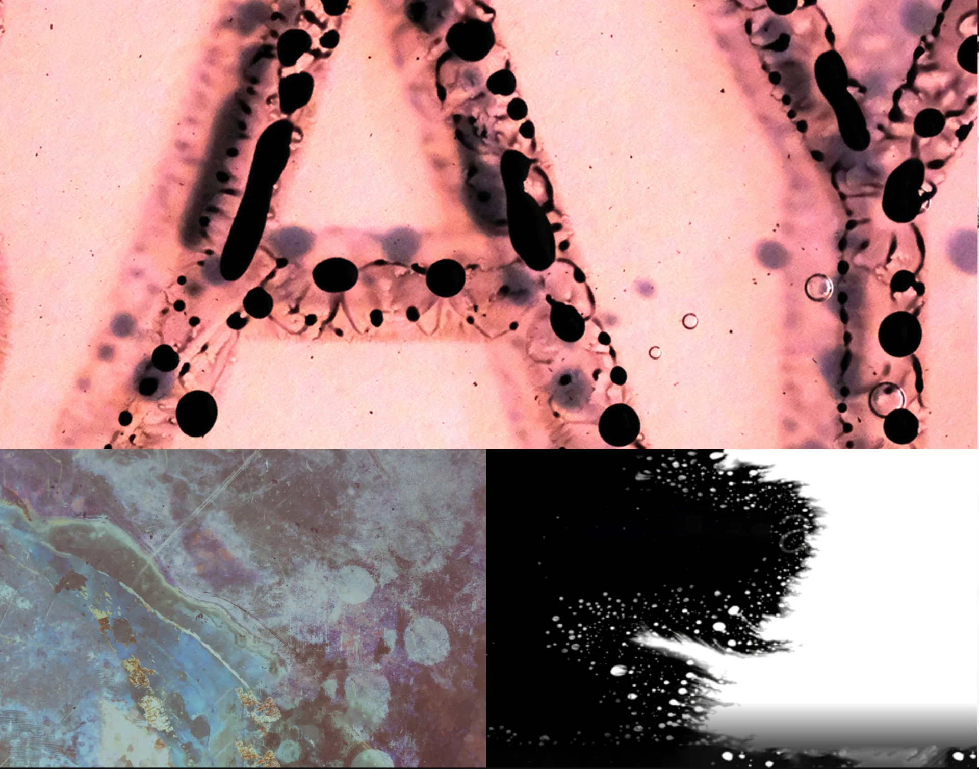
When we were brought on for the film design portion of the series, Rossi and his team had a rough cut for most of the episodes. This gave us a great jumping off point to begin the design process based on the very specific feel of the existing edits.


From there, we moved into designing other elements of the film including treating interviews, developing org charts, fine-tuning the archival Super 8 shots and portraits of other featured Warhol work. Our collaborative relationship with Rossi’s team empowered us to lean into the years of work they’d put into the series and find things through our research and exploration we might not have otherwise tried.

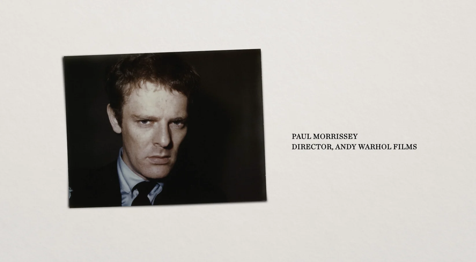
One example of this is the organizational charts we designed to explain Warhol’s journey moving between mediums and through eras as an artist. Warhol was not only an artist, but a film director, publisher, TV producer, band manager, scene maker and celebrity.


The idea was to create a tableau that felt like a practical manifestation of Warhol's business world as if it was laid out in his studio space. Various ephemera - business cards, polaroids, clippings et cetera - were used to create an organic-feeling canvas of these relationships that would allow us to move a camera from one to the next while still seeing their contextual relationships.
icons
Warhol / Film Design (continued)
The series takes a comprehensive look, from Warhol’s childhood in Pittsburgh to his groundbreaking work to his relationships with Jean-Michel Basquiat and others to the attempt on his life in 1968. We designed several sequences that focus on some of these noteworthy events, one standout being the Polaroids Warhol took of prominent figures of the downtown New York City scene and transgender activists, including Marsha P. Johnson.
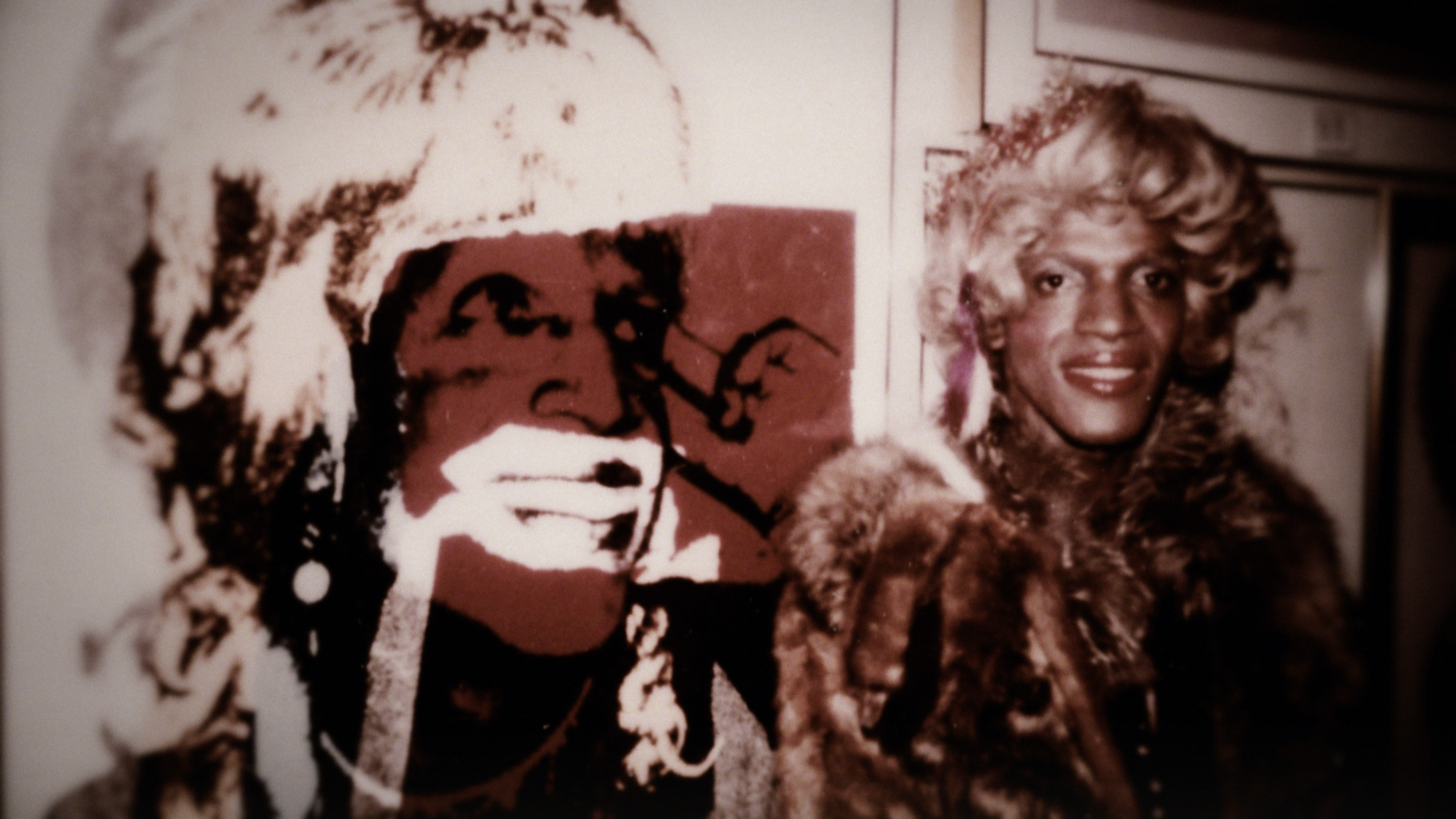


As with so much of this project, handling these materials and designing for them in a way to feature their beauty while keeping them as close to their original form as possible was a challenge we really enjoyed.


Much of the series is B-roll shot in museums, studios and various other art world locales, and that was something we played off of with our design. We wanted our design and the art featured in the series to feel very organic- almost as if placed in a catalog space.
This led to our design carrying this almost museum-like feel to appropriately feature the art and other series elements, like interviews, so that it could flow seamlessly with the B-roll.


Joining The Warhol Diaries toward the end of what had been an ongoing labor of love for its creators pushed us to maintain a healthy pace in our process. We have a lot of Warhol fans here at the BigStar office, and because of that, we handled the project with immense respect and put a lot of effort into our shared goal of getting this series out in the world. We couldn’t be happier with how the design and series turned out and thank our partners, Andrew Rossi and team, for entrusting us with this work.

zoom
NASCAR Promo Package
For the 2022 NASCAR season, we teamed up with our friends at Fox Sports to create a set of topical promos to be used in various ways throughout the Cup Series. We’ve worked with Fox Sports on several sports focused projects over the course of the last few years– primarily one-off events like boxing or wrestling, whereas for NASCAR, a set of promos would need to span an entire season’s worth of events. As always, we’re up for a new challenge and set out to design the look, set the editorial tone, as well as lend our expertise with musical style, scripting and voiceover for the promos.
To begin, we met with our clients to get a full understanding of their wants and the goals they were looking to accomplish with the promo. We also kept the length of the Cup Series in mind, noting the need to have design that could carry the entire season and remain fresh. This project was multidimensional, and we maintained a great rhythm with our client throughout- narrowing down looks, tweaking design, and simultaneously scripting a spot.
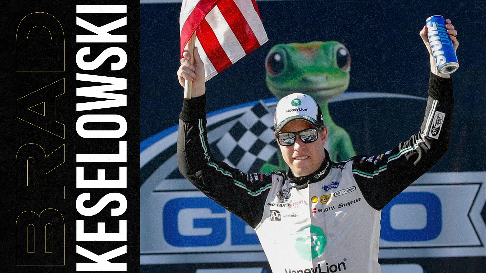
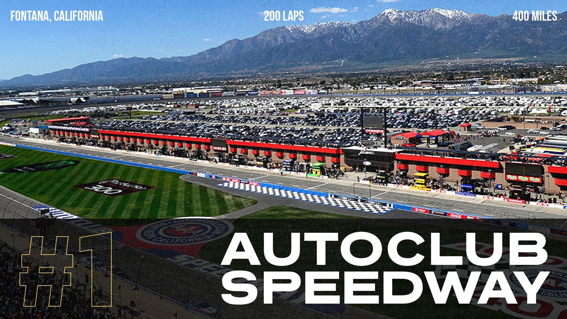
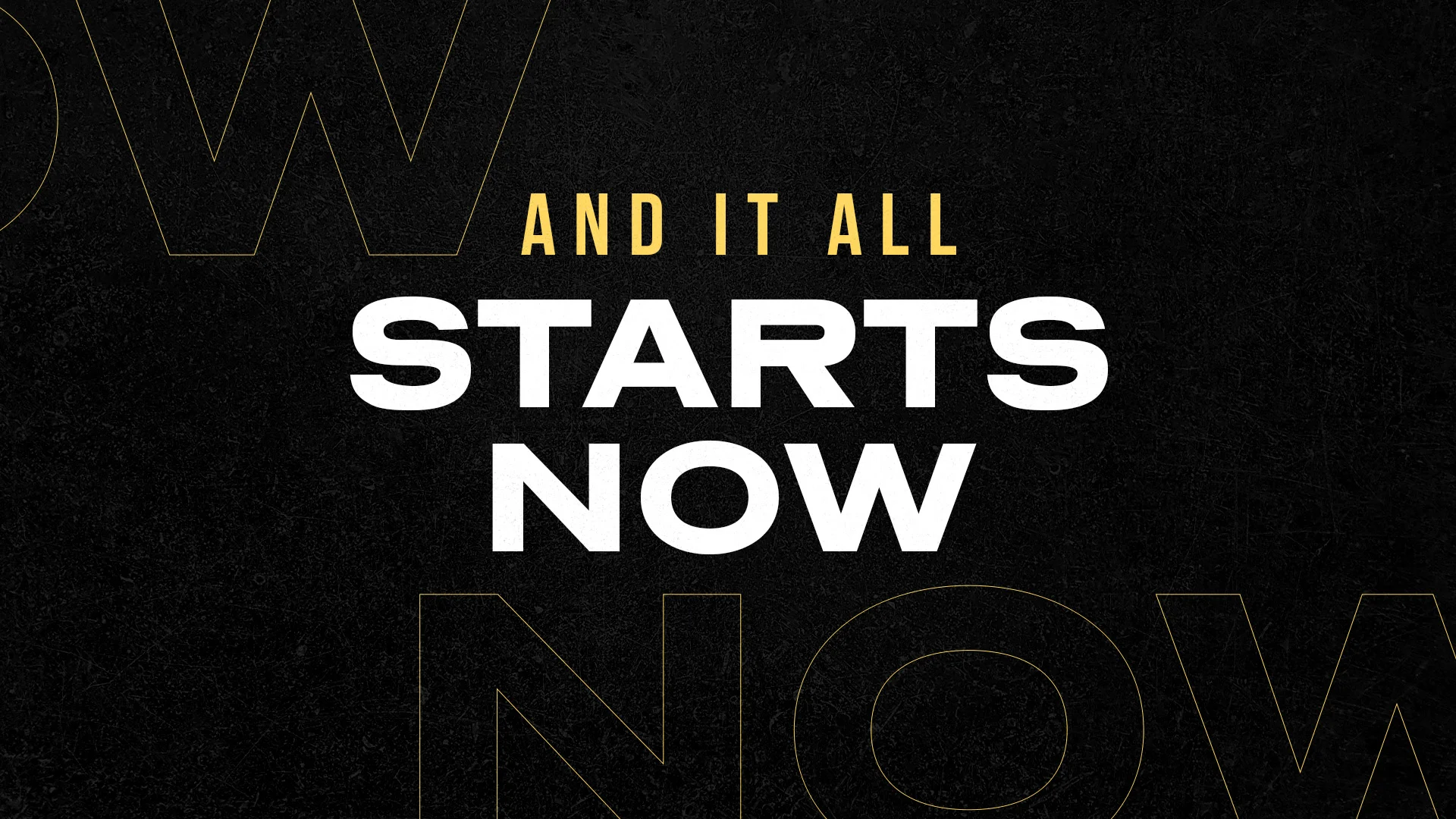


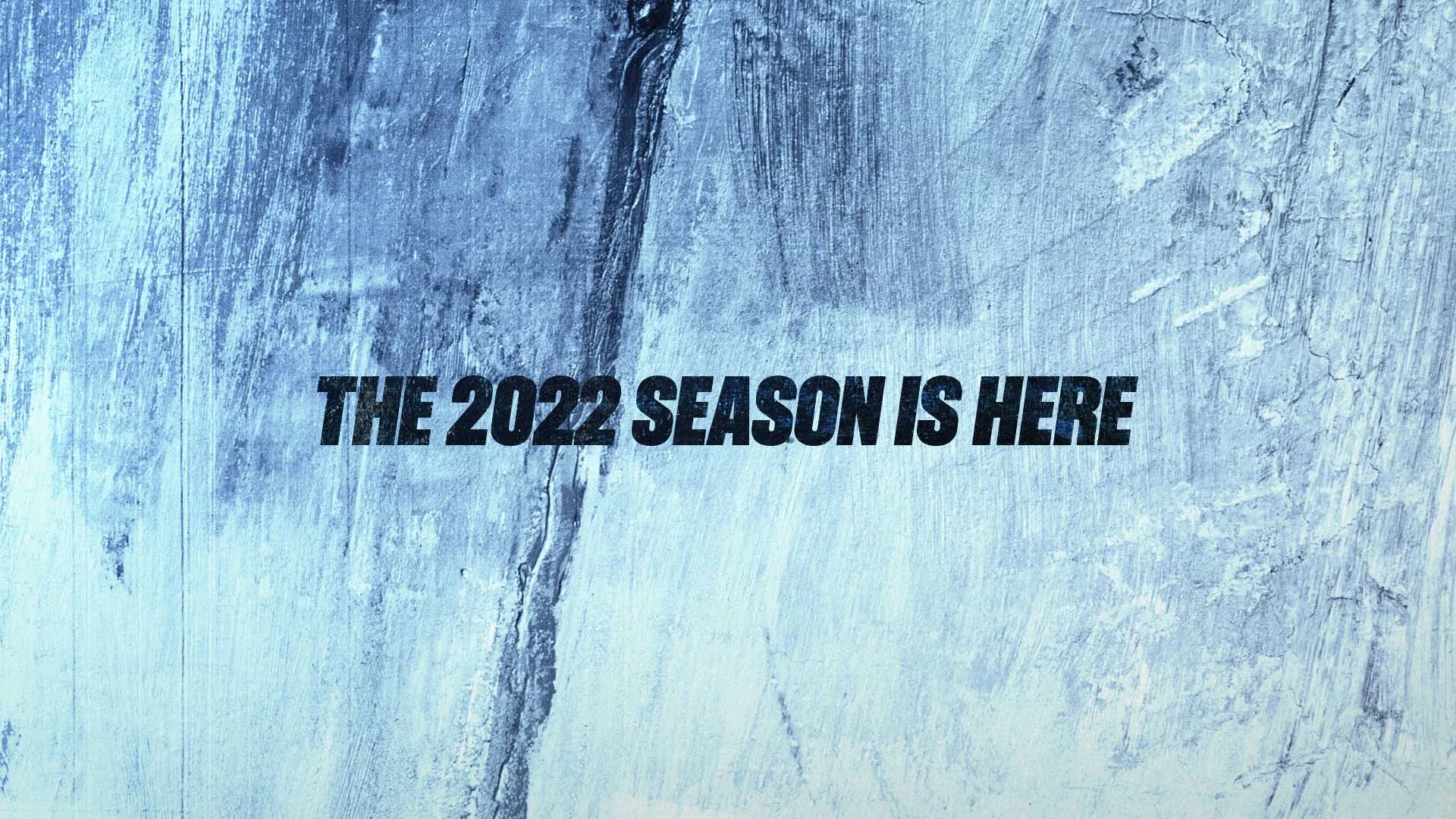
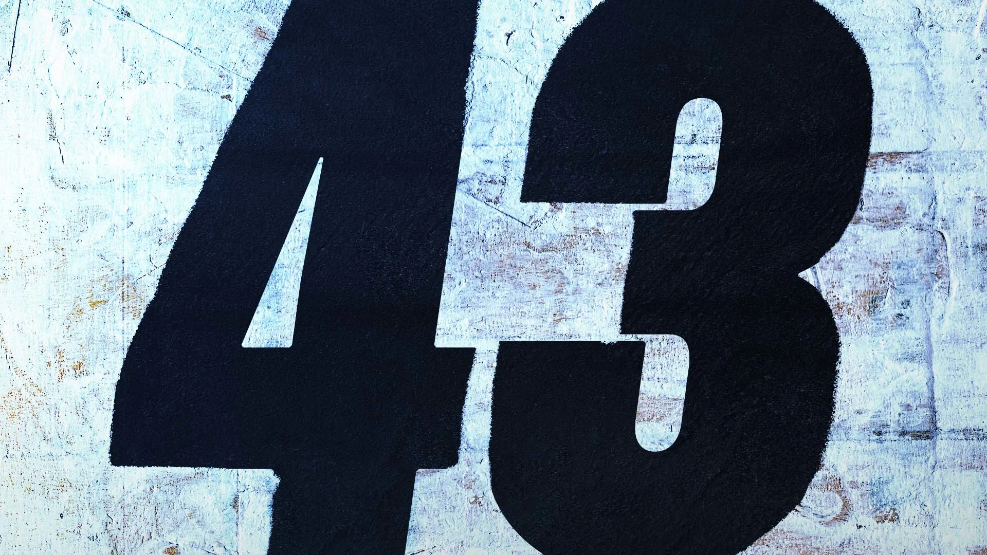

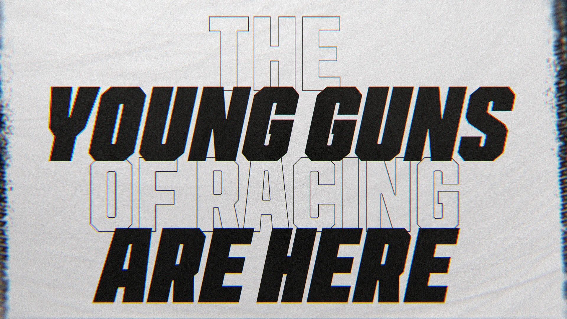

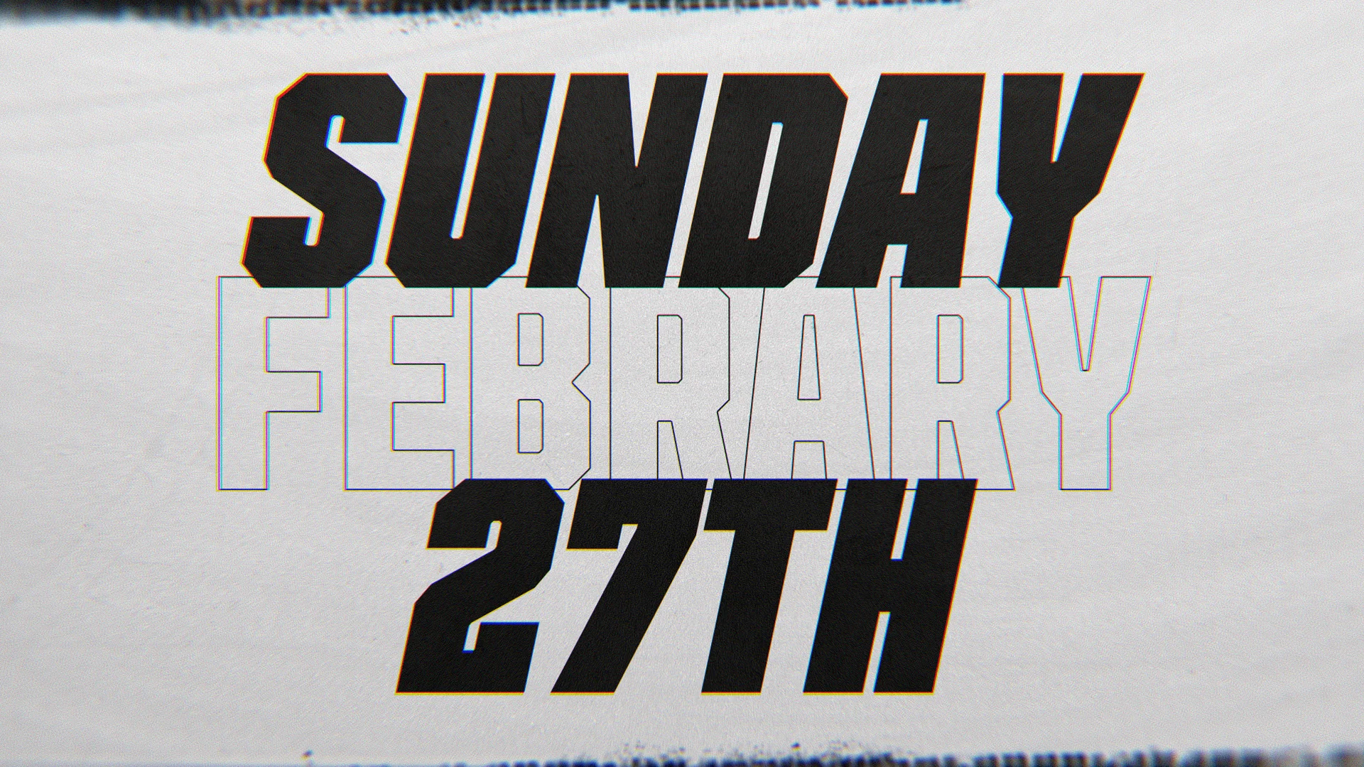
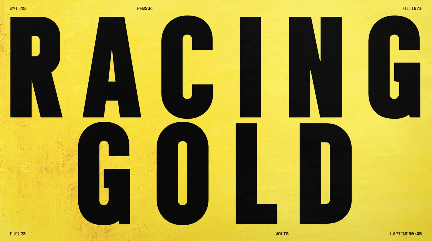
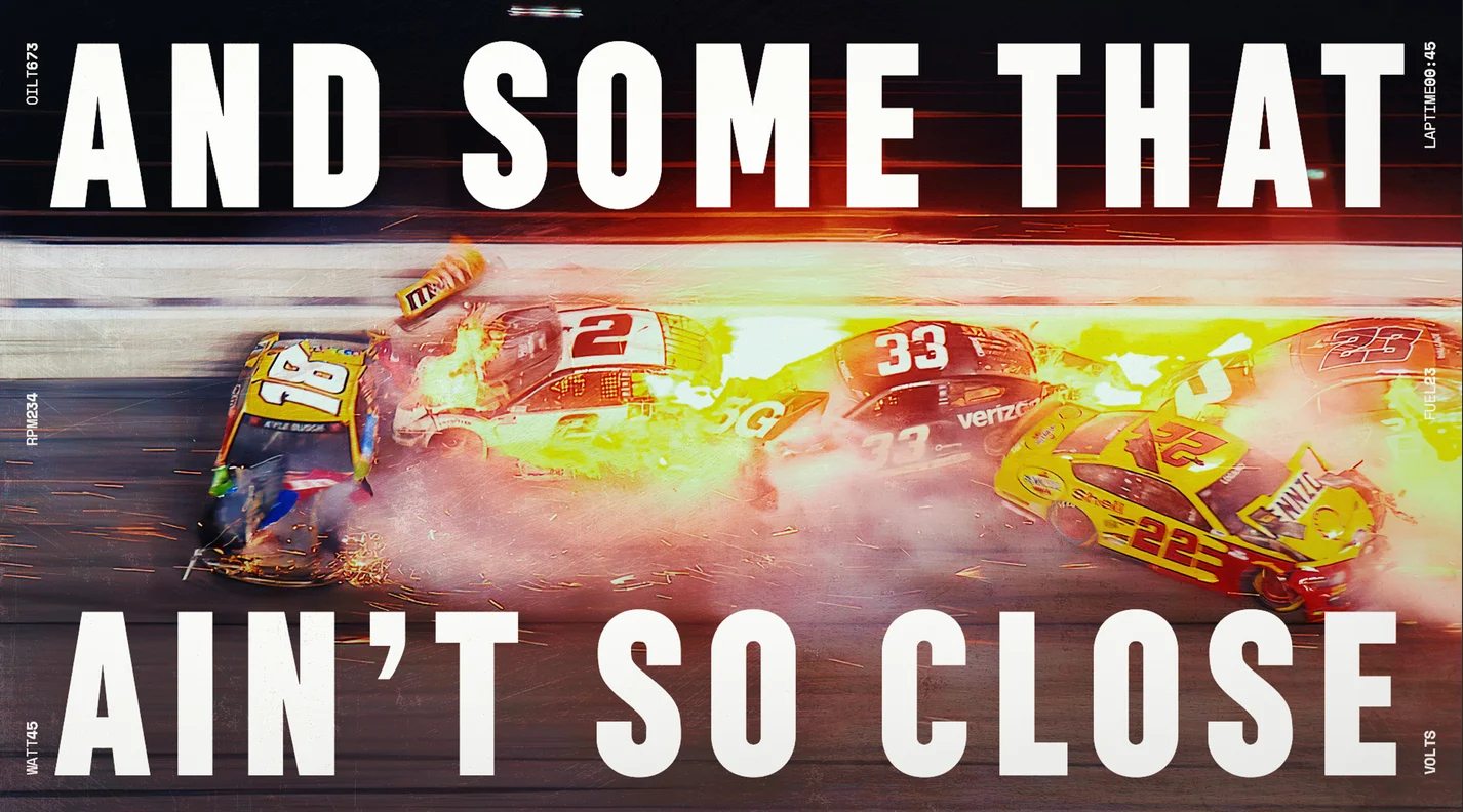
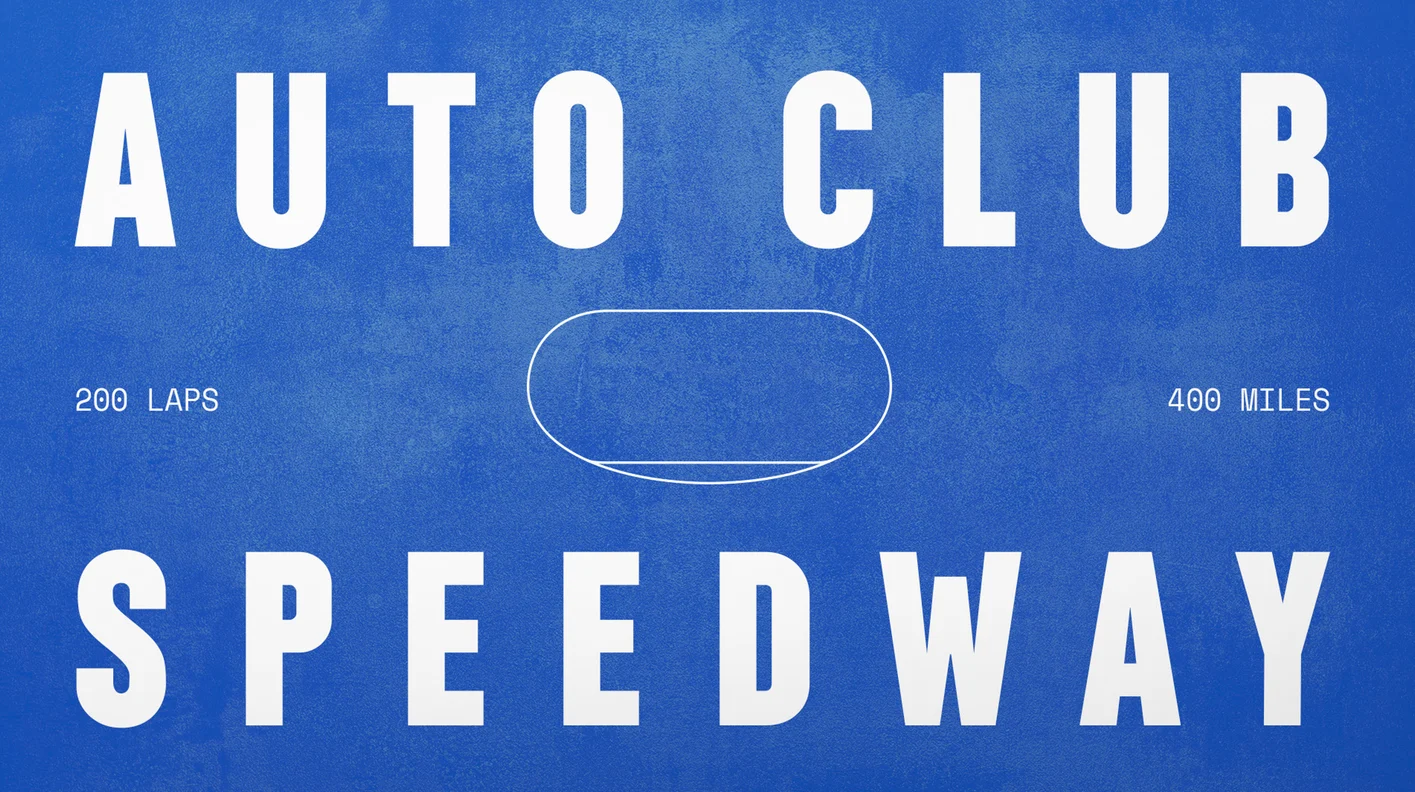
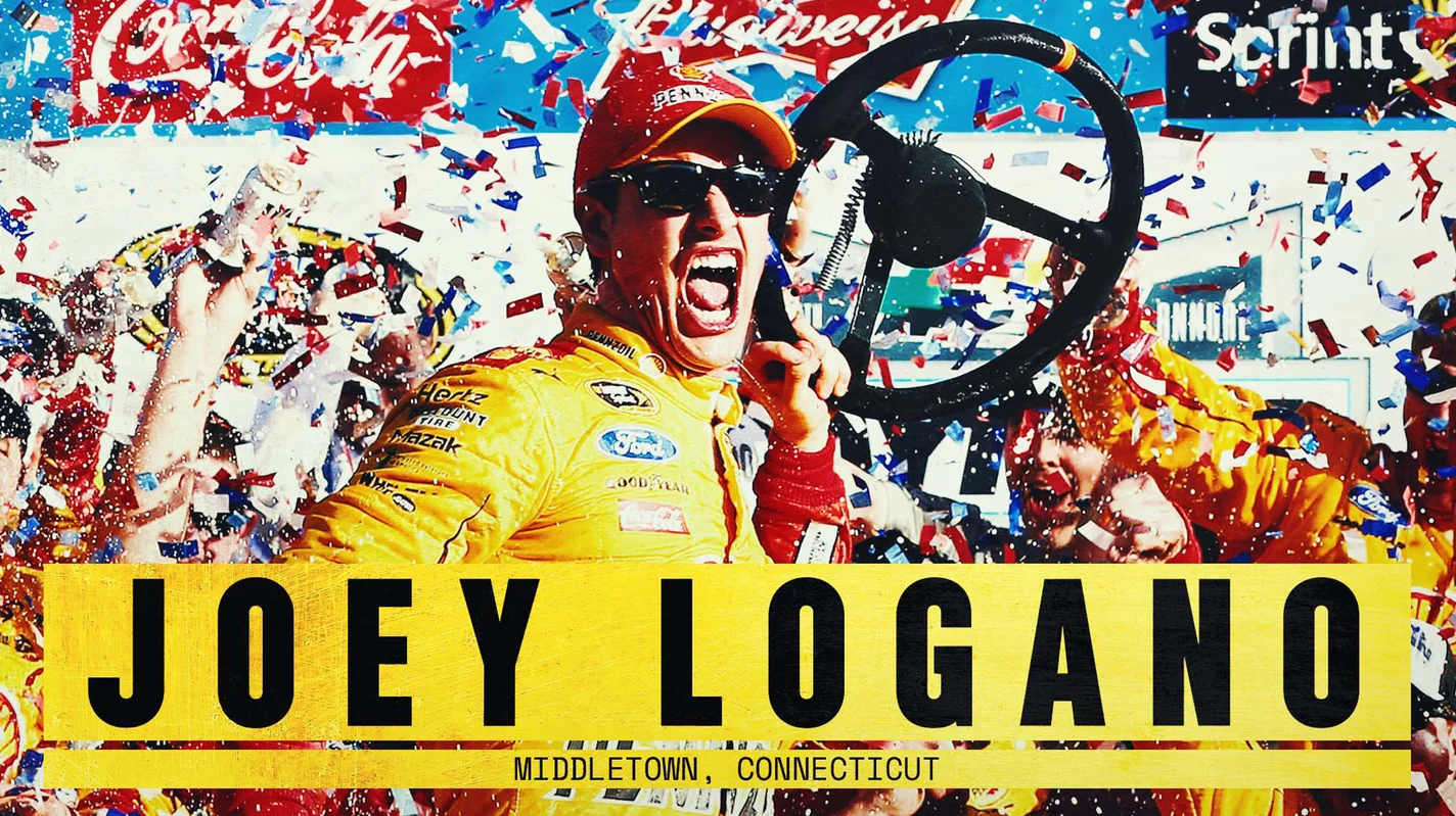
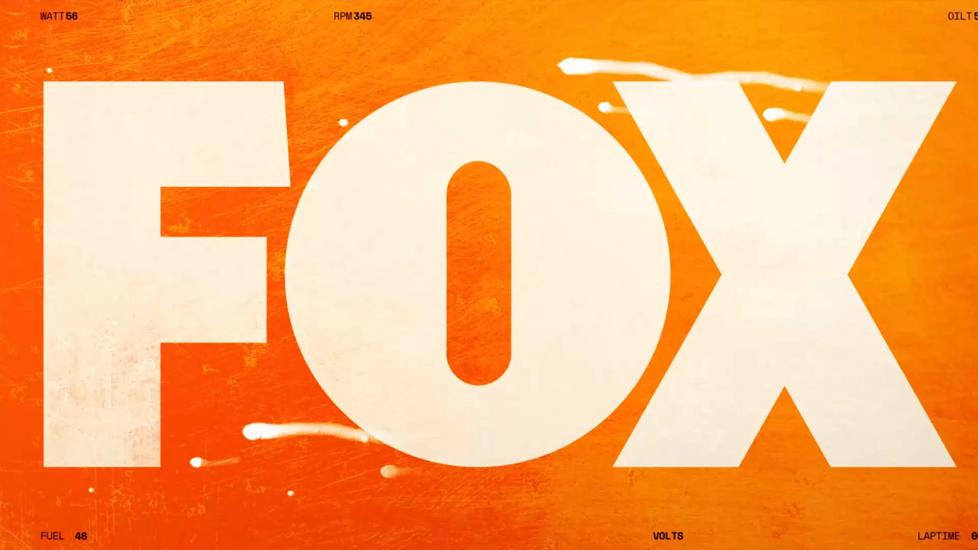
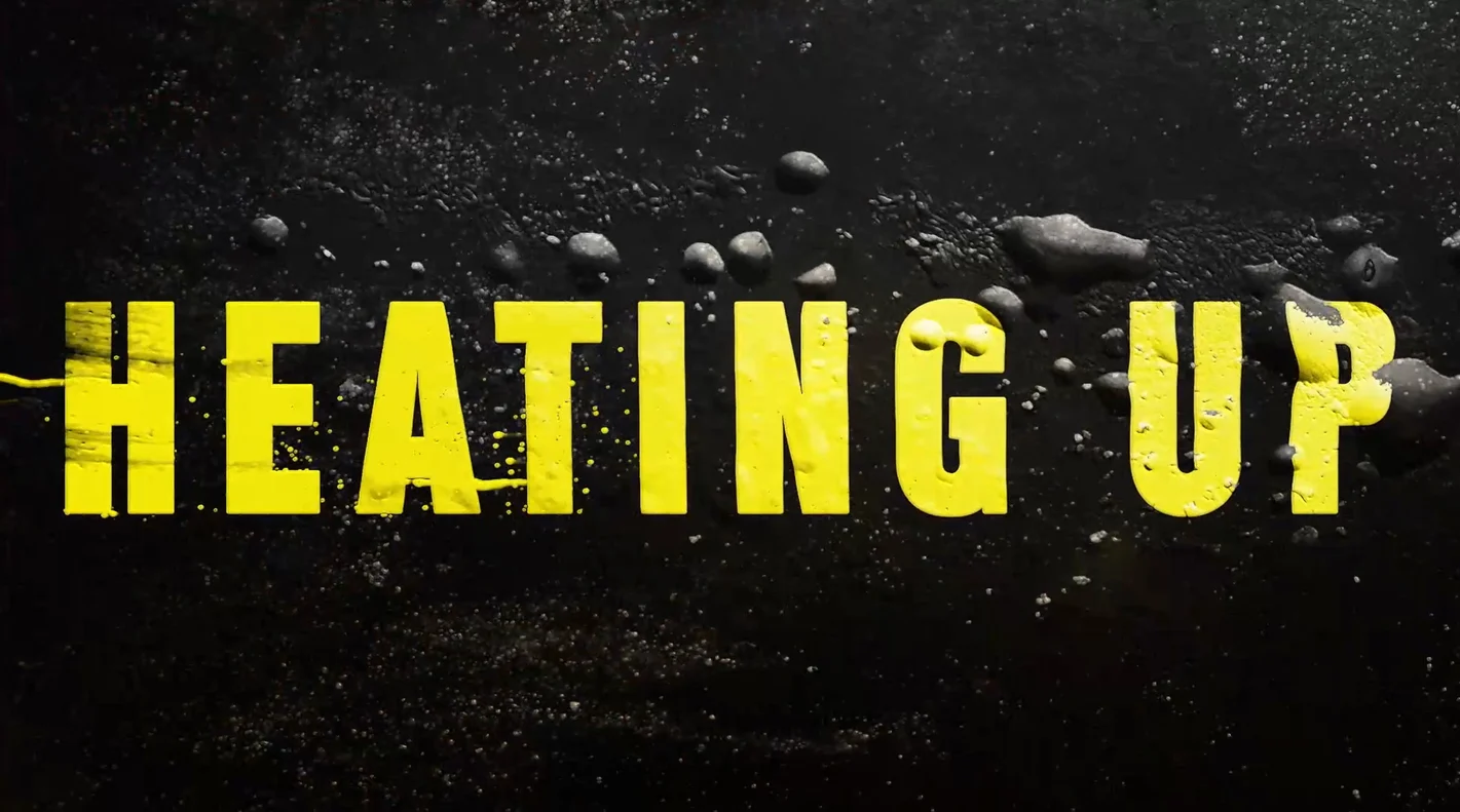
We wanted to design a graphic language filled with big color, big type and big textures to embody the spirit of NASCAR and really feel like car racing. All of the textures we used were inspired by the sport of racing- sparks, bubbling asphalt, paint tearing, elements of the track and more.
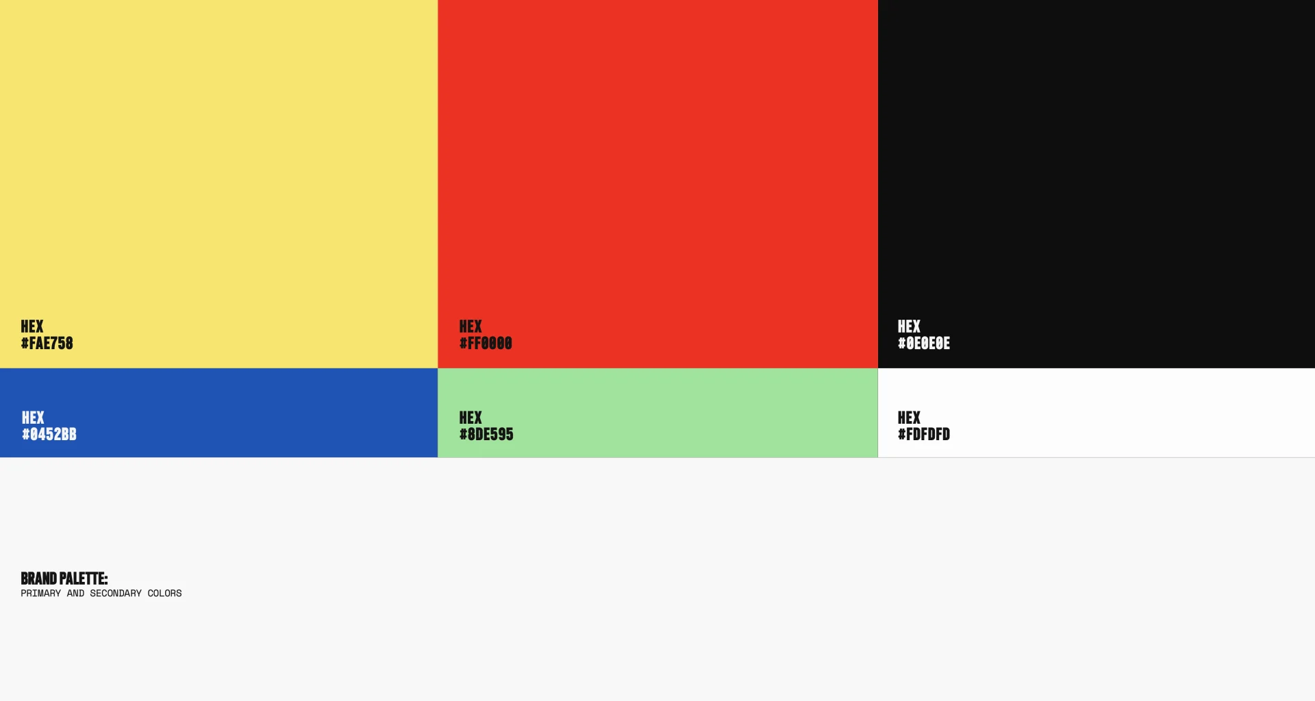
This broad range of textures complemented the color palette, which was inspired by the NASCAR brand, and is incorporated into the toolkit to assist in the storytelling throughout the season.
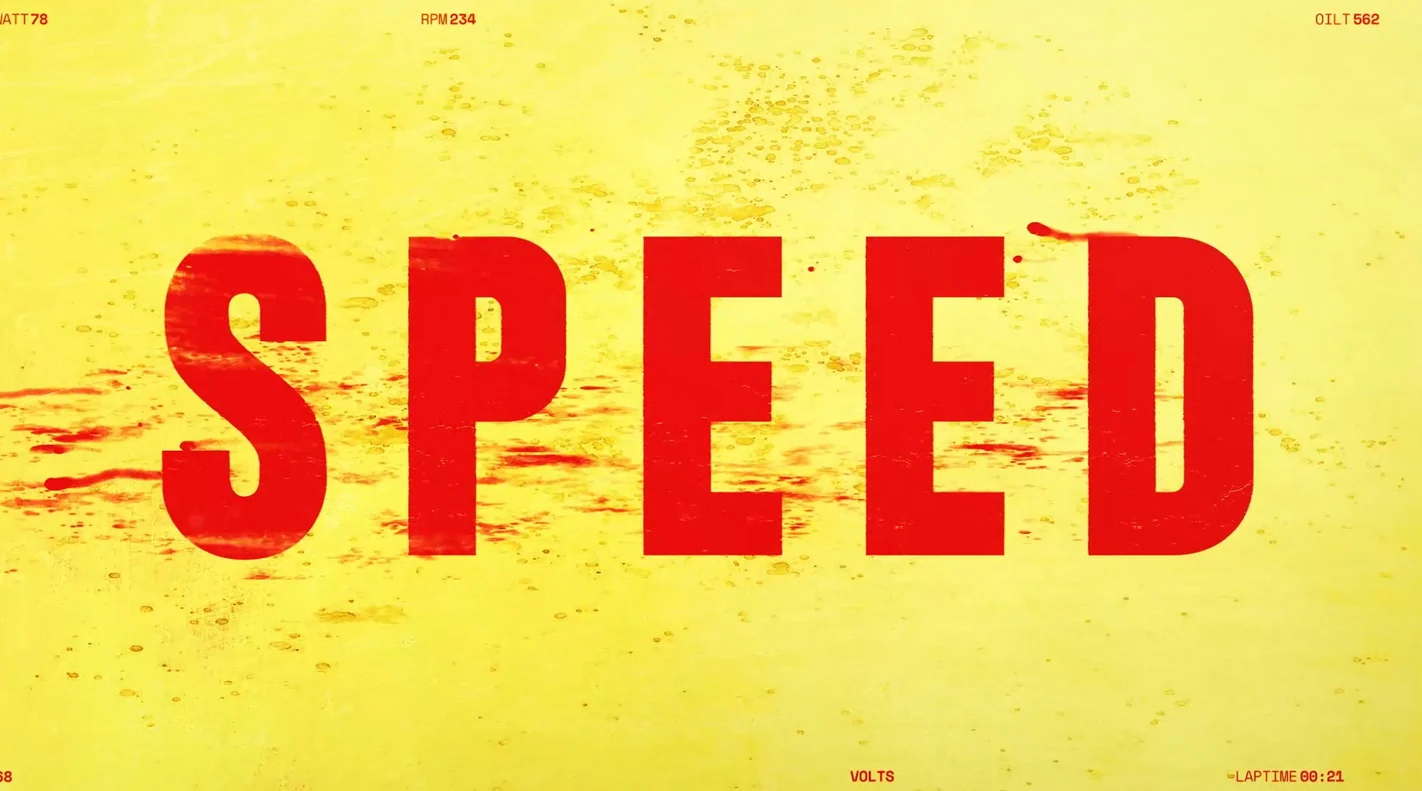
The first promo to air promoting the season opener: the legendary Daytona 500 that takes place annually in February in Indianapolis. The team of artists working on this project had a great shorthand with Ross and Carol managing the design approach and then Casey Drogin managing the audio, editorial and animation.
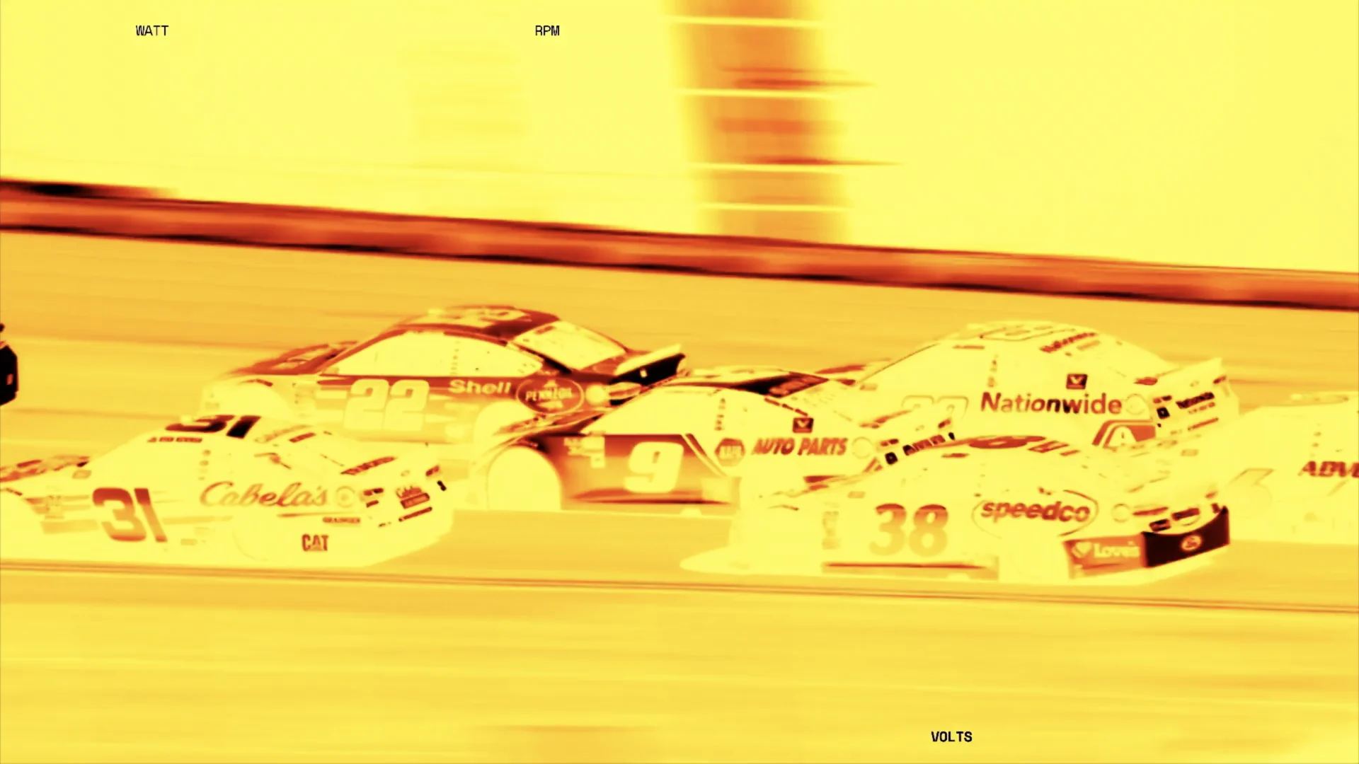
In addition to the editorial elements and spots, we delivered an extremely robust toolkit with a huge toolbox for our client to use throughout the season and create new elements that would stay within the design constructs we’d created. We brought in a lot of new techniques and easy ways to change color and texture and really unique transitional moments - everything from After Effects toolkits to a style guide.
For each race, we designed a race track system custom to the track featured for each event. This illustrated outline highlights pertinent information for each race about the city, track and unique attributes and was a really fun way to show the versatility and diversity of the racing venues.



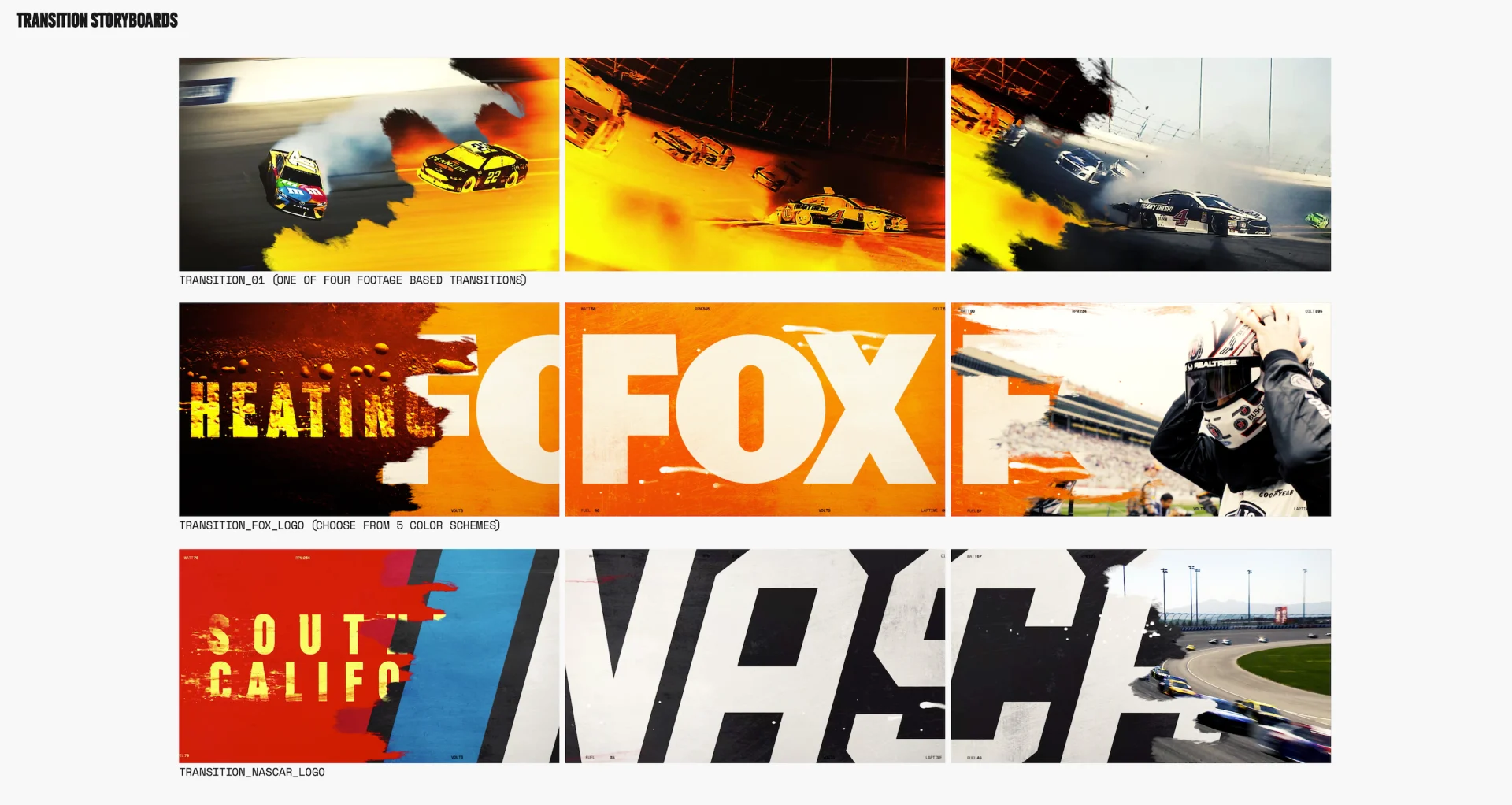

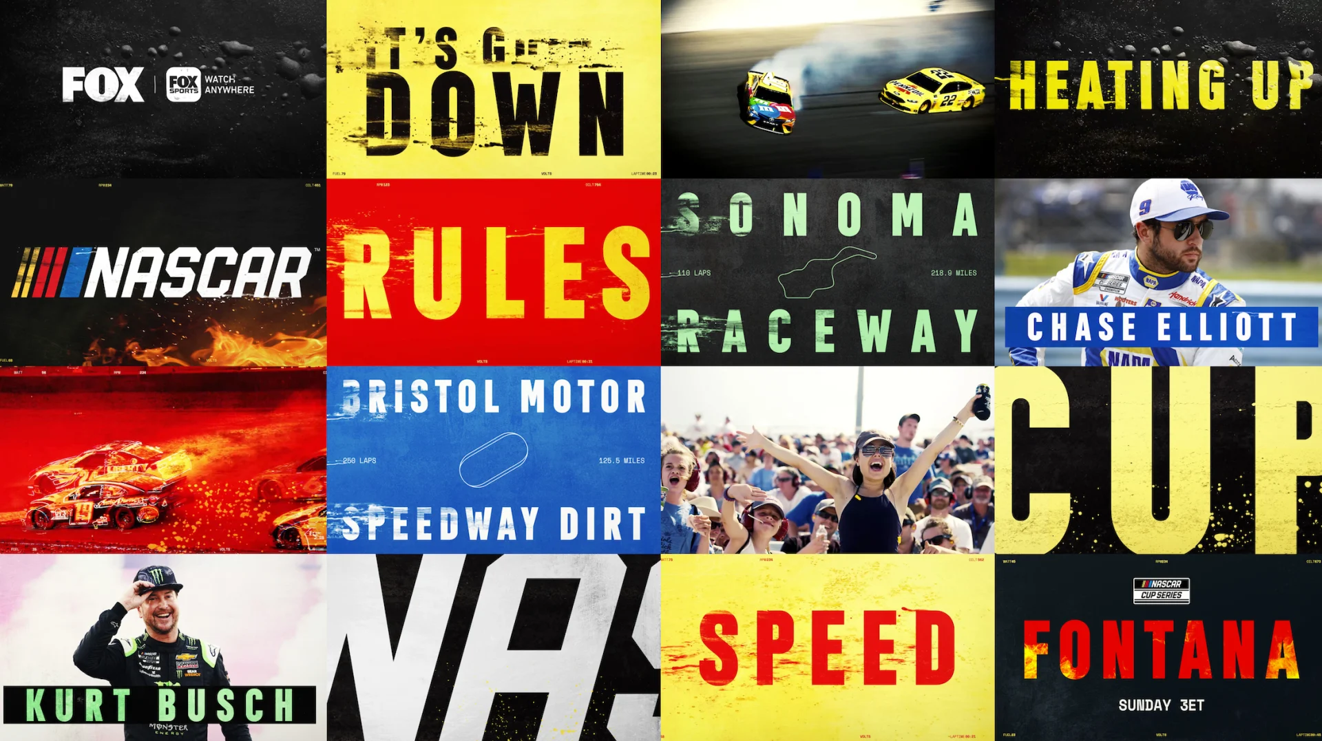
This project gave us a unique challenge: create something that’s exciting plus has a lot of usability. Once we found the correct voice for the edits, we had a great time letting the design fly and translating that voice into editorial that really feels like racing- speed, movement and competition. We had a great time working on this project with the team at Fox Sports and can’t wait to watch the evolution of the 2022 Cup Series.

lights, camera...
SAG 2022 Promo
It was a return to form for the 28th annual Screen Actors Guild awards show with the broadcast airing live and hosting an in-person audience for the first time since 2020. We were thrilled to be invited back by our friends at TNT, who broadcast the ceremony, to mark this momentous occasion with a fresh batch of promos that would highlight what makes the SAG Awards so great– the actors.
We’ve had a hand in our fair share of SAGs, which presented both a challenge and an opportunity. How do we freshen up the design with some new and exciting ideas while maintaining the spirit of the awards? The team at TNT shared with us some inspirational concepts that incorporated a lot of Art Deco elements, many pulled from the elaborate set design being created for the ceremony, which we used to compile a robust reference deck.


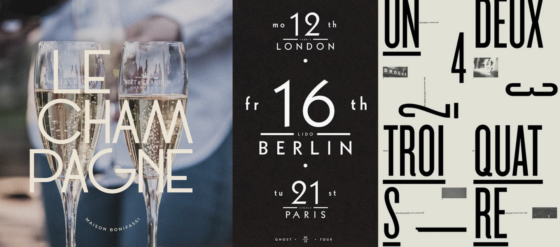
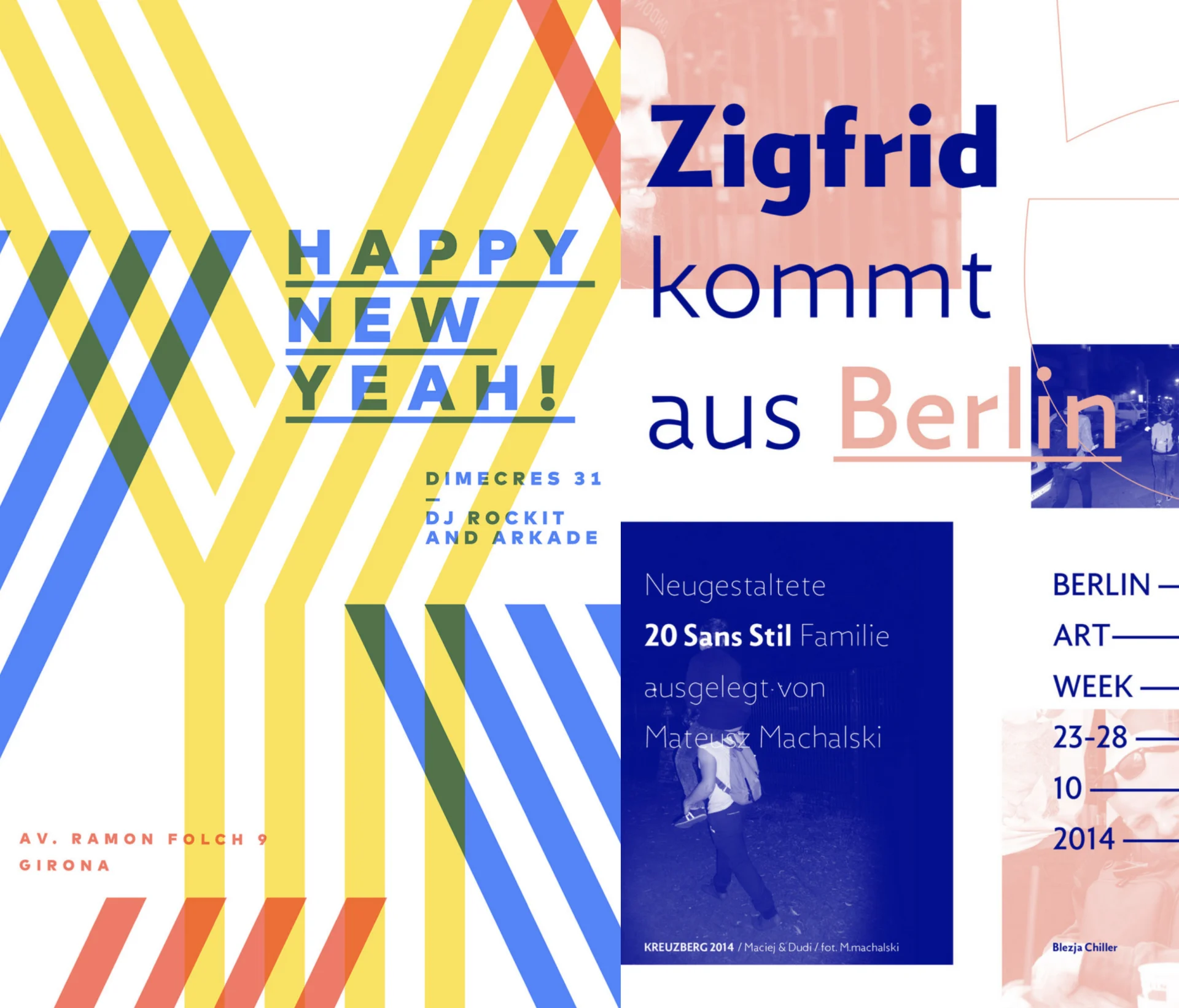
After a couple SAGs together, we have a great shorthand with the team at TNT, so it was easy for us to build and ideate on design concepts that were working. We cast a fairly wide net, then drilled down into variations on each of those to give the clients a lot from which to choose what resonated.

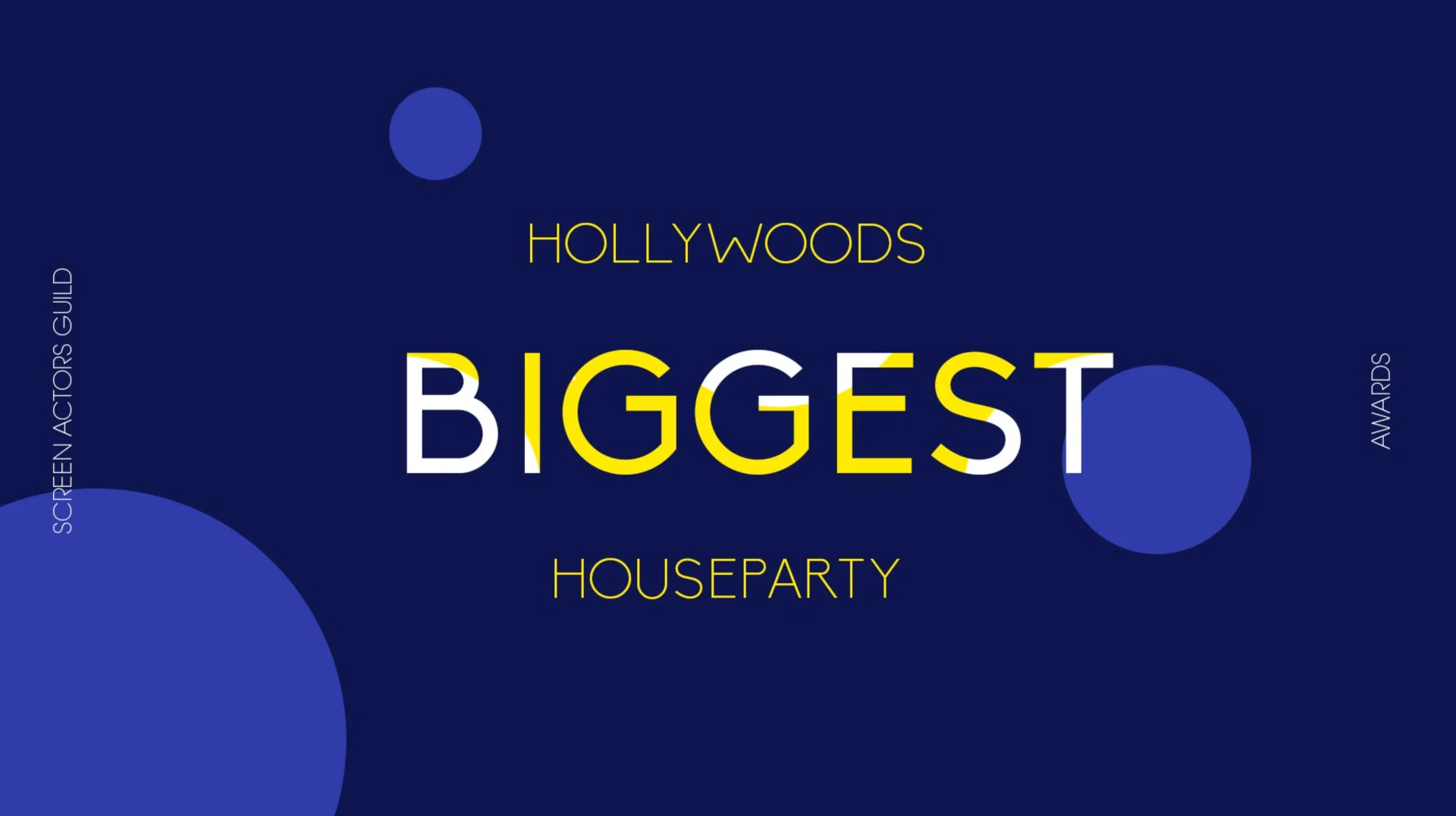


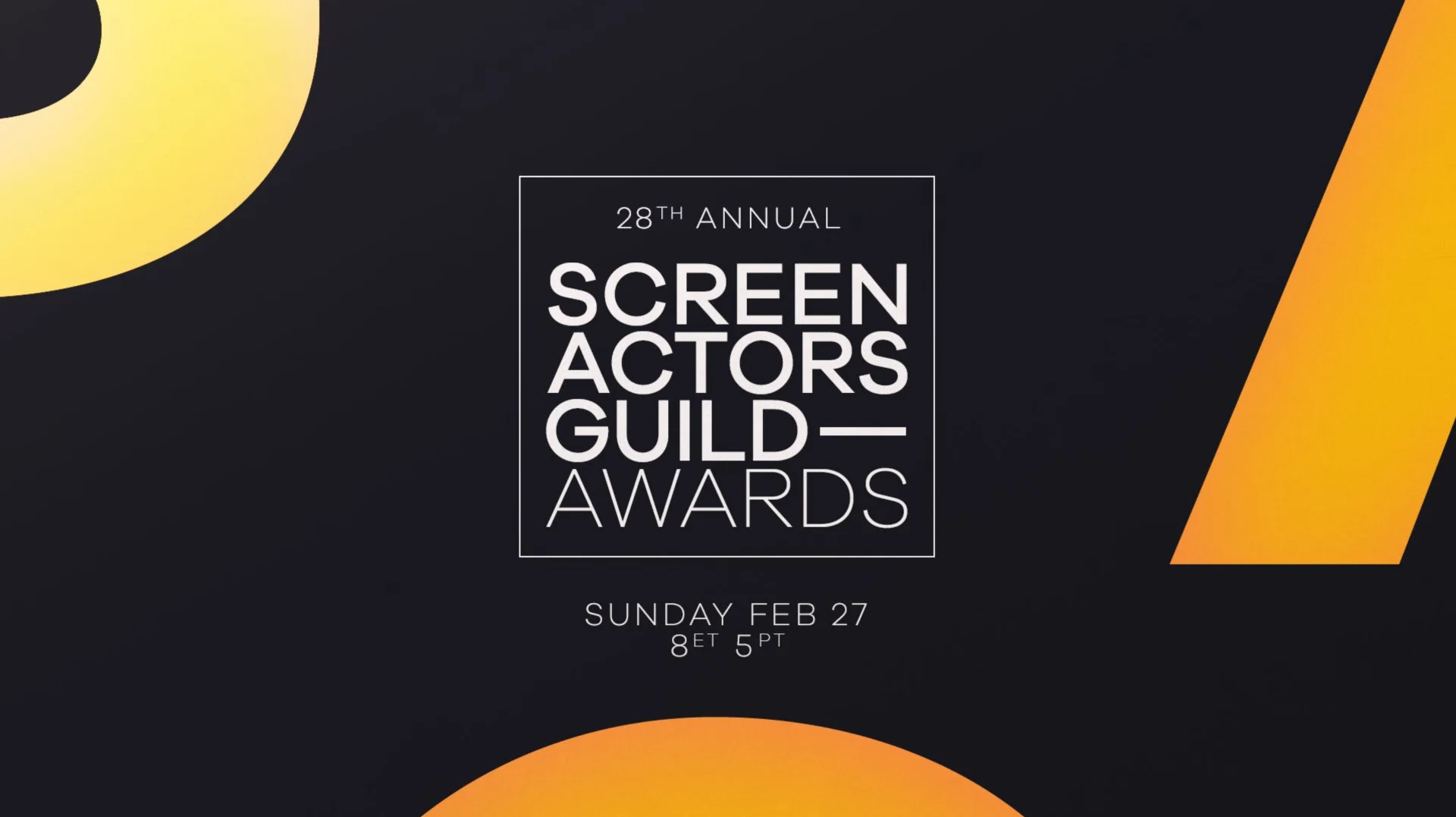


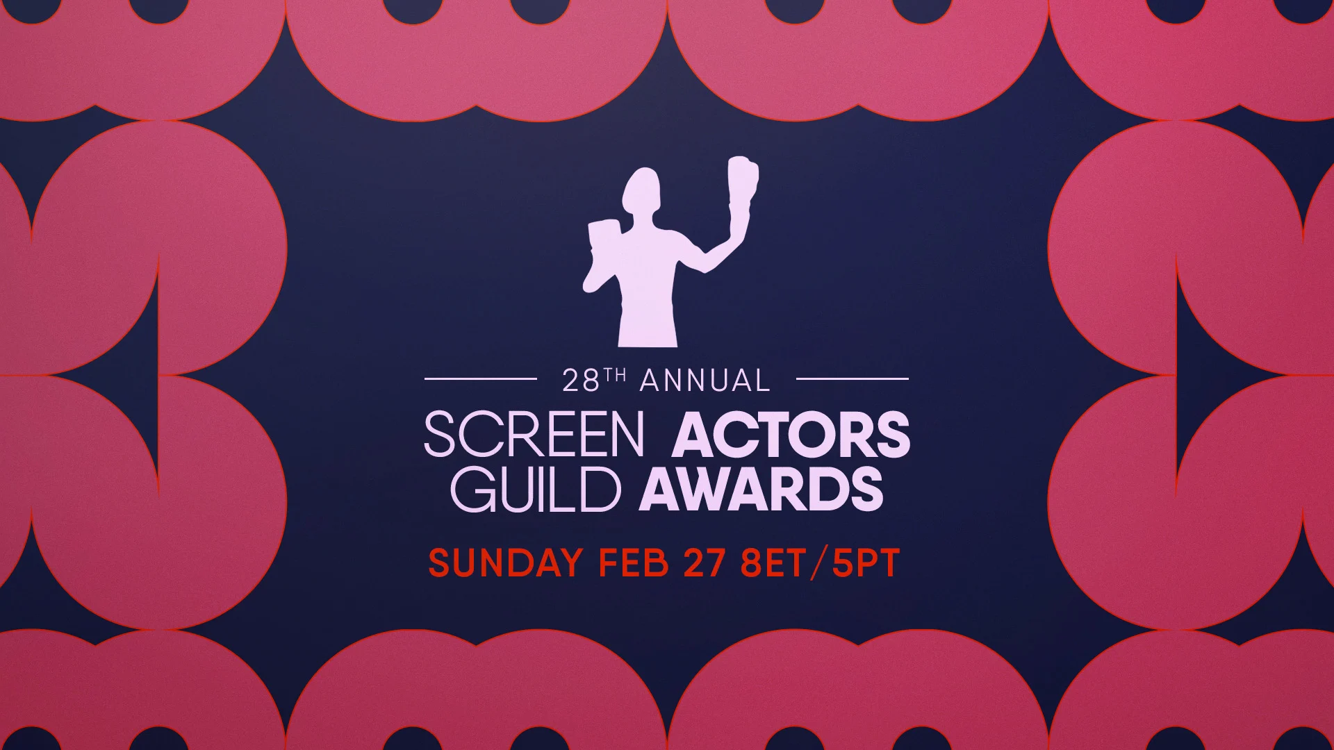


After working together to edit down our ideas, we moved forward with a concept that would incorporate Art Deco design and Hollywood glam while placing the actors front and center. Much of the beauty in this project comes from the fact that it came from a really straightforward exercise in graphic design in all the best ways.
Classic typography, bold shapes, highlighting the statue and showcasing the logo– these were the directives that guided our design led by BigStar artist Ross Henderson. This pure form graphic design is something he really excels at and it translated to a really slick final edit.
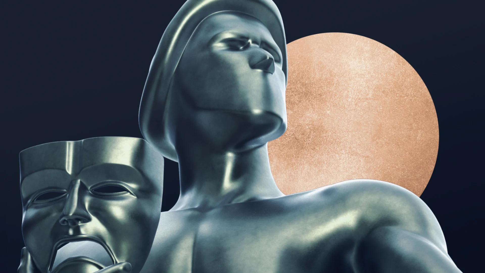
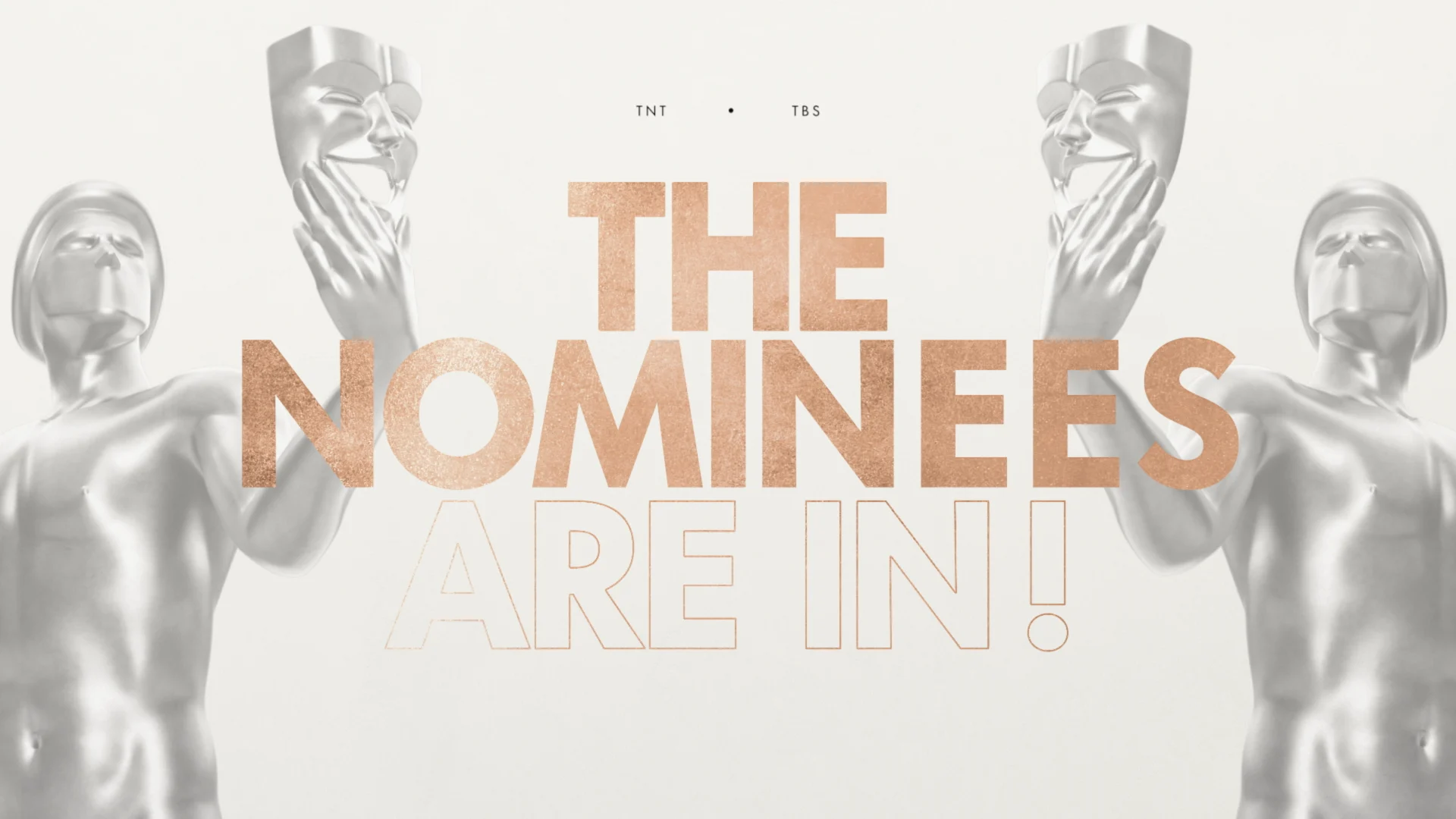

Our first milestone was to combine the design elements into a toolkit for our client. We built an architecture to house the elements needed to create the title cards, transitional language, treatments and more, giving our clients what they needed to produce promos on their end. After we’d delivered that package, we also produced a couple of fully graphic spots for the ceremony’s nominee announcements.
The design on these highlighted the intimacy of the return to the in-person format of the awards and was something we tried to translate by featuring the actors.

The incorporation of the stars into the Art Deco design creates a sophisticated vibe that plays well into the re-entry into live events SAG is returning to.
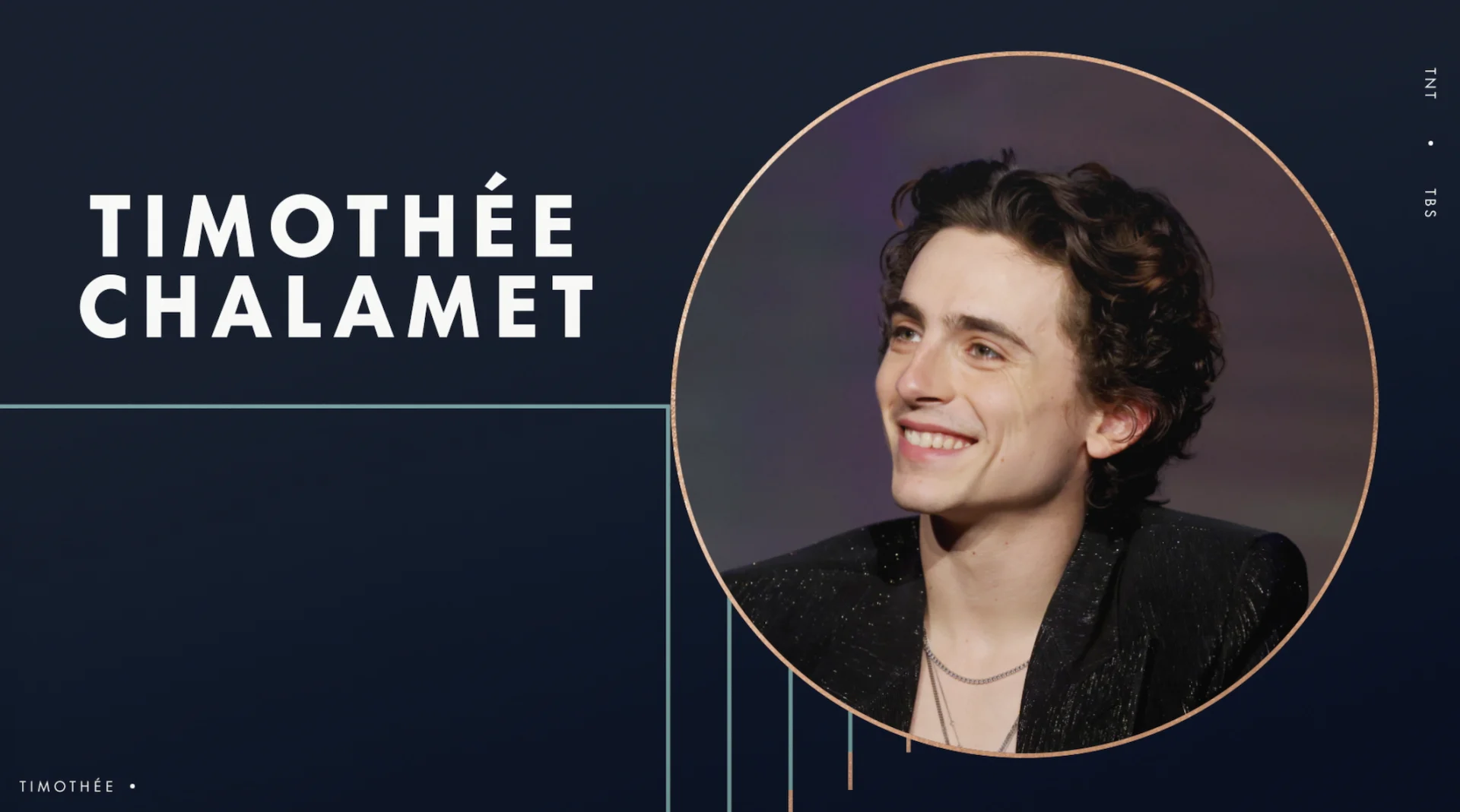

We built out a few social elements to build on and we were able to turn over a robust and highly functional promo package. The beautiful design and versatility set the TNT team up for success as they began promoting the fan-favorite awards show. We always look forward to what the team comes up with each year and are honored to be asked back to design it into existence.

Props where props are due
Credits
The Andy Warhol Diaries
Executive Creative Director Josh NortonCreative Director John LeamyExecutive Vice President, Executive Producer Carson HoodProducer Kristen PritchettDesign Mark Thompson, Carl DempseyAnimation Carl Dempsey, Christopher Scales, Liu Chia-Lung
NASCAR
Executive Creative Director Josh NortonExecutive Vice President, Executive Producer Carson HoodDesign Director Ross HendersonHead of Production Virgil ConklinLead Animator & Editor Casey Drogin2D Animation EunSung DoDesign Exploration Carol Cai, EunSung Do, Paolo Garcia
SAG 2022
Executive Creative Director Josh NortonExecutive Vice President, Executive Producer Carson HoodDesign Director Ross HendersonHead of Production Virgil ConklinDesign Carol Cai, EunSung Do2D Animation Michael Luckhardt, Eun Sung Do, Chia-Lung Liu3D Design & Animation Nick Woythaler