May 4th, 2022
Volume 47
Client
Various
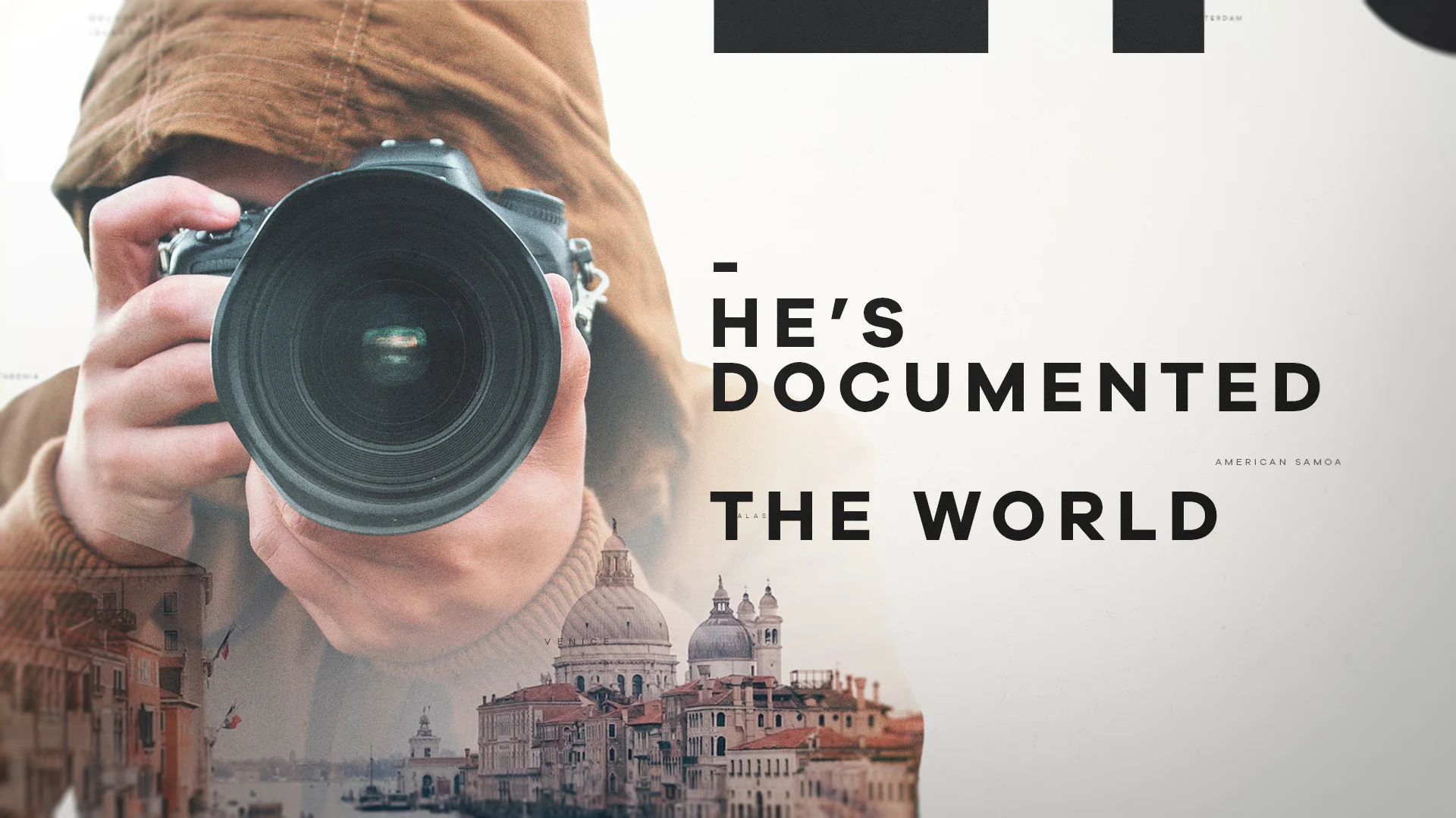
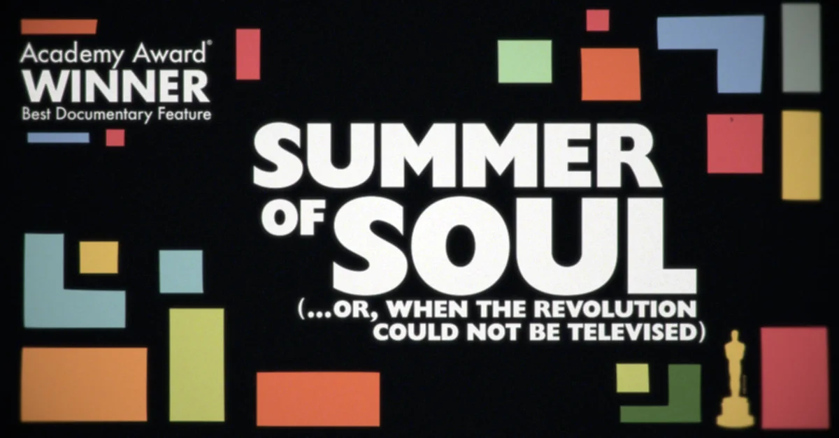
Take a closer look at our work on HBO's Undercurrent: The Disappearance of Kim Wall, The Wonder List and our very own Mark Thompson's graphic design on Oscar-winning documentary, Summer of Soul.

Undercurrent / Film Design
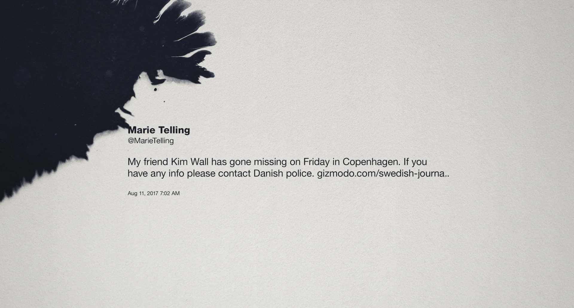
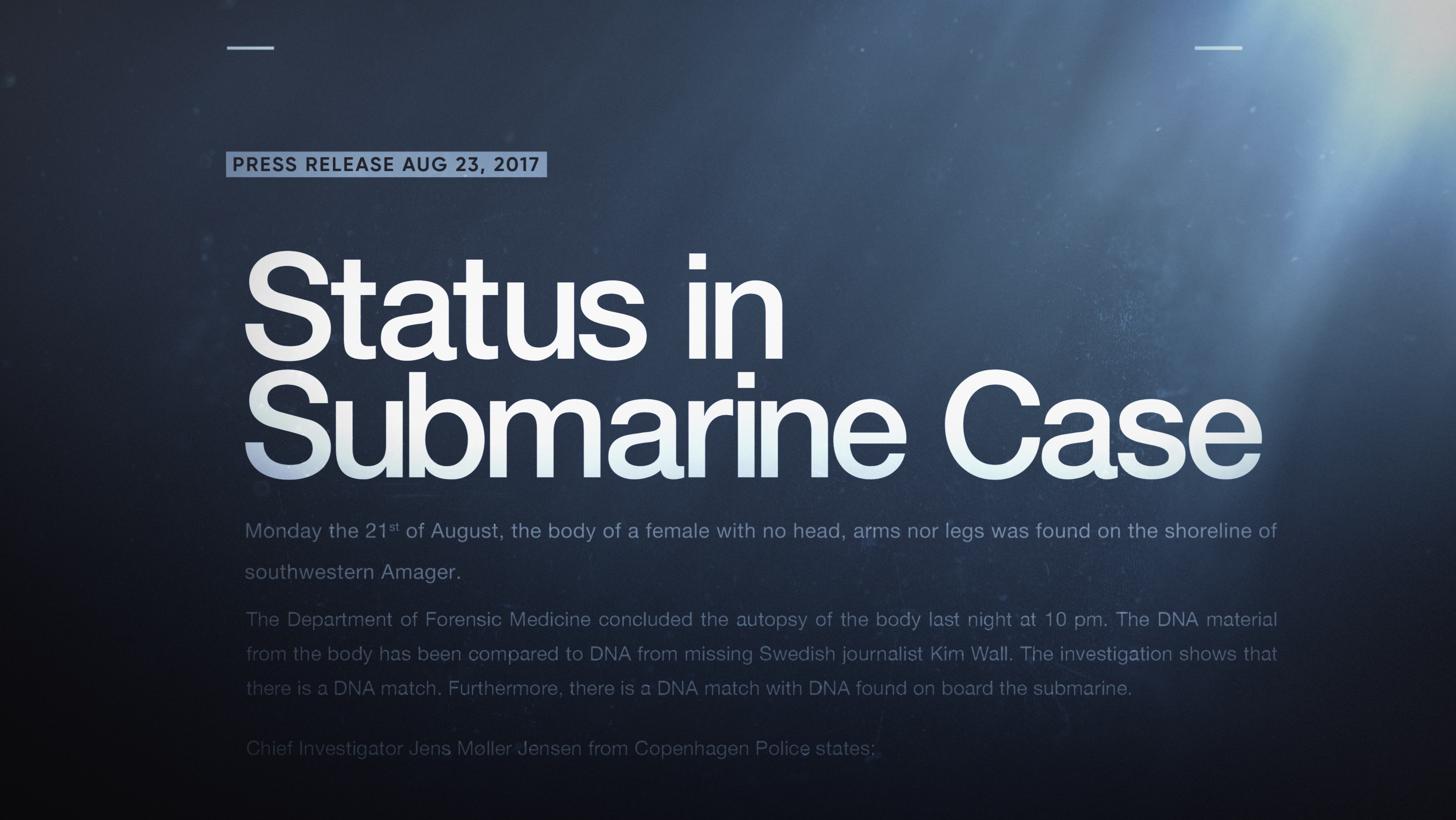
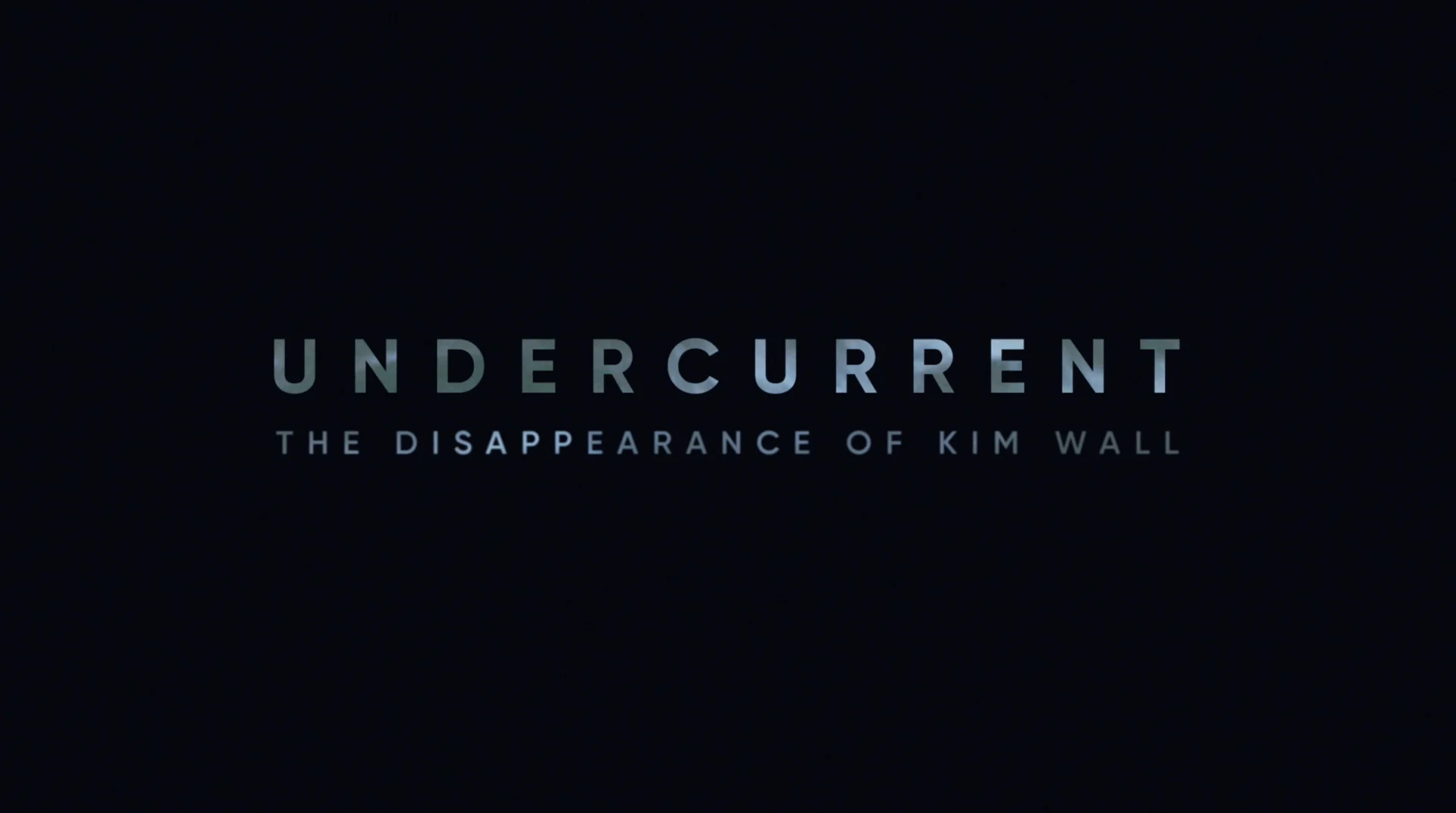
The disappearance and murder of journalist Kim Wall is at the heart of the two-part documentary, Undercurrent: The Disappearance of Kim Wall, which debuted on HBO Max in March. We designed the graphics for this film, the latest addition to filmmaker Erin Lee Carr’s catalog of nonfiction films featuring true crime involving women.
Director Erin Lee Carr and Executive Producer Andrew Rossi, brought the project to us in its early stages and we were thrilled to partner again to design the overall look for the series. As longtime collaborators of theirs, we understand the role the design process plays in Erin’s films, enabling her to make stylistic choices based on what she’s filming. Our goal was to design both beautiful and accurate graphics to enhance the narrative and contribute to the film’s storytelling in a compelling way.


We brought a robust design exploration to Erin and her team early on to assist in the development of everything from the film’s logo, to tweet treatments and headlines, to imagery of Kim, in order to create a cohesive, overall look for the film. The design treatments we presented varied slightly but all prioritized information delivery and an overall simplicity to support the film’s storytelling.


Undercurrent is a nonfiction story rooted in a true crime, but like others in Carr’s oeuvre, the film is focused on giving an accurate depiction of Kim Wall rather than a sensational one. Thus, it was important for us to keep in mind the content and the audience when designing graphics. Our goal was to keep the design language clear and concise so as not to detract from the story unfolding on screen. We landed on a clean, modern approach for our design: elegant, simple and crisp; and most importantly, to the point.

Ross Henderson was the design director for this project and his ability to elevate a story through motion graphics really underscored the elegance of the film’s design. Whether typography or tweet elements, his ability to simply and beautifully convey information through graphics resonated perfectly for the tone of the film.
The opening sequence of the series sets out to establish key story elements as well as create a rich and textural environment that immerses the viewer in the story. We carefully considered the role of design and typography within this cold open and decided on clean and elegant treatments that could be seamlessly woven between evocative and eclectic imagery.
Film Design (continued)

True to the thesis of the film, our design maintained Kim as the focus whenever possible. Photos of Kim were brightened while photos of Peter Madsen were lightly distorted via an ink bleed or another technique to minimize his presence within the film and Kim’s story. We also designed beautiful maps of Copenhagen to guide the film’s narrative, lower thirds, locators and date information that were all hand animated.

Additionally, we modeled a 3D replica of the infamous submarine where the murder occurred, used in the cold open and in occasional other relevant moments.
We always enjoy the collaborative process of working with clients to achieve the right look and feel for their work. Our extensive deliverables list required frequent client input from our partners at Anchor and a high level of organization in everything from motion tests to archival footage treatment on through to delivery. High quality design output and attention to detail was a priority for us throughout the process in order to reflect the high caliber of our creative partners.
Undercurrent: The Disappearance of Kim Wall is an HBO Documentary Films presentation of an Anchor Production, in association with Anonymous Content and Abstract Productions; Undercurrent is available to stream now on HBO Max.
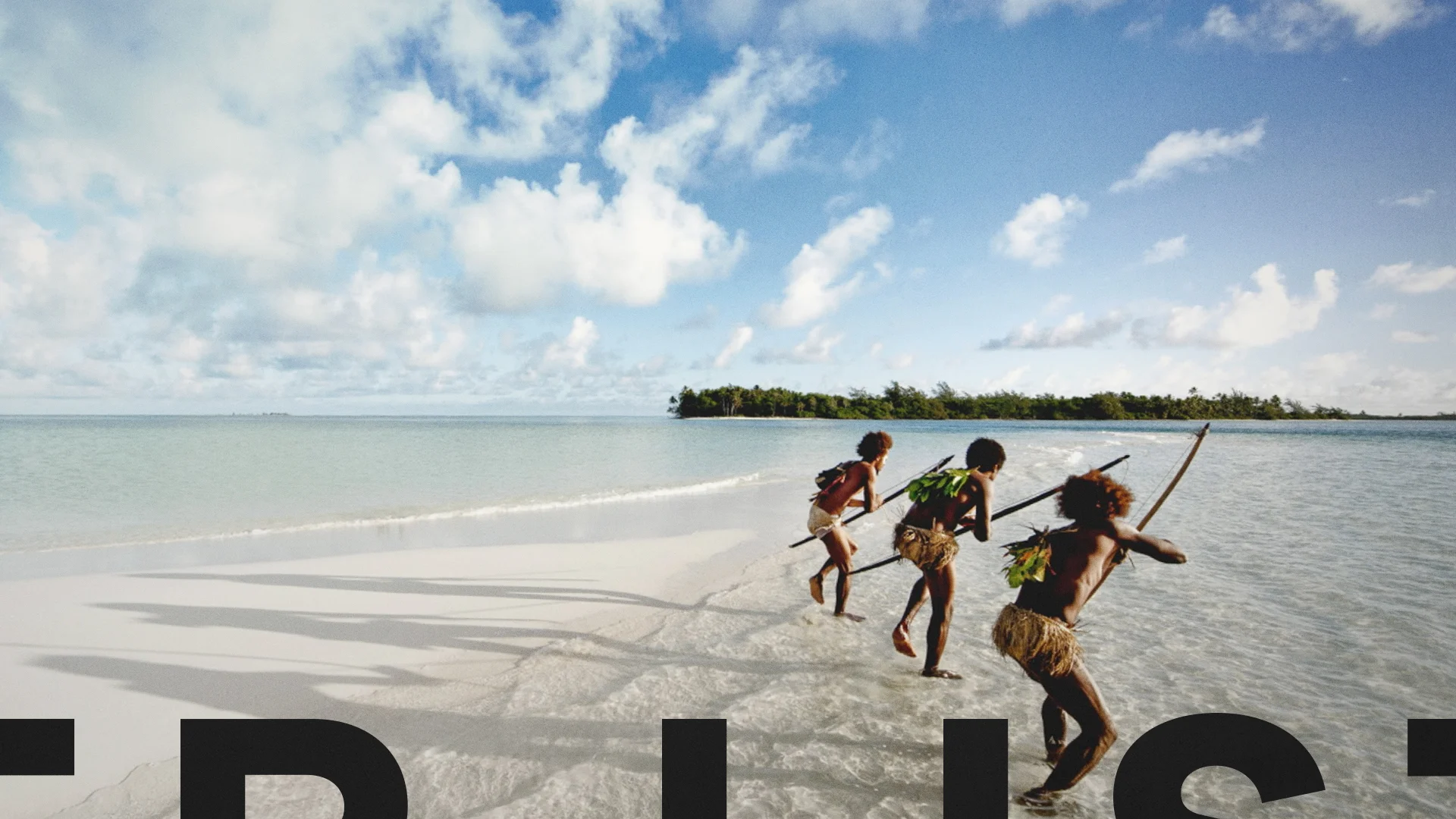
The Wonder List / Launch Campaign
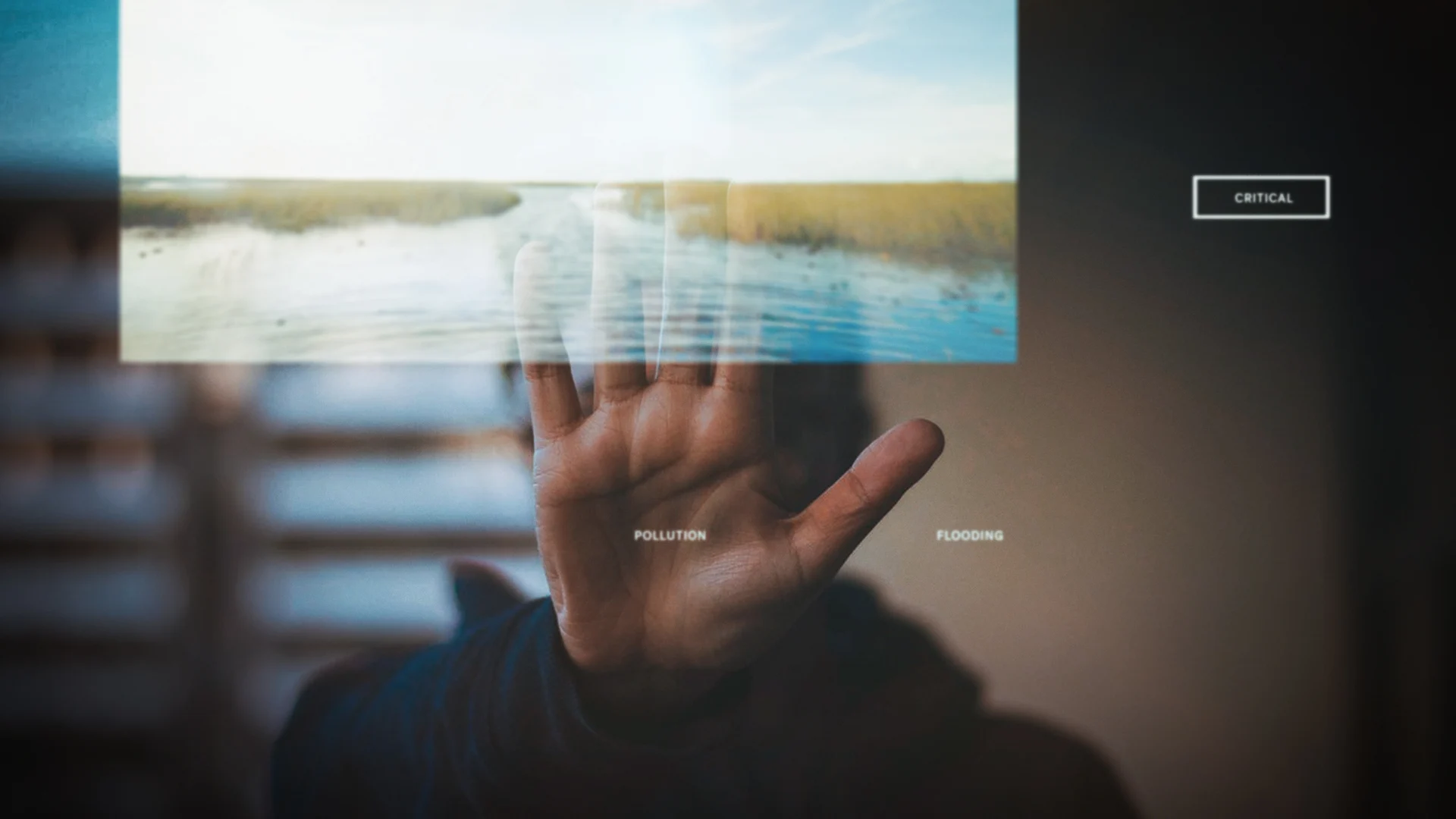
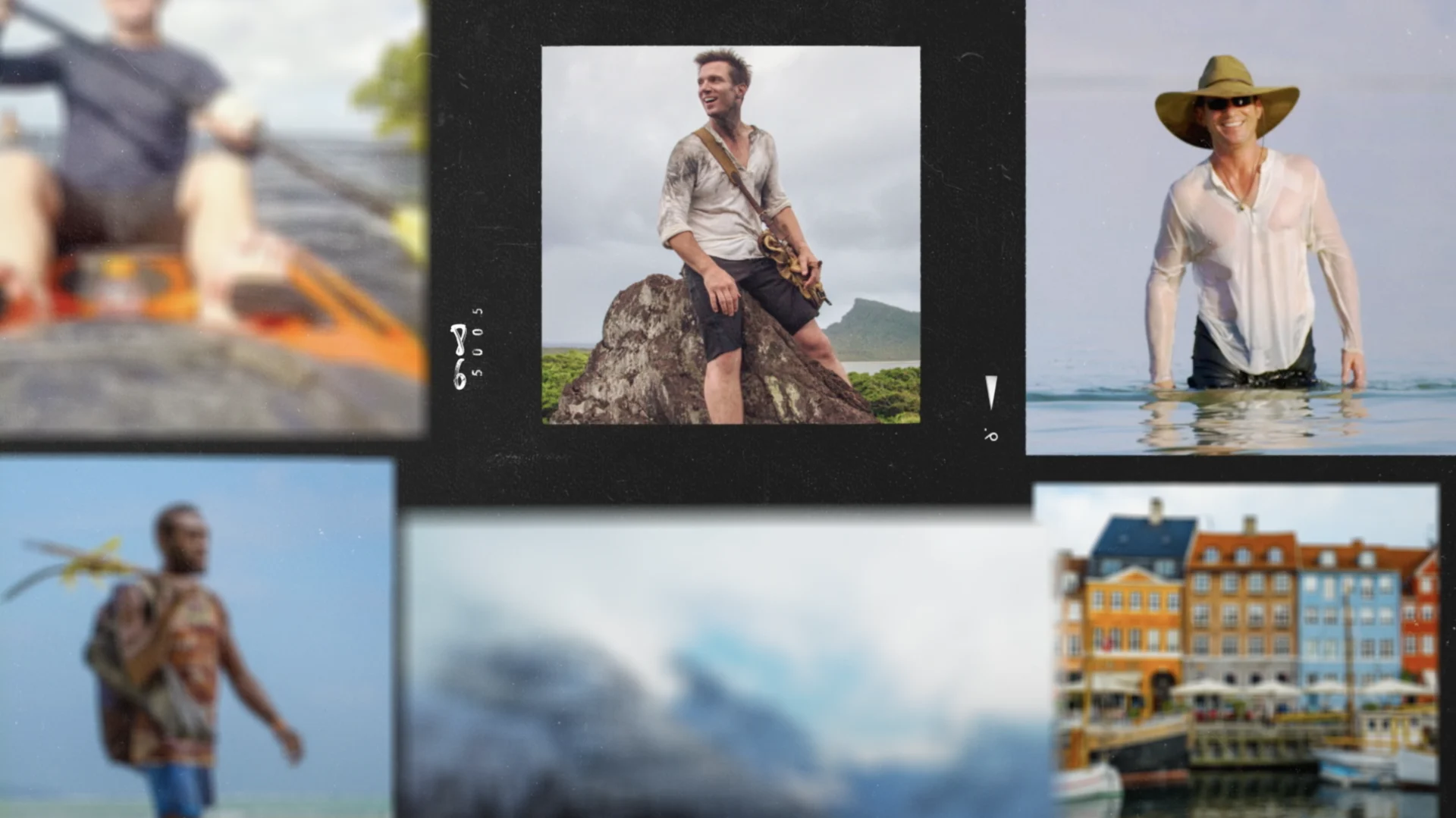
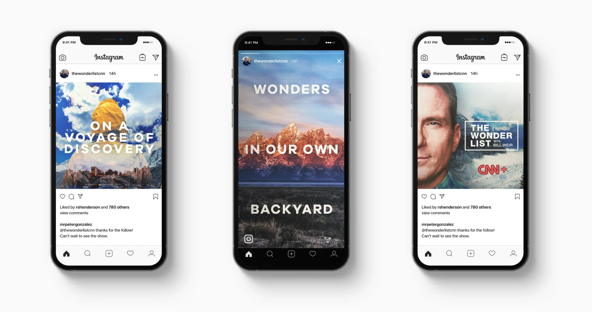
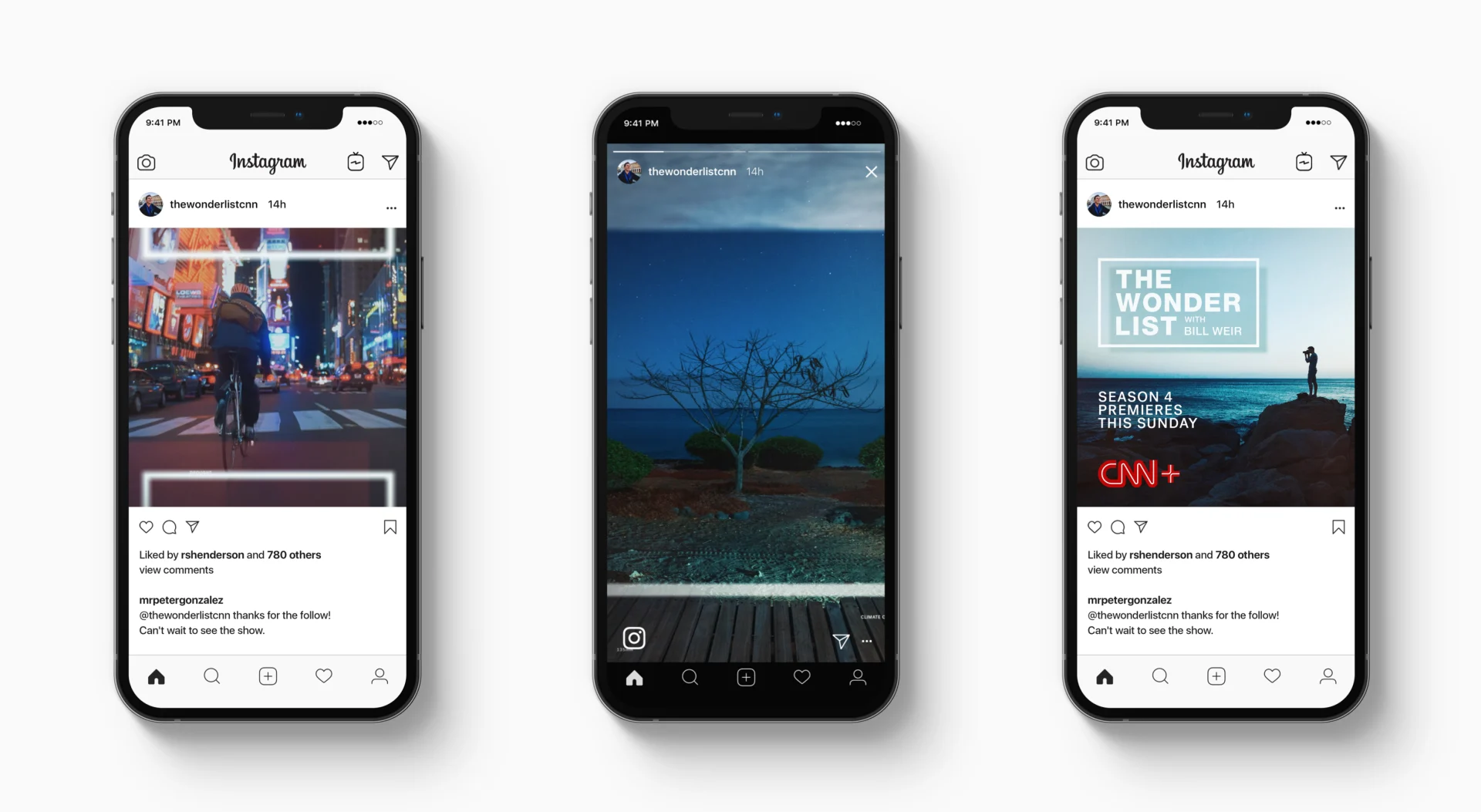
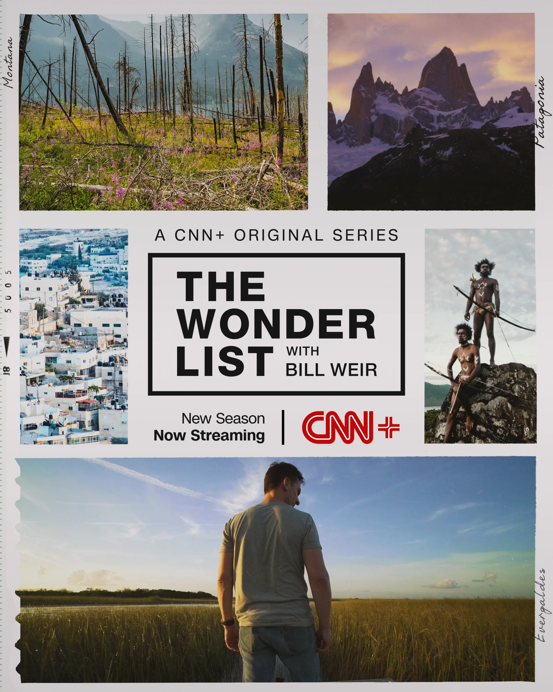
Climate change-focused travel series The Wonder List With Bill Weir has returned to air after nearly a five-year hiatus, launching its fourth season as a CNN+ Original. We had successfully worked on several campaigns with CNN in 2021, so when our partners at the network invited us to be a part of The Wonder List we were thrilled to have the opportunity to design for the beloved show’s return.
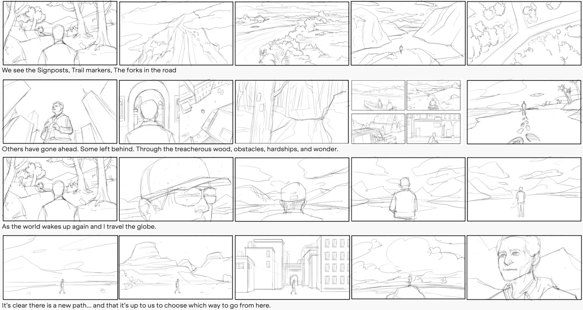
We began the project by putting together a number of different looks and ideas for the CNN team to explore. After initially planning a very high end design and shooting concept, our design exploration evolved the project into a more editorial space. The footage from the show that already existed was so spectacular that it was practically begging to be a part of the design. We took the beautiful landscapes, nature shots and high end imagery that we wanted to highlight and used them throughout the whole edit.


Once we made this decision, we leaned into scripting and storyboarding. From that initial script, we were also able to create cutdown spots including a one minute, :30 second, and :15 second spot. In addition to the varying lengths, we delivered three different edited versions of the spot each with a unique perspective.
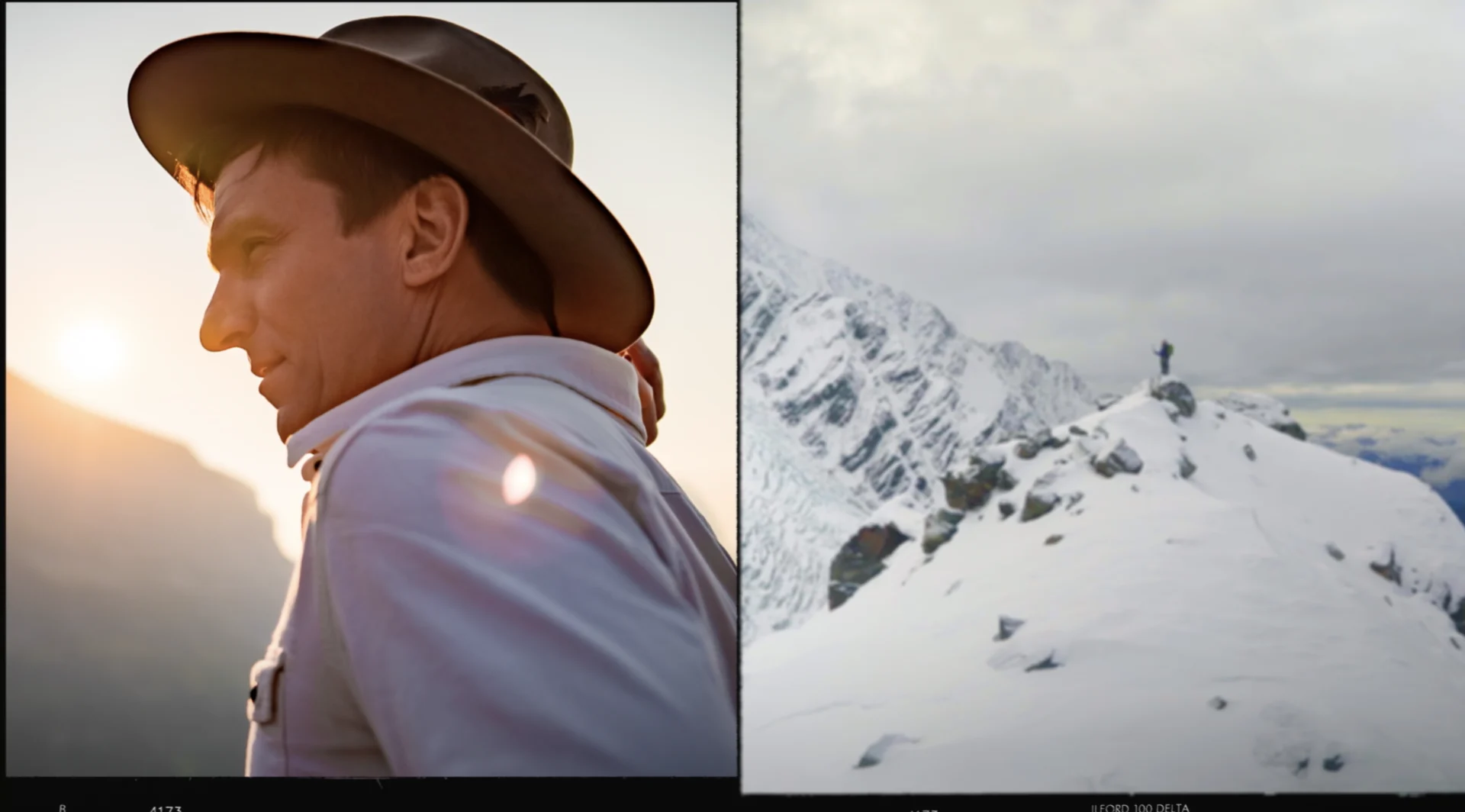

We designed this narrative in three formats in order to give our clients all of the tools they could need to market the new show and also to ensure we gave host Bill Weir edits that were worthy of the show’s re-launch on the new streaming service. As CNN’s Chief Climate Correspondent, all of our design really had to speak to his work specifically and encapsulate his message.
We also used a piece of original music composed for the edit by Brian Senti at Hook & Line. Ultimately we delivered the three versions of the spot and then a solid chunk of key art - 16 pieces, 3 different directions, with different placements for OOH, mobile, and more.

Ross Henderson led the design early on for BigStar and did a ton of work on the project. Adding in Stephen Ross as editor and Paulo Garcia as a designer and animator, we really had a great team working. Casey Drogin was deeply involved in the process as well, helping us project organize and deliver, and of course lending his hand whenever editorial or animation support was needed
Designing this trailer hit a lot of high points for us here at BigStar and we're glad to have a hand in a series that highlights how modernization, warming climates and tourism are affecting Earth's natural wonders as well as the actions of individuals trying to save them. We enjoyed partnering with our friends at CNN and navigating the new waters of their streaming platform. As part of such a large launch, we were challenged to stay nimble and on top of our design so we could flow through whatever CNN needed and make any changes quickly and correctly.
We loved making these beautiful spots and working with our partners at CNN.
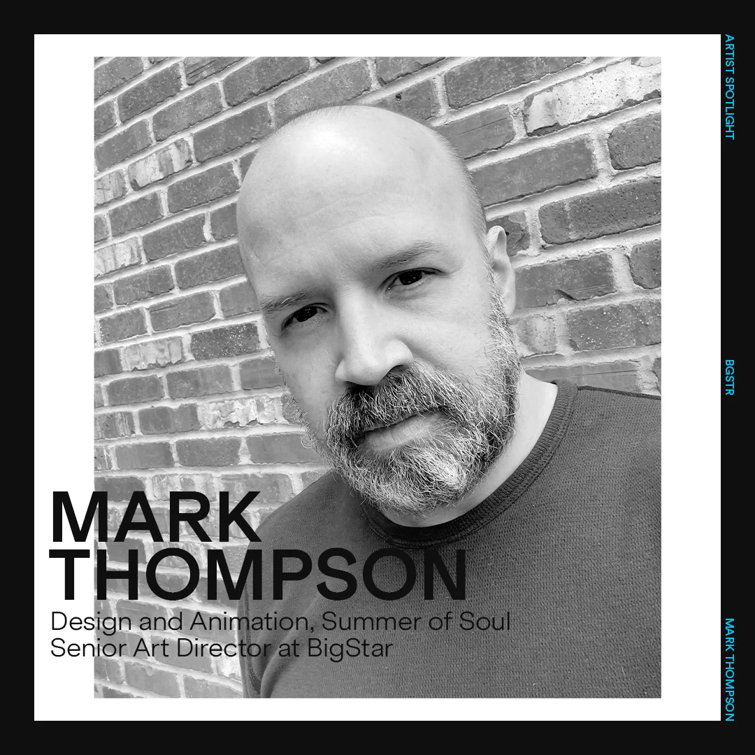
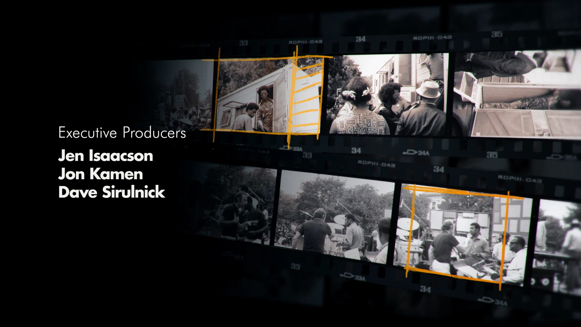
Mark Thompson and Summer of Soul (...Or, When The Revolution Could Not Be Televised)
Mark Thompson, joined us as Senior Art Director at BigStar in the summer of 2021, directly after wrapping up working on Summer of Soul (...Or, When the Revolution Could Not Be Televised), a documentary about six weeks in Harlem in the summer of 1969. Summer of Soul, which was also Ahmir “Questlove” Thompson’s debut as a filmmaker, recently took home the Academy Award for Best Documentary. We sat down to chat with Mark about his experience working on the film, his design process, and how it feels to see the film be so well received.
BGSTR: Tell me how you came to be involved with this project?
Mark: I was working independently when I was contacted via the film’s producer, through Radical Media, about a film they were working on with Questlove about this Harlem music festival, and would I be interested? Obviously I was like, yes, yes -- and so I got the initial ask, which was graphics and an opening title sequence.
BGSTR: Walk us through your process and how you got started.
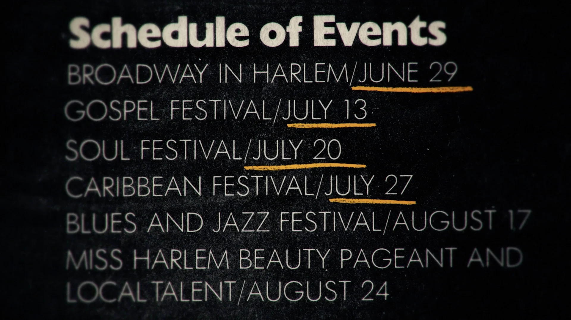
Mark: The challenge we had was that there was this abundance of media from the festival — posters, pins, shirts. So really my first task was to get this stuff in there and put it together.
The film’s editor Josh Pearson is incredible, and he and I have worked together before — He’s a true pioneer in terms of video and music editing. Josh has a very rhythmic style, so when I started seeing the cuts, I knew the music was going to come into the graphics and into the film in a very rhythmic way. All I really did was take what he was giving, keep time, and keep the beat going. The whole thing came together like a DJ set or a mixtape.
BGSTR: How about designing the title sequence? How was that?
Mark: There was a black hole around what to do with the title sequence. I had some initial conversations with Ahmir and Joseph Patel, the producer, we discussed it borrowing some design elements from the stage and having a classic feel. I showed them some experimental stop motion films from the time, because I felt the sequence needed to have a percussive feel to it. We mentioned that Sesame Street came out the same year as the festival and felt the sequence could have that classic animation feel like the animated shorts on the show. Once we made that connection, I felt like we both knew the direction we wanted. Then it was just a matter of matching the drum solo that leads into the title, putting in the frame by frame work to nail the pace and beat.

BGSTR: What other elements of the film did you work on?
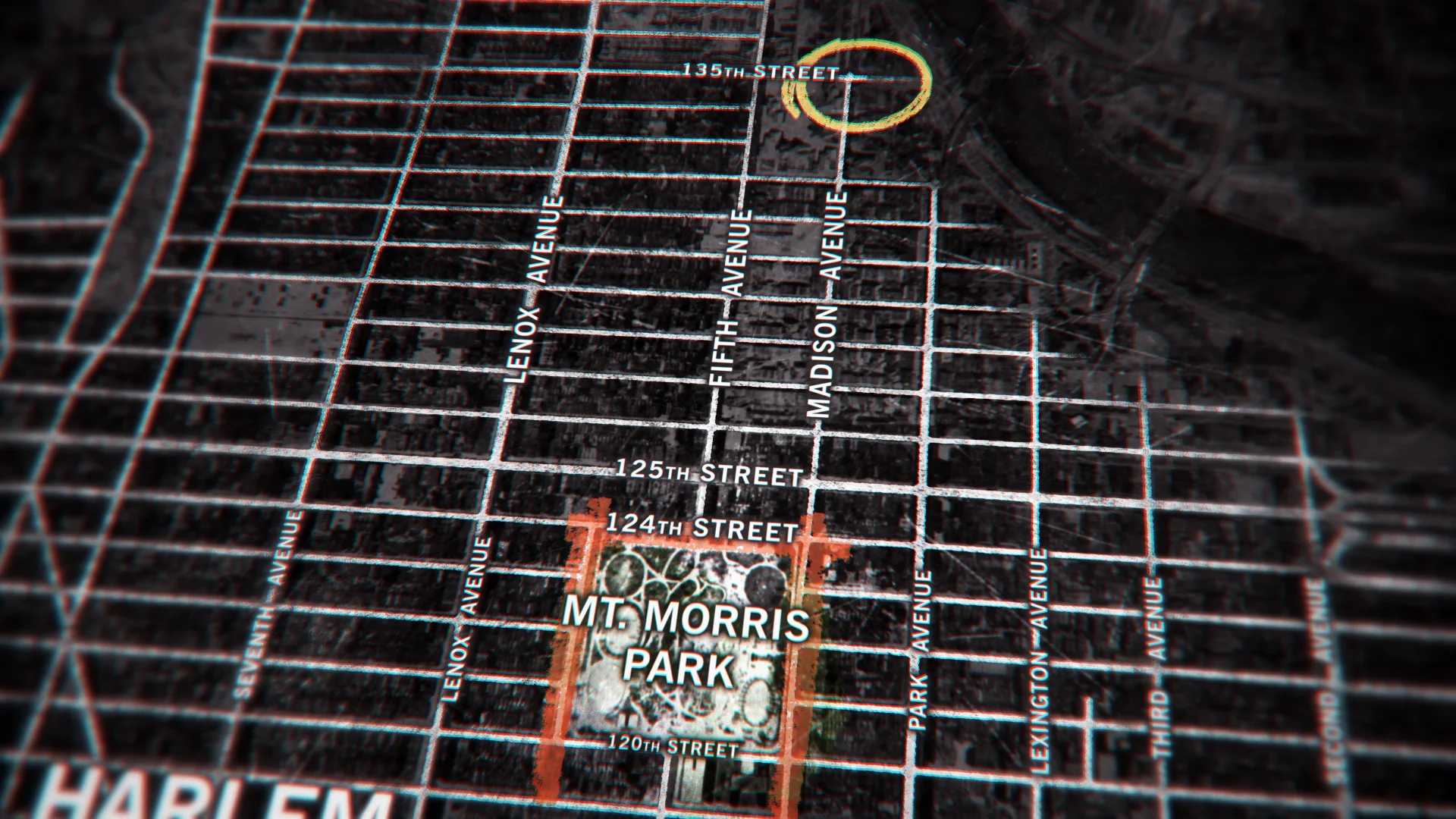
Mark: I ended up designing the film’s logo, the rest was graphics seen throughout the film— a series of maps showing how the festival came together, personal photos, and finally the end credits. The end credits were a late addition to the project, I think we all just felt we needed a little encore, a nice little fade out.

BGSTR: Tell me a little bit about actually making this film mid-pandemic and how that went.
Mark: Really, this was the height of the pandemic, we were right in the middle of everything timeline wise, March, April 2020. It felt like we were scrambling to put this thing together while the world was burning around us. But throughout the project, you could really feel that it was good and that it was going to be something special. So we’re all kind of working on it, locked in our homes and this is a lot of our only release. So with any graphics, there’s always a desire to take it one step further, and especially being at home I had time to work with it and make it all really tight.
We were all spread out, meeting on video, showing screenings through Avid and Questlove sitting in on edit sessions remotely. Parts of it were bittersweet to do remotely, but overall we all really had this hopeful and positive feeling.
BGSTR: And then, where did it go from there?
Mark: When the film started to gain success, everyone in the crew was extremely humble about the whole thing— even all the way up until the Oscar. When we were working on it, there was a sense that everything was coming together. It felt like we were a band and were just in sync. Everyone was contributing their part and everything kind of flowed together until we were able to look back and be like, damn- this thing is pretty good! And then when it won Sundance we were like, oh OK- other people think it’s good, too! So yeah, the awards are definitely reinforcement that our instincts were right and that the film is something great.
BGSTR: How was it transitioning from working on a full length film to being an Art Director at BigStar?
Mark: BigStar - the work is seamless, we all have the same desire to make beautiful things here. But the true benefit is the talent all around from top to bottom...everyone has a general passion and a unique skill so you feel there’s nothing we can’t do. It’s like planning a bank heist; we got a safe guy, someone to handle the security, a getaway driver... I’m really excited about what we can all do with some really special upcoming projects.
Watch the full film, Summer of Soul (Or..., When the Revolution Could Not Be Televised) streaming on Hulu.
Props where props are due
Credits
Undercurrent
Executive Creative Director Josh NortonExecutive Vice President, Executive Producer Carson HoodHead of Production Virgil ConklinProducer Shannon HallDesign Director Ross HendersonDesign Ivan Viaranchyk, Carol CaiAnimation Director Casey DroginAnimation Brian Landisman, Carl Dempsey, Liu Chialung, Conner O'Brien, Ivan Viaranchyk
The Wonder List
Executive Creative Director Josh NortonExecutive Vice President, Executive Producer Carson HoodHead of Production Virgil ConklinDesign Director Ross HendersonDesign Doug Chang, Paolo GarciaEditor Steven RossAnimation Director Casey DroginAnimation Paolo GarciaOriginal Score & Sound Design Hook & Line