July 28th, 2022
Volume 48
Client
Imagine Documentaries, Disney+, SundanceTV
Take a closer look at our work on Disney+'s docuseries, Light & Magic, and the SundanceTV rebrand.
in a galaxy far, far away
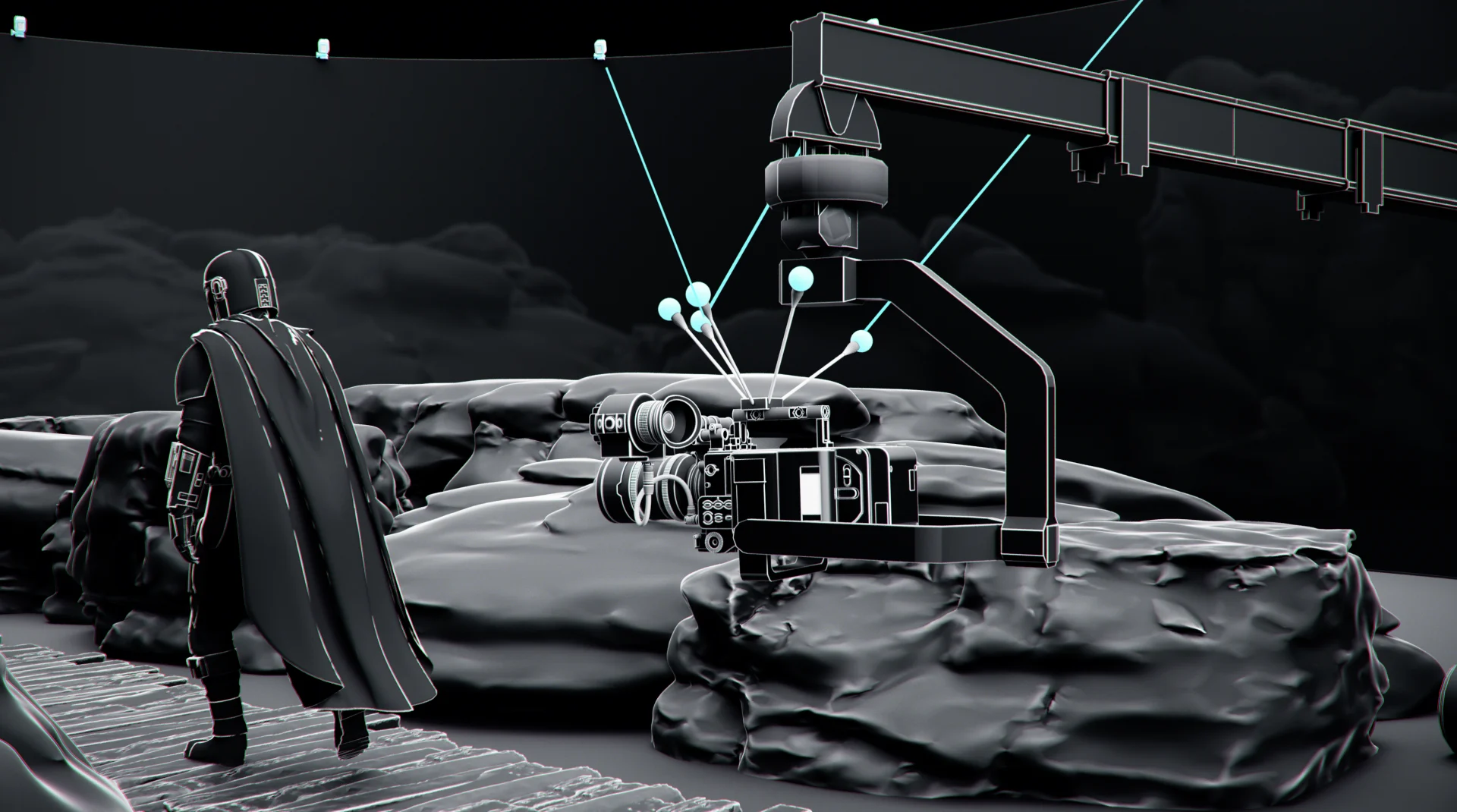
Light & Magic
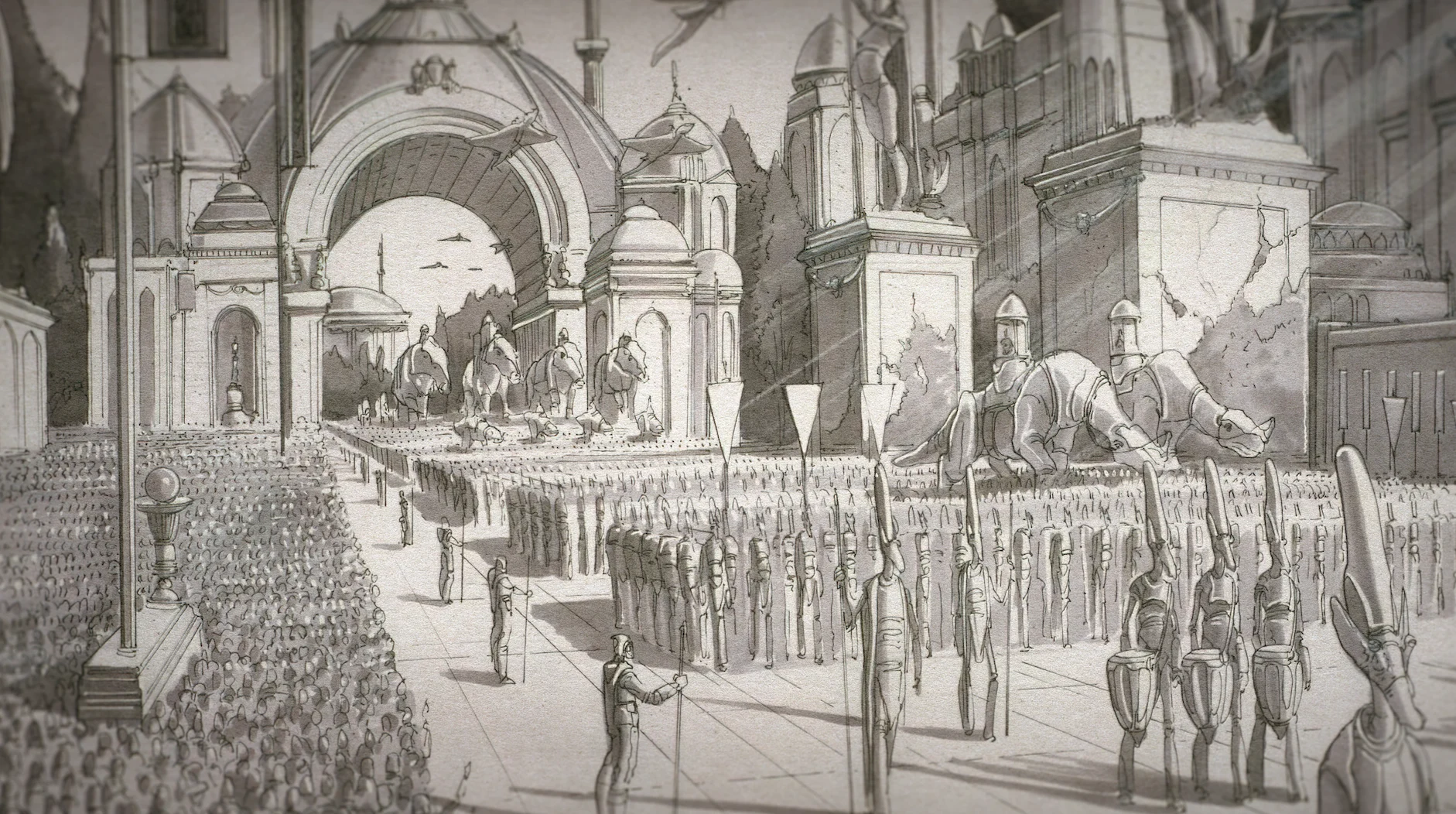
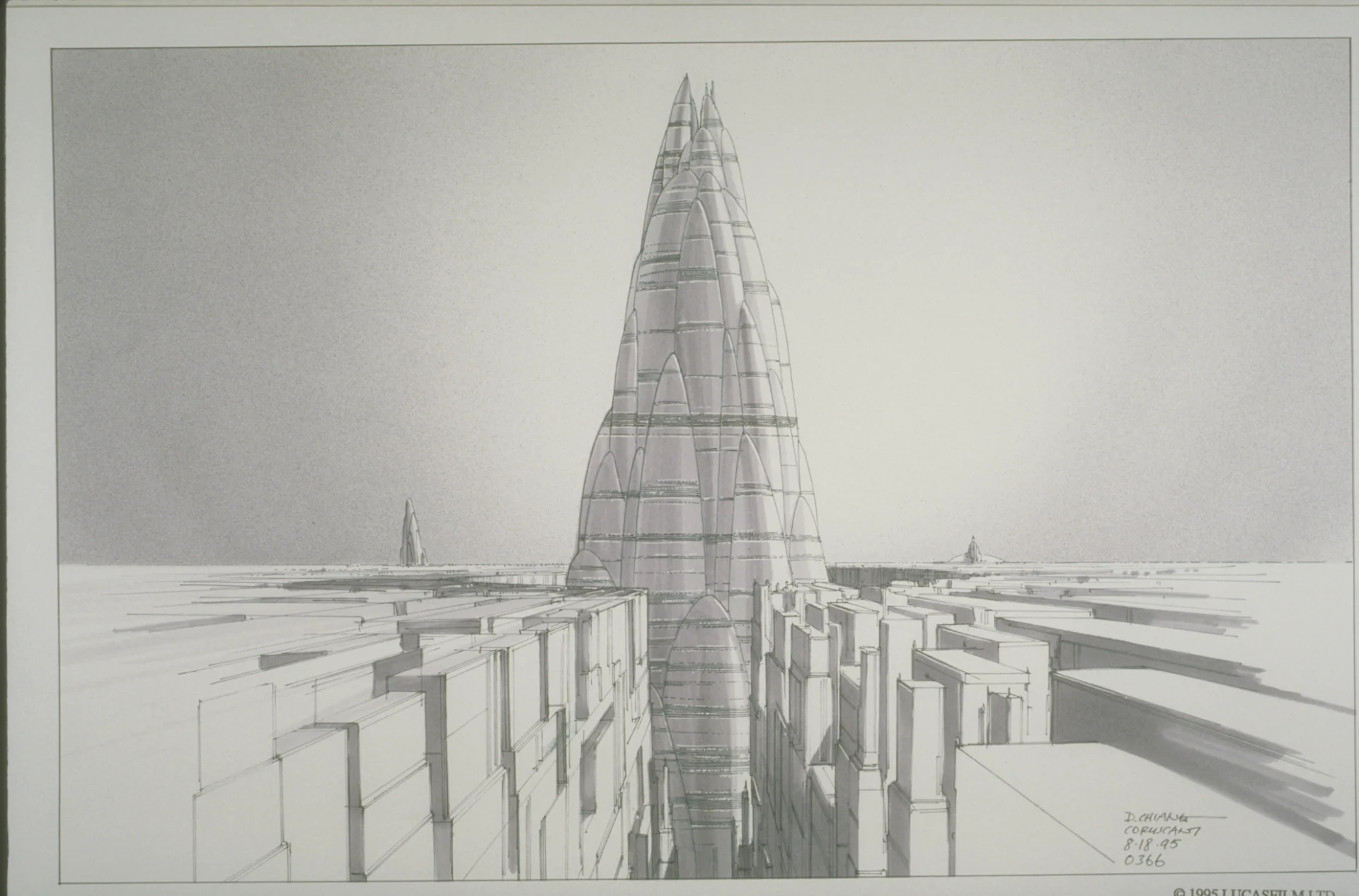
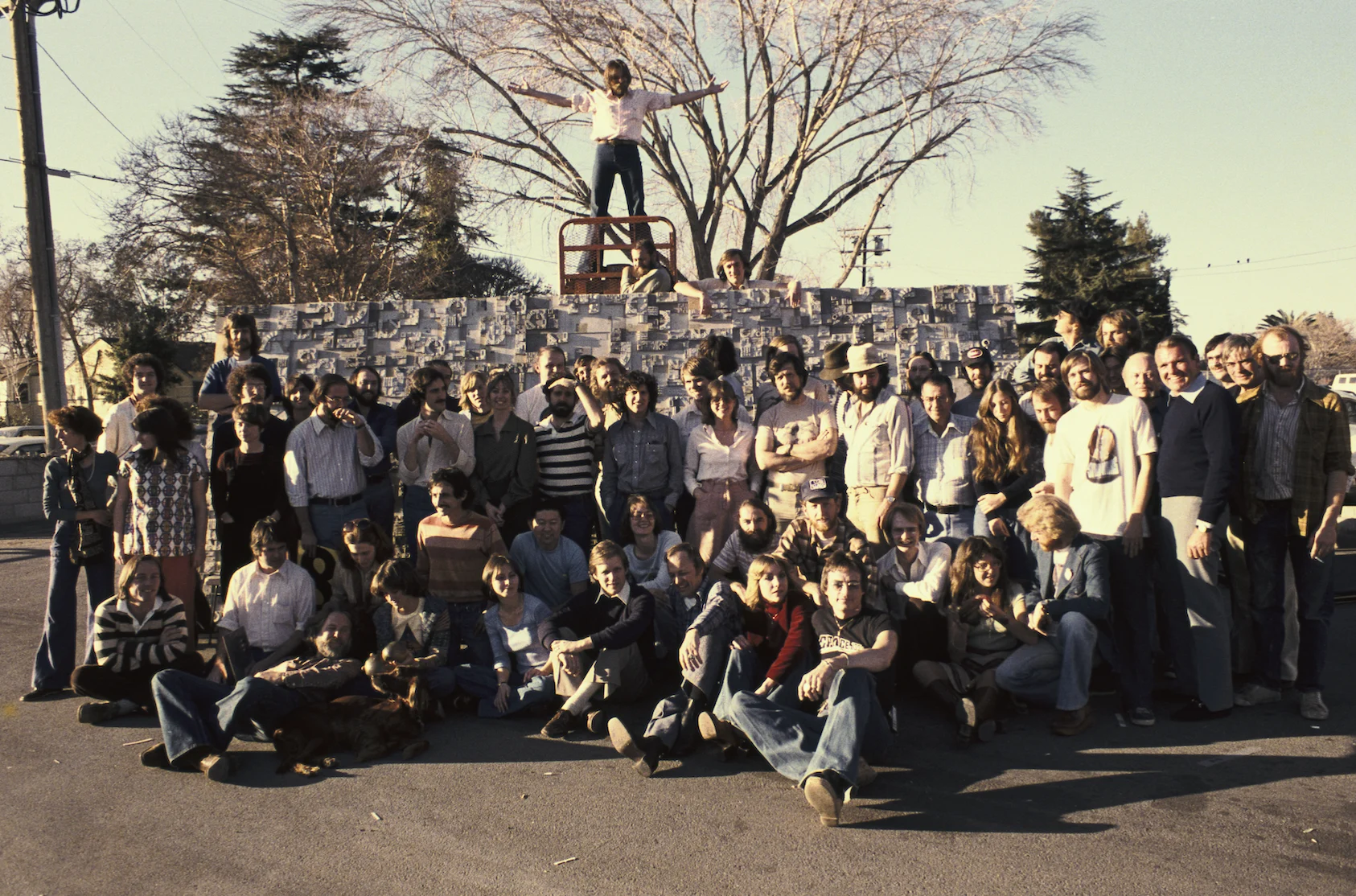
Light & Magic is a Disney+ created docuseries that pulls back the curtain on legendary special effects studio Industrial Light & Magic and their work on some of the most iconic movie moments in history. It is not a stretch to say this is a once in a lifetime opportunity, so you can imagine how honored our team at BigStar was to be brought onto design the series and be given access to the treasure trove of archives that comprise ILM’s legacy.
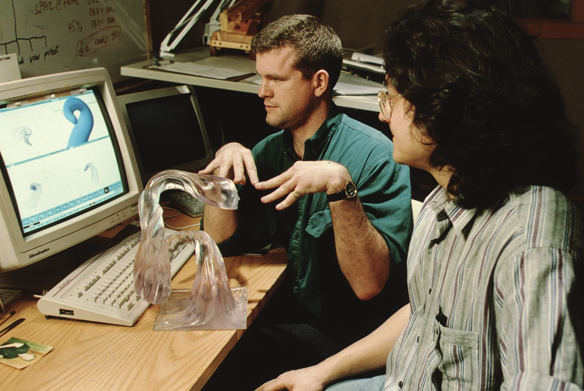


After wrapping our heads around the massive quantities of materials we had to work with, our BigStar team approached the project with the same ethos as any other, focusing on our priorities of organizing, designing and delivering a high quality set of graphics to support the narrative of the series. Led by Creative Director Mark Thompson, we began with some of the larger graphic needs, setting a look and feel for our design that would carry through the rest of the series.

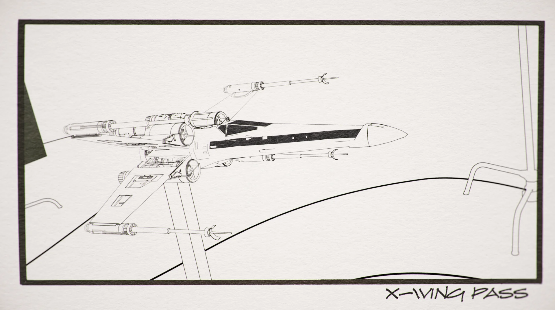


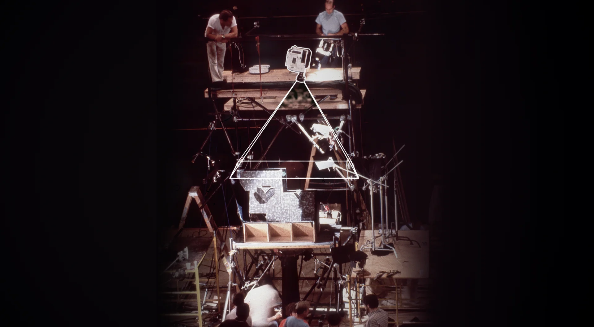
A key element of storytelling we graphically solved for in this project was to understand how the special effects initially came together for the original ILM team and then figure out how to visualize and explain that for the audience. For instance, flying spaceships through space in Star Wars— the complicated yet primitive technology the ILM team developed to get these shots would be the blueprint for special effects for years to come. To design these explainers, our BigStar design team learned how ILM was able to historically get the shot, and then we pulled back the curtain, graphically showing the magic trick from the other side to the audience.

These explainers pushed us to creatively express how these effects that are so ubiquitous now originally came to life using design. Moments we all remember- so it was a pretty special experience.
Light & Magic (ctd)
The explainers element was one of several that we workshopped with the editors and the director, Lawrence Kasdan, a legend in his own right. They became the small focus group we used to guide the exploratory aspects of our design until we landed on an approach that felt authentic and would help propel the narrative forward. That look also became the series' overall style and would inform a lot of the rest of the series’ look and feel.


Designing for nonfiction storytelling is a foundational part of BigStar, and we get to work on some incredible stories. Documentaries are such a labor of love, and unlike others where graphics might not be as relevant in the initial creative process, we were involved from the very beginning of this series. This type of real-time synchronicity between us and the filmmakers expedites our timeline substantially because our team was able to develop graphic solves for pieces of the series as they happened.


We worked diligently on this project over the course of about a year and a half. During that time we tackled the massive amount of content and learned a ton about the movie industry and how essentially every massive blockbuster from the 80s and 90s were produced from a special effects standpoint. Not only was working on a series about this foundational group of artists incredible, but the team that was involved in creating this series was very special as well. It was a privilege to work on this project and at the end of the day, we feel like we can officially say, may the force be with you!

Refresh
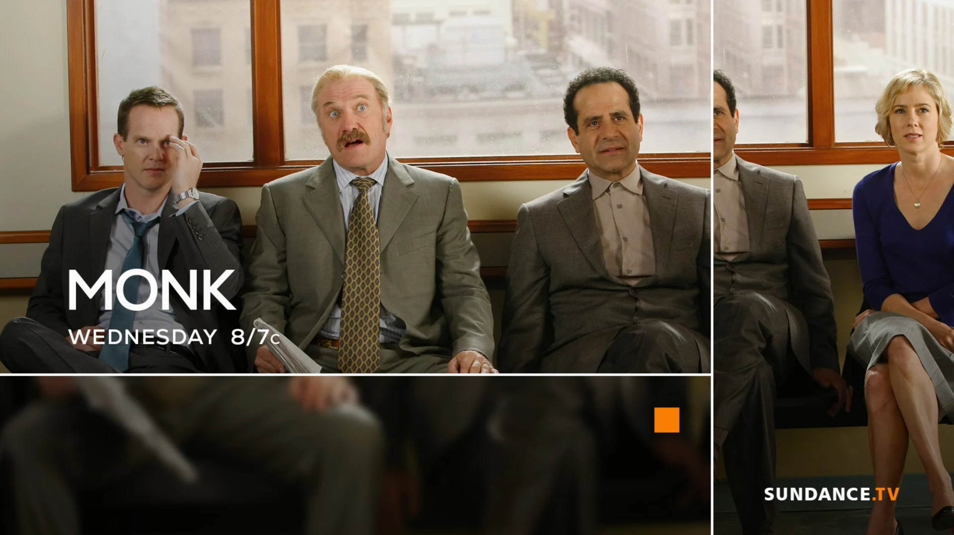
Sundance TV Rebrand
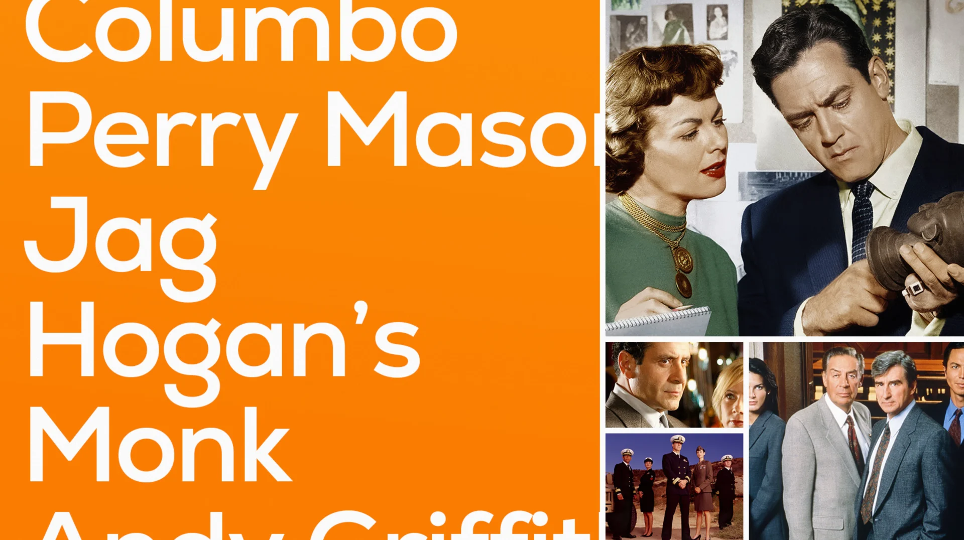
Sundance TV is home to the network’s original programming, film favorites and must-watch series and was ready for a brand update to showcase its prestige storytelling. BigStar had previously partnered with the network’s sister brand, BBC America, for a successful rebrand and we were excited to bring that same collaborative spirit to Sundance.
The Sundance team came in with a point of view and a position for where they wanted their brand to go, something we love from a partner. The concept focused on their tagline, “Take another look,” which was crafted to encourage viewers to check out some of the classic programming Sundance houses on its platform. We took this tagline to heart as part of our design ethos and turned it into four different design directions.


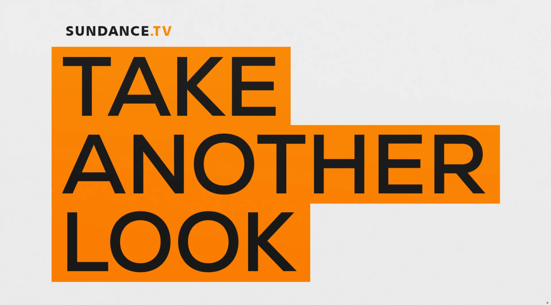
We translated the tagline visually, taking the idea of taking another look and creating a visual grammar that plays into that by using different shapes, different ways of framing, footage, focal length, typography and so on. Our goal was to distill everything that comprises the Sundance brand and represent them in different ways. After bringing the team a broad selection of designs, we whittled down the concepts to a direction we all really connected with and took it into production.


Ross Henderson was our design director for this project, lending his creative talent as well as overseeing the overall process and ensuring everything in the design phase stayed intact through to animation. A typography heavy project, the package Henderson delivered included one of our favorite Style Guides to date.

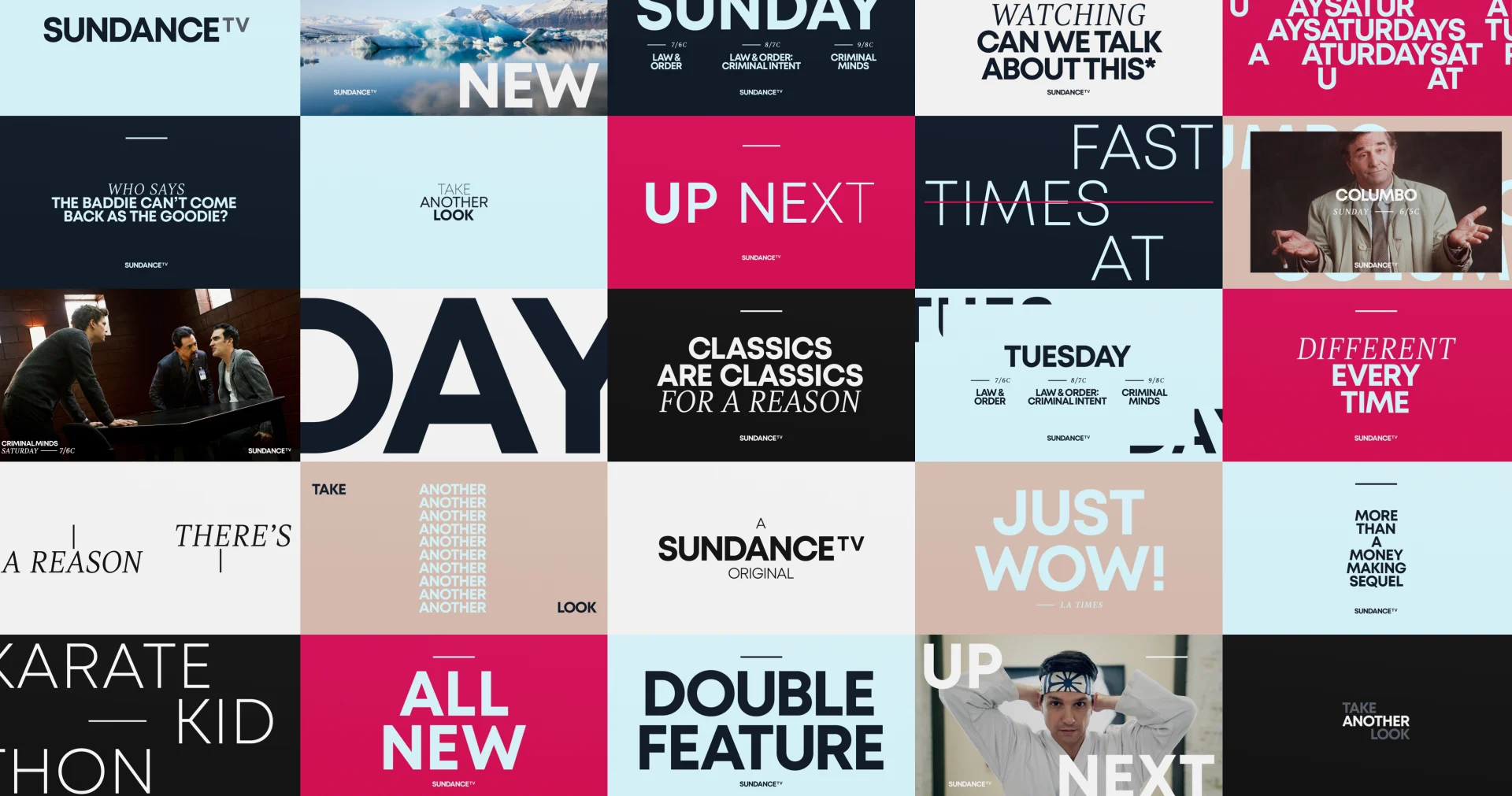

The motivation behind this brand aesthetic was the classic and timeless nature of the content on Sundance TV. Programming this good deserves to be watched again and again. We created a design and animation language that celebrates this repeated viewing experience.
SundanceTV Rebrand (ctd)
Senior 2D Animator Casey Drogin headed up the animation direction and was instrumental in figuring a lot of details out. At the end of the day, this package really ended up being about the typography and how it moves, expanding and contracting.

An interesting thing that emerged from this project was a change to our approach to developing a toolkit. We’re always looking to level up the toolkits we deliver to clients, and this particular project required an extensive fitting process that resulted in Chris and Casey developing a couple of new techniques. As a result, we designed one of our most seamless toolkits yet, and set a new standard for our toolkits going forward.
In the end, the design for the rebrand of Sundance TV really conveys the aesthetic the tagline “Take another look'' calls to mind. We were able to deliver a thorough and thoughtful package of BigStar-designed components to reintroduce Sundance to its growing audience.
Props where props are due
Credits
Light & Magic
Executive Creative Director Josh NortonSr. Art Director Mark ThompsonExecutive Vice President, Executive Producer Carson HoodProducer Kristen PritchettDesign Carl Dempsey, Mark Thompson2D/3D Animation Carl Dempsey, Casey Drogin, Bryce Barsten, Brian Landisman, Ivan Viaranchyk
SundanceTV Rebrand
Executive Creative Director Josh NortonExecutive Vice President, Executive Producer Carson HoodHead of Production Virgil ConklinDesign Director Ross HendersonAnimation Director Casey DroginDesigner Doug ChangAnimation Paolo Garcia, Sung Do, Chris Scales