August 24th 2022
Volume 49
Client
HBO
Table of Contents:
- Letter from BGSTR
- HOTD DracARys App Promo
- HOTD Character Teases
- GOT Ambient Videos
- HOTD Trailer & Toolkit
with gratitude
A Letter from BGSTR, on House of the Dragon
20 million. That’s how many times our graphics have been viewed in the official House of the Dragon trailer on YouTube. The premiere of the new series Sunday represents a working relationship that has spanned over a decade and has produced some of BGSTR’s proudest moments. We’re honored to be a part of a show that has a true place in television history and want to share a little more about our part in the launch of one of the most anticipated premieres of the year— House of the Dragon.
As HBO’s primary partner tasked with developing the creative for the campaign launch materials, we’ve worked tirelessly for over a year to rise to the occasion of this enormous responsibility. Beyond creative talent or skill, success in this role requires the ability to collaborate closely with HBO stakeholders and be confident enough to inject our POV and push the work to the highest level.
House of the Dragon is set 200 years prior to Game of Thrones when dragons were at the height of their power. More dragons means more pressure, an area where we at BGSTR thrive. Top-tier design, premium 3D, precise management and execution— being able to deliver a premium campaign of this magnitude is a result of developing a full body of work and reaching a level of motion design that reflects BGSTR’s 18 years in business. Here’s a look inside the campaign package we delivered for HOTD.
-The BGSTR team
BGSTR takes AR
HOTD DracARys App Promo
Focused on the era of the House Targaryen, dragons were guaranteed to be an integral part of House of the Dragon and its launch campaign. The HBO creative marketing team brought us into the idea of designing a promotional video for their House of the Dragon: DracARys app, HBO Max’s official augmented reality app. We loved the concept of the app which allows fans to “hatch” and raise their own virtual dragons at home and made the project our own.
BGSTR steered the ship for the creation of this promo spot. Josh Norton, ECD/Founder, directed the shoot with assistance from Virgil Conklin, Vice President and Head of Production. In addition to shooting the footage, we managed the storyboarding, location scouting, casting, and wardrobe, giving us the ability to maintain the vision throughout production.
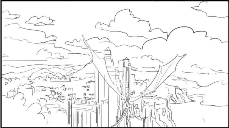
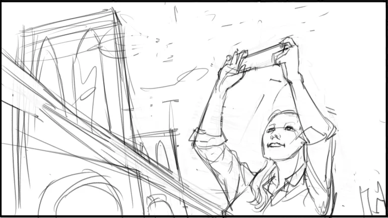


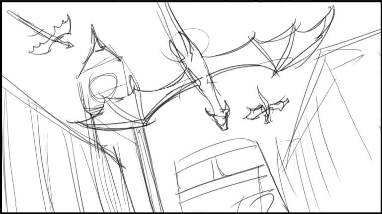
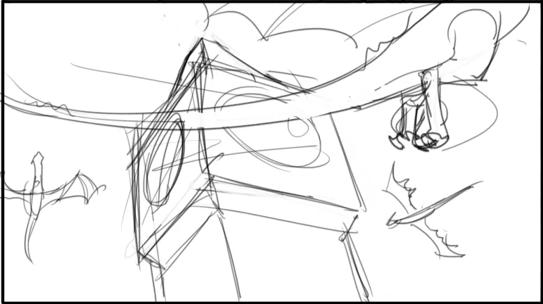
We worked closely with the app’s creators, utilizing the dragon models and pre-rendered dragon animations they provided. We retextured those models here in Cinema 4d* and then comped and placed them in situ, tracking them into our scenes. This agency collaboration effectively enabled consistent dragon imagery across both the app and promo spot.
We’ve been working with the Game of Thrones brand for over a decade so we have a shorthand with the client was hugely advantageous for this shoot. We’re visual thinkers, so we jumped into pre-production and once we knew the mechanics of the shoot we connected the dots with what we wanted the dragons to do.
HOTD DracARys App Promo
Being a one stop shop for the production of this promo had a lot of benefits for us and our client. The live shoot had a lot of moving parts, but everything ran efficiently and smoothly which gave us a lot of options for post-production. Likewise, our artists’ history working with the dragons empowered them to utilize The Mills’ dragon renderings from the app and comp them into the shots to beautifully tie the promo together.
When setting up each dragon shot in Cinema 4D we used the actual 4k footage for the dome light backgrounds and floor textures. This way all the diffuse, specular and shadows for each dragon would look as natural as possible and move seamlessly with the footage when comped.
HOTD DracARys App Promo
“It’s really terrific as a creative and a company when we’re able to be on both sides of production and make decisions that elevate both the shooting and what we capture in live action as well as the graphics in post,” Josh Norton, said. We delivered the spot to HBO to air alongside the app rollout and have been thrilled with the reception and seeing all these new baby dragons ARound town.

the gods have scorned us
HOTD Character Teases
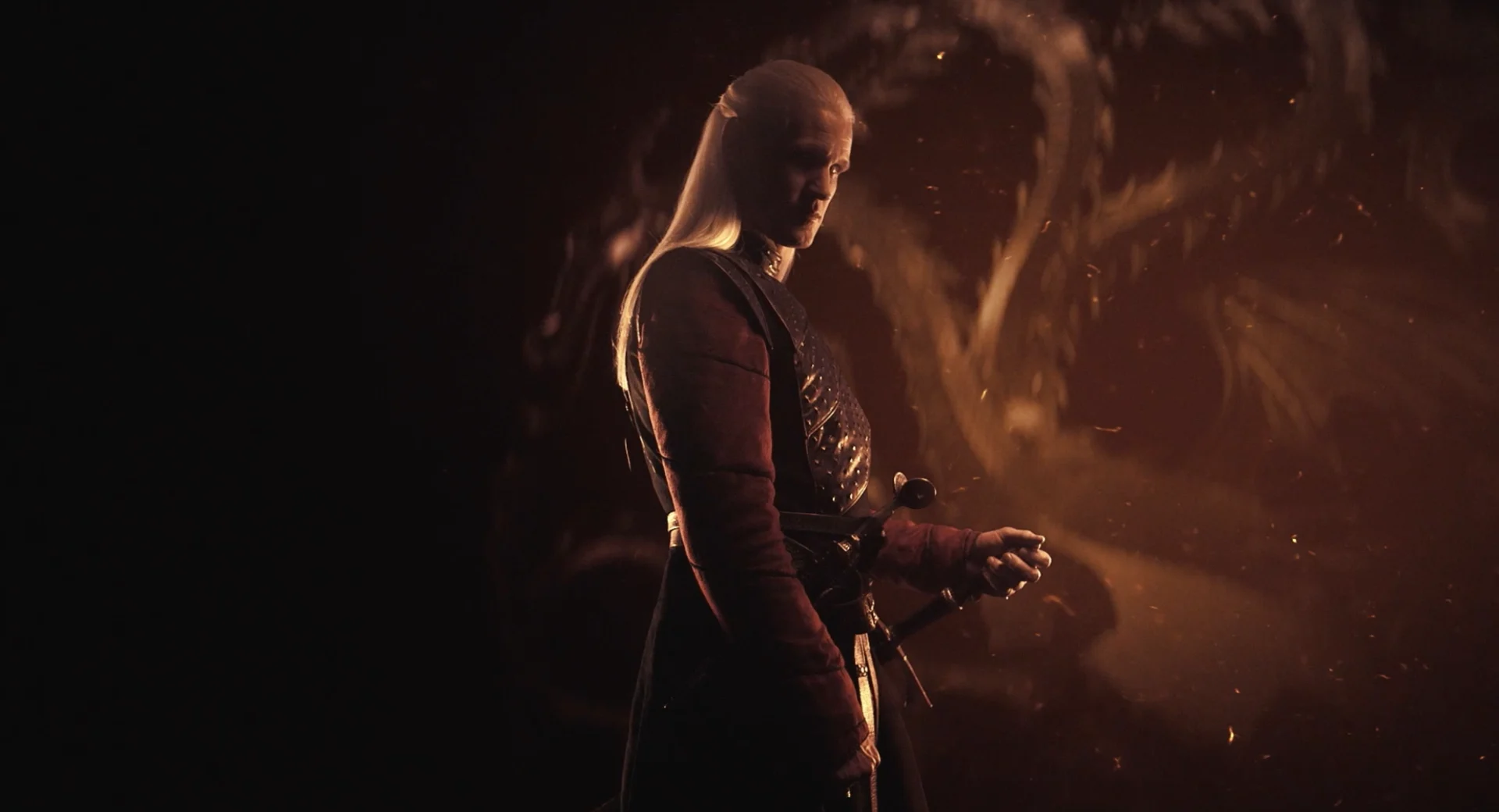
Something we love to do at BGSTR is transform something simple into something incredible. As HBO worked to assemble the robust collection of assets needed to launch House of the Dragon, they came to us with a bundle of extra footage that wasn’t being used to see if we had any ideas. The footage features the series’ main characters, so we proposed a set of character teases to be used for marketing to assist as HBO introduces these characters to viewers with the launch of the show.
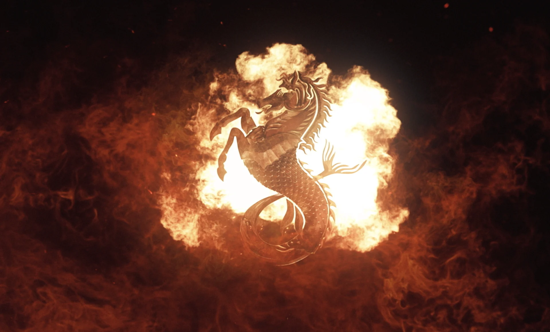
House of the Dragon features three houses: the Targaryens, the Hightowers and the Valyrians, all who have their own sigil. To design the spots, we leaned into each of the three houses and what they represent to develop a unique look for each. Seahorse warrior for the Valyrians, a high tower with flames atop for Hightower, and of course a three headed dragon for Targaryen.
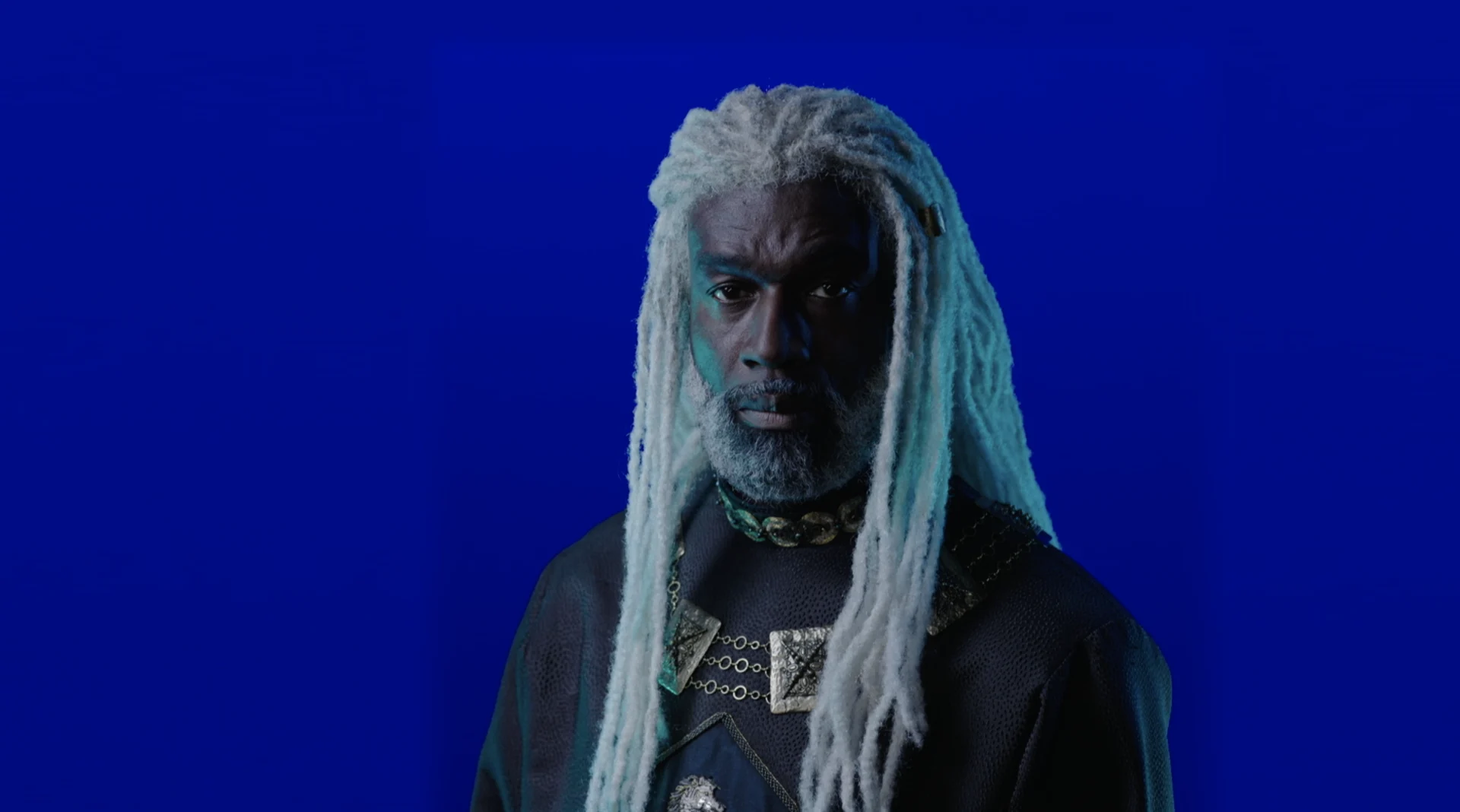
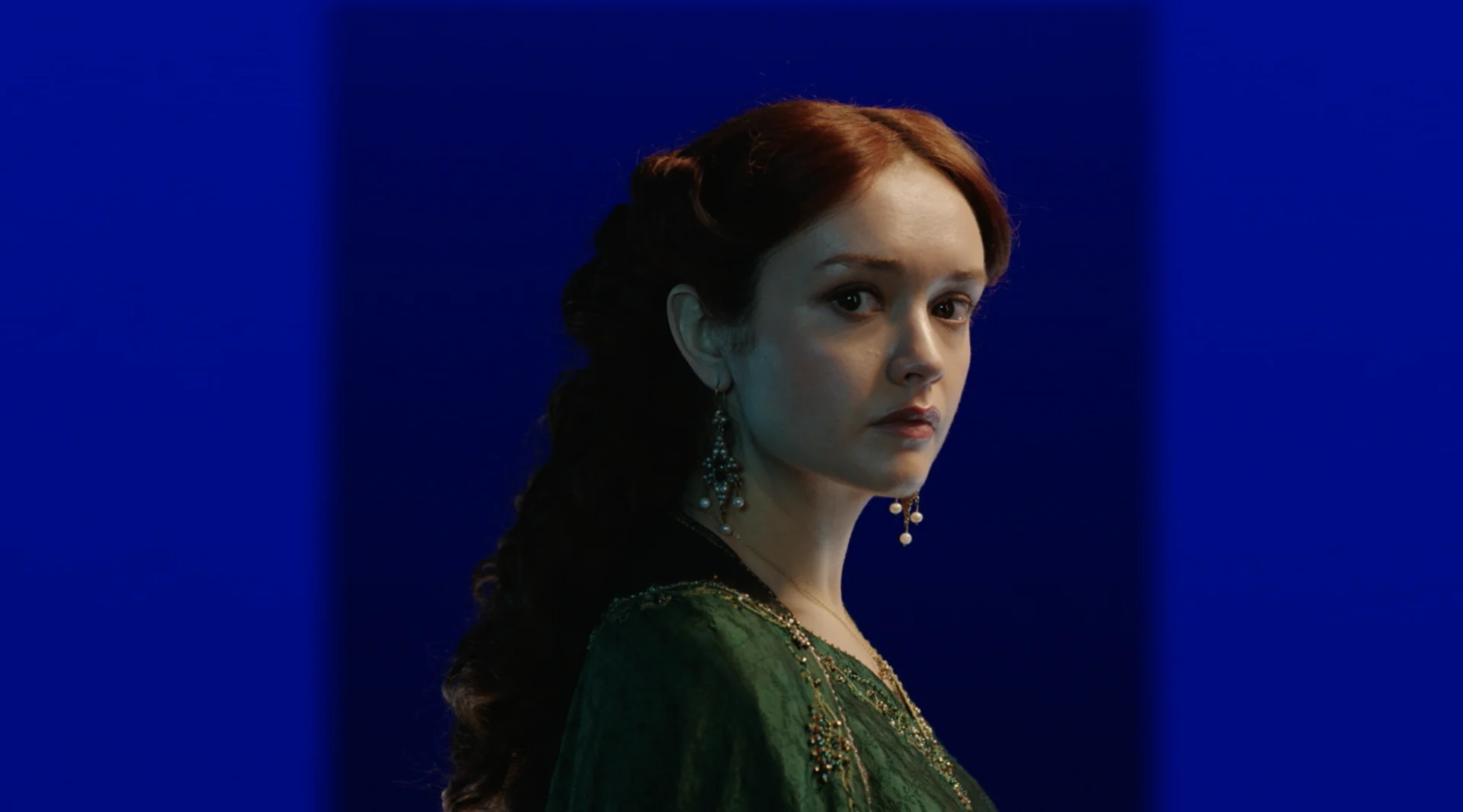

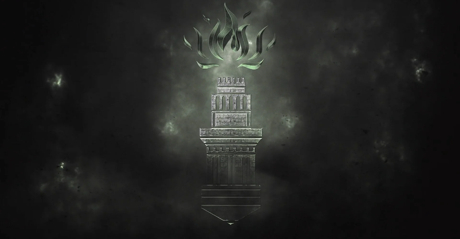
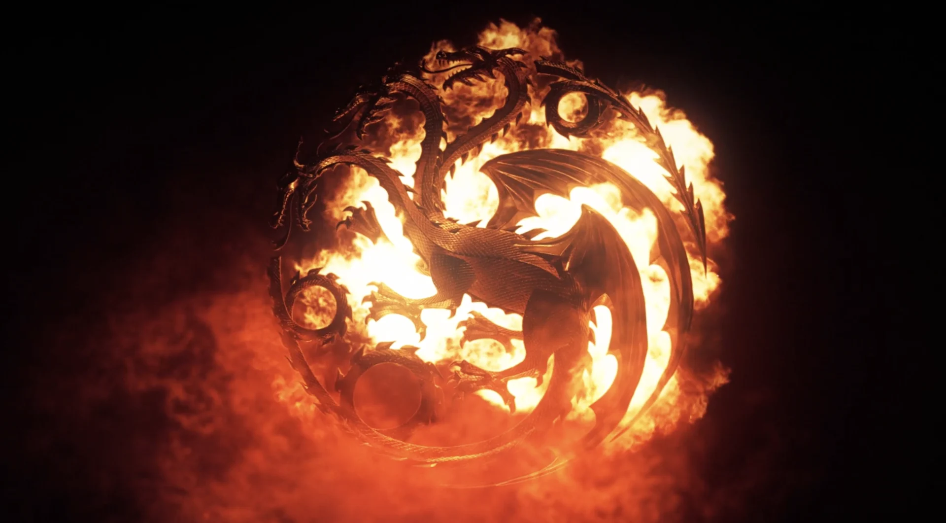

We took the sigils and rendered them beautifully, textured them and lit them really elegantly. We composited in fire elements and the character plates from the footage to make a series of :10 to :15 second character spots for each of the houses. These spots will be rolled out on social media as the series premieres, assisting with worldbuilding as viewers learn the roles and loyalties of the new houses.
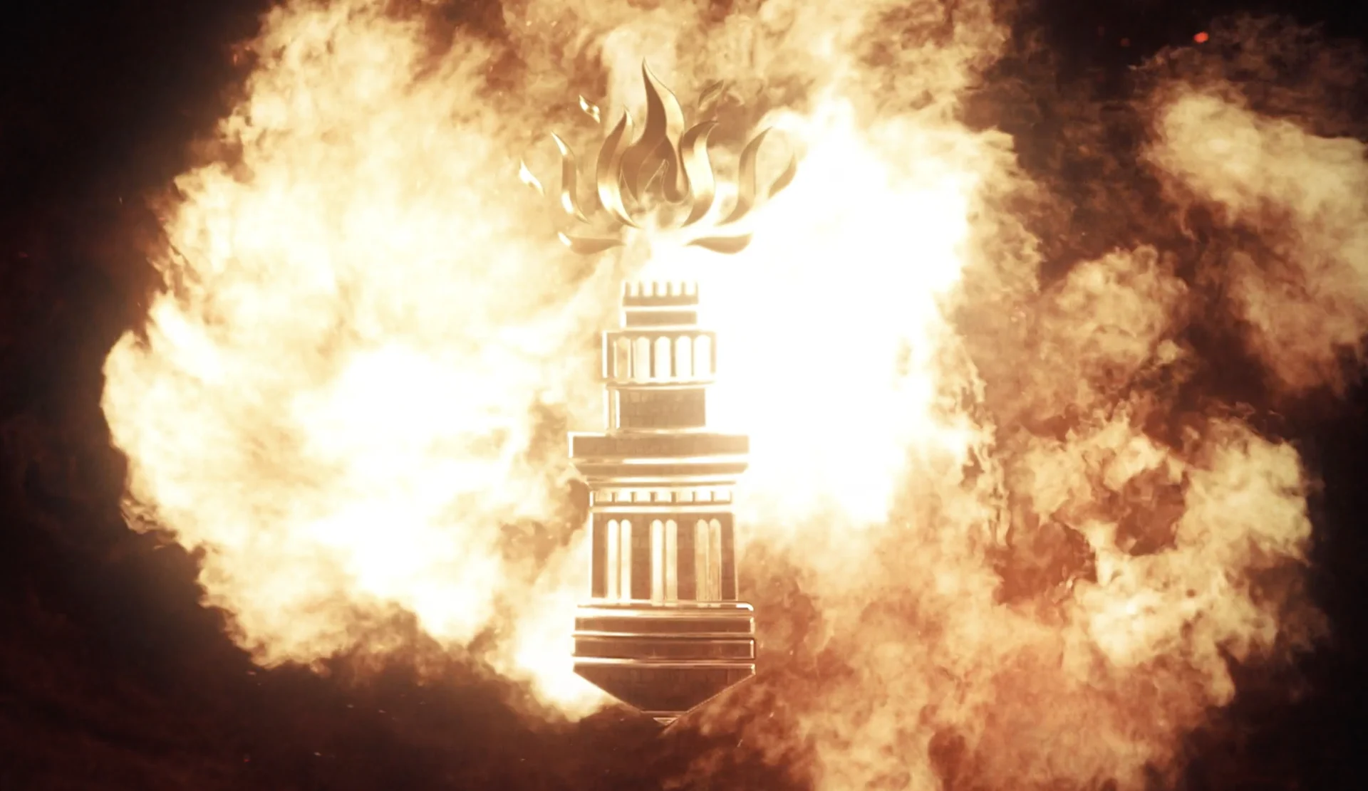
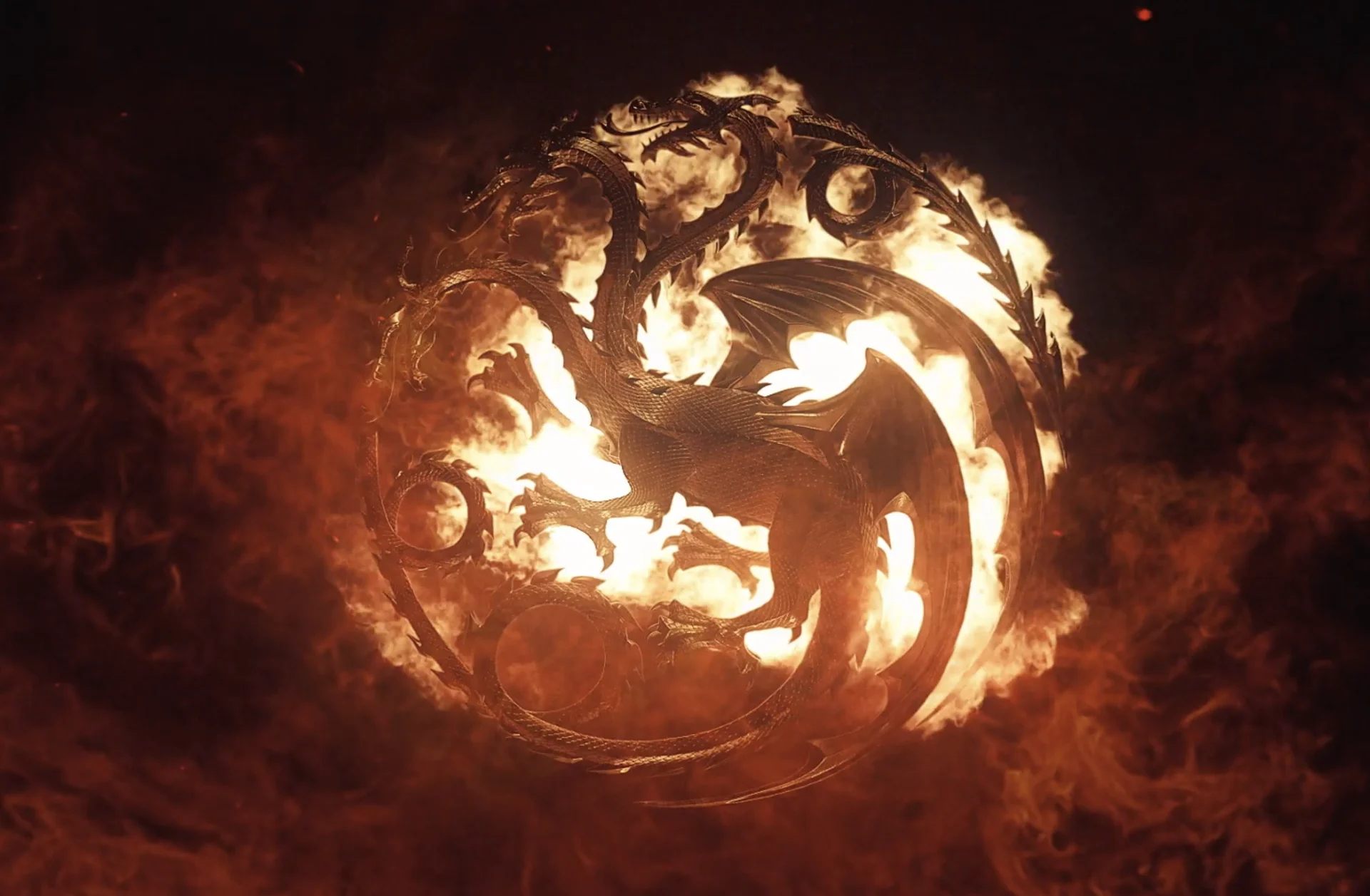
moving in slow motion
Game of Thrones Ambient Videos
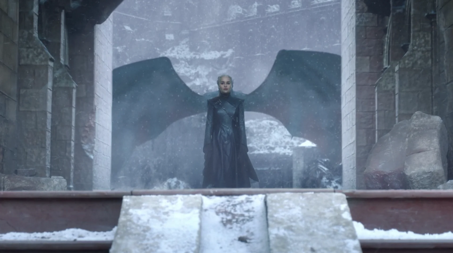
We originally pitched the idea of an ambient video to HBO during season eight of Game of Thrones. Years later, they have found a place to live. The concept for these videos was that we would use an extreme slow motion effect to stretch out one second of an iconic GOT scene and make it last :30 seconds to amplify the effect of that moment. We called these extreme slow motion moments ‘ambient videos’ and created three, ten-minute-long promotional videos for houses Stark, Lannister, and Targaryen using the ambient technique for a total of 30 minutes of content.
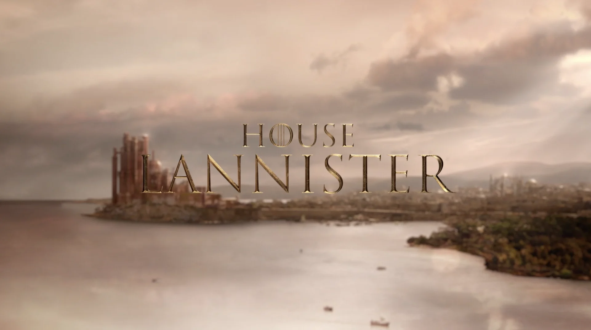
This project proved to be a huge technical lift for our team— not only technically but we also had to be sure we were accurately telling the stories for each of these houses. Luckily our BGSTR team is deeply invested in the Game of Thrones universe and are experts in our own right! We used a wide array of techniques including matte painting, rotoscoping, particle simulations, VFX, and 3d rendering to showcase these shots.
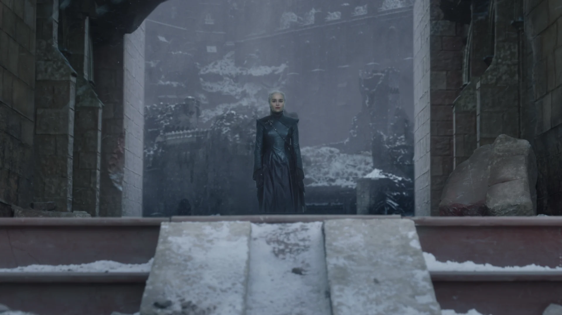

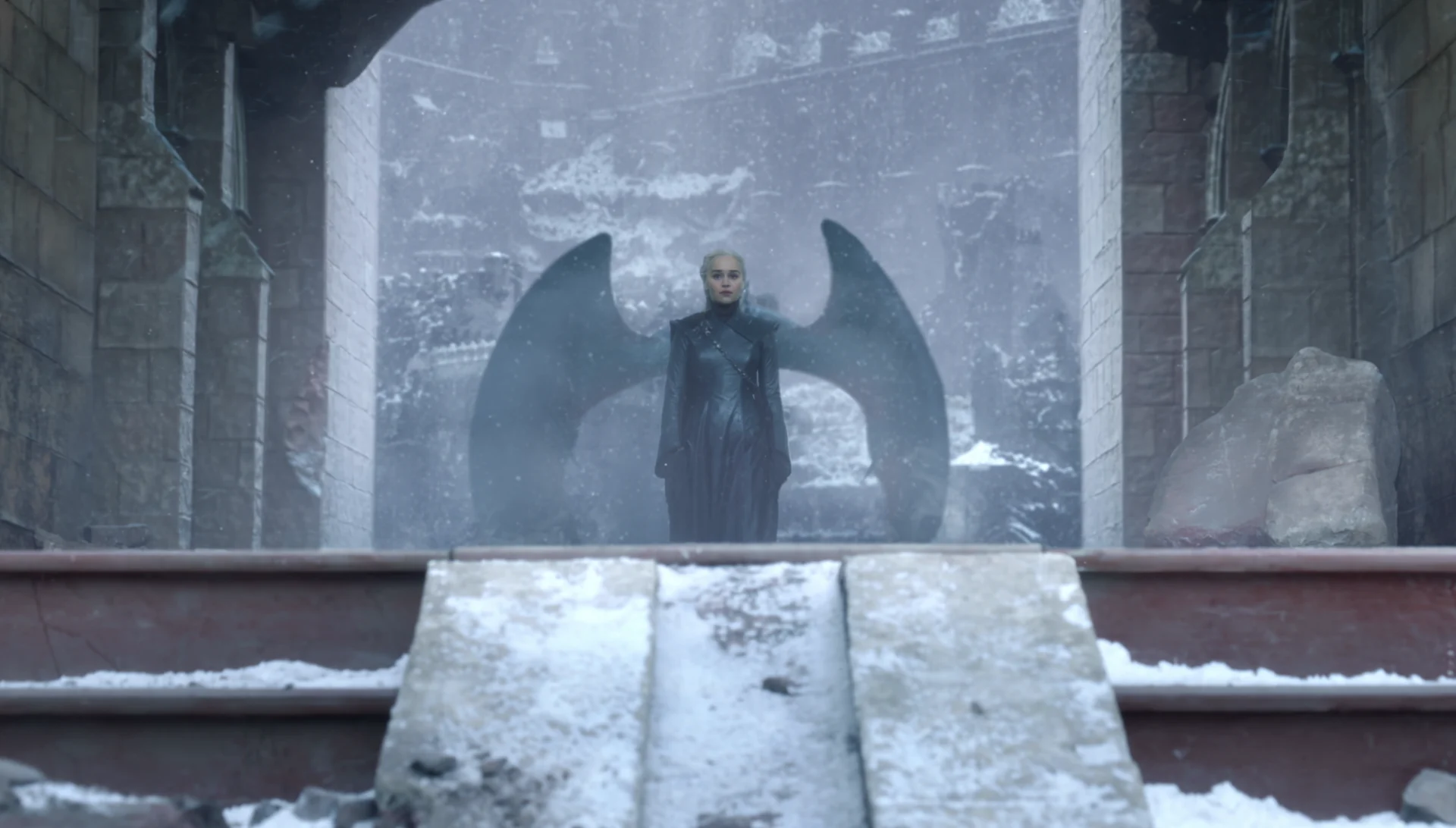


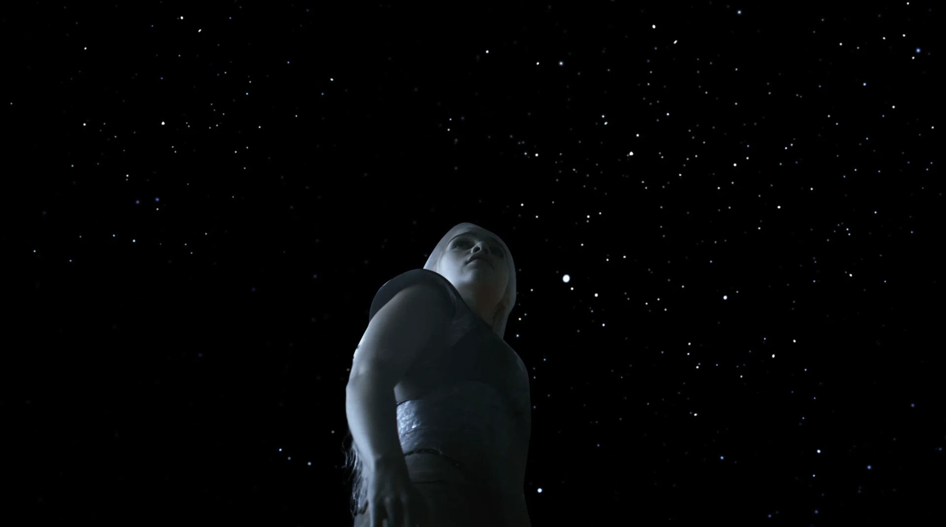
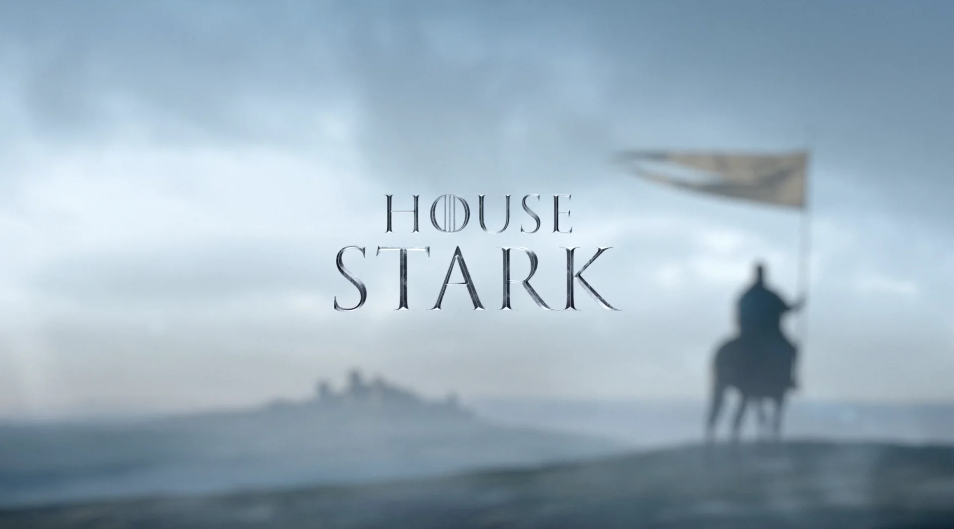
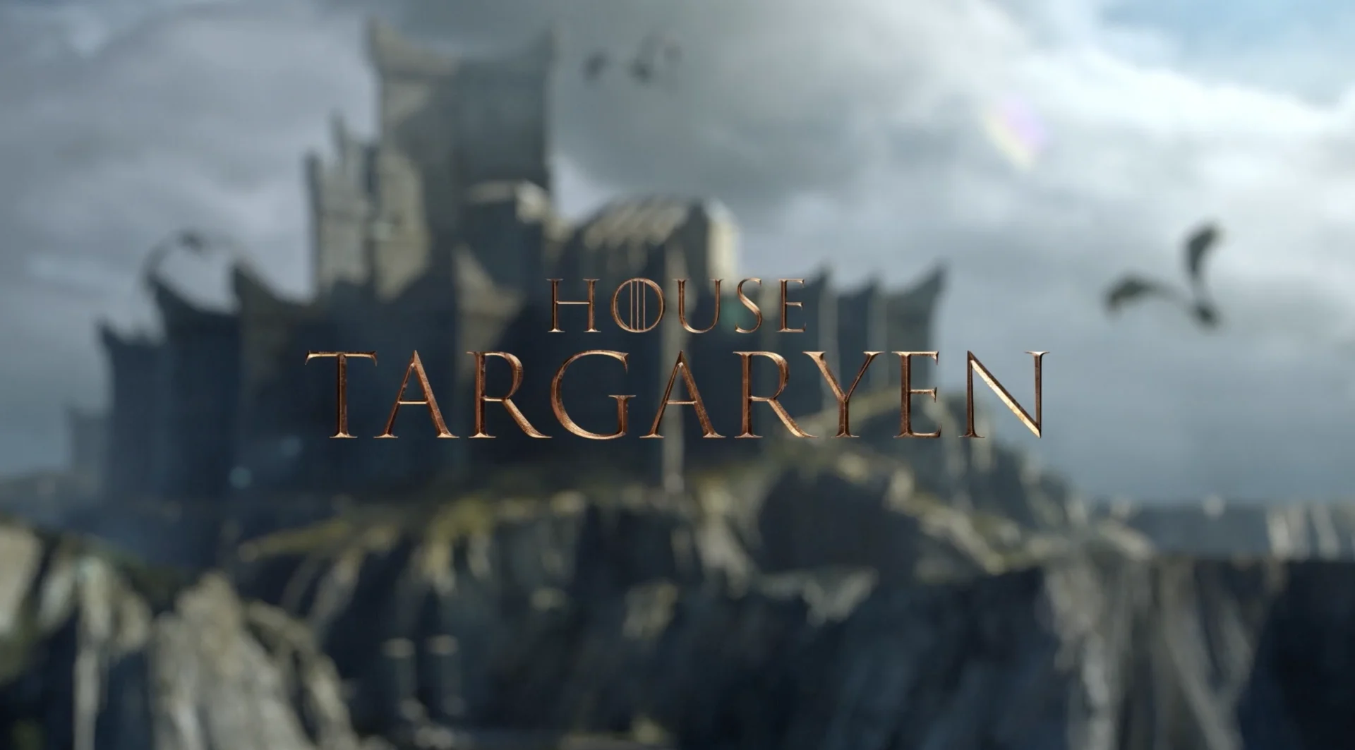
Once we’d assembled these sequences, we took the scores for each house and edited them in to help set their mood and tone. By using the house’s colors and musical scores, we cultivated a strong identity through the videos that are subtle yet can stand on their own. The spots will play in the background on the HBO hub for Game of Thrones, newly released in 4k, and House of the Dragon.
highly anticipated
HOTD Trailer and Toolkit
Last but not least, we delivered a trailer, teaser, promo graphics and a toolkit to kick things off for the prequel to the blockbuster series. The trailer premiered earlier this summer and currently has over 18 million views worldwide.
Once HBO made the decision that House of the Dragon would be the next extension of the GOT universe, we dove headfirst into the launch campaign. First things first was determining how to bring the news of the prequel’s 2022 air date to the public.
The announcement had to be :15 seconds, beautifully designed, and ramp up excitement around the show’s focus-the House Targaryen-without using any footage from the show. Dragon iconography is a key element of the Targaryen family and the concept of unveiling the House sigil in a burst of flames was the perfect way to introduce the next chapter of the GOT franchise.
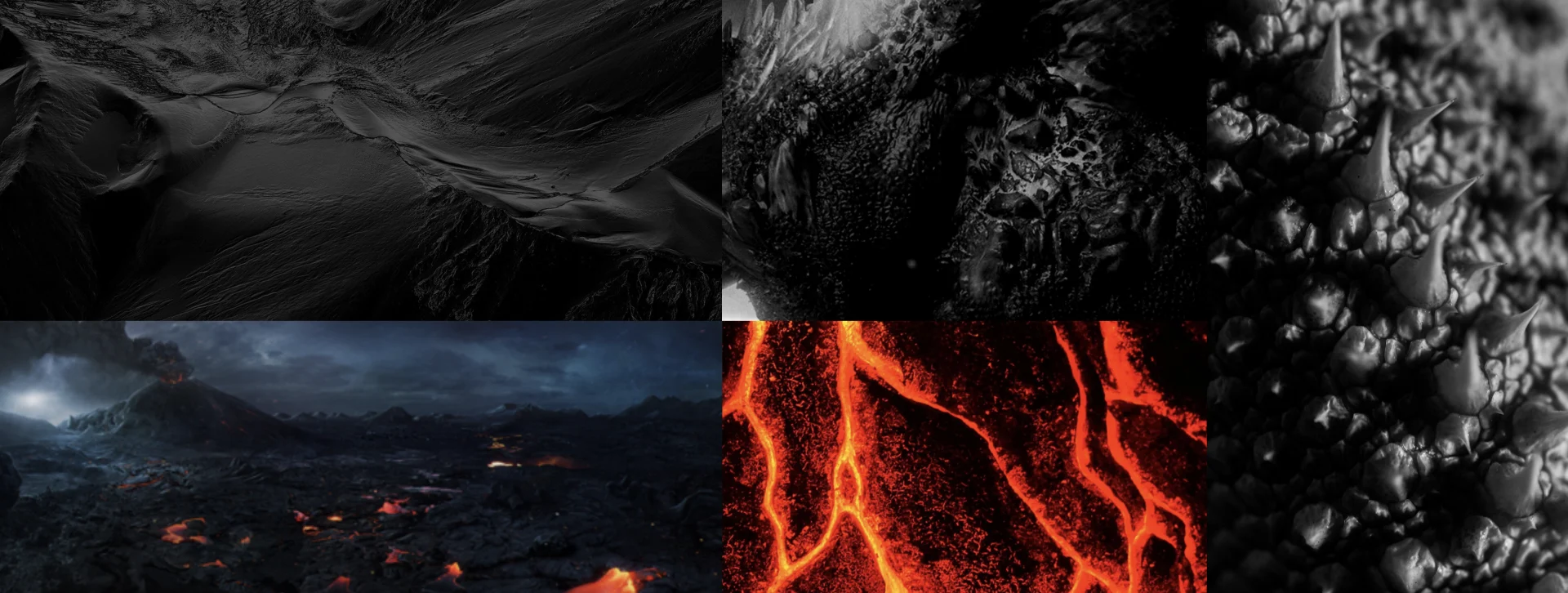


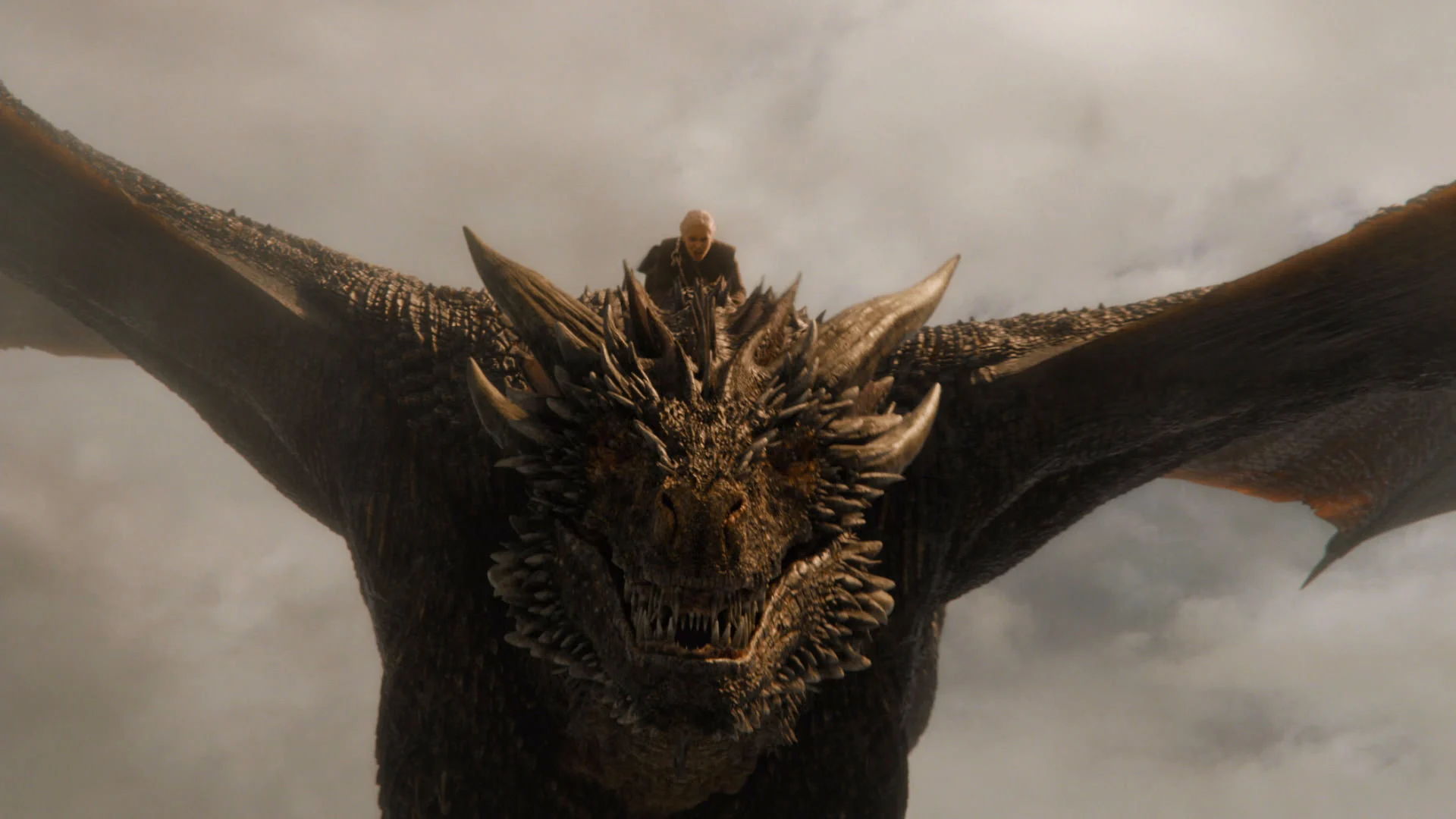


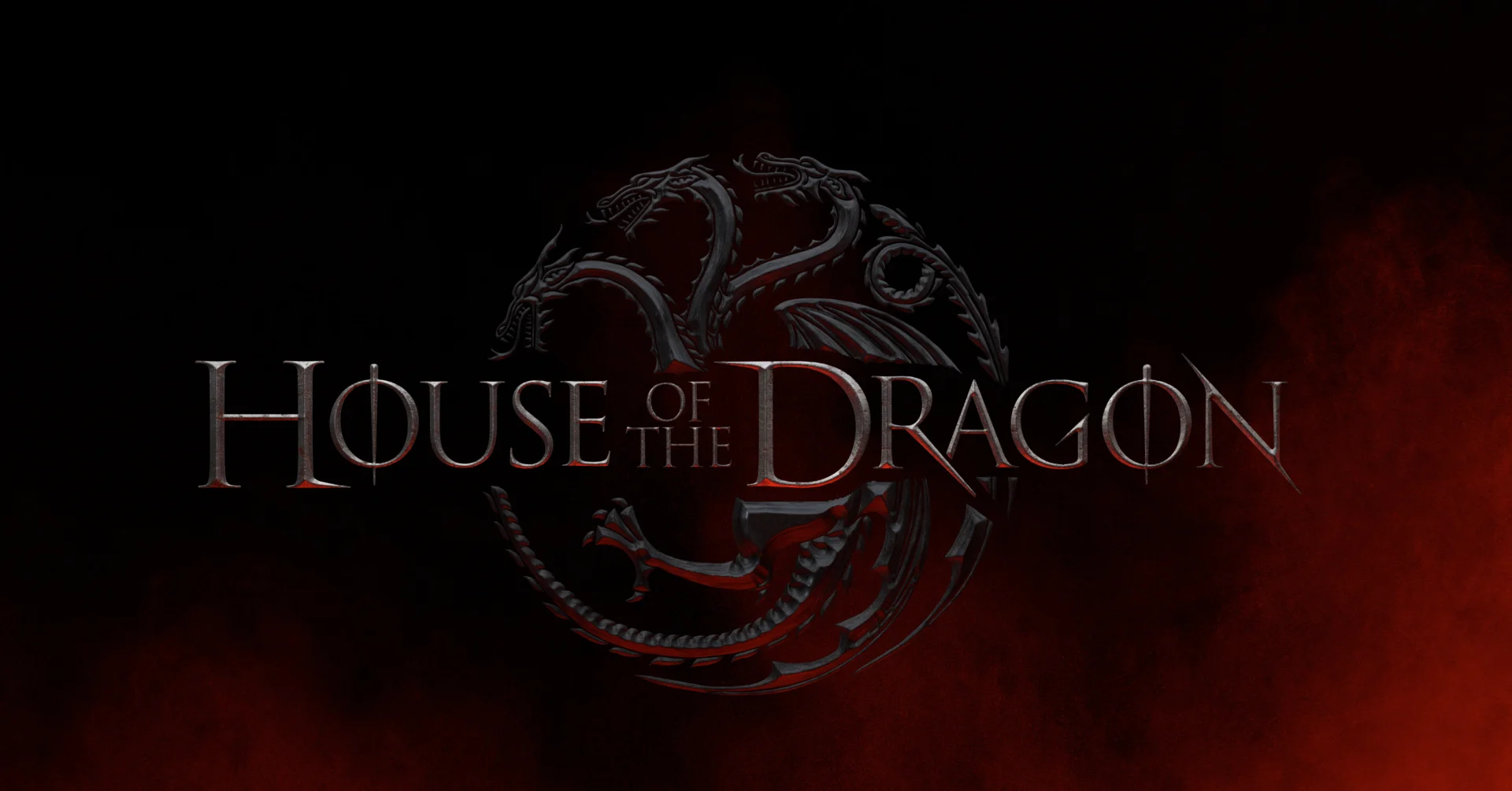


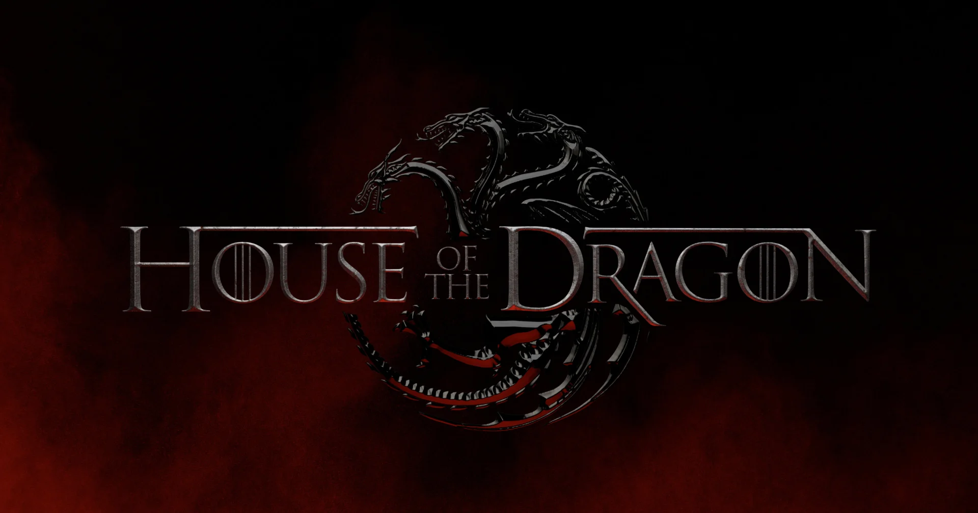
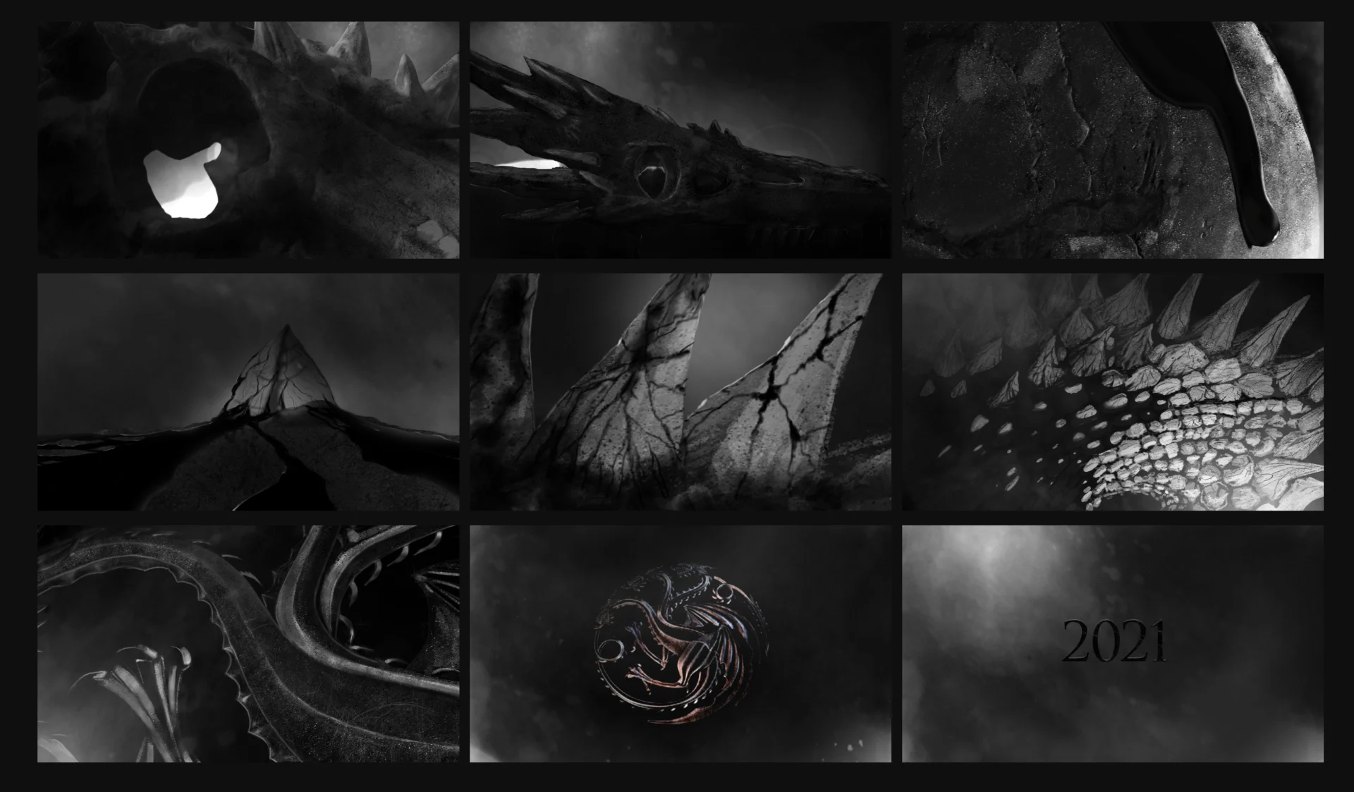
We needed to elevate the Targeryan sigil to give it a renewed focus for House of the Dragon, but wanted to stay true to the original 2D Targaryen sigil. We also wanted to bring in some of the iconic style of the Game of Thrones dragons. Researching and drawing inspiration from the historic GoT dragons, the design team utilized several different metals and firelight images to execute the rendering.
We began by modeling the Targaryen sigil- tweaking the style slightly in regards to the legs, teeth and a few other elements to subtly elevate the design.
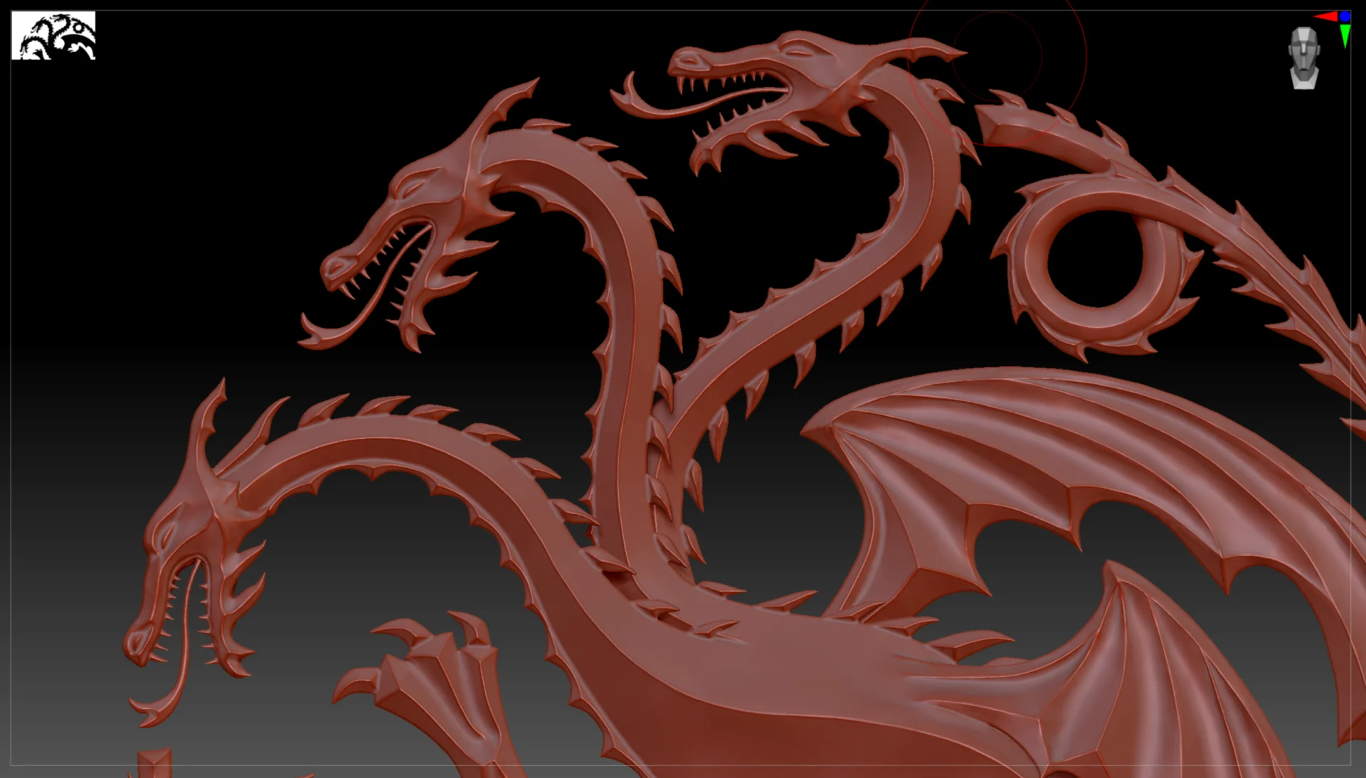
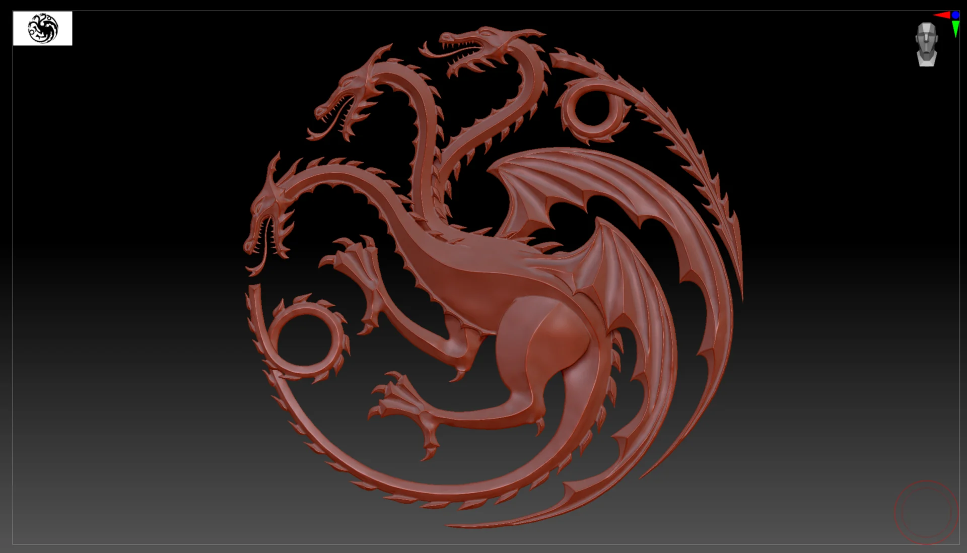
Lead designer Conner O’Brien led the process, managing the end-to-end 3D work. “To create the sigil model I used Zbrush so we would have no limitations in getting the exact look and feel we were going for,” O’Brien said. “For the rendering I used Octane in C4D. Octane just had that level of realism we really wanted.”
From there we ignited the golden sigil using dragon fire created in Houdini.
The :15 second spot was unveiled by HBO on several platforms simultaneously to a hugely positive response from the Game of Thrones fandom. This was particularly exciting for us and the team at HBO because there is far more pressure to launch a series tied to a cultural icon than your standard promotion. Once the reviews were in, we focused in on the deliverables still to come and kicked our internal standards up even higher to align with the public’s newly formed expectations.
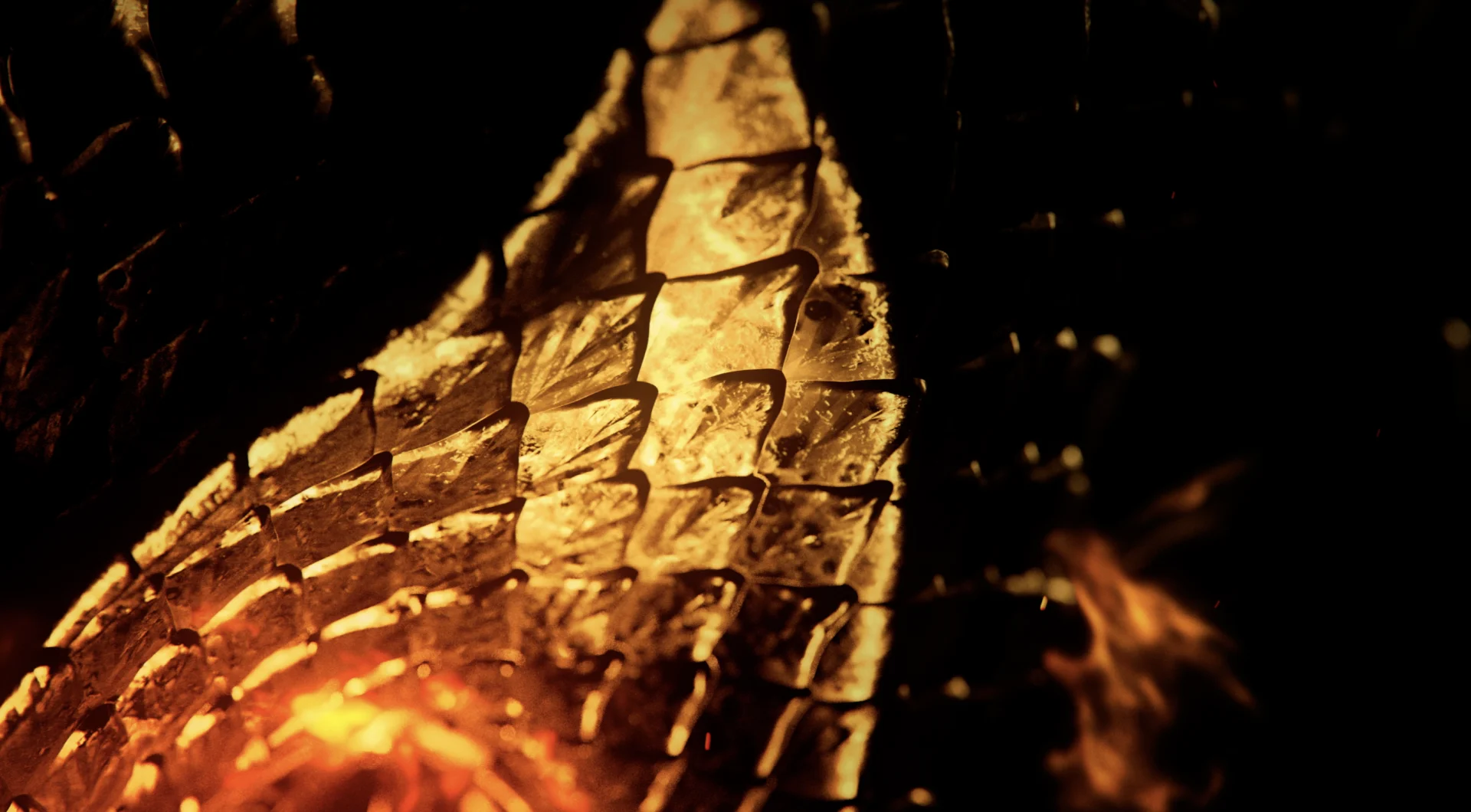
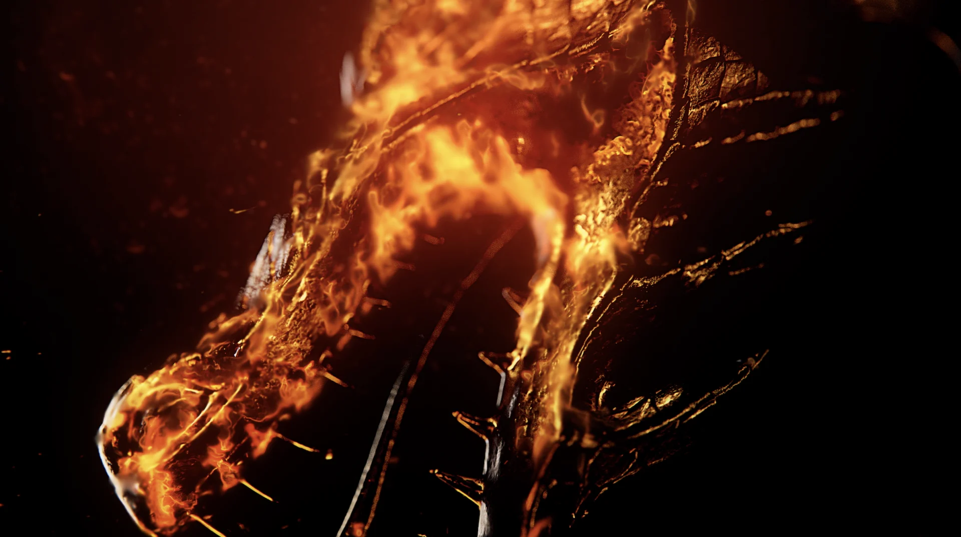


We took the elements from the sigil tease and built out a toolkit for the team at HBO. Fire elements, title cards, interstitials, the sigil itself and more were included in that package enabling HBO to apply those effects wherever they were needed.
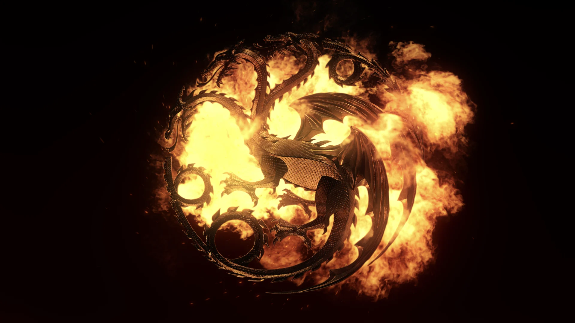
HBO utilized this toolkit in combination with footage from the show to create the official House of the Dragon teaser, giving fans an even more in depth peek at the series to come. Original BGSTR design can be seen throughout the trailer, and the back :15 seconds are entirely BGSTR created- the logo, the date, the HBO button - all were rendered, textured and animated by our team, including the fire in Houdini.

Props where props are due
Credits
House of the Dragon: Launch Campaign Credits
Executive Creative Director Josh NortonVP, Executive Producer Carson HoodVice President, Head of Production Virgil ConklinLead 3D Designer & Animator Conner O'BrienAnimation Director Casey DroginDesigner / Animators Brian Landisman, Nick WoythalerVFX Alec Iselin, Justin NixonAnimation Elijah Ben, Tife Odumosu, Adam Afzali, Jay KimStoryboard Artists Ivan Viaranchyk, Kurt Huggins