November 22, 2022
Volume 51
Client
Various
A versatile election package for CNN and Model America's film design

Promo Package
CNN is the go-to source for election coverage in American politics and we approached the rebrand of their on-air election package mindful of the network’s expansive audience and the broad reach of our design.
The package rolled out with CNN’s coverage of the 2022 midterm elections, but was designed to be multifunctional. The toolkit we designed is the foundation of the package, enabling an evolution of design so it can be utilized for additional elections moving forward, including the 2024 presidential election. Developing this from a graphic perspective required us to design something with maximum versatility that could reflect any number of informational permutations the CNN newsroom staff would need in the future.

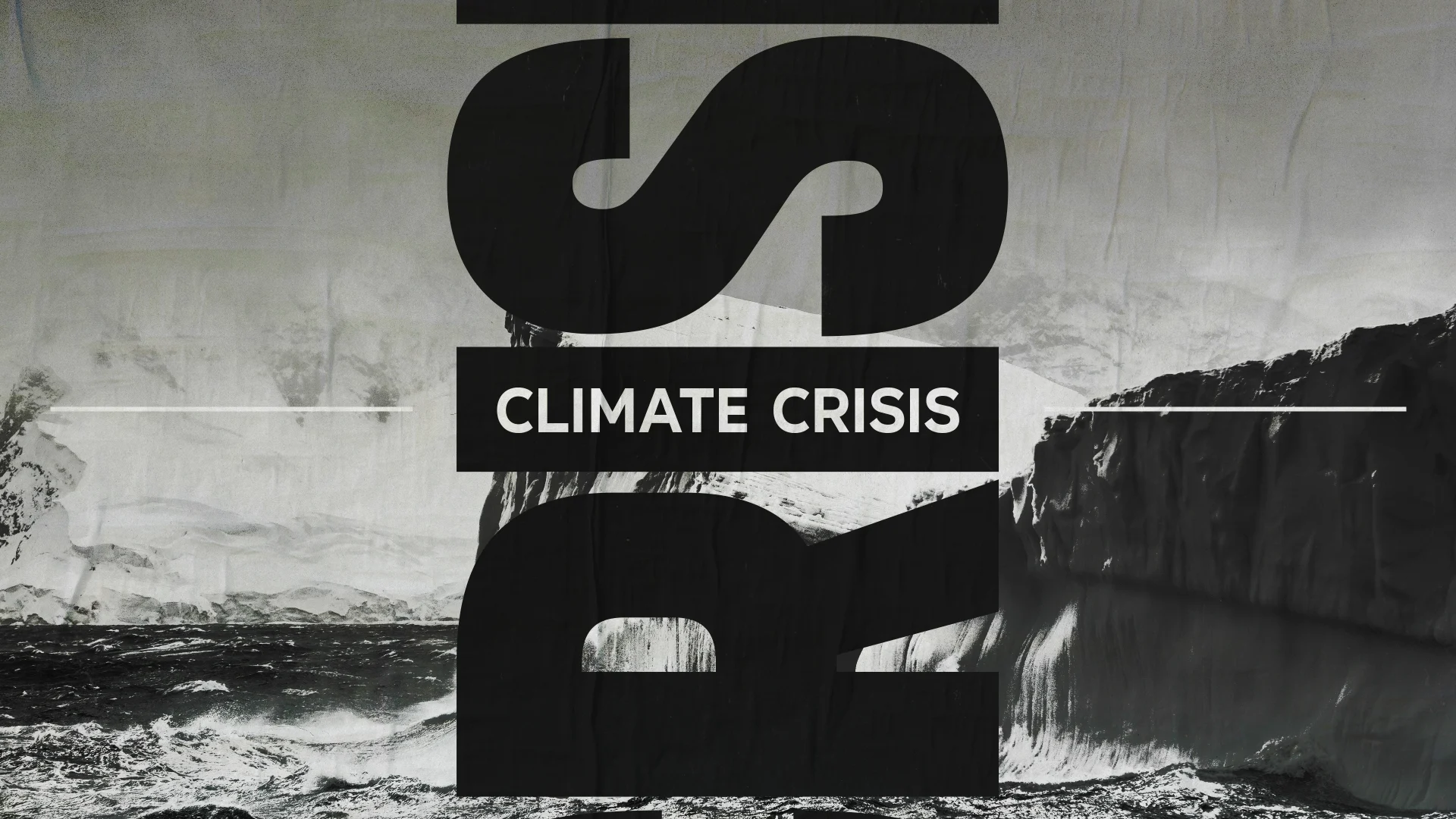


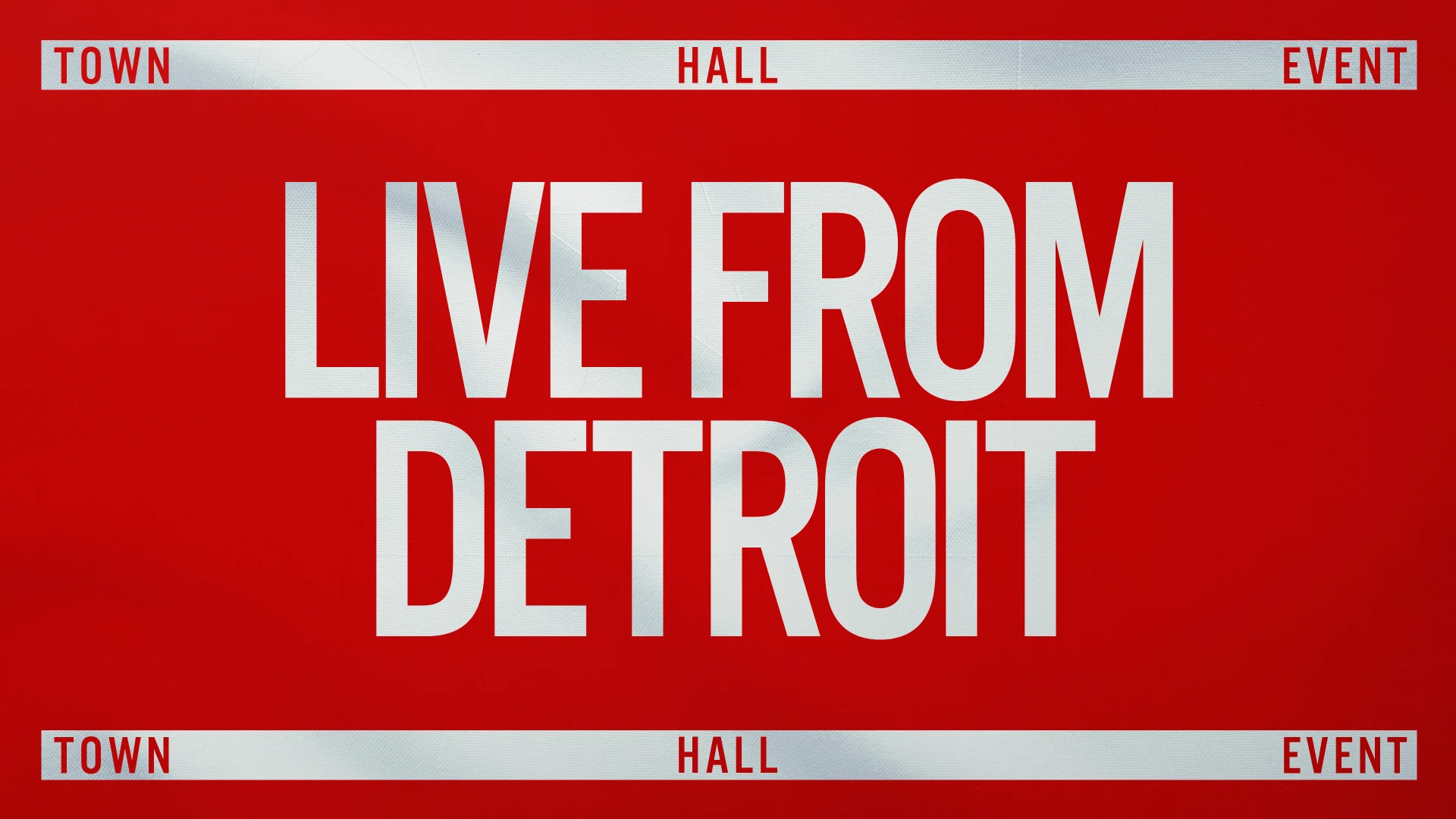
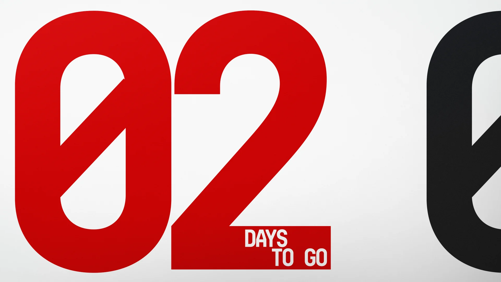

Design Director Ross Henderson led our design exploration which tried out different interpretations of the aesthetic CNN was seeking. After a few productive exchanges between our teams, we landed on a look that we all agreed struck the right tone: punchy, urgent without being alarmist, nonpartisan and could be evolved for future elections.
Once our design was set, we were able to begin animating the graphics and incorporating elements for our toolkit. Animation Director Casey Drogin oversaw the toolkit, adding timing and movement to the graphics so that they would seamlessly deliver the relevant information to viewers.
Animation for a brand like CNN is always a big responsibility. We worked to craft impactful animation that combines powerful typographic messaging with complex transitions. We also built our animation into a robust After Effects toolkit that would allow CNN to replicate our motion and design into the future. Working this way allowed us to imbue structure into every facet of the animation language, from the visuals to the project itself.
Promo Package continued

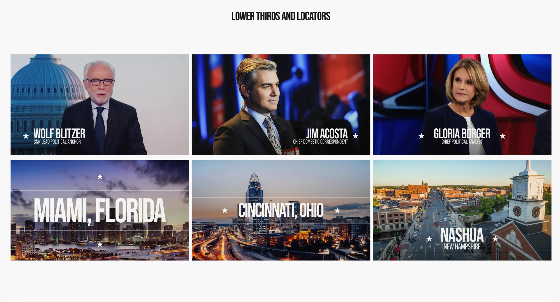

CNN needed a system that had a strong foundation, but could evolve visually over the course of the next four years, specifically in the leadup to the 2024 presidential election. Functionally, we had to consider the quick turnaround for these graphics to be updated on election night and informationally, we needed to cover a huge number of potential results scenarios.

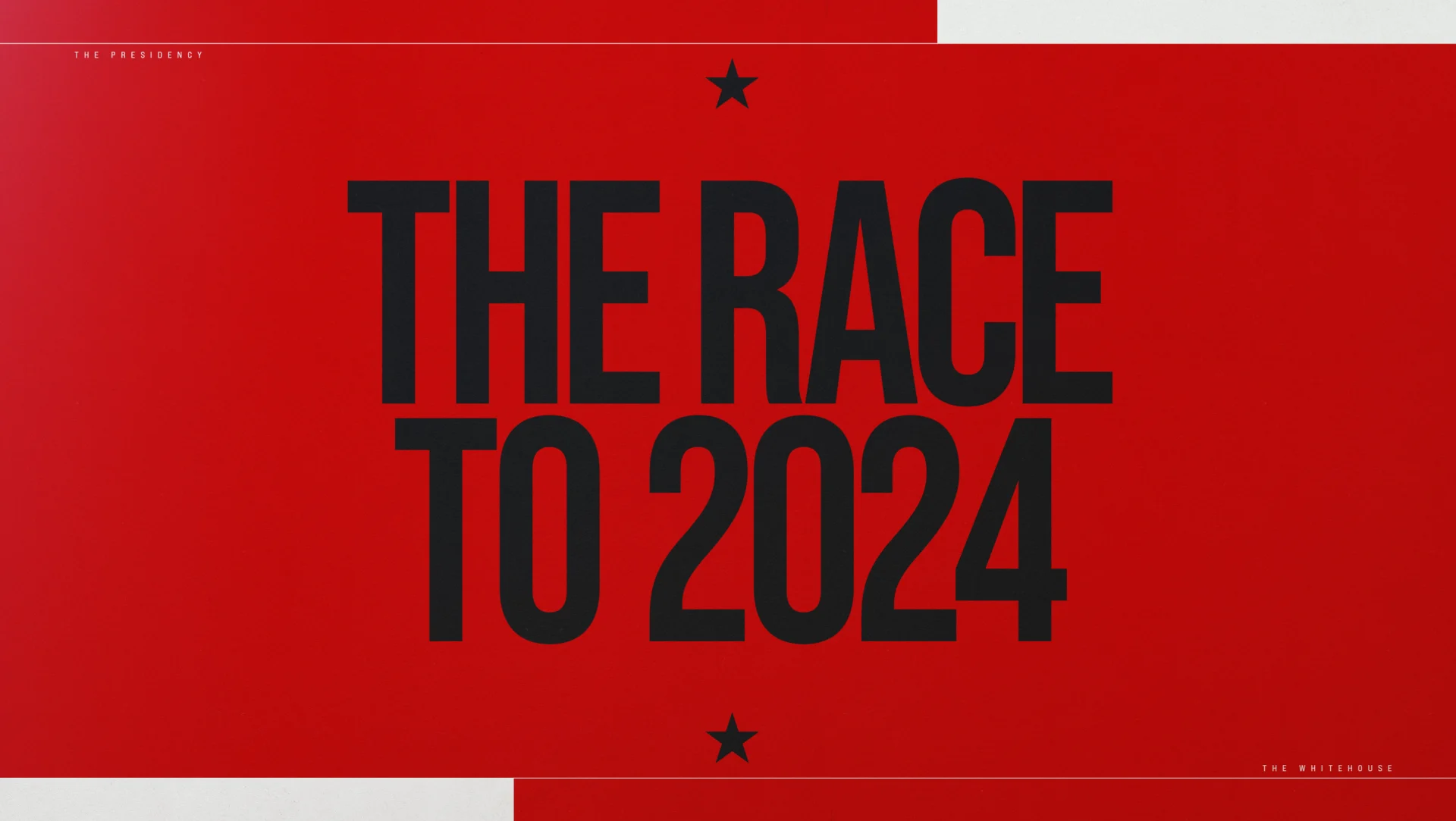

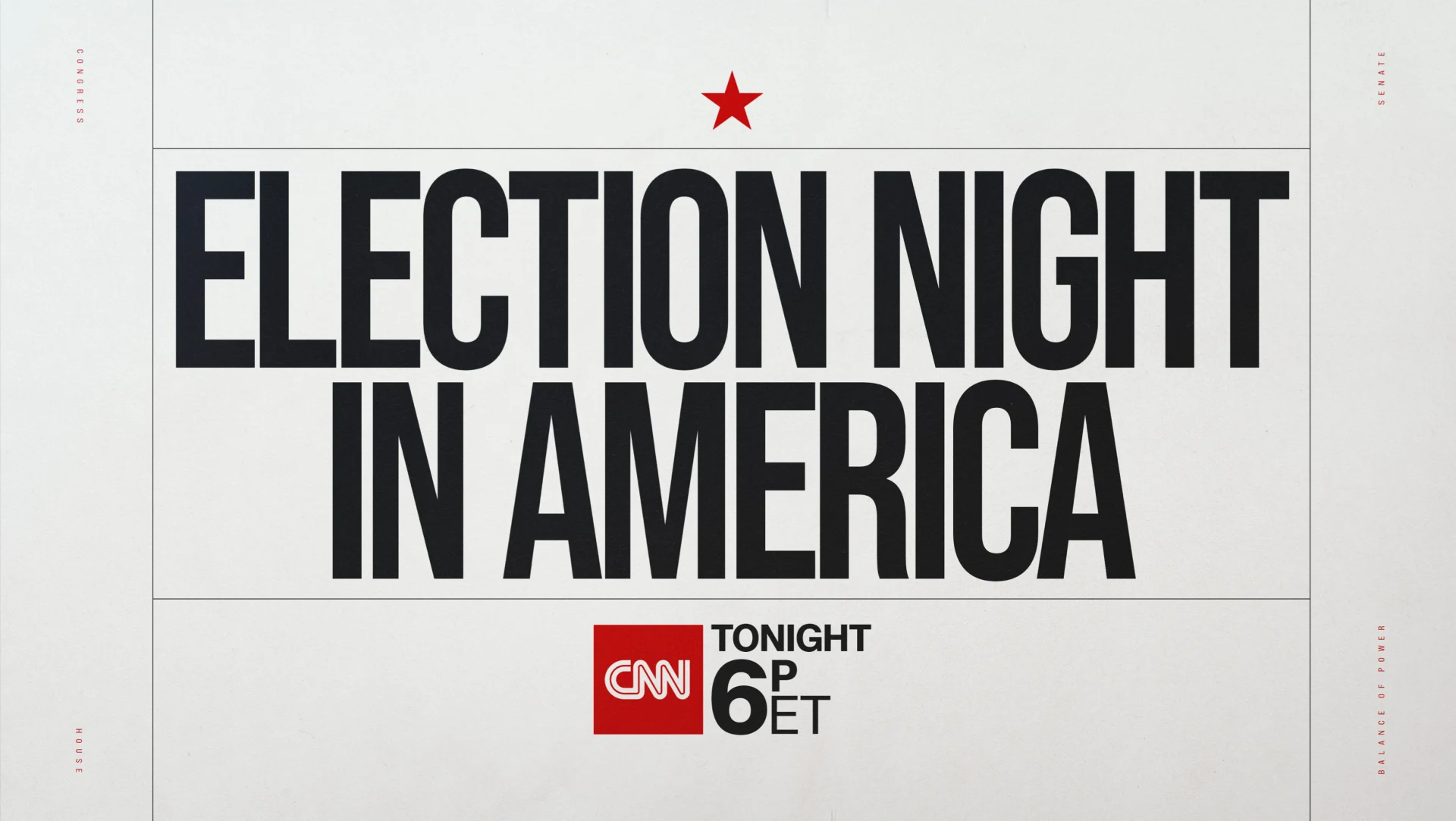
Toolkits are fun to produce because they’re always unique to each client and so we’re always evolving. For CNN, we had to design elements that visually convey the escalation of urgency as coverage nears decision time, and then include that functionality in the toolkit for their team to manage in the lead up to results coverage and beyond.
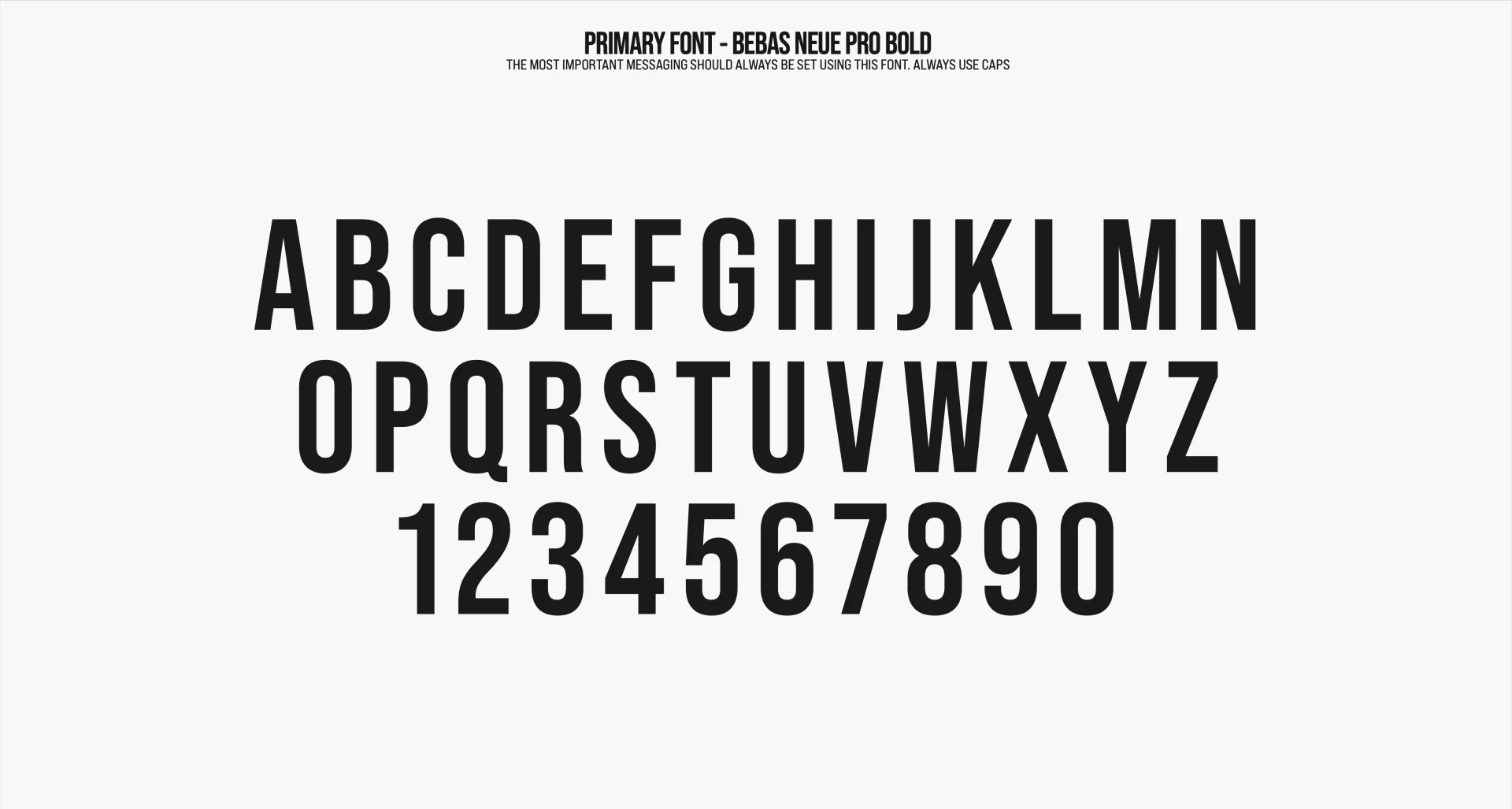


“From a design perspective, we wanted to start big and then become more poignant as we get to those defining moments,” said Virgil Conklin, VP, Head of Production. “Being easy to use and putting our clients in control to quickly enact design changes was key, and the toolkit we delivered is really special in that it’s highly functional, but keeps the integrity of the design at a premium, too.”
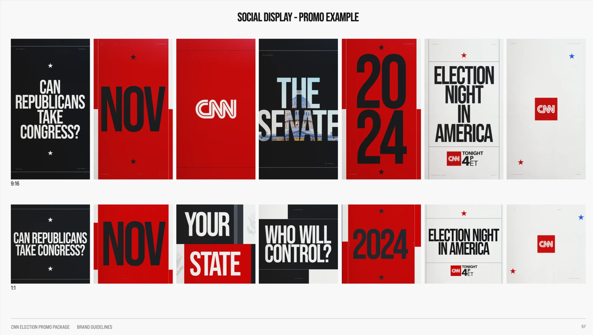


Another goal we shared with our client from the outset was increasing the bipartisan appeal of the network’s design and expanding reach across generations, especially younger. We pushed our voiceover and music to be more progressive stylistically in line with the visual elements.
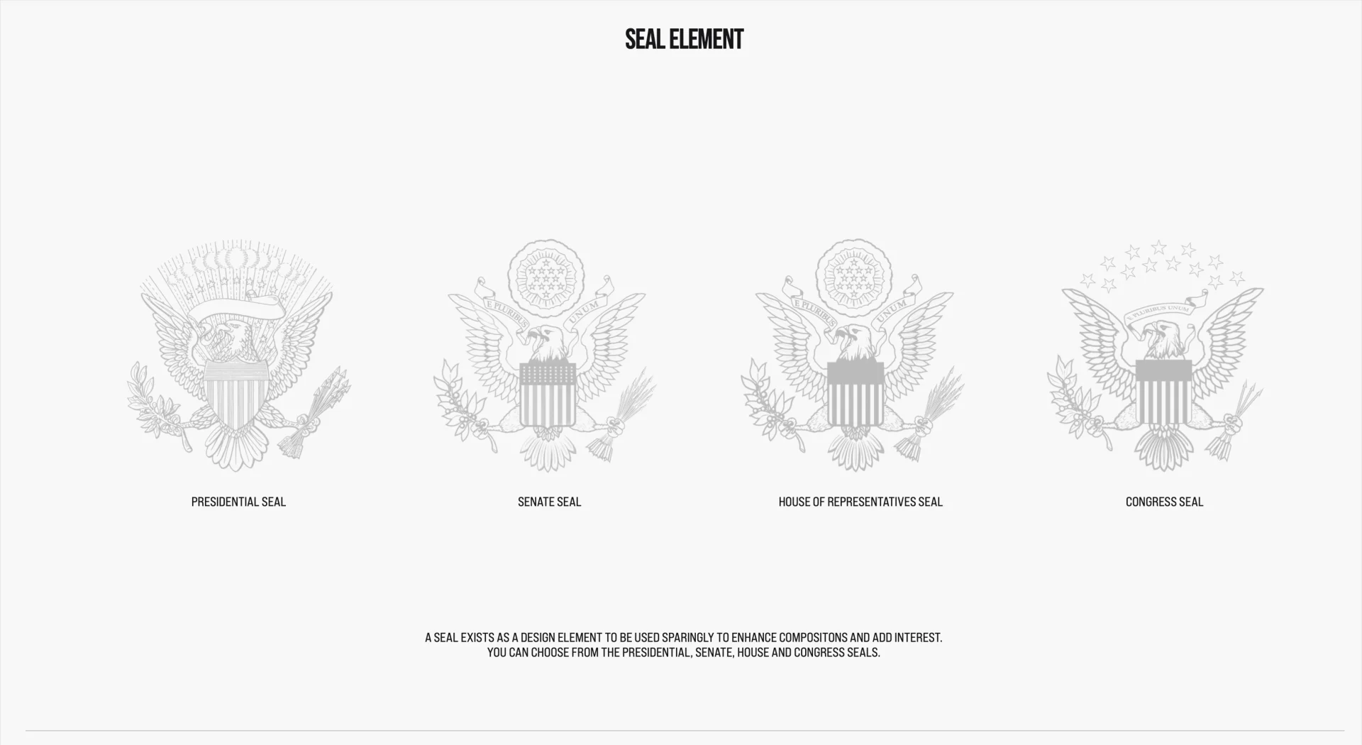
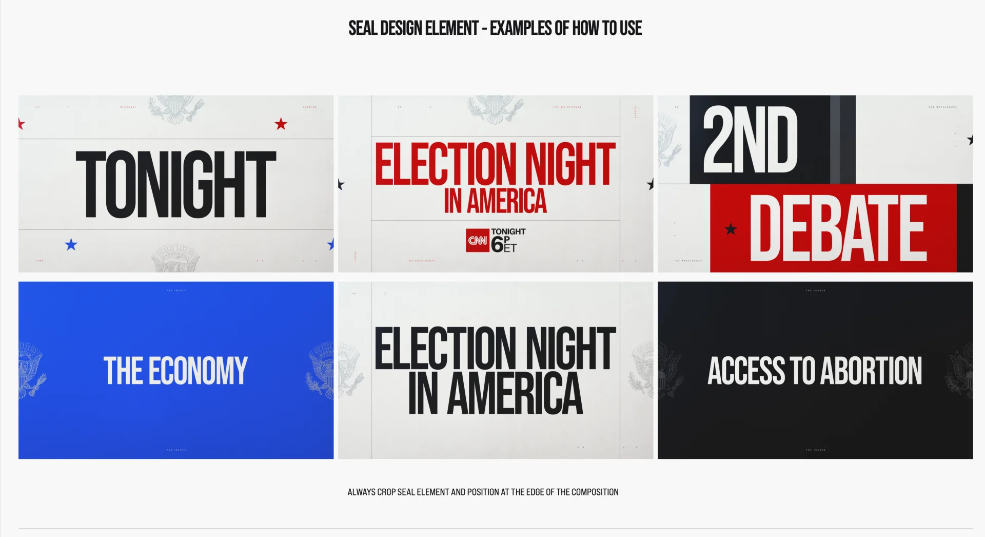
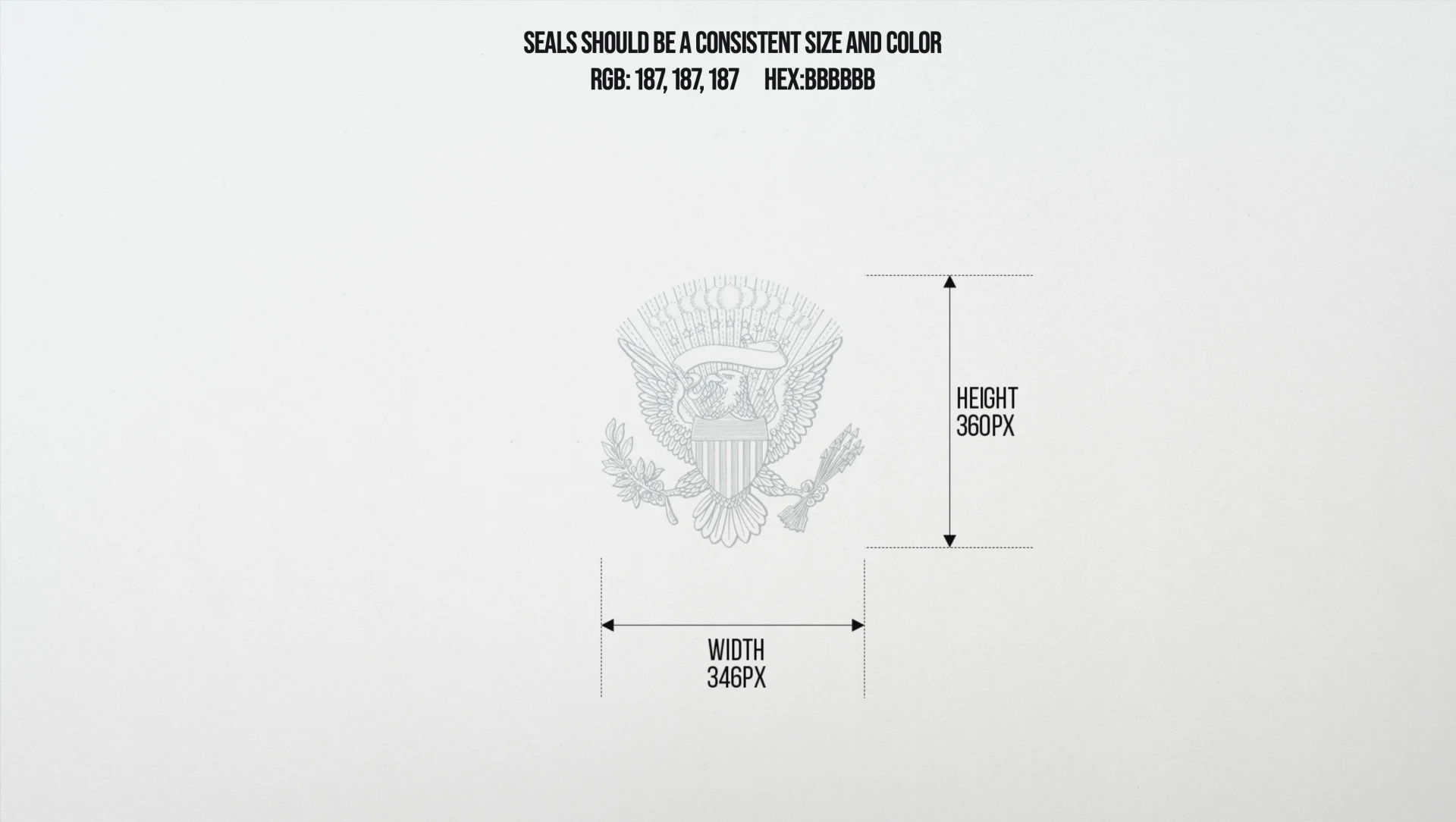
CNN is known for their comprehensive coverage and real-time results of elections, and we designed a graphics package that visually contributes to their unique election experience, starting as CNN reporters and analysts covered the 2022 Midterm Election results and what they mean for the country. We enjoyed coming up with a design language to progress the nonpartisan stance of the network and pushing ourselves to the next level to develop a toolkit with premium output to match our standards as well as those of our client.

Model America
Model America is a four-part docuseries which explores how a fatal police shooting in 1990 that became a flashpoint of Black community protest and activism has taken on a new resonance in the era of the Black Lives Matter movement. We partnered with the film’s creators at Anchor Entertainment and NBC News to design the film, which is also notable for being the first documentary series to be produced under the MSNBC Films banner.
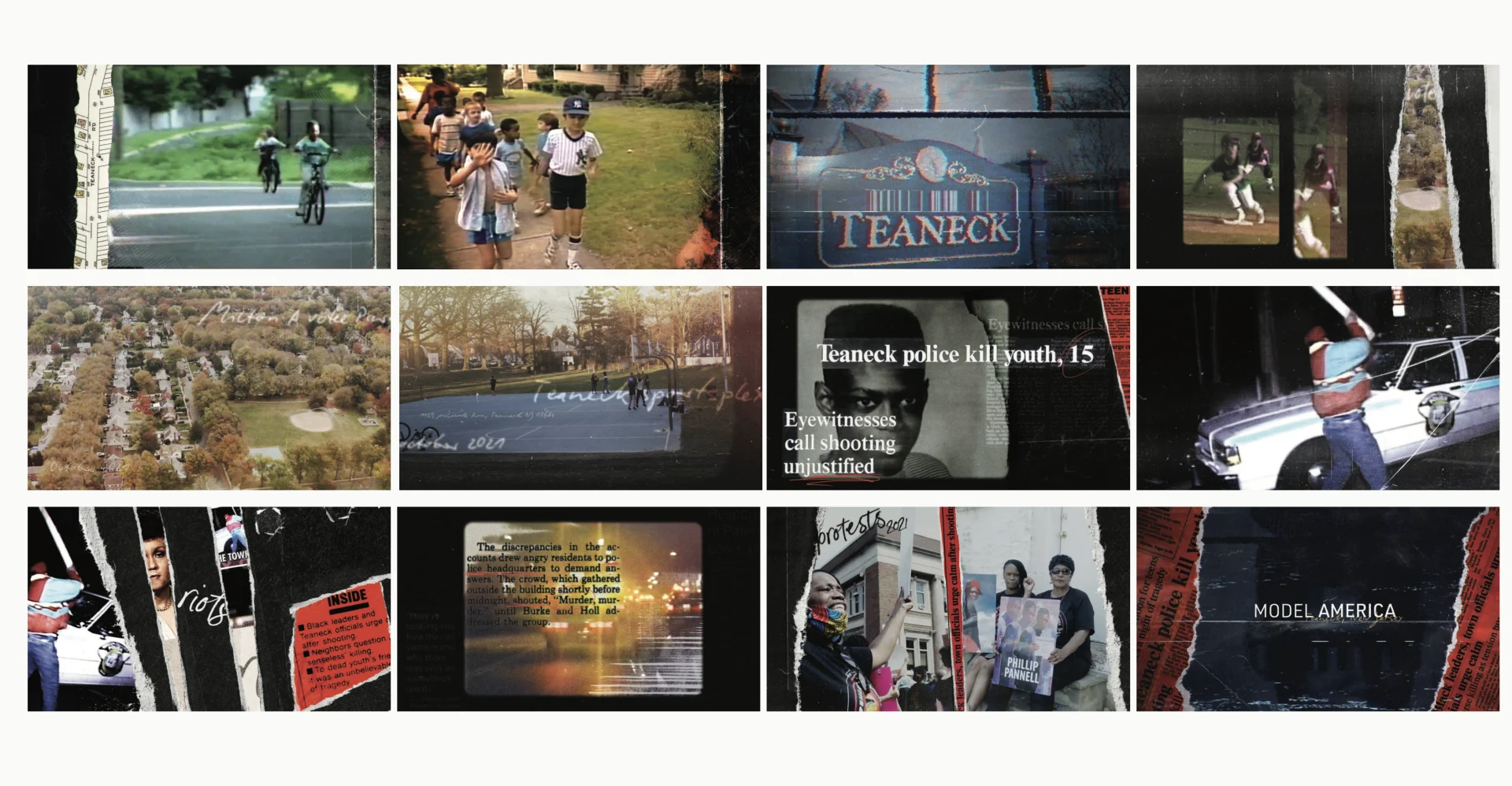
The inciting incident of the docuseries is the death of Philip Pannell, a 16-year-old Black teenager from Teaneck, New Jersey who was fatally shot in the back by white police officer Gary Spath on April 10th, 1990. The murder drew widespread interest due to the fact that prior to the murder, Teaneck had positioned itself as a model of interracial harmony.
We came into the project with a solid understanding of the direction our partners wanted to go, but getting our hands on the copious amounts of archival footage and imagery really solidified our design choices. Using the archival materials, we put a baseline edit around our concept and then incorporated it into the series’ look and animation.

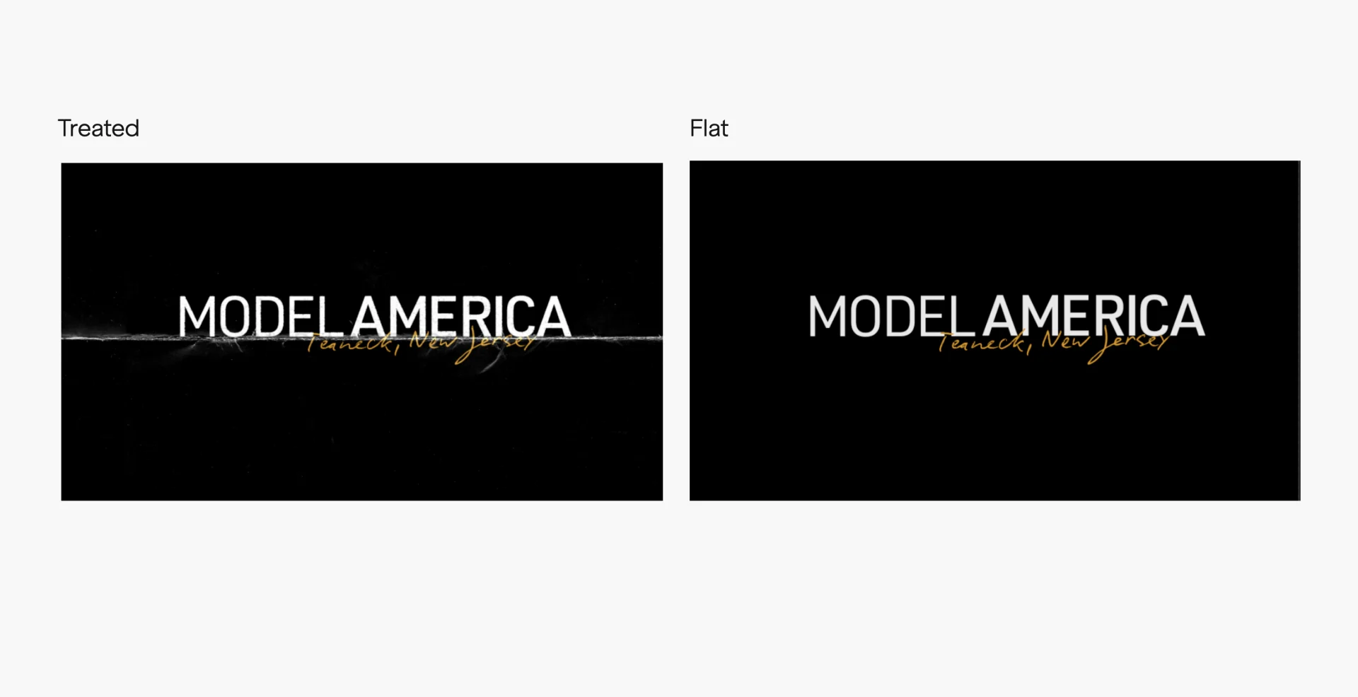


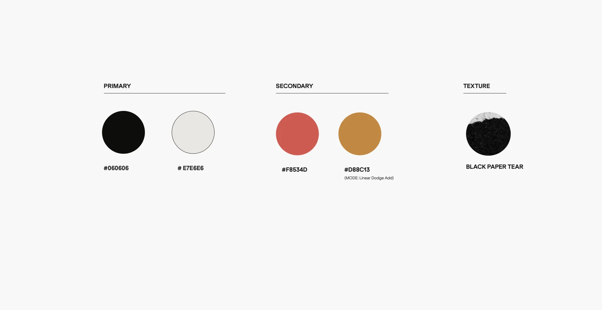

As the series’ narrative progresses, it moves from the 30s and 40s all the way through to present day. Throughout each transition, our design provides a pleasing juxtaposition of the historic content and typography and animation style that reflects the 80s and early 90s and the urban setting where the murder took place.

A focal point of the series is the map we designed of Teaneck, New Jersey. The episodes span a number of decades, so the map serves as both a visual marker for viewers to return to each episode and as a symbol of the town’s history.
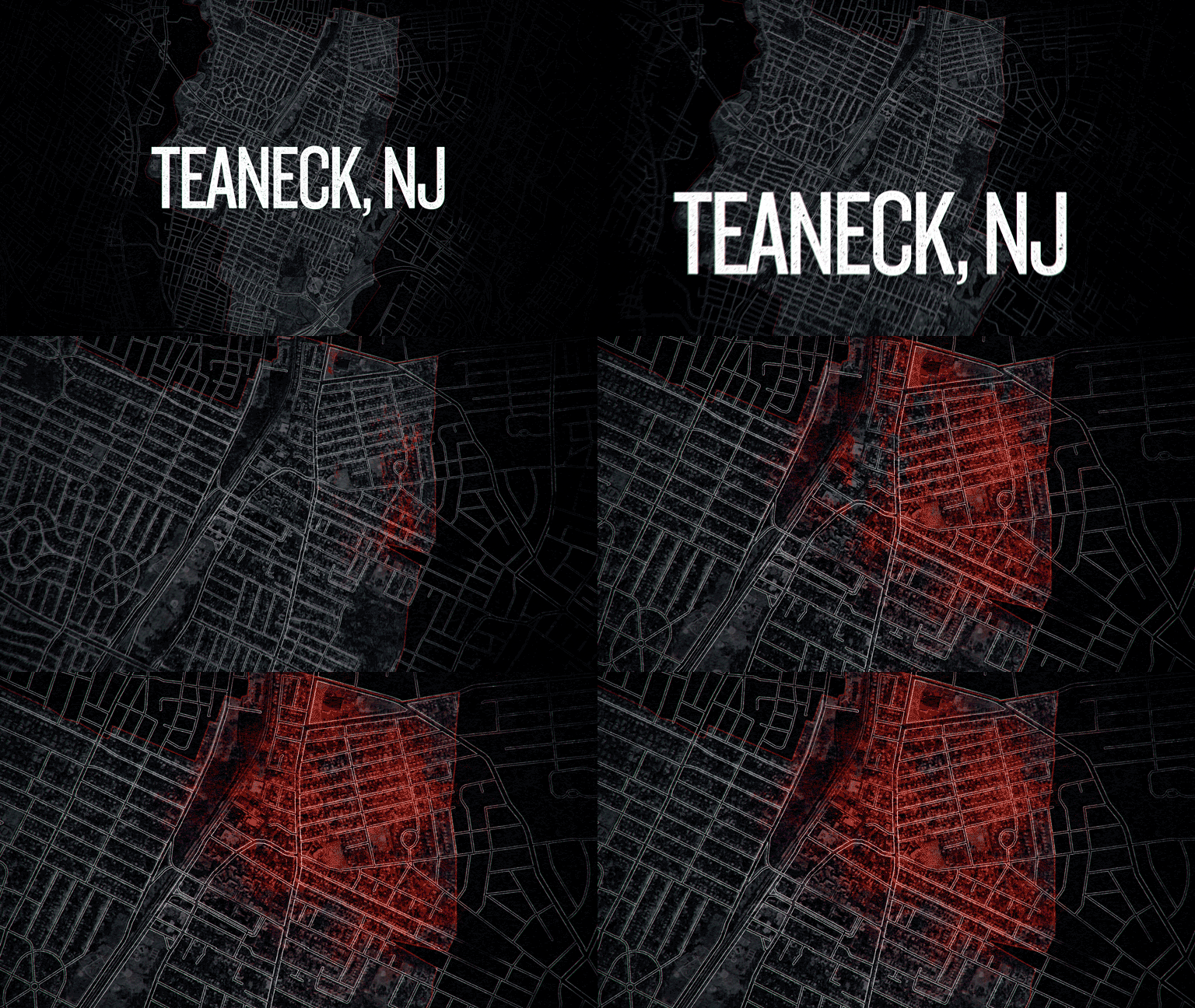
In the docuseries, the filmmakers both chronicle the original case and trial, and explore how the emergence of the Black Lives Matter movement has given Teaneck residents a new lens through which to view this 30-year-old tragedy. Because of the wide expanse of decades covered, the design style evolves along with the narrative.
Overall, the series design is rooted in a slightly retro style- thick boxy type and animations that reference the news coverage of the era. Even as the design style evolves throughout the four episodes, we stays connected to the era of the grounding incident of the series- the murder of Philip Pannell using the film’s design.


This project was one that hit a good stride out of the gate and continued on through delivery. As we neared the final deliveries, we added an En Memoriam segment that the film’s producers had conceptualized. The moving segment begins with Philip Pannell’s name and populates with names of other victims of racial violence until the screen is completely white— a poignant end-note for the film.
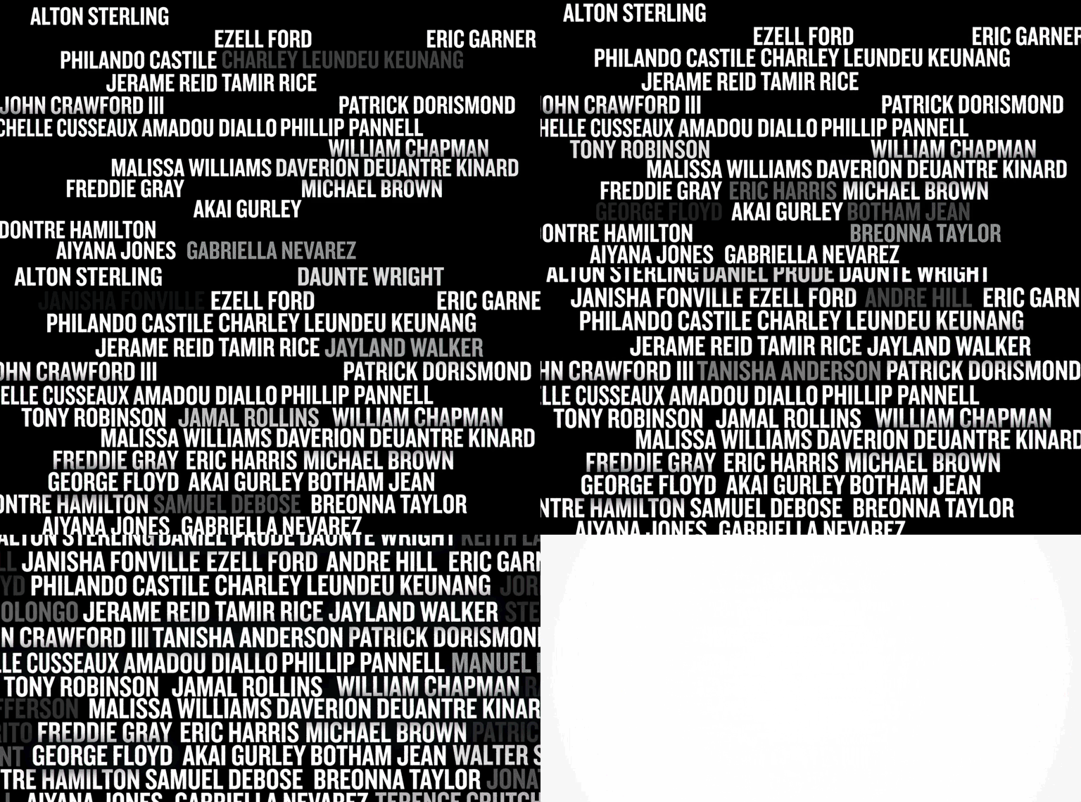
Our partners were great collaborators and we all were pleased with the organic and handmade feel of the film’s design and how they blended with the modern day elements and evolved together throughout. Stream all four episodes of Model America on Peacock.