February 9, 2023
Volume 53
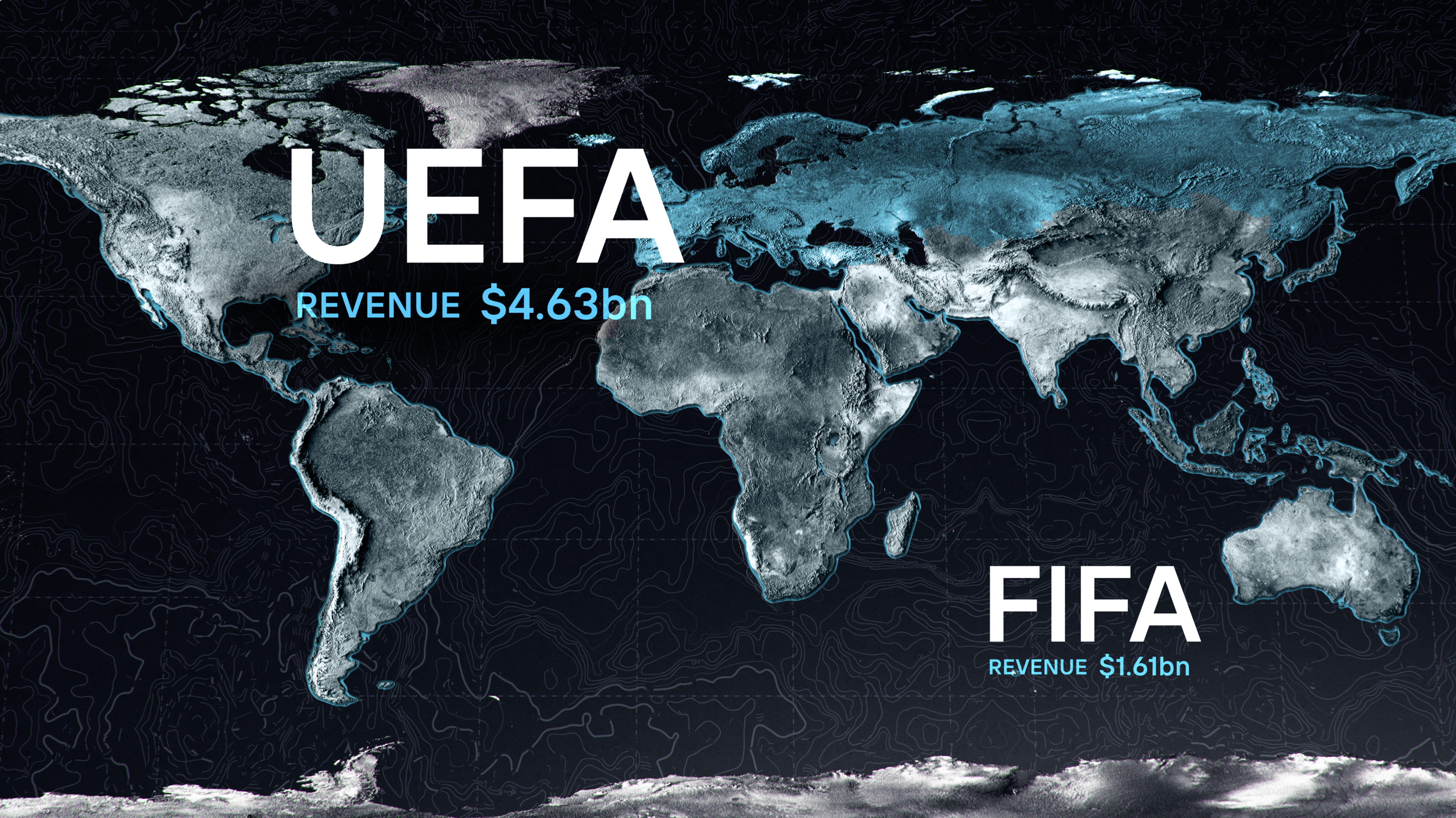
Client
Apple TV+, Vice, Aquitania, Turner Sports
In our first Spotlight of 2023, we come out of the gate strong with two fantastic projects from the world of sports— a graphic show open for the NHL Winter Classic for TNT and the series design for Apple+'s Super League: The War for Football— and a titillating title sequence and graphics for Vice TV's series Sex Before the Internet. Sign up to receive the BGSTR Spotlight when it comes out here below.

Chess Pieces
Super League: The War for Football
As self-admitted sports fanatics, the BGSTR team was familiar with the story of the Super League, so we were excited to dive deeper into the story in a creative way. Once we opened up the hood and dove into the elements of the documentary, we started to understand how quickly every piece of the Super League moved from inception to implosion. From information exchanging hands, players moving teams and money driving all the decisions— each element was like a chess piece being moved around a board— a concept we latched on to and incorporated into our design direction.


In order to represent the changing battlefield through out the series, we crafted player game pieces to represent a team's allegiance at any given time in the show. The pieces were meant to evoke, both the heroic nature of the players involved yet also demonstrate to some it was all just a game.
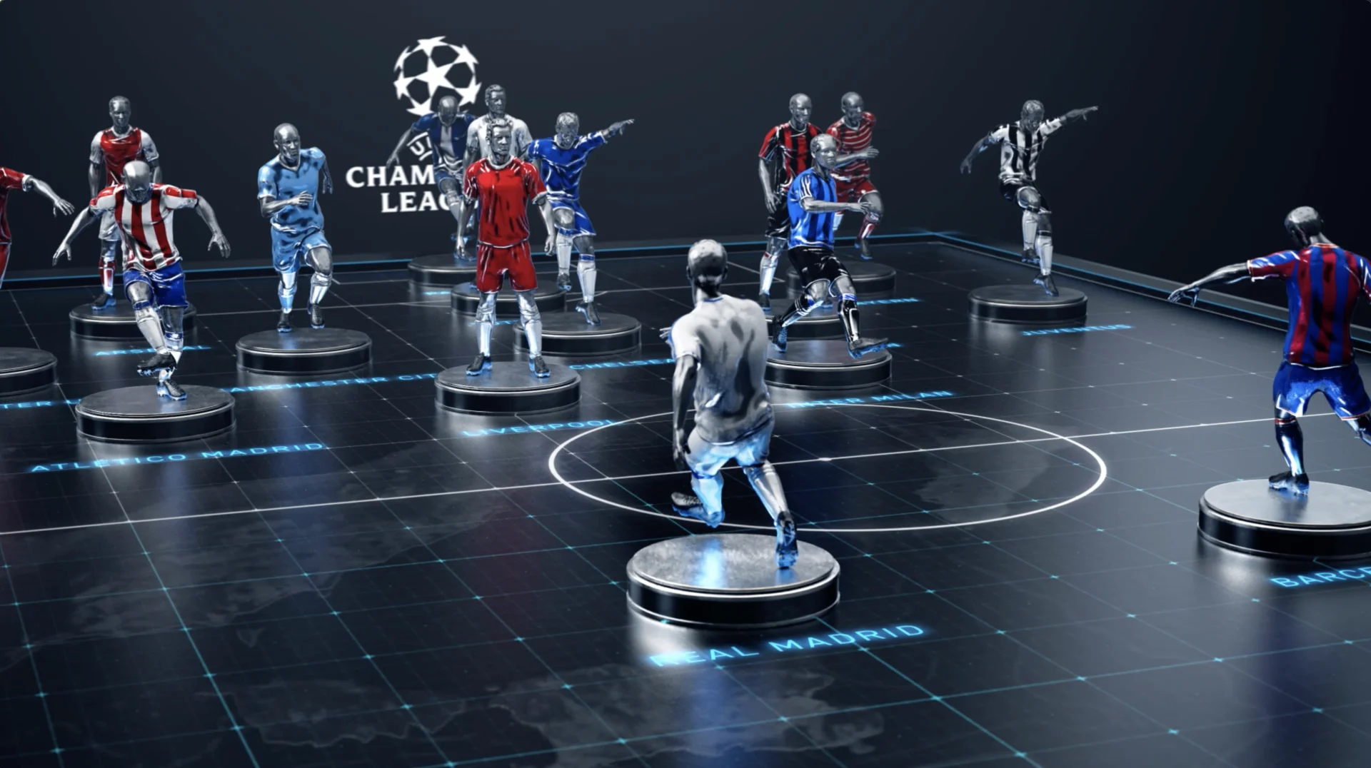
Even in very early cuts of the show we could see that Jeff (Zimbalist, director) and his team were crafting an elegant take on this sports story. It plays part espionage thriller, part castle intrigue with family backstabbing— our task was to deliver on something that hit on all those levels. In that sense, our approach was to create something elevated, with touches of epic yet with clear storytelling… oh and a touch of drama
The battle continues...
Title Sequence
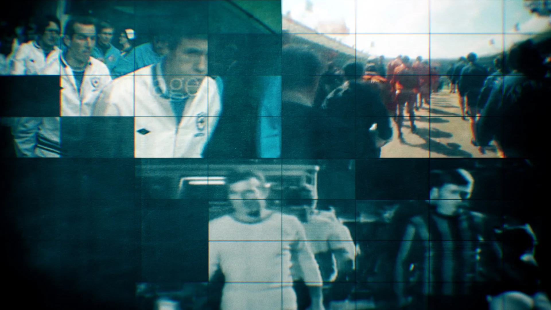
The title sequence sets the tone for the series. It's designed to reflect both the rapid evolution of the history of the sport and the complexity of issues in the series. We were presented an editorial framework of images and footage and were tasked with creating a visual architecture to tame these disparate elements into a fast pace start of the series.


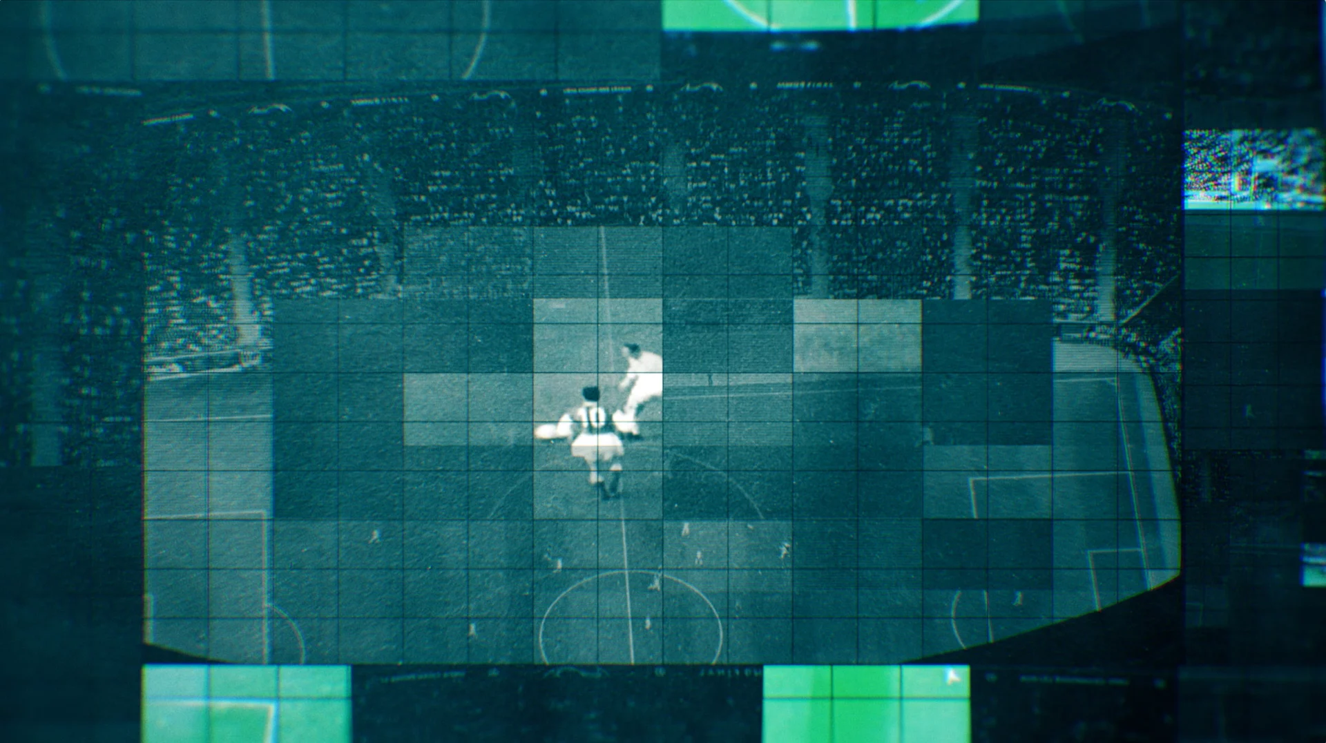

We designed a grid system within the title sequence to show multiple things to viewers simultaneously, exaggerate brightness and reduce lighting in certain spots and draw the viewers’ eye. The result is an elegant open that conveys the high-stakes battle around the breakaway league.
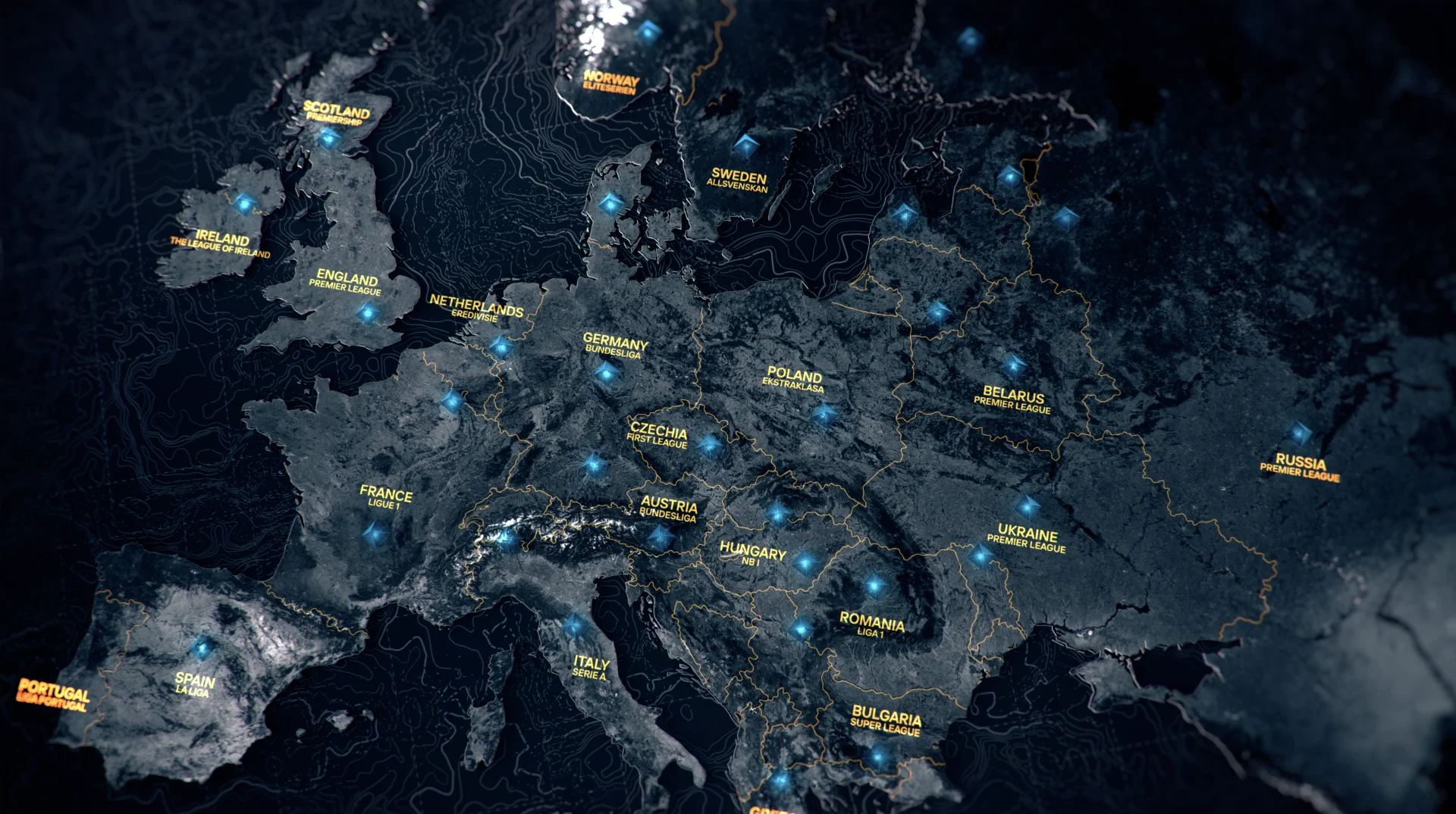
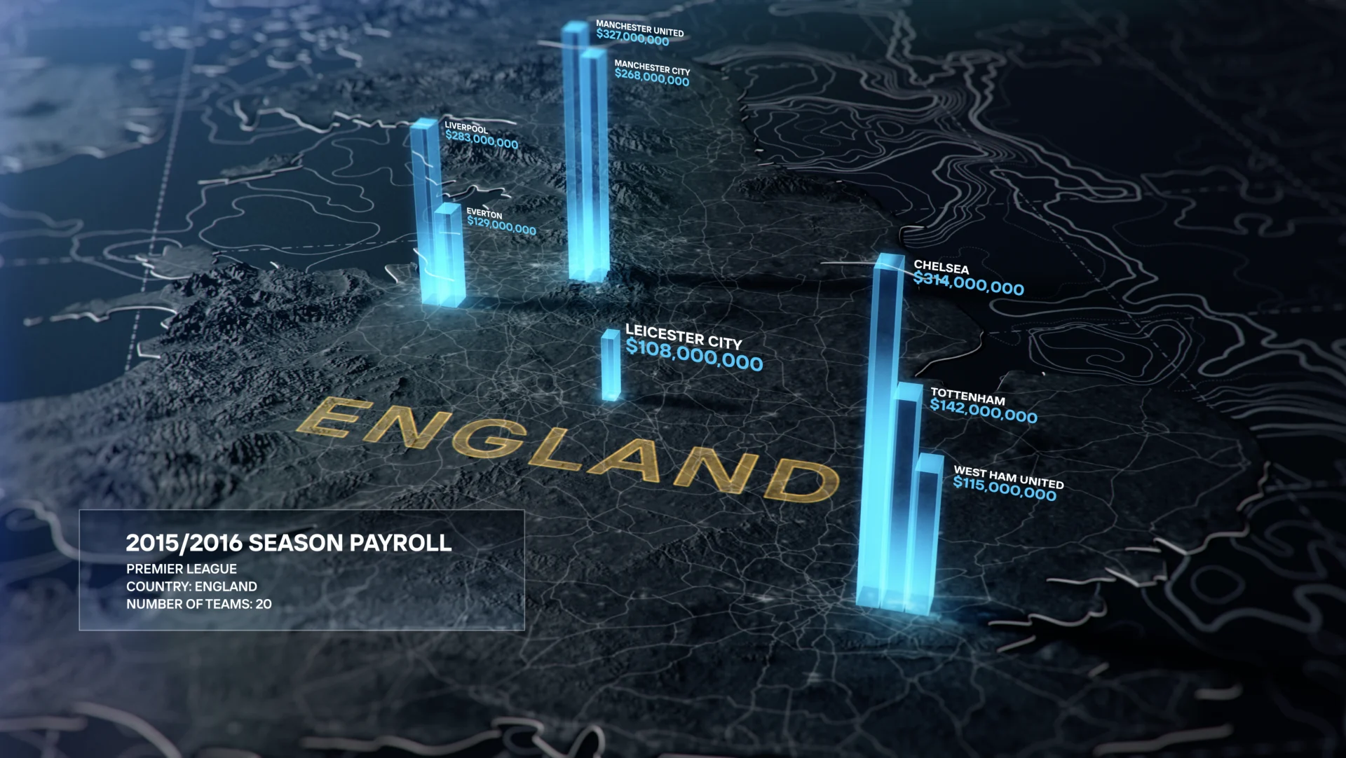
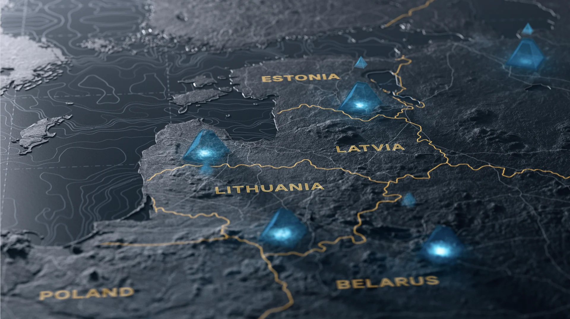
The web of information that comprises the story of the Super League necessitated several other graphic elements for our design.
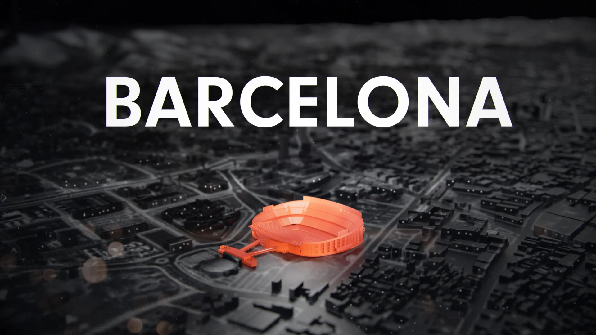
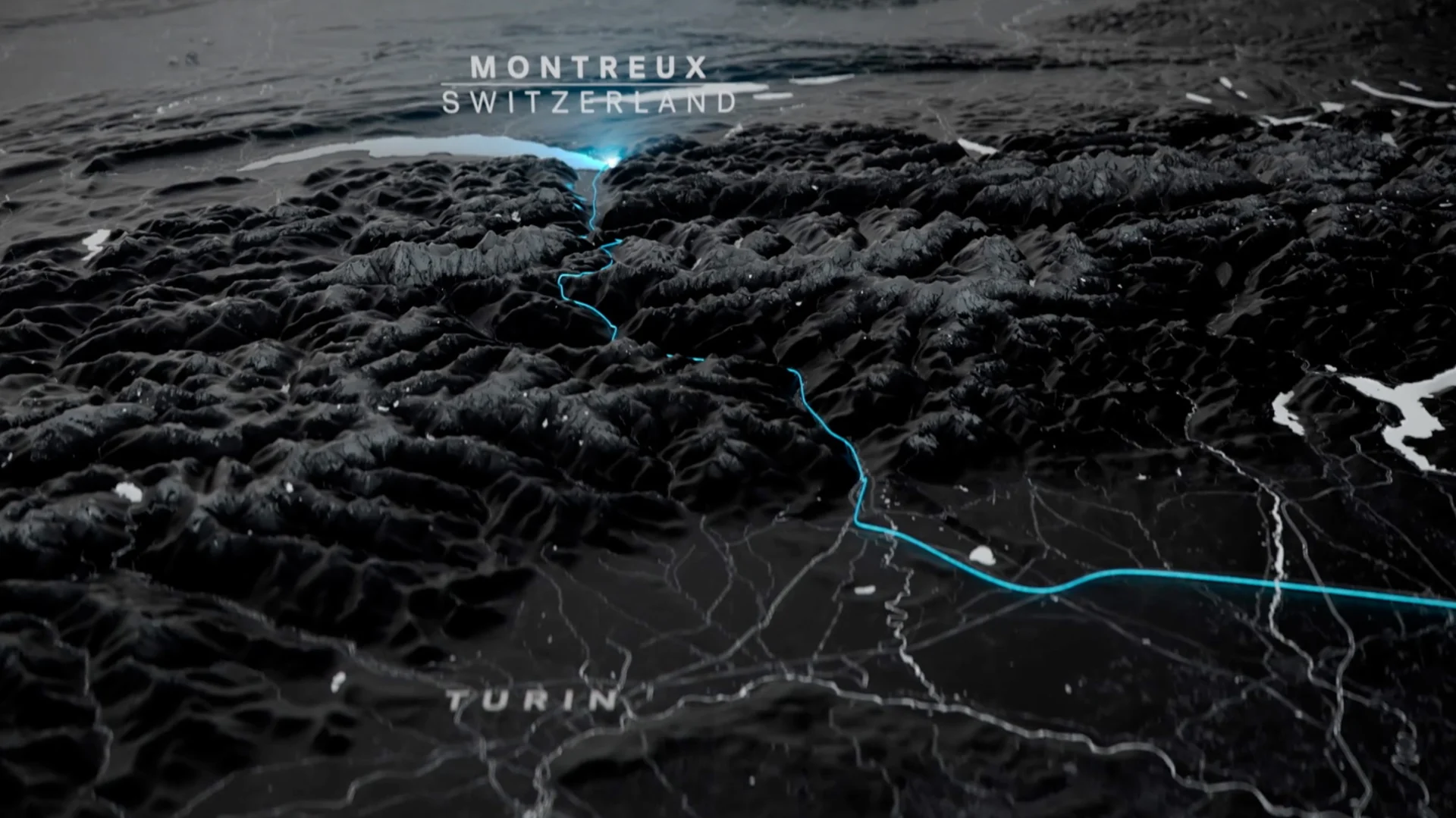
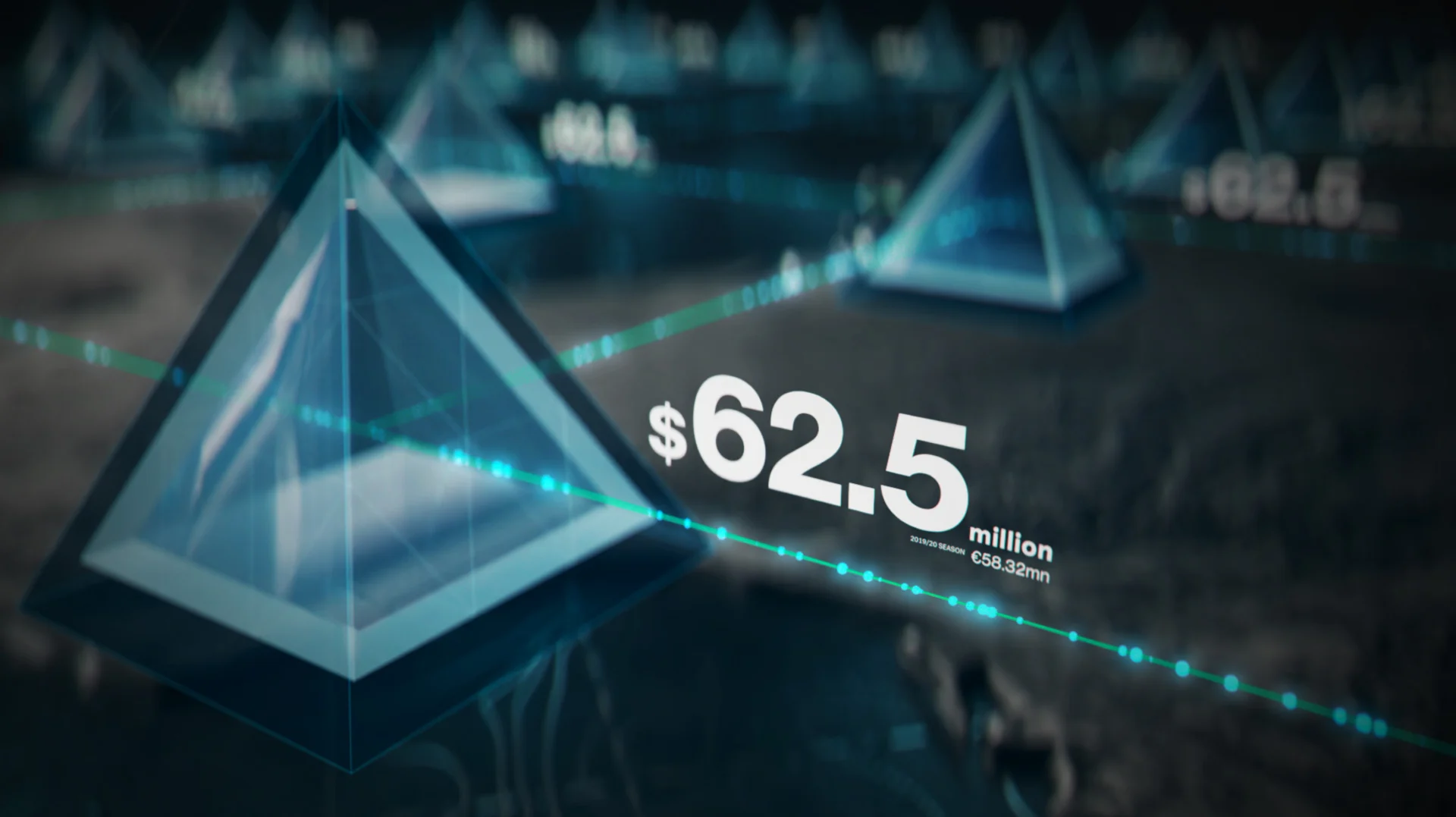
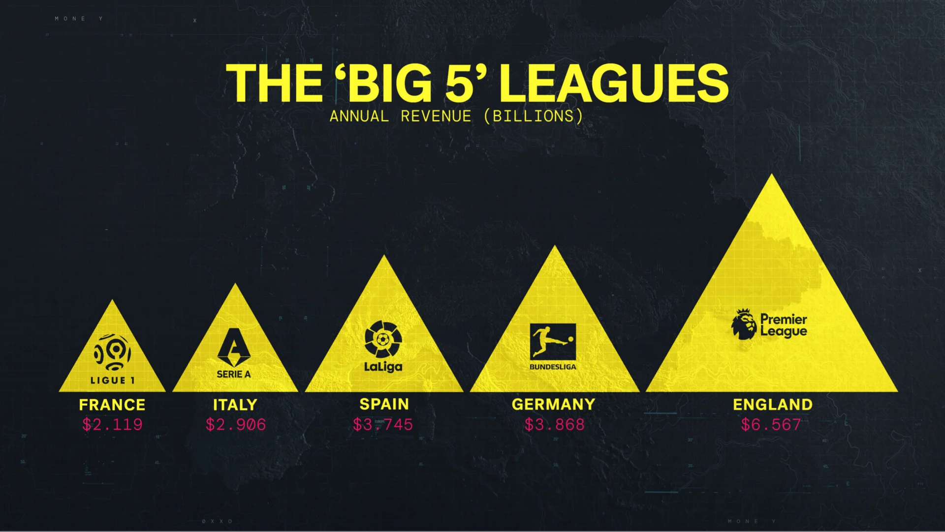
We designed a series of maps based on the idea of the sport of football’s stronghold on Europe and the looming presence of the Champions League and then the potential for the Super League. The map ended up being the base for all of the other graphics that we were creating—scorecards, cities, votes and the relevance of the pyramid system to the Super League.
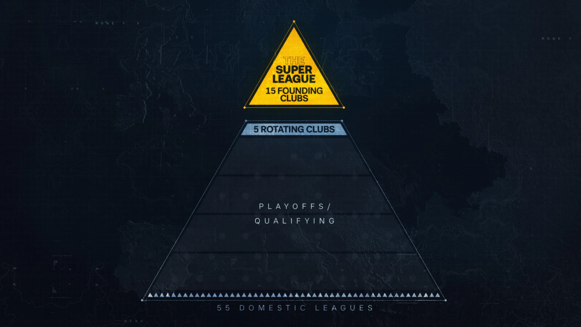
We designed a set of pyramid graphics to represent the idea of relegation from the Champions League that the creation of the Super League was looking to destroy. The topic of relegation was extremely important to the show’s narrative, ultimately being the deciding factor for the clubs’ decision not to join the league. We kept the look and feel of the other graphics we’d designed and incorporated the idea of promotion and relegation and the importance of the hope it gives to fans.


At BigStar, sports projects appeal to us because they combine the creative, technical, and human elements that enhance storytelling. This type of personal storytelling is in our brand DNA, and lets us really flex our creative muscles.
BEHIND THE WALL
NHL Winter Classic 2023


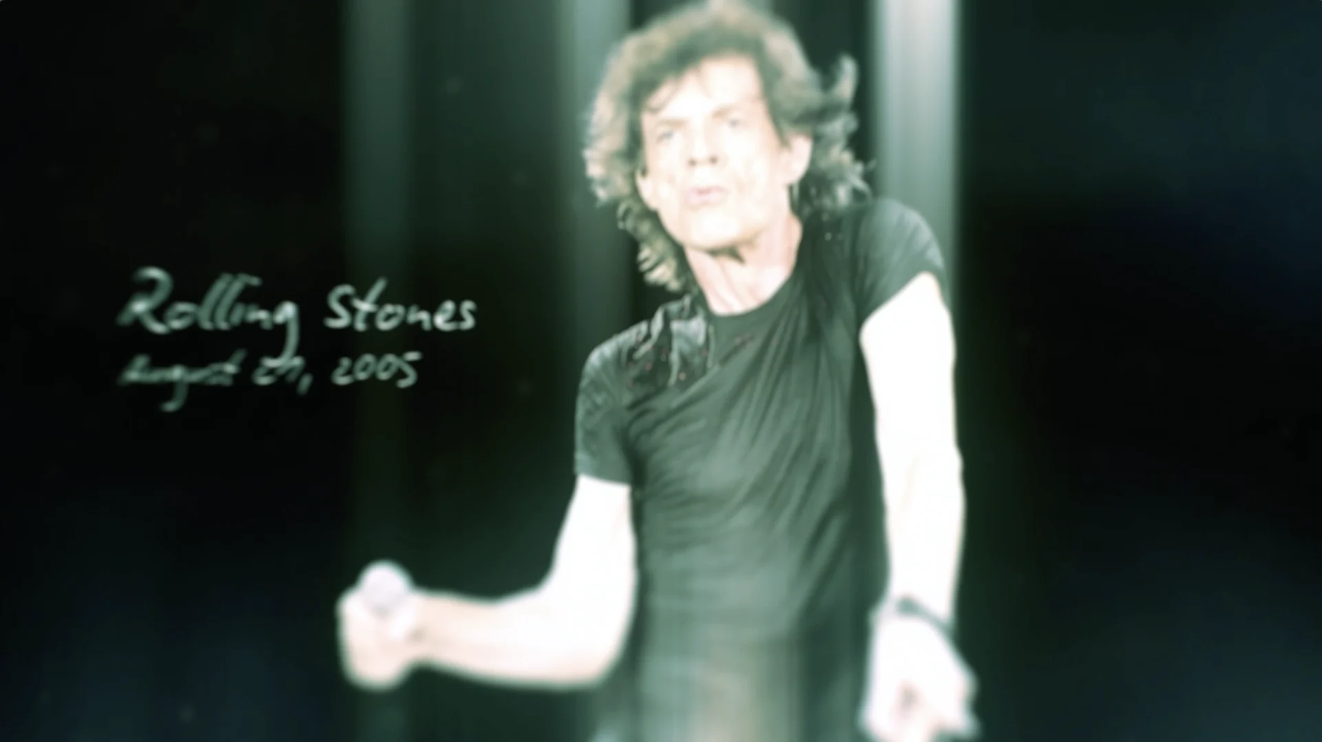
We worked with our friends at Turner Sports to design a show open for the big event. Partnering with Turner’s sports division has led to some of our most notable design work, including our award-winning Made for Madness promo spot.
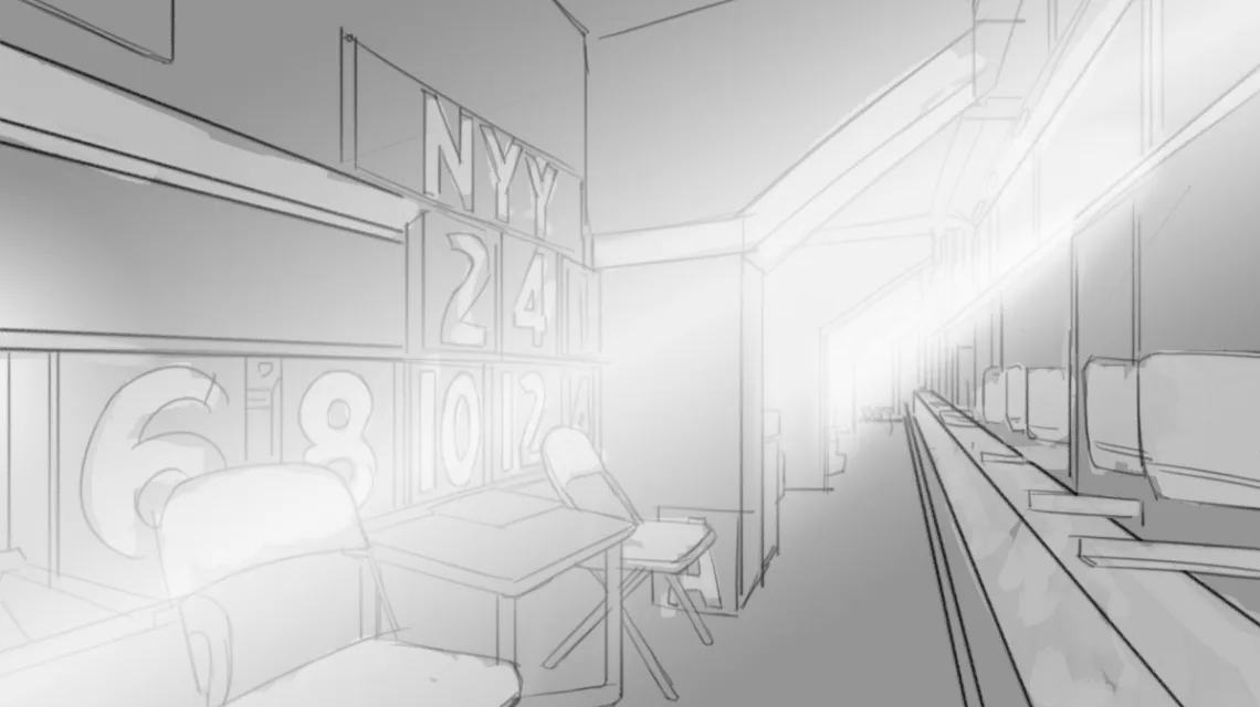
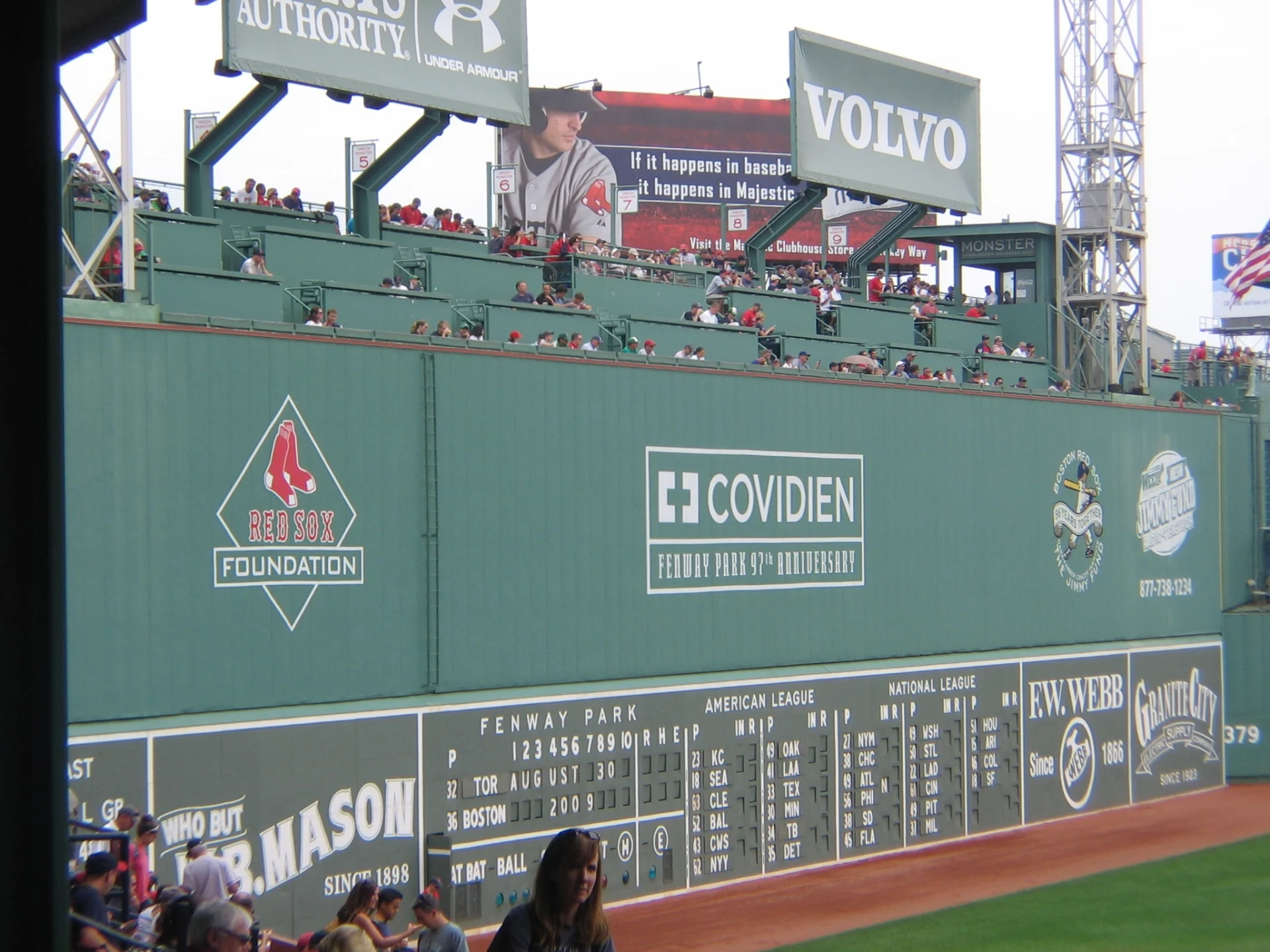
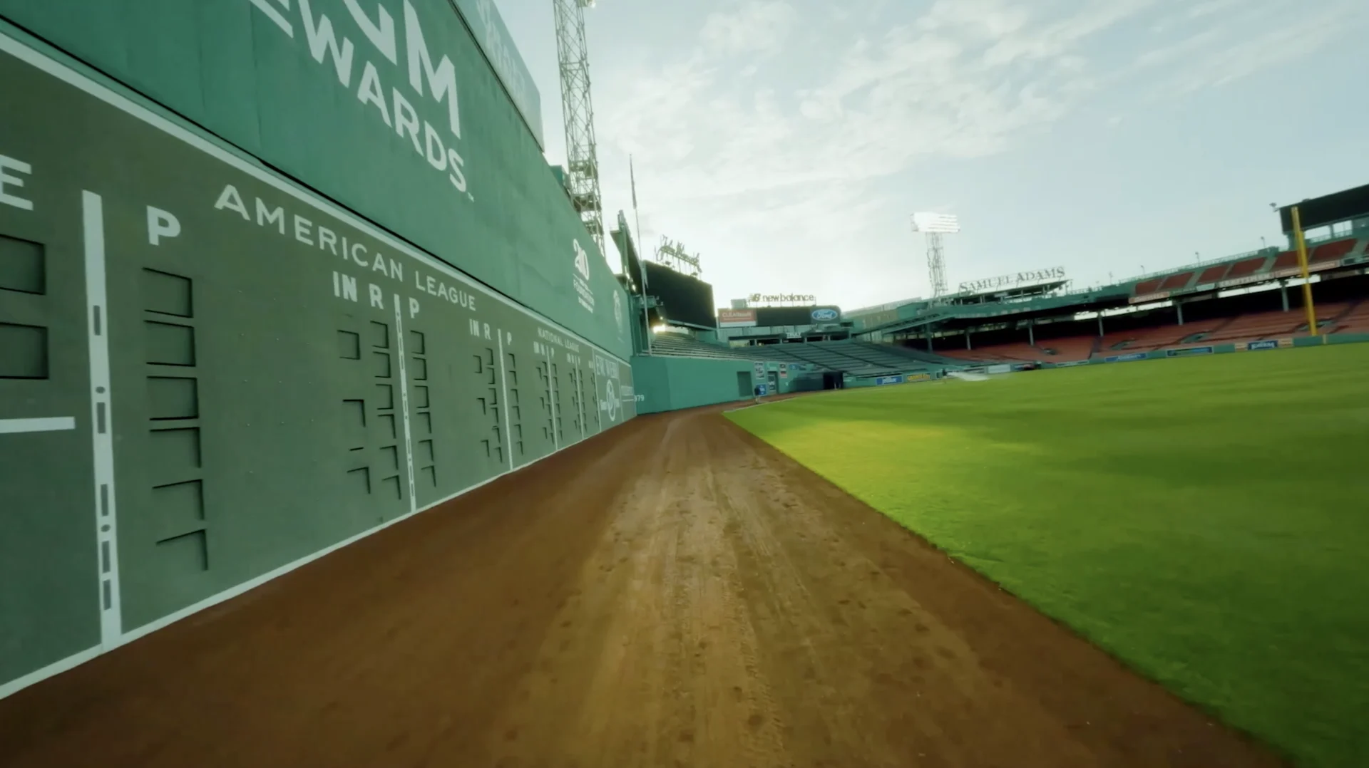
The Green Monster is the nickname for Fenway’s legendary left field wall, and became the anchor of our open. The lore around the wall and the history behind the ballpark led to the concept of ‘If this wall could talk’, which gave us a strong direction to begin storytelling graphically.
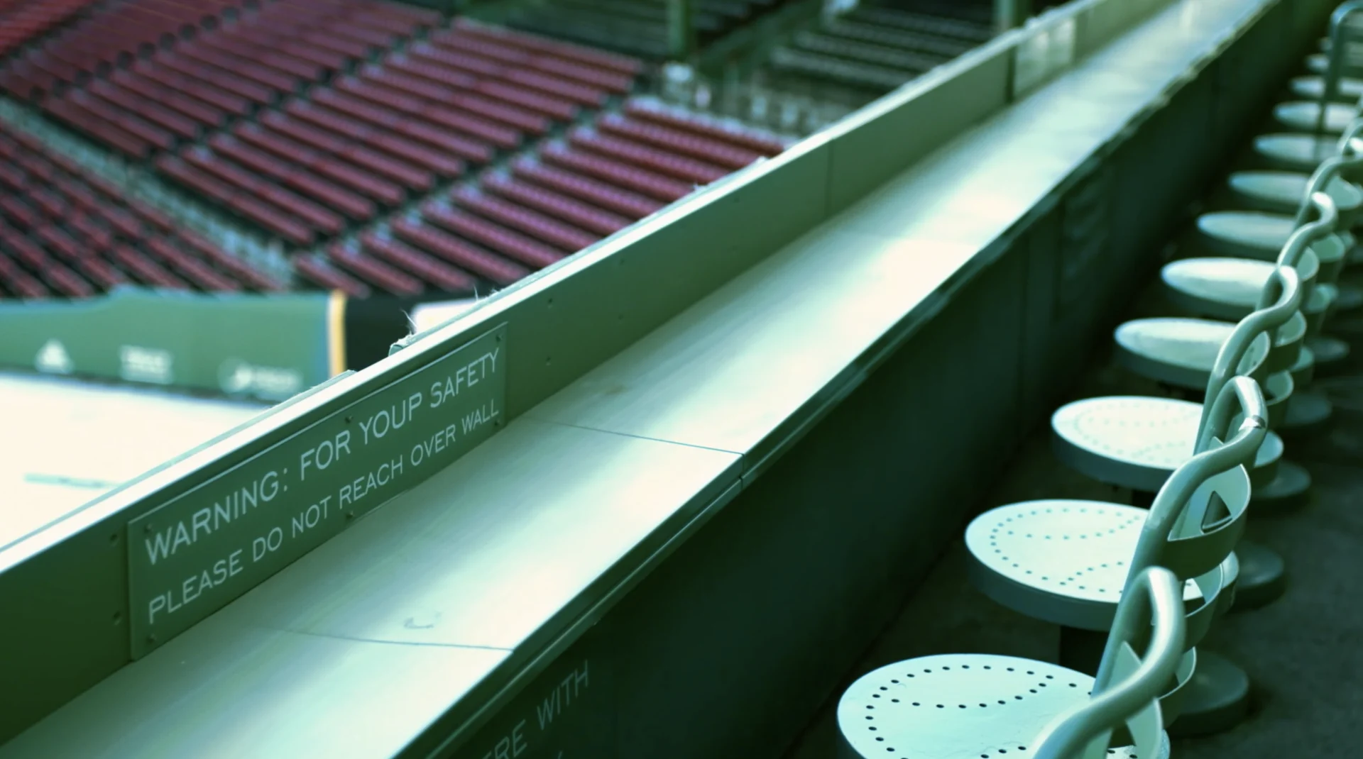
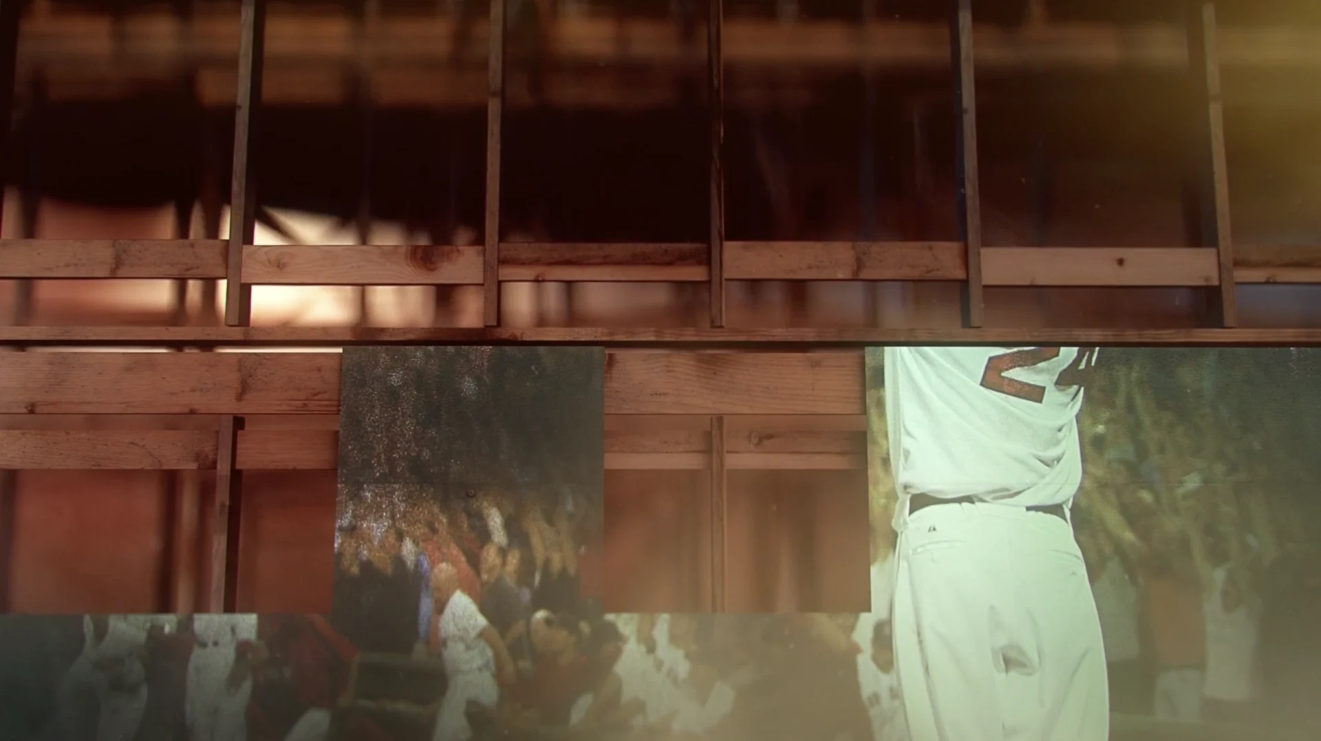
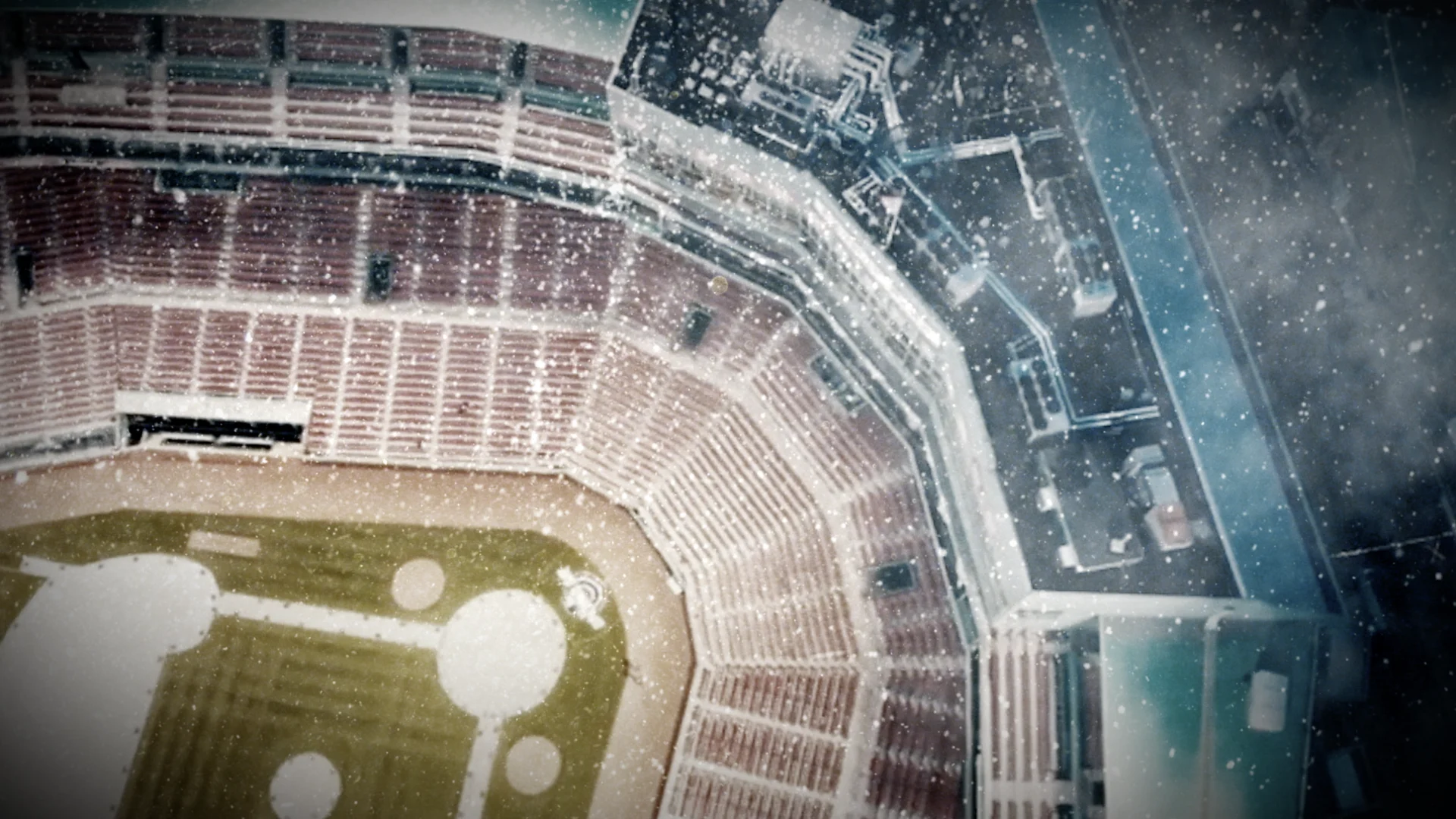
We created an experience within the 3-minute show open using the Green Monster’s POV to establish the Winter Classic as another piece of Fenway’s history alongside the historic baseball games, legendary rock concerts and prominent celebrities the stadium has hosted. To establish this POV, we used CG to render a space behind the Green Monster and move through it while using that imagined corridor as a basis to project archival footage.
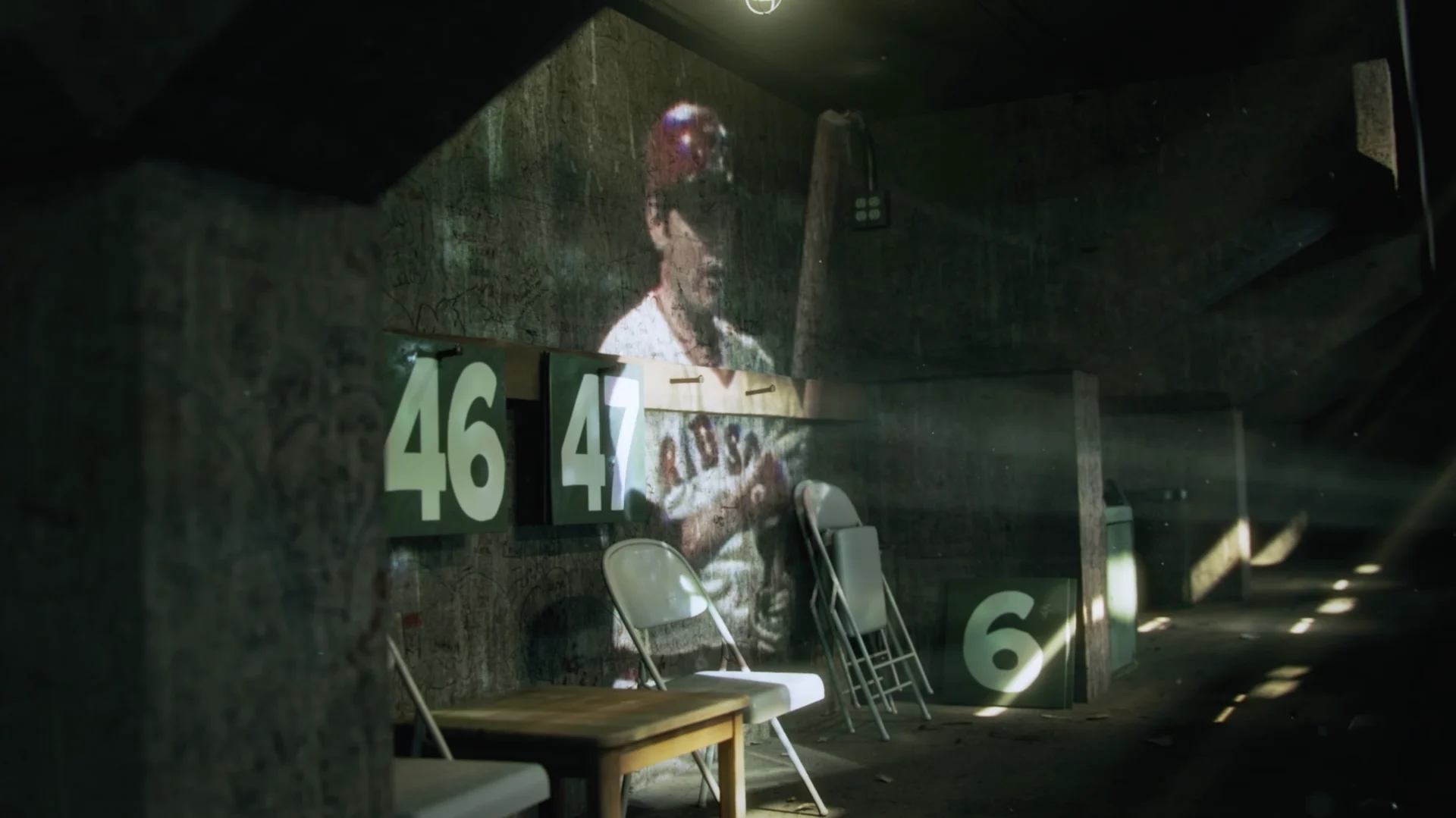
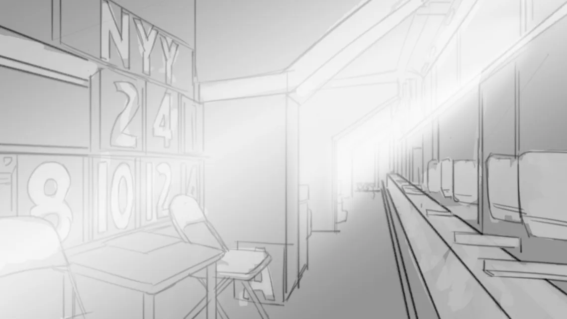
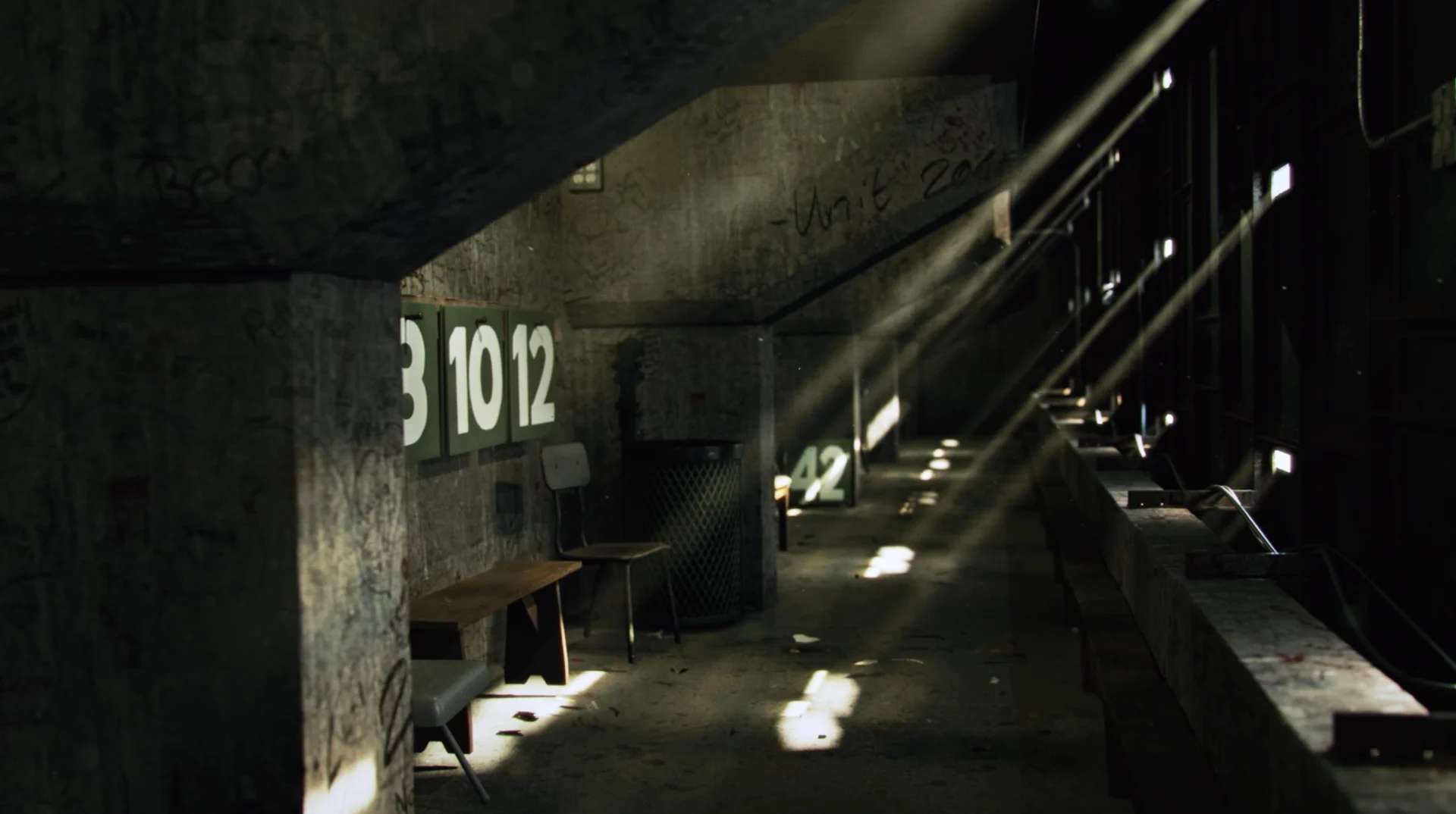
This ‘behind the wall’ concept really worked for us to create a narrative graphically and was something we leaned into strongly. Conner O’Brien designed the CG for behind the wall and rendered it in Arnold to achieve the photoreal look we were going for - something we're excited about doing more of in the future.
NHL Winter Classic 2023 (cont)
The NHL Classic always occurs around the first of the year, so we worked quickly to promptly deliver the spot before the end of the year. In addition to the CG elements, we treated archival footage with an interesting 2.5D technique to add dimension, and designed some really slick looking player composites. We tried out a few other elements, such as a 3D creeping ice growth around the stadium, that didn’t end up in the final edit.
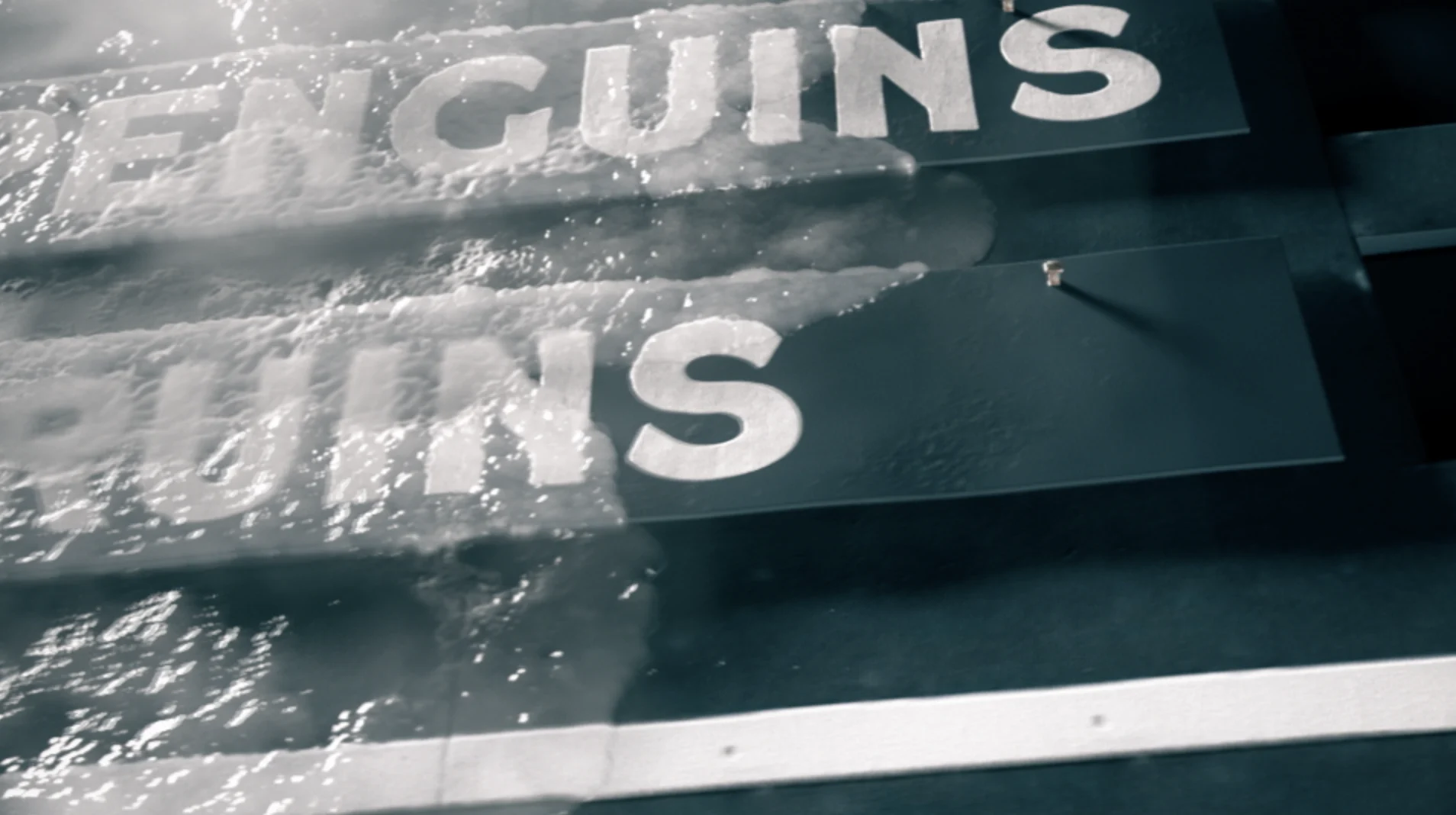
The show open successfully establishes the Winter Classic as an event worthy of the iconic ballpark and manages to deliver a history of Fenway and the Green Monster while also hyping up excitement for the fan-favorite game. Thanks to our partners at Turner Sports for trusting us to design for this bucket list event and congratulations to the hometown Bruins for taking home this year’s win.
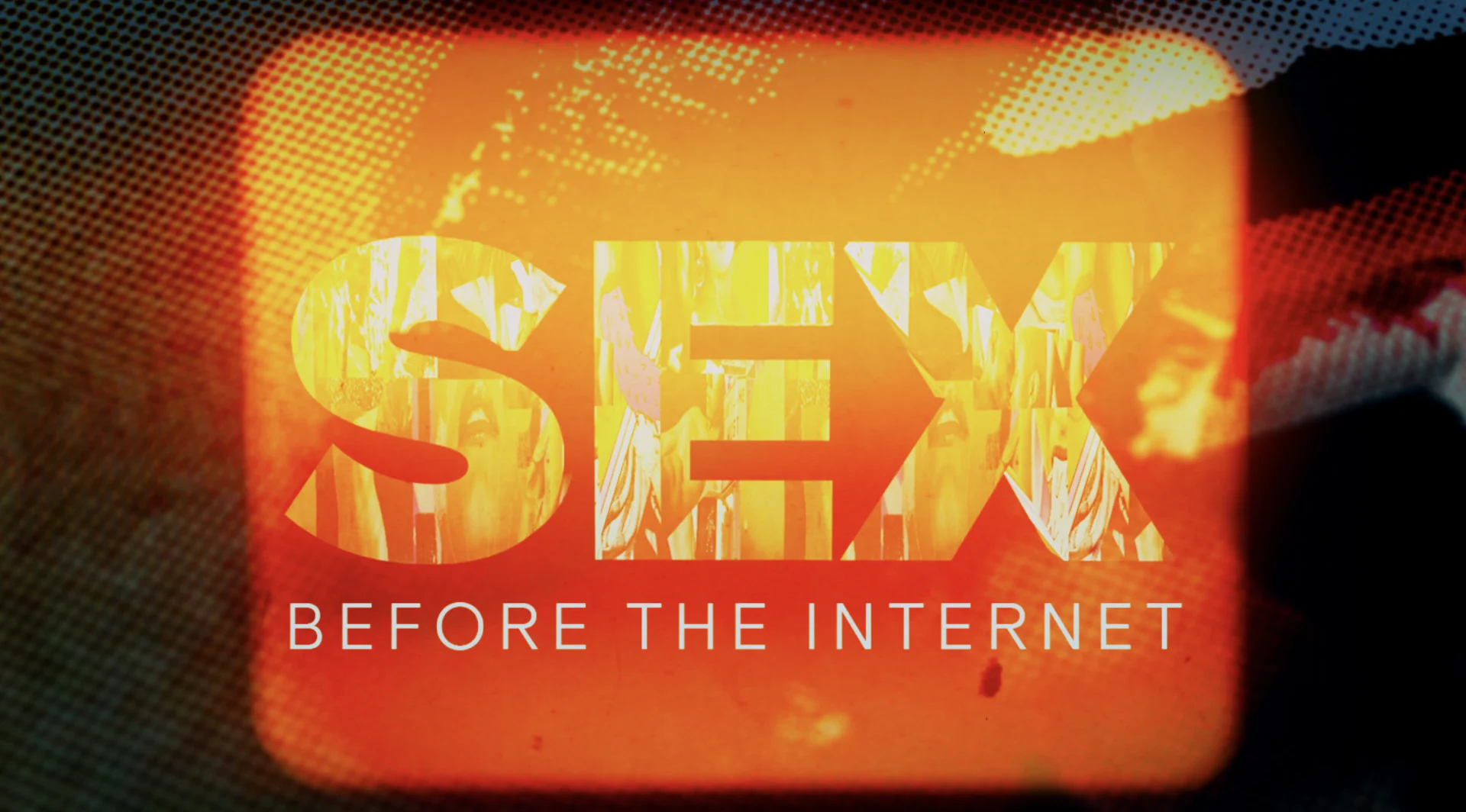
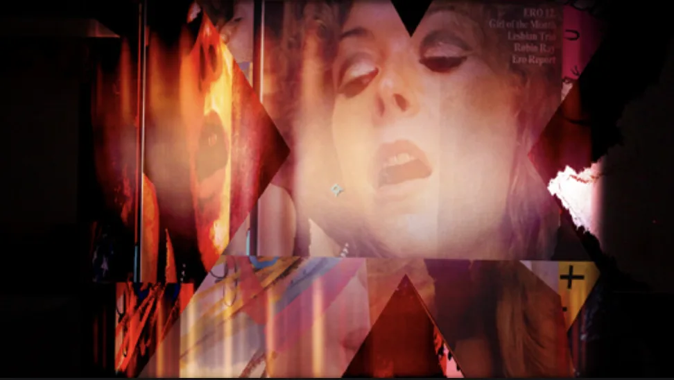
Hot and Raw
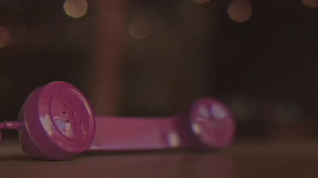
Sex Before the Internet
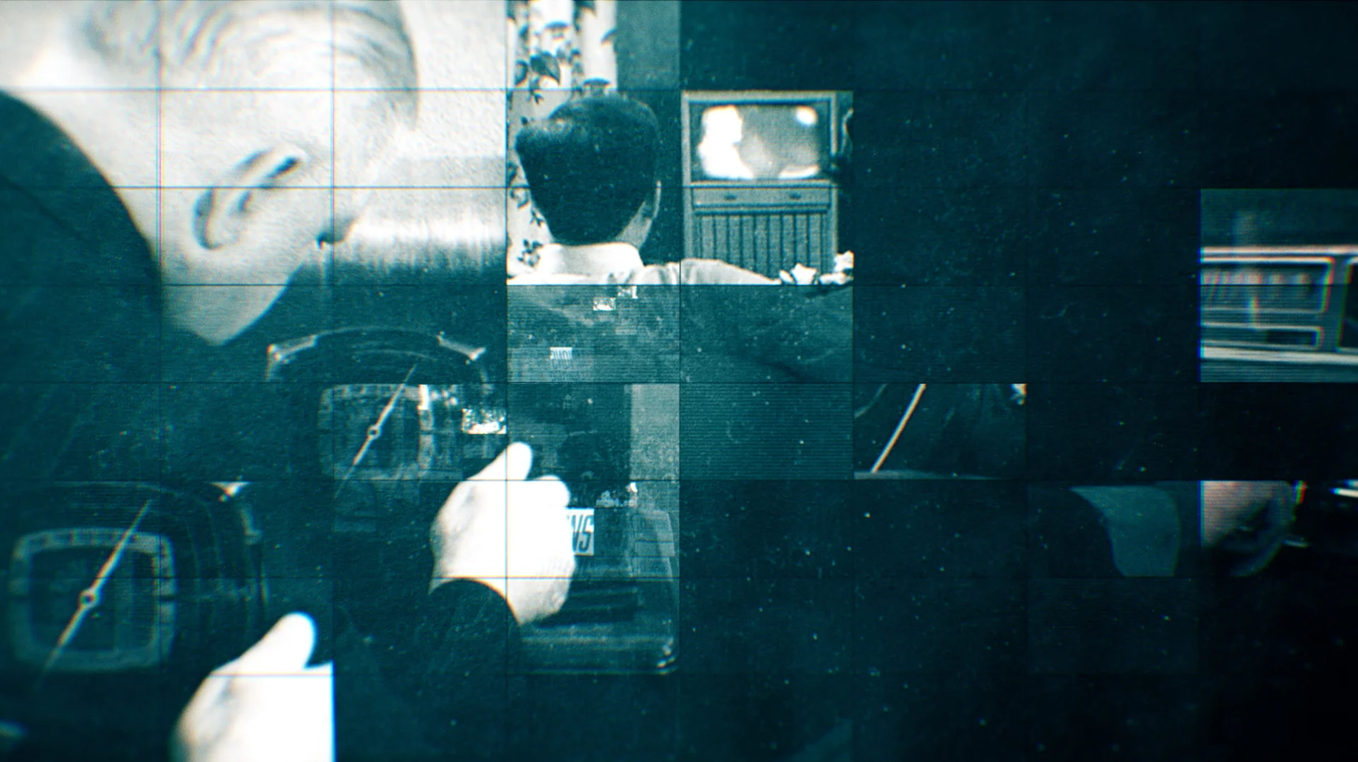
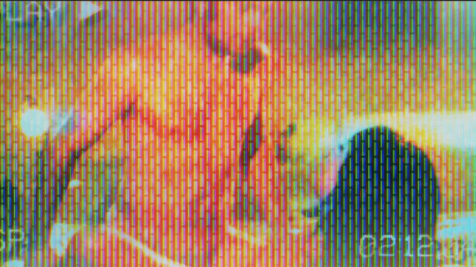
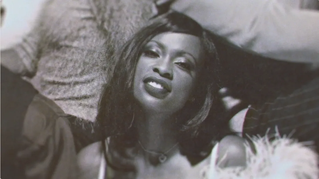
The steamy content of the series and the analog era in which the story unfolds gave us some great inspiration for our design direction. Our clients wanted something authentic to the time period and very up close and personal- just like sex itself.
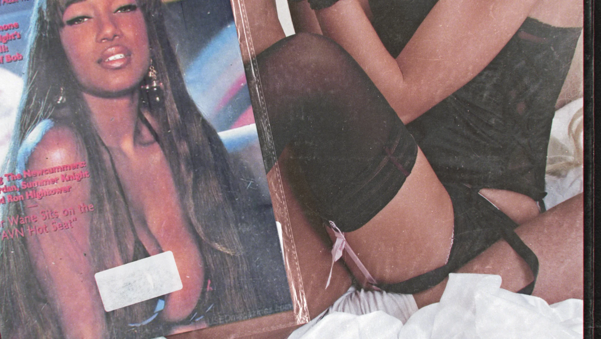

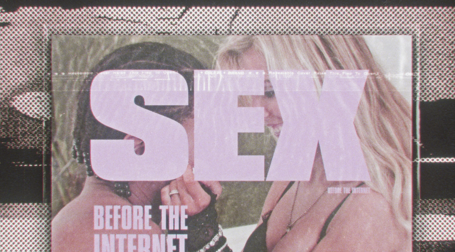
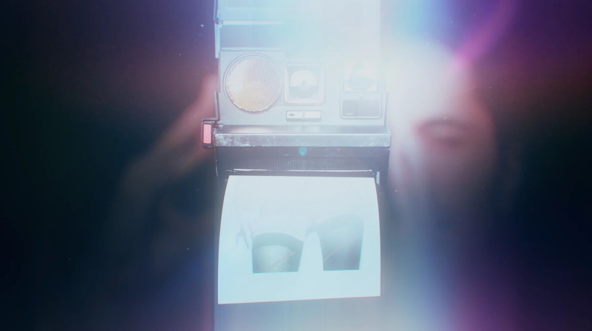
To achieve the intimate look and feel for the title sequence, we kept to an analog approach using vintage film treatments on the archival footage we received. It was important to hint at the sexual nature of the show without being overly explicit, so we utilized a lot of texture, typography and zoomed in body parts to land on a bold and confident style.

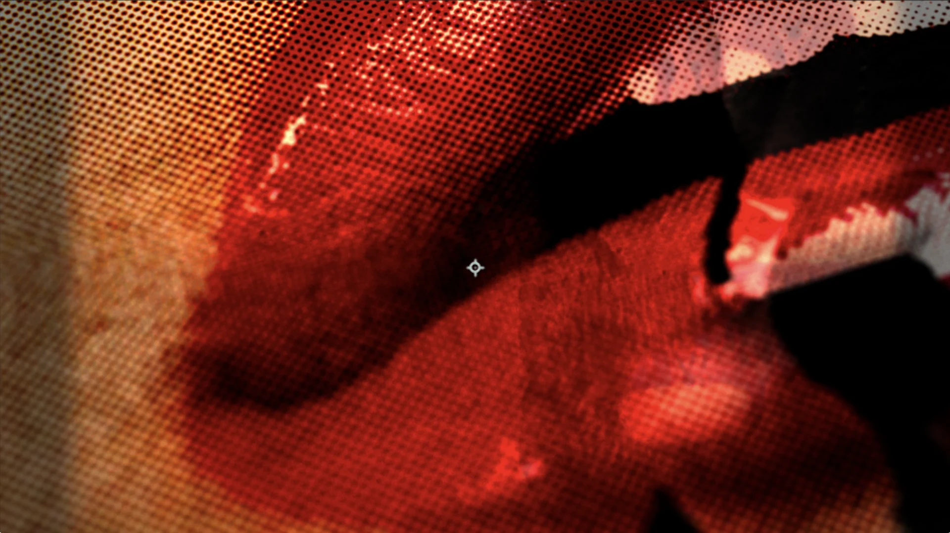

The film’s producers handed over a massive volume of archival footage, so we went the route of creating user friendly templates to provide all sorts of different framing and even camera movements for our clients to be able to use throughout production. The toolkits we designed for them were simple in nature but had a ton of range and variety, ensuring that the texture and light leaks from the Kodak and Polaroid style footage was consistent and visually appealing throughout.


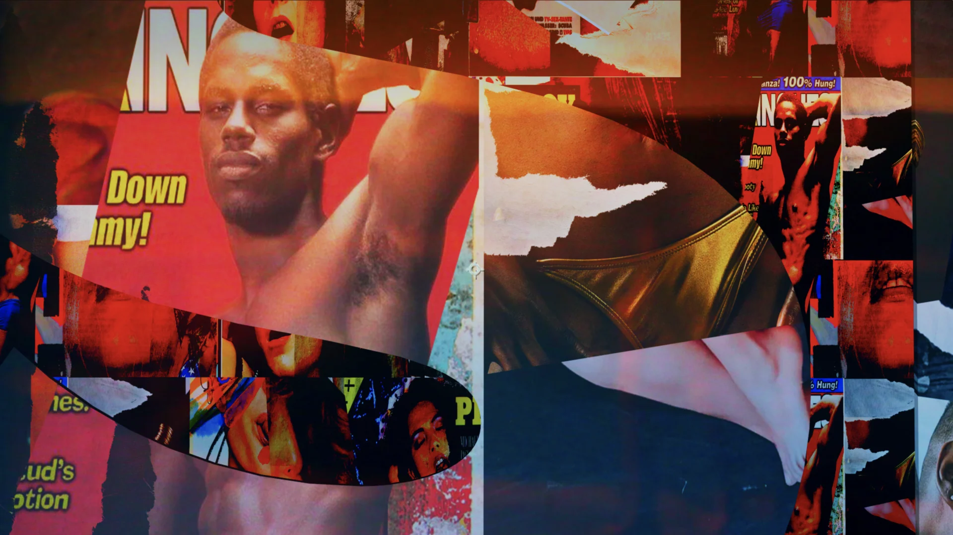
Interior Graphics
The project moved at a tight pace, so we moved fast to include as many era-authentic details as possible. Our art director, Padraic Driscoll, maintained the consistency of the treatments throughout— look to the layers of grain and distressing on the VHS covers for a great example of subtle artistry that perfectly fits the era.
Paddy also made motion graphics templates for all of the type design for our clients to use and quickly turn the work around for each episode. While this type of deliverable is standard, Paddy’s ability to problem solve for our clients’ preference to use After Effects on their end made for a particularly seamless toolkit element.
The series dropped to rave reviews and has been attracting a cult following as it airs— tapping into a key moment of nostalgia for viewers and offering a glimpse into the titillating history of a subject that seems almost overdone, now. We enjoyed working with the Vice and Aquitania teams and can’t wait to collaborate on more spicy content with them in the future.