March 31, 2023
Volume 54
Client
IPC, CNN
Reality competitions are the focus of this Spotlight as we graphically tell the story behind the spectacular downfall of the HQ Trivia app in Glitch and how we mapped and scaled mountains for the HBO Max competition series The Climb
Epic flop
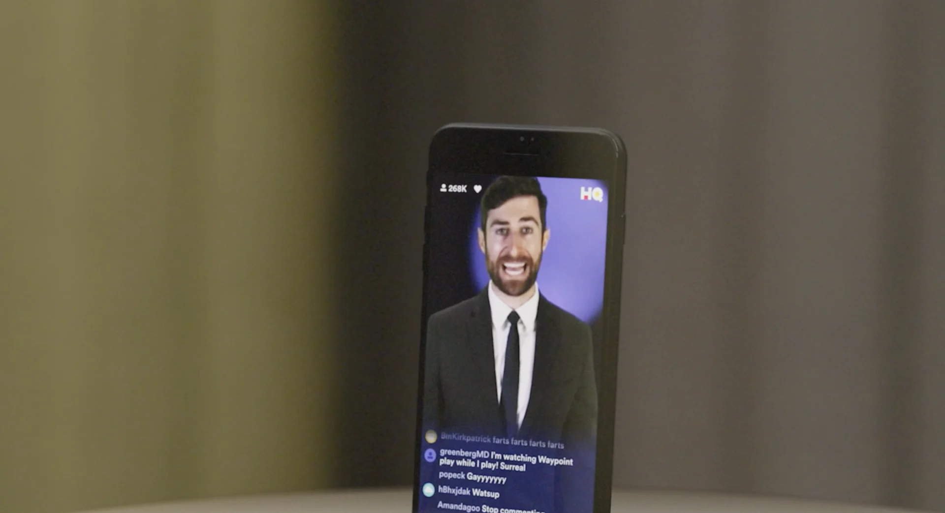
Glitch: The Rise and Fall of HQ Trivia
We’re a standardly online bunch at BigStar, so were familiar with the app and its moment of virality, but not so much with the story behind its rise and fall. Only when the film’s producers at Left/Right approached us and detailed the behind-the-scenes drama that took the app down did we know we had to be a part of telling the story of the brief game sensation.
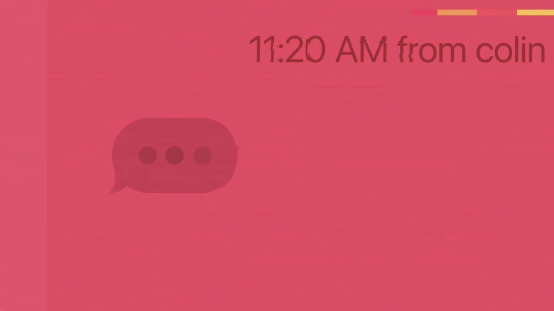
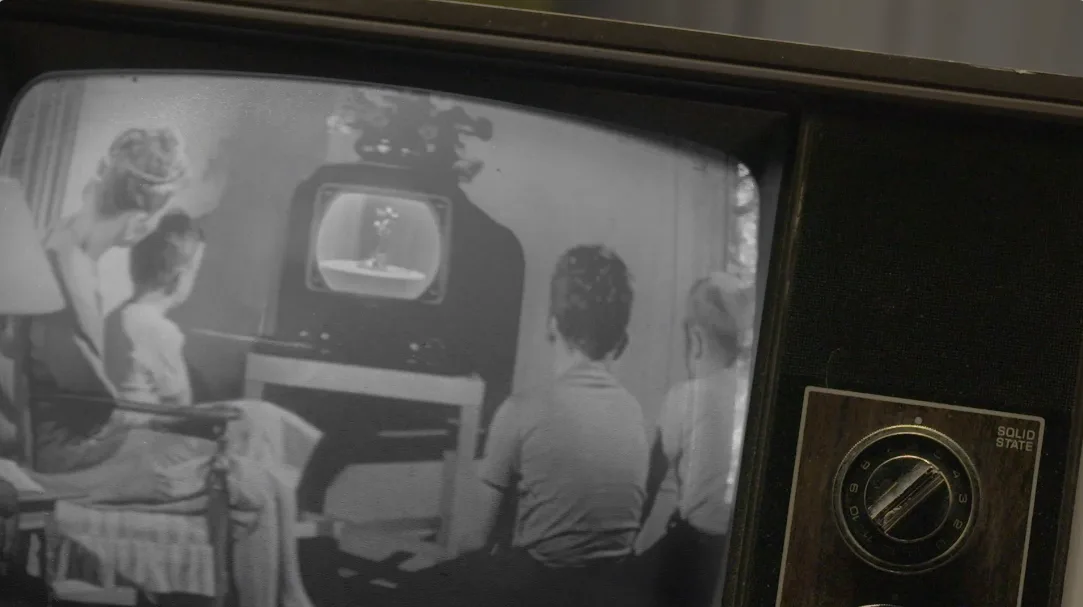
HQ went viral during a time in tech that could aptly be summed up as, ‘move fast, break things’— an ethos we used to guide our design for the film. We didn’t want the film’s design to mimic the app’s look in an overt way because that was something that was already established and would appear throughout the film.
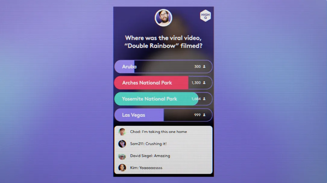

In our design exploration, we set up three modes that would take viewers through the dysfunctional progression of the app graphically. The three modes included a crystal clear mode where everything was functioning fine as the game kicked off and hit the scene. Then, as the app gained popularity and started to suffer technically, we transitioned to the second mode where you can tell things have started to go wrong. The final, third mode is the shitshow, which funnily enough was the film’s initial working title.


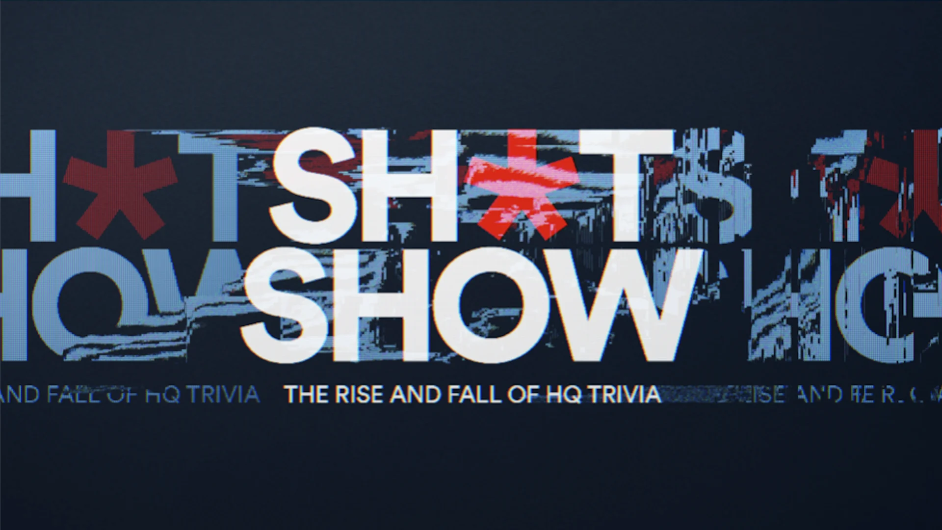
While Sh•tshow didn’t stick as a title, the final title, Glitch, was inspired by the graphic evolution of our design. Our design touched almost every aspect of the film from TV and phone comps to tweets, headlines, trivia questions, player counts, custom GIFs, mortises and the title sequence.
One of our favorite elements was designing graphics for the talking head interview portion of the documentary— something we usually don’t have too much interaction with in a film. Here, however, we got to add some levity to the interviews and specifically showcase host Scott Rogowsky with some bespoke custom graphics that really round out the storytelling.
Design Director Ross Henderson concepted some of these quirky elements and really put a memorable spin on the graphics.
Film Design cont.
Seeing the film come together was the culmination of the effort of a lot of hard work and creativity. The film strikes the perfect balance between accuracy and levity— sharing the details behind the dramatic story of the HQ app and also the fun that was had during its heyday. Glitch is airing now on CNN and will debut on the HBO platform sometime next month.
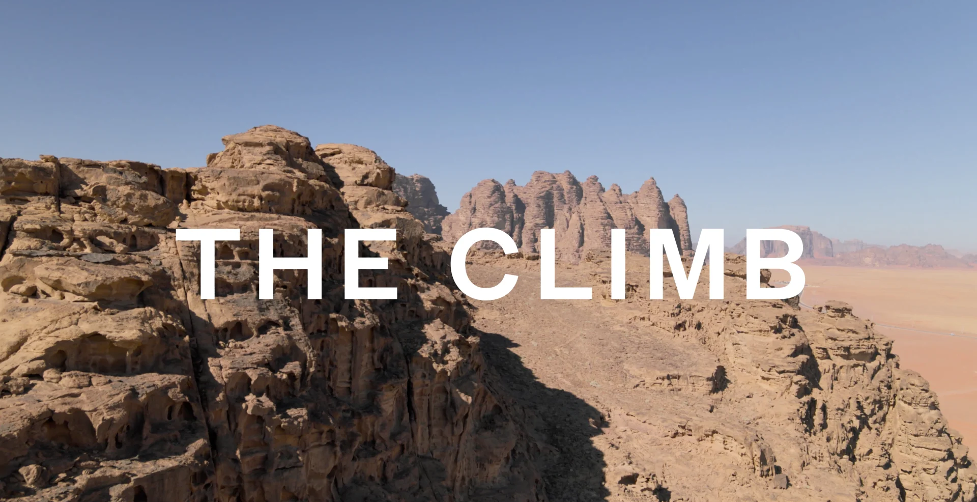
Don't Look Down
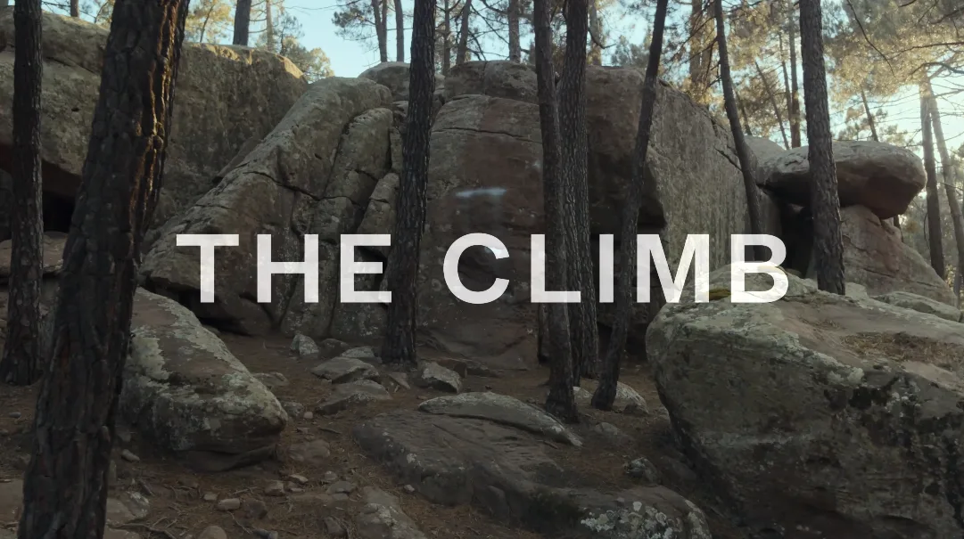
The Climb
In The Climb, HBO Max’s climbing competition show, amateur climbers compete for a cash prize while scaling some of the most picturesque peaks alongside hosts Jason Momoa and Chris Sharma. We enthusiastically joined the project via our partners at IPC to design the series, excited to blend some technical artistry with the natural beauty of the show’s landscapes.
From the outset, the project felt meant to be. We had a solid design premise and our background in designing beautiful yet technically accurate maps set the stage for a productive timeline. Given a blank slate by the showrunner, we had full rein to figure out how we wanted to build something fantastic for the maps of the different climbs each episode highlighted.
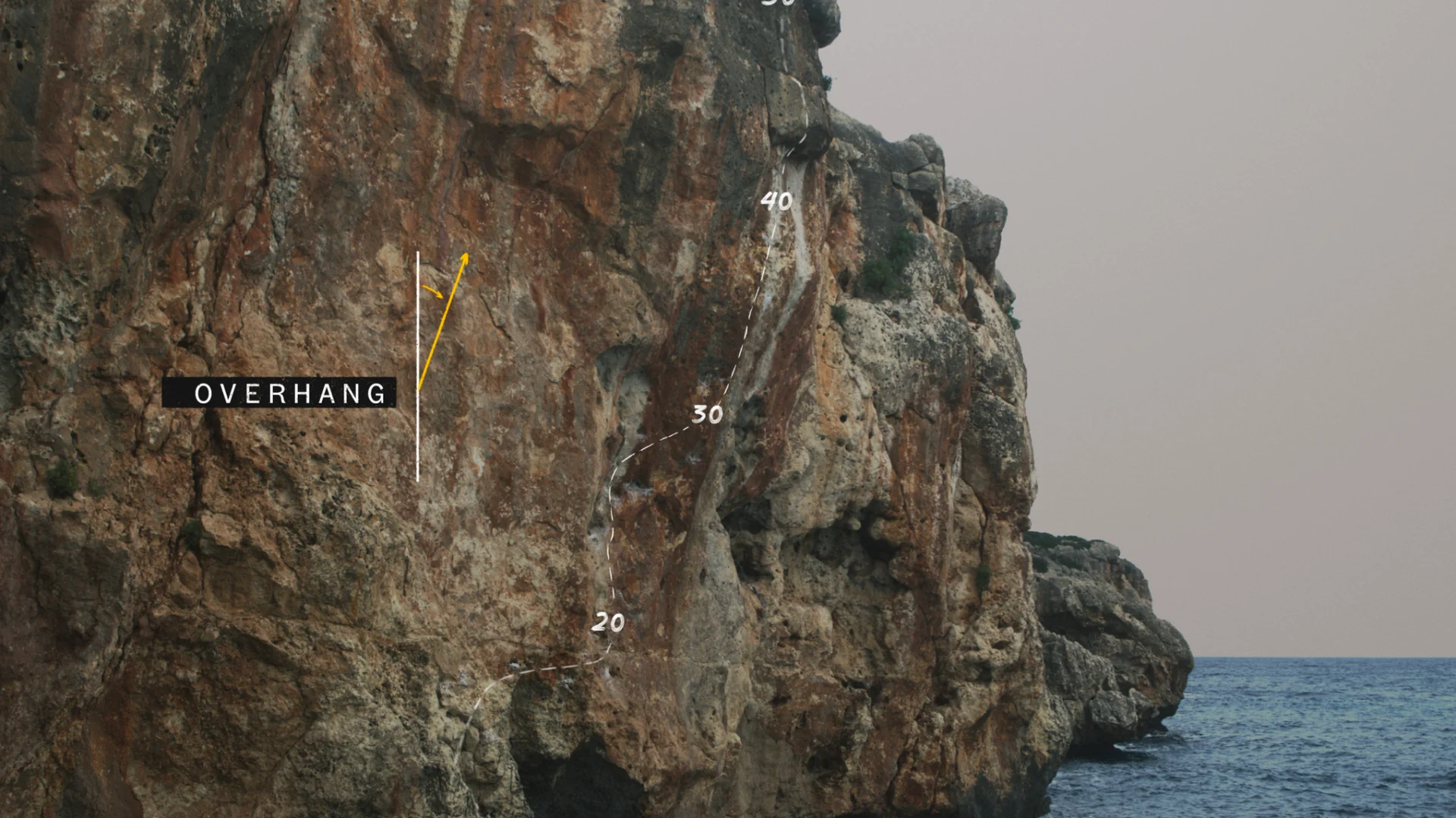
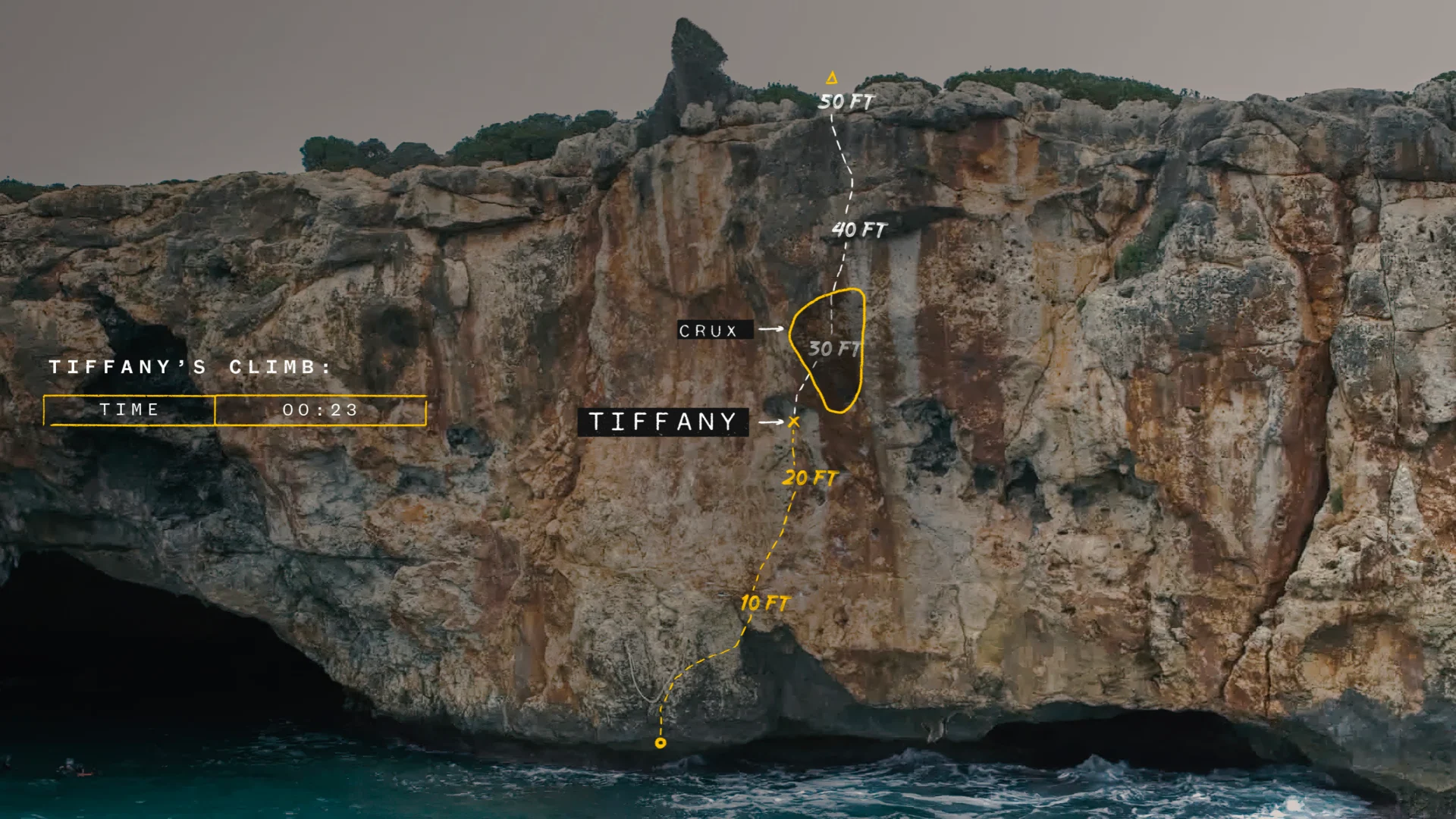
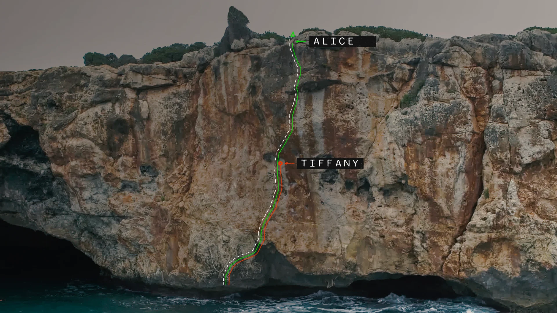

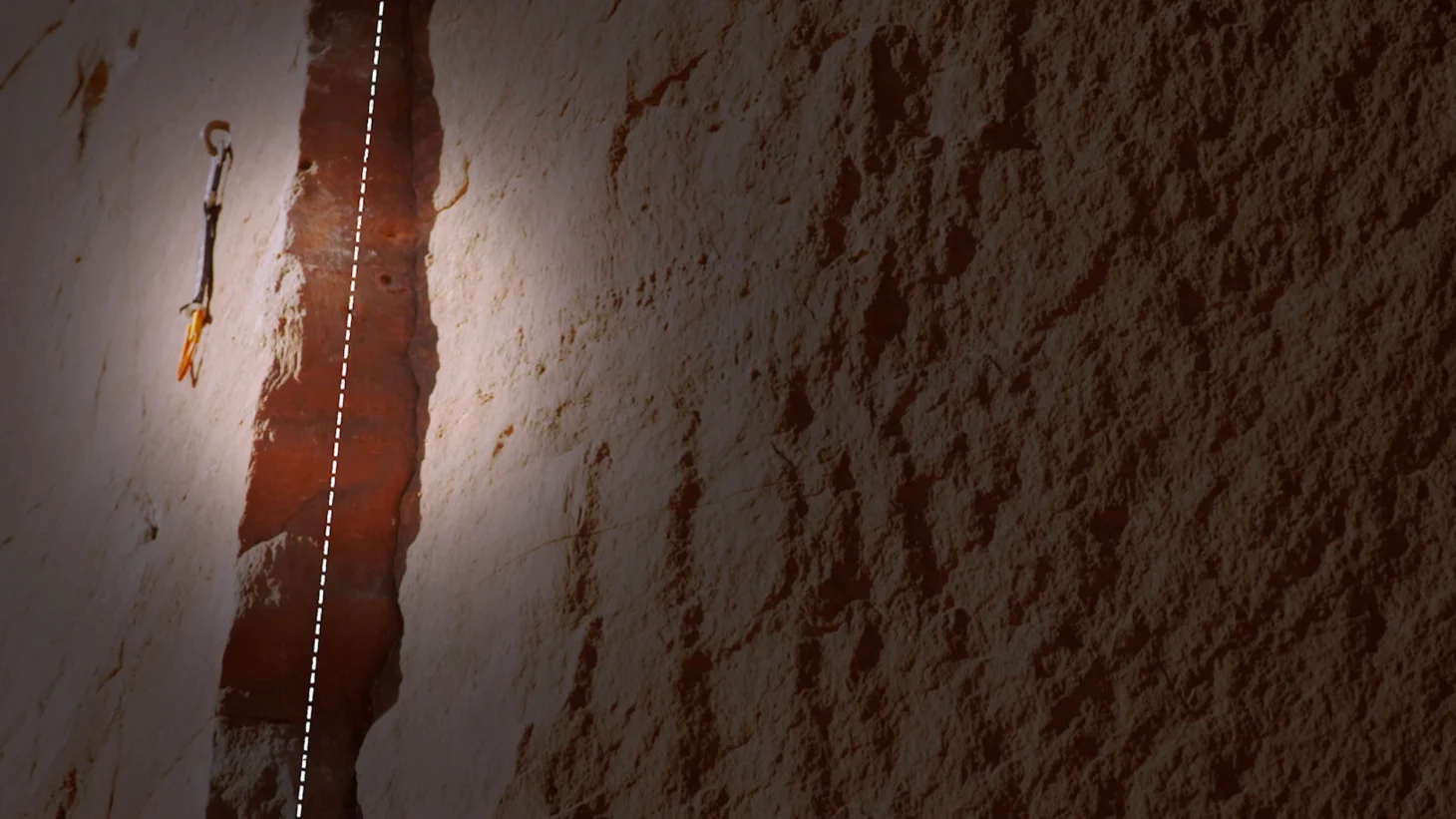
Accuracy was a key focal point for us- conveying the climbers’ paths trekking the trickiest rock faces in the world and also explaining to the audience the technique involved and the ways to approach the climb.

Each climb originates at the ‘root’ at the base and we developed a design language to navigate moving the markers along the trail path both for accuracy and to increase audience fluency with the climbing lingo. We also designed our maps to differentiate between heights, hand and footholds, belay points, crack and anchors and the route itself, all composited on top of actual photography.

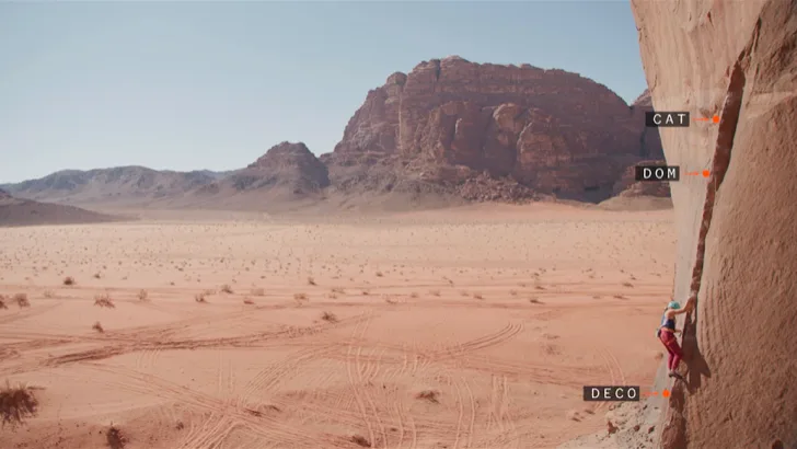

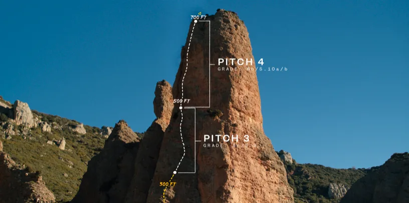
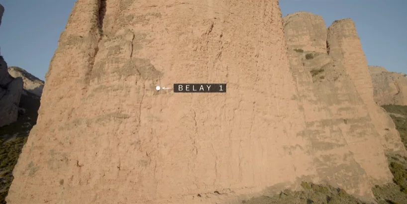
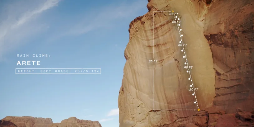
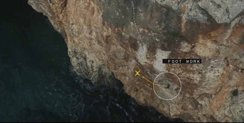

If the topography was in any way inaccurate we would adjust our design to correct and ensure the viewers were seeing the most technically precise version of the climb possible. The end result is a clean design that has a sophisticated style and pulls together the components of each episode really beautifully.


Artist Chris Scales was the mastermind behind all of this technical design. He did a ton of research over the course of 6-7 months— essentially becoming a desk-bound rock climbing expert.
Presenting the visual guides of Chris Sharma’s climb routes was a very engaging process. It required great attention to detail to faithfully convey the physically imposing nature of each challenge. For someone with zero climbing experience, the strategic mapping of each climb felt like a window into the complex planning each climber faced when staring down the rock in front of them.
Series Design cont.
In addition to the custom maps we designed for each climb, we changed the logo lock-up each episode to reflect that setting’s unique topography. Each main title invoked and enhanced the episode— we designed them to be highly cinematic, going bigger and bolder for each one. We achieved this wow factor with the eye-catching end result thanks to input from the wonderful HBO team and even host Jason Momoa himself.
The series came together to be a stunning exploration of climbing and an exposition on the camaraderie of the climbing community. The best part of the sequences for us tied the technical aspects of the climb and the photography into the transitions in each episode, setting the stage for something cinematic and special. Thank you to our partners at IPC and HBO Max for letting us be a part of this special show.