hungry for more
Food Inc. 2
Client
Robert Kenner Films
In 2008, BGSTR worked on the Oscar-nominated documentary Food Inc. and fifteen years later we got back together with the film’s creators to revisit the food system in the film’s sequel.


Film Design
The filmmakers were inspired to make Food Inc. 2, during the pandemic when more vulnerabilities in the food system were exposed and they saw an opportunity to tell another part of the story they started with the first documentary. One focus of the sequel is the ultra-processed food that has taken over the country and its influence on rates of obesity and diabetes, which is something we carried through into our design.


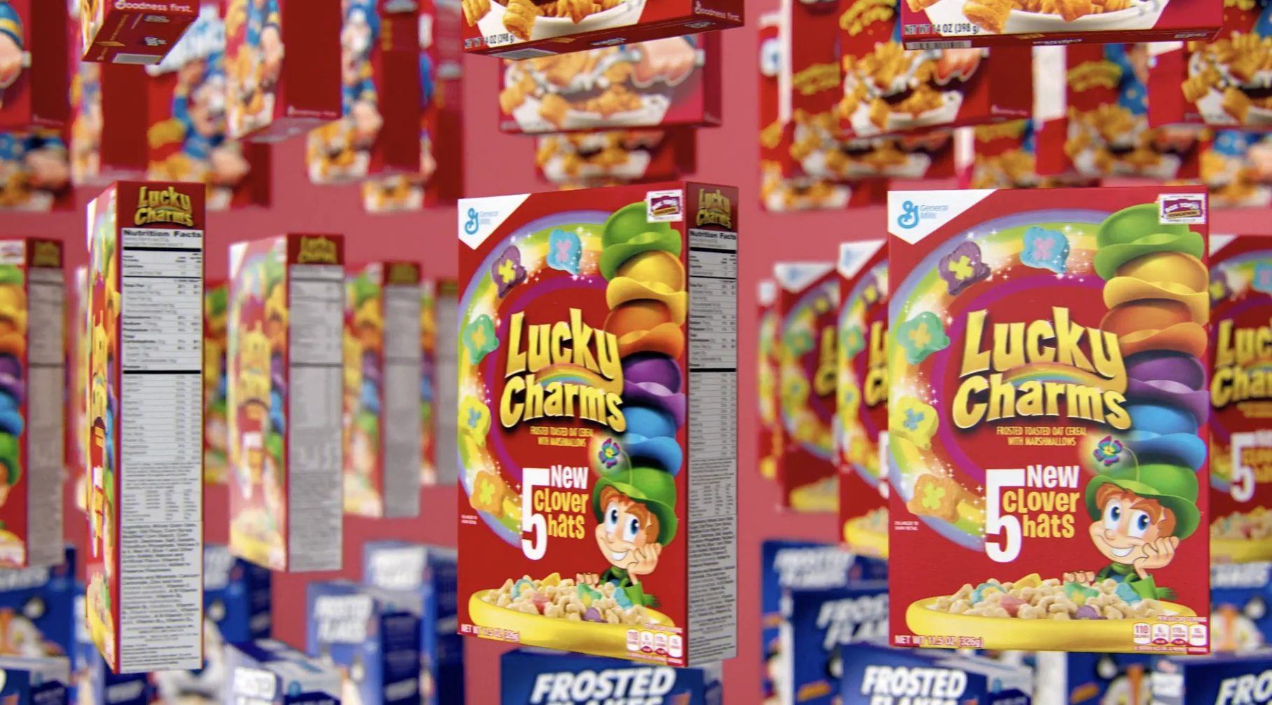
We leaned into the ultra-processed idea and developed several rounds of design riffing on the concept of glossy, plastic-feeling food. The bright style keeps the design of the film feeling exciting and fresh and cements it as a standalone film in its own right.
Because we were able to begin our design early in the development of the film, we had a highly collaborative relationship with our partners that began at kickoff and carried through the two years we worked on the film. Their creative input was essential in setting a direction for things like the logo, title sequence and interior graphics to influence the overall film design.


The 3D style we conceptualized for the overly processed food created a look that looked hyper real and then took it one step too far with a plasticky finish. This style was a great canvas for the information delivery we were focused on for internal graphics— sharing pieces of information about the products in discussion and explaining how they are bad for you.


We shot a lot of these products in-studio, buying the products from the many food purveyors available in New York and Marvin Perez capturing the item. Then our 3D team would take the shots in After Effects and add elements there, designing what would become one of our favorite aspects of the film.

Title Sequence
When beginning a longer tail project, we approach the process with a mindset that takes the timeline into consideration. We began here by creating the umbrella brand for the documentary, starting with the title sequence.


The title sequence is a 1.5 minute animated journey through the history of food, starting with super illustrative basics and then ending with the ultra processed 3D food that sets the film’s design against the dystopian landscape of corporate agriculture ownership. The BGSTR team wanted to set an approach that was visually different and transition the look every hundred years or so— shifting the narrative and design language along with the time periods.


Call to Action


After spending over two years working on the design of Food Inc. 2, we’ve become deeply connected to the film’s message and the topics the documentary covers. We were honored to attend a recent screening of the film as part of New York’s Climate Week, and got a thrill from the interesting conversations with the highly intelligent crowd and hearing how they interpreted reacting to information through our graphics. Congratulations to our partners on another incredible film!
Props where props are due
Credits
Food Inc. 2
EVP / Executive Producer Carson HoodFounder, Executive Creative Director Josh NortonVice President, Head of Production Virgil ConklinCreative Director, Designer Ross HendersonAnimation Director Casey DroginDesign Sohyun Park, Ann Kruetzkamp, Doug Chang, Idil Gozde, Riley Carson3D Design & Animation Conner O'Brien, Brian Landisman, Justin Nixon, Nick WoythalerAdam Afzali, Padraic Driscoll, Brian Landisman, Sohyun Park, Ayden Ackerman 2D AnimationStoryboard Artist Kurt HugginsStop Motion / Live Action Photography Marvin Perez