Boardwalk Pictures
Home Game
The original Netflix docu-series, Home Game, explores the excitement and cultural significance around unique competitive sports all across the globe.
View ProjectShifting Perspective
Client
NYT Documentaries
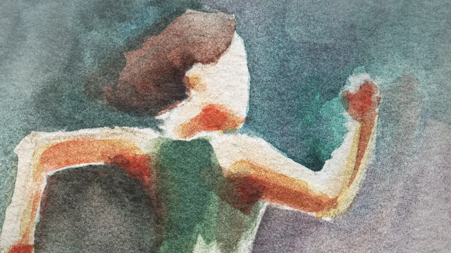
We did the design for this short film from director Kate Novack about the only Sigmund Freud case study written about a woman. Our design elements include watercolor illustrations, photography treatments and a font based on Freud’s handwriting.

Shifting Perspective
Teaming up with director and writer Kate Novack, we worked to bring this powerful, perspective-shifting short film to life.

In order to start putting all of the pieces together, editor Steven Ross joined Kate and the BigStar team to build a cut. We had an initial structure in the re-creation of the woman, Ida, casting a modern actress to recount Ida’s experiences during Freud’s analysis. To add emphasis to the telling of her story, we wanted to integrate timely cultural artifacts into the visuals.
Pulling from art, popular films, news footage, senate hearings, vintage commercials and more, the film began to find its unique voice. Our design concepts stretch across the film, from our treatments to old archival films to our main character cards to Freud’s own cursive writing.
As the edit evolved and we began design exploration, we were inspired by Austrian typography, French New Wave, and matte, bold colors for the overall look. These design concepts stretch across the film, from our treatments to old archival films to our main character cards to Freud’s own cursive writing.
Along with the archival footage of Freud, the film threads Ida's story with other historic moments like Christine Blasey Ford and Anita Hill's testimonies, drawing parallels on society's treatment of women. We wanted to remain sensitive to the subject matter, while still grounding it in reality. Artists Carol Cai and Jane Wu took to painting beautiful watercolors, which were then scanned and animated frame by frame. The watercolors reflect moments in time: painted dark and colorless when certain parts of the story are being told and transitioning to full color in moments of freedom or relief.


We were also interested in the artfulness and representational nature of seemingly plain objects- placing them within stark, bold colored backgrounds gave them context and related them back to Freud.


Ending with Ida reading the back of Freud's book, we use a clean, concise typewriter font reflecting on his final conclusions.
The film was selected by SXSW and aired as a New York Times Op-Doc. It was a greatly rewarding experience for us to collaborate on the film and bring it to its final form - thanks to Kate Novack for bringing us into the fold!
-BGSTR
Props where props are due
Shout out to the BGSTR team who put it all together.