Symbols and Stories
Iconic America with David Rubenstein
Client
Show of Force
ICONIC AMERICA: OUR SYMBOLS AND STORIES is an 8-episode nonfiction series from PBS that examines the history of America through some of its most iconic symbols, objects and places, diving deep into each symbol’s history and how its meaning has changed over time. BigStar partnered with the series’ creators to design the series and graphically assist the storytelling around these iconic symbols and how they can be used as a gateway to understanding America’s past and present.
Series Design
The design for this series was a unique ask— we were brought in to treat the entirety of each episode including photography and archival, so this was a big lift. Our goal was to collaborate with the show’s creators in a way that defines a really smooth workflow for everything and incorporates a cohesive design look across the series.
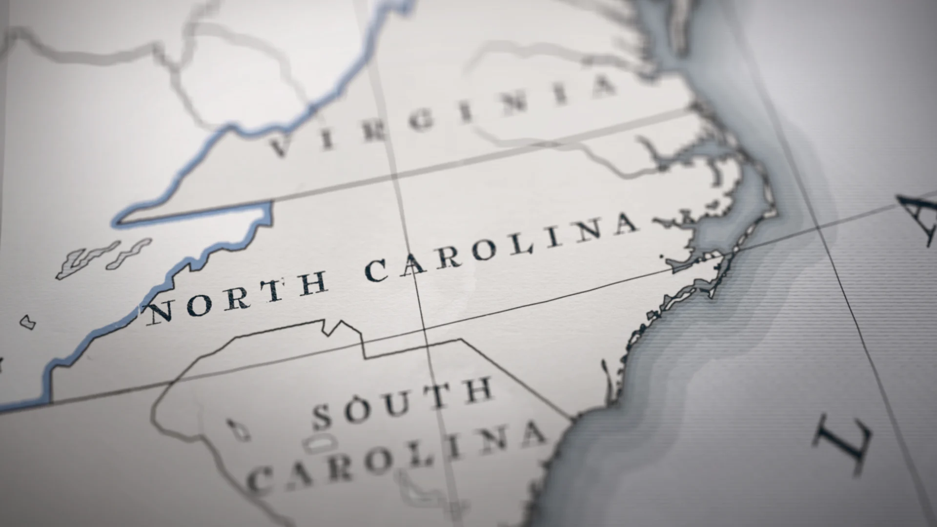
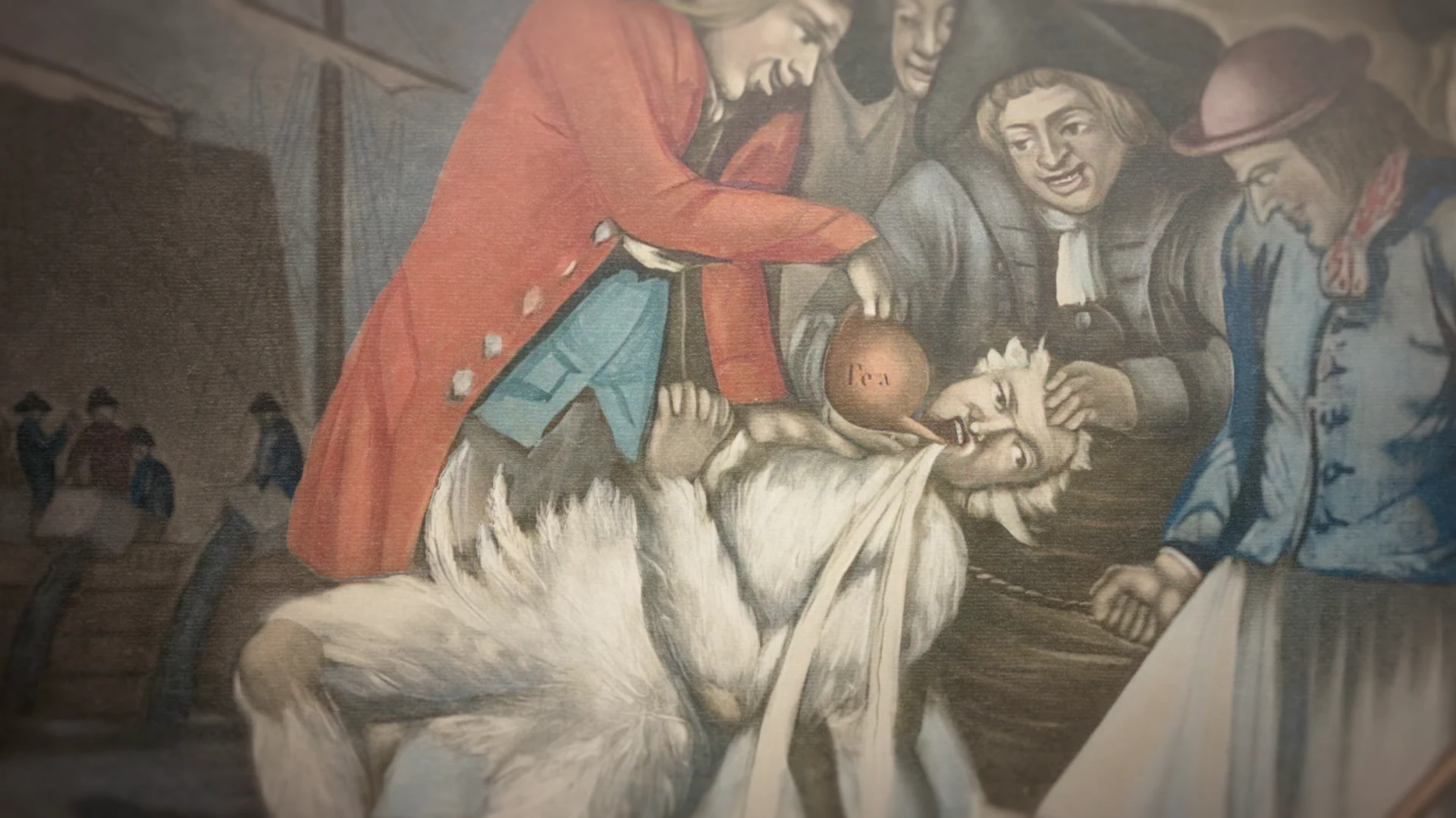
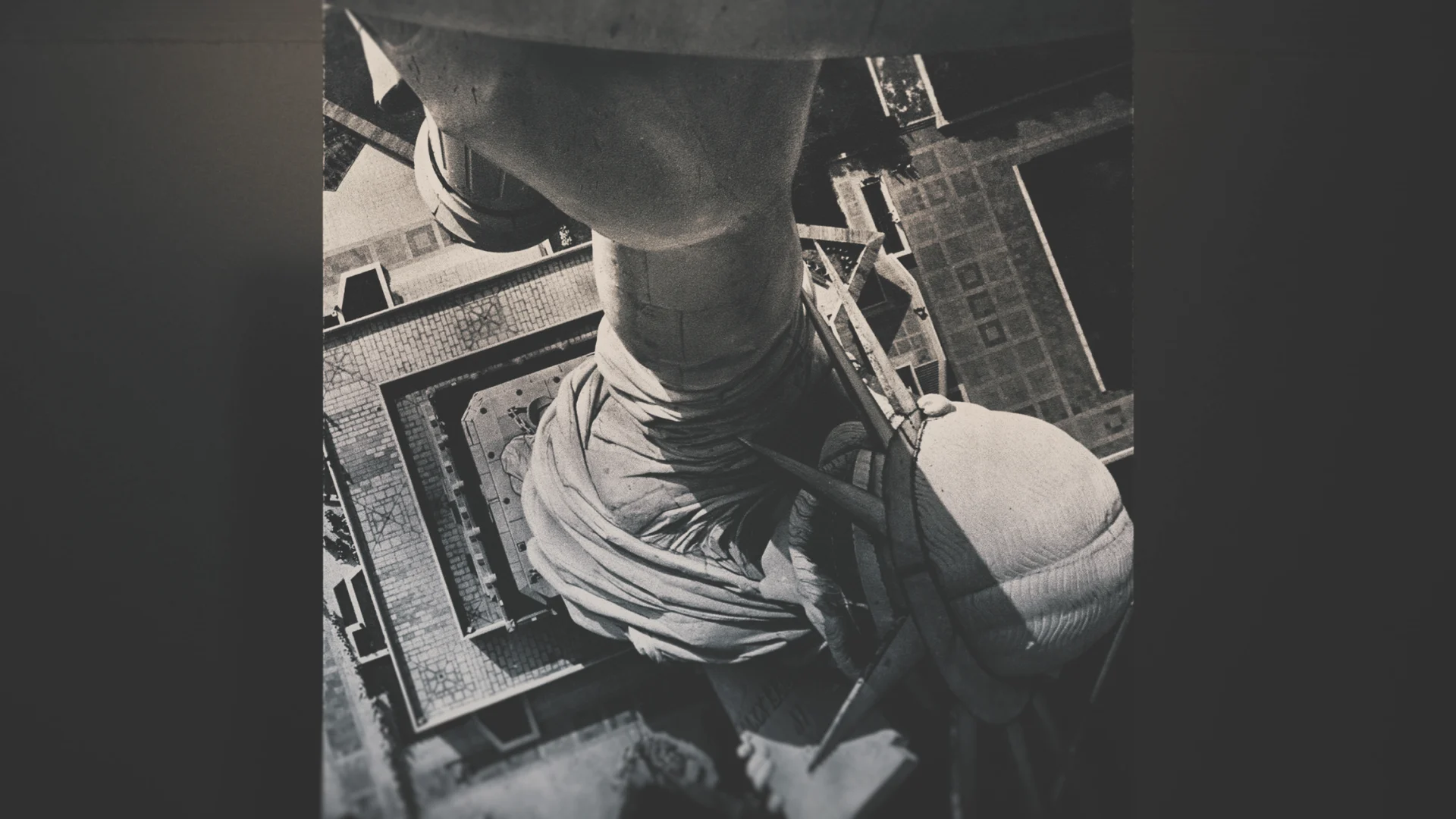
Luckily, our team had just come off a similarly dense project with Light & Magic, so led again by Creative Director Mark Thompson, we evolved what we had learned there and applied it to Iconic America, streamlining our overall process. Thompson’s strong rapport with the Show of Force team enabled us to design a visual language early on that would carry throughout the series’ design.
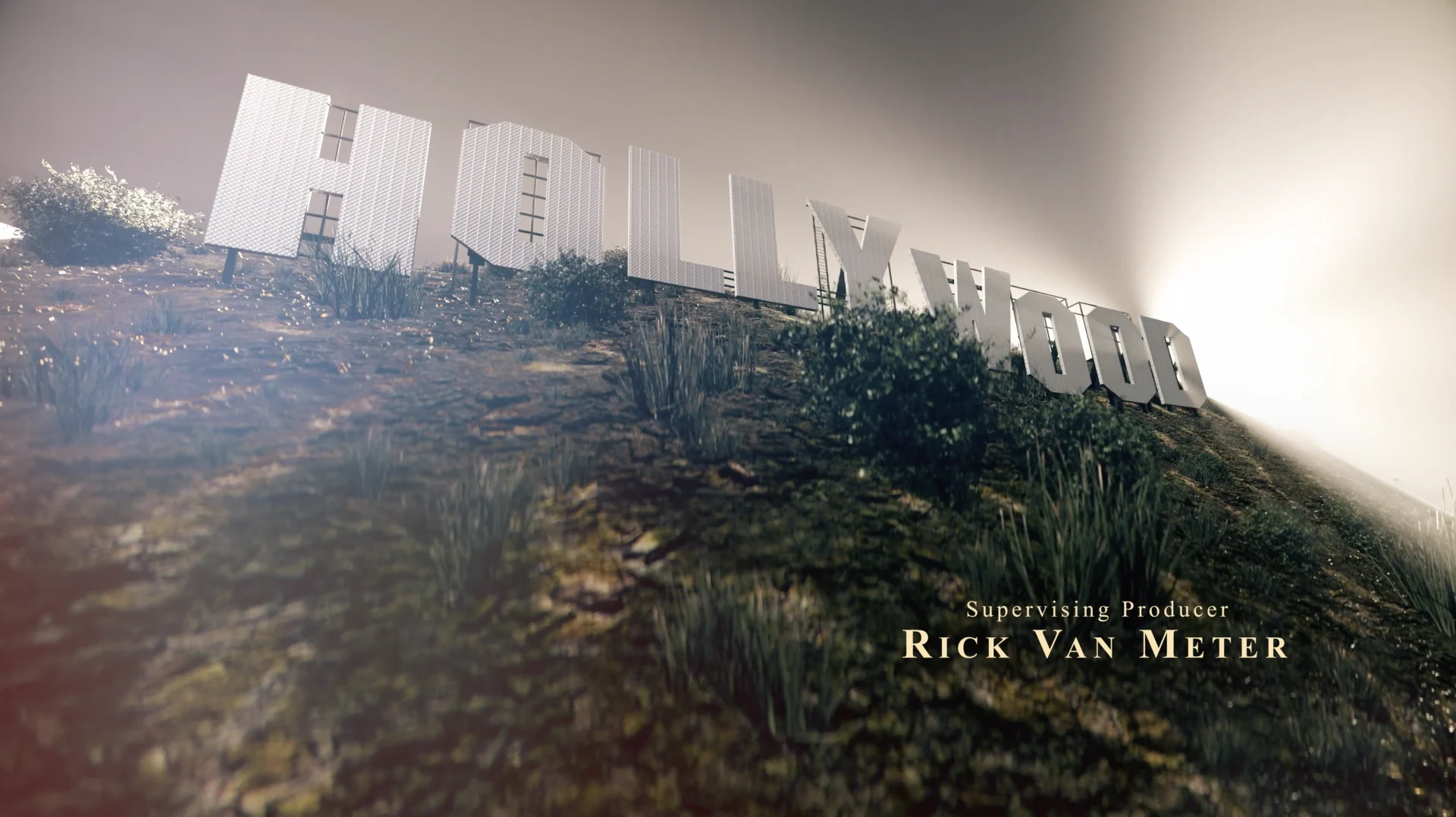
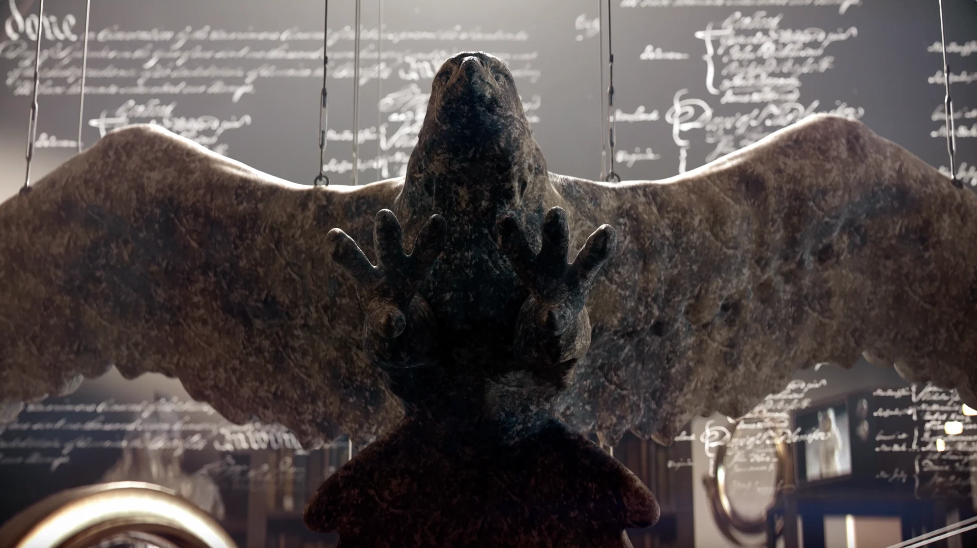
In each episode, host David Rubenstein — co-founder of the Carlyle Group, acclaimed philanthropist, and lifelong student of history — explores a symbol from history. From flags and statues to revered landmarks, objects that people live alongside and interact with history every day. Whenever we were introduced to a new episode, we would meet that team and talk through the specialized graphics.
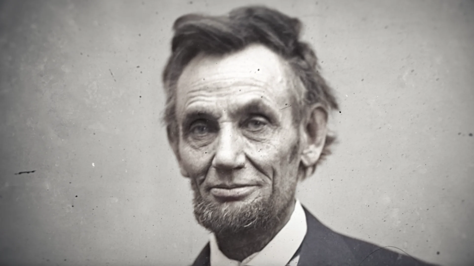
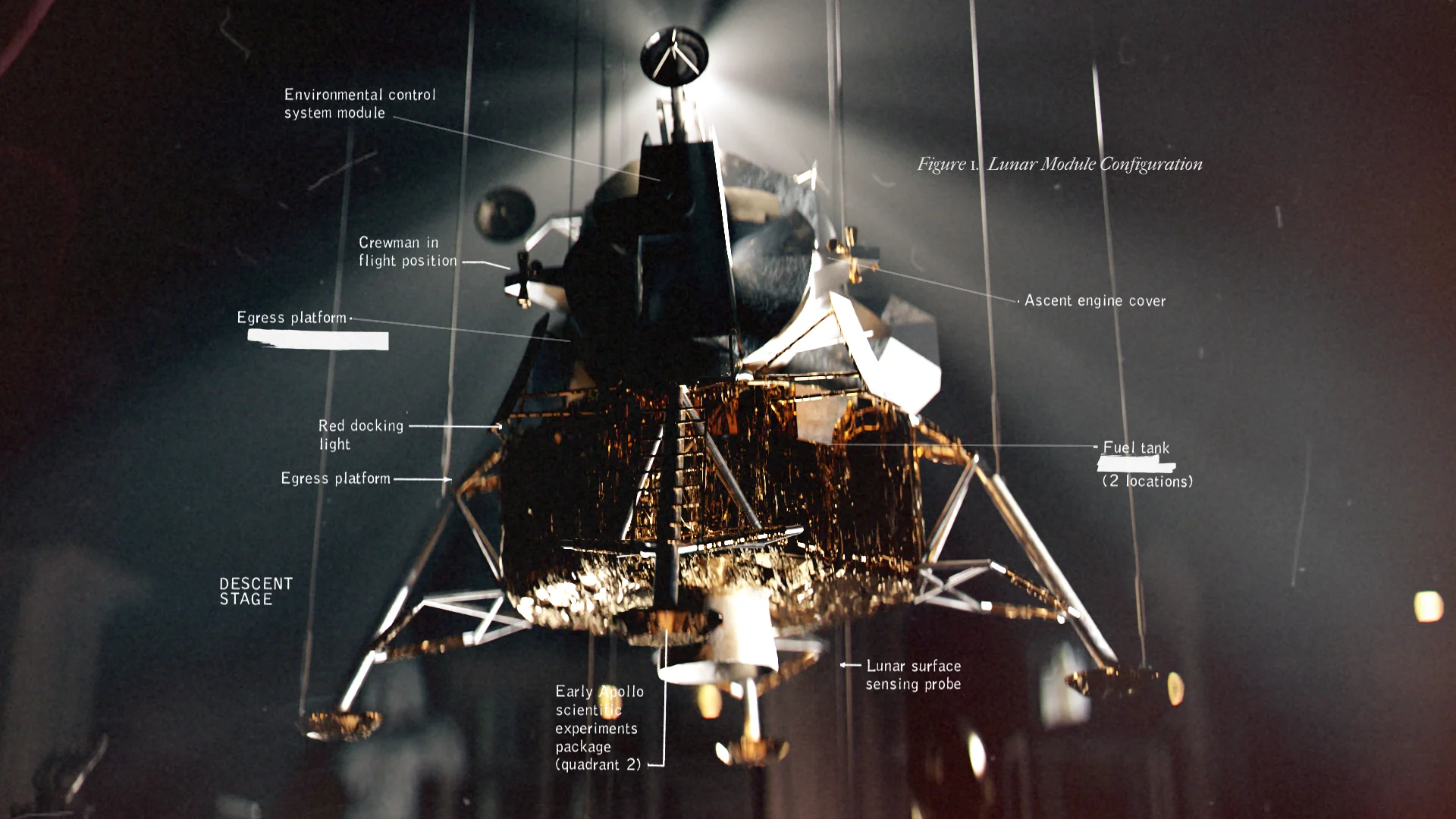
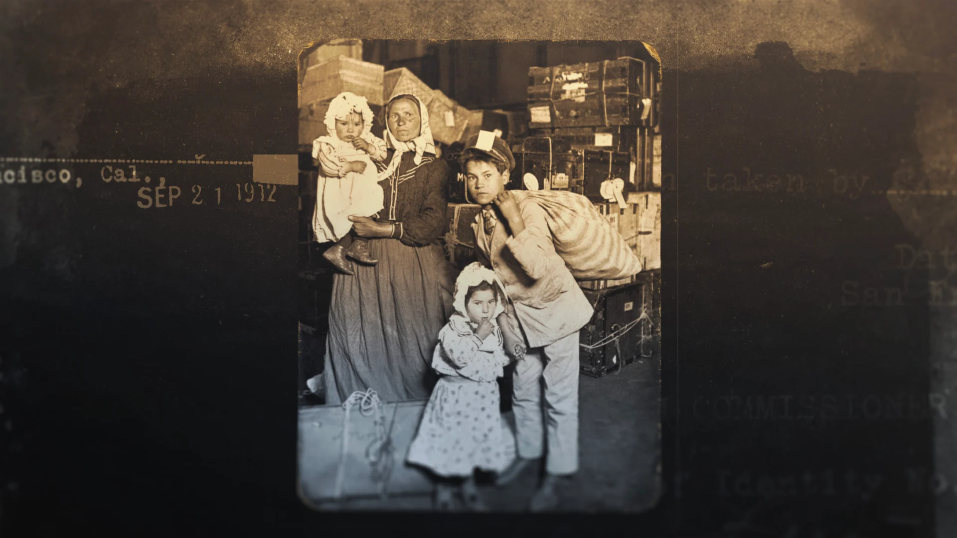
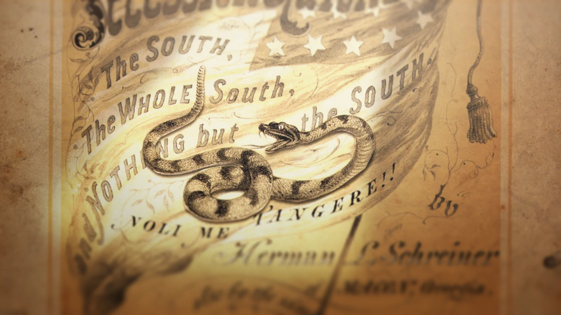
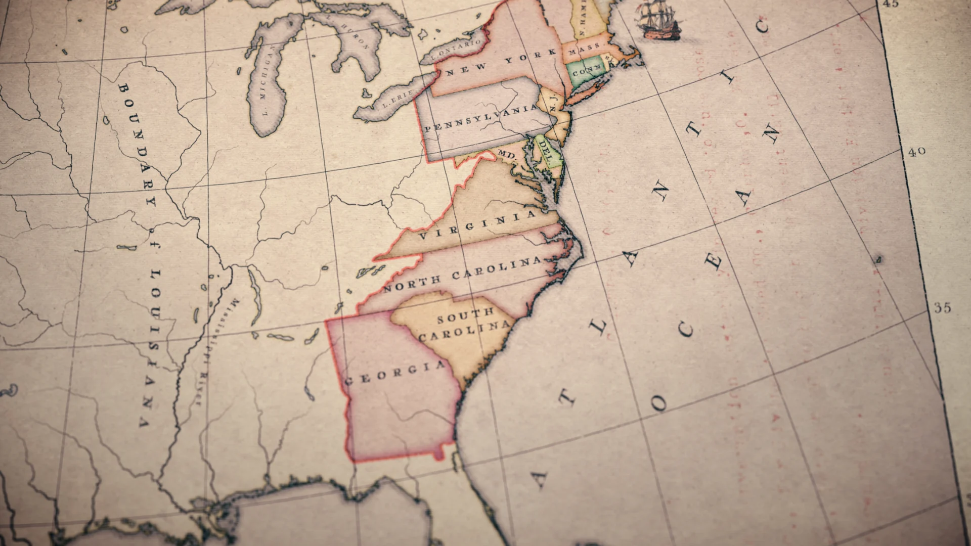
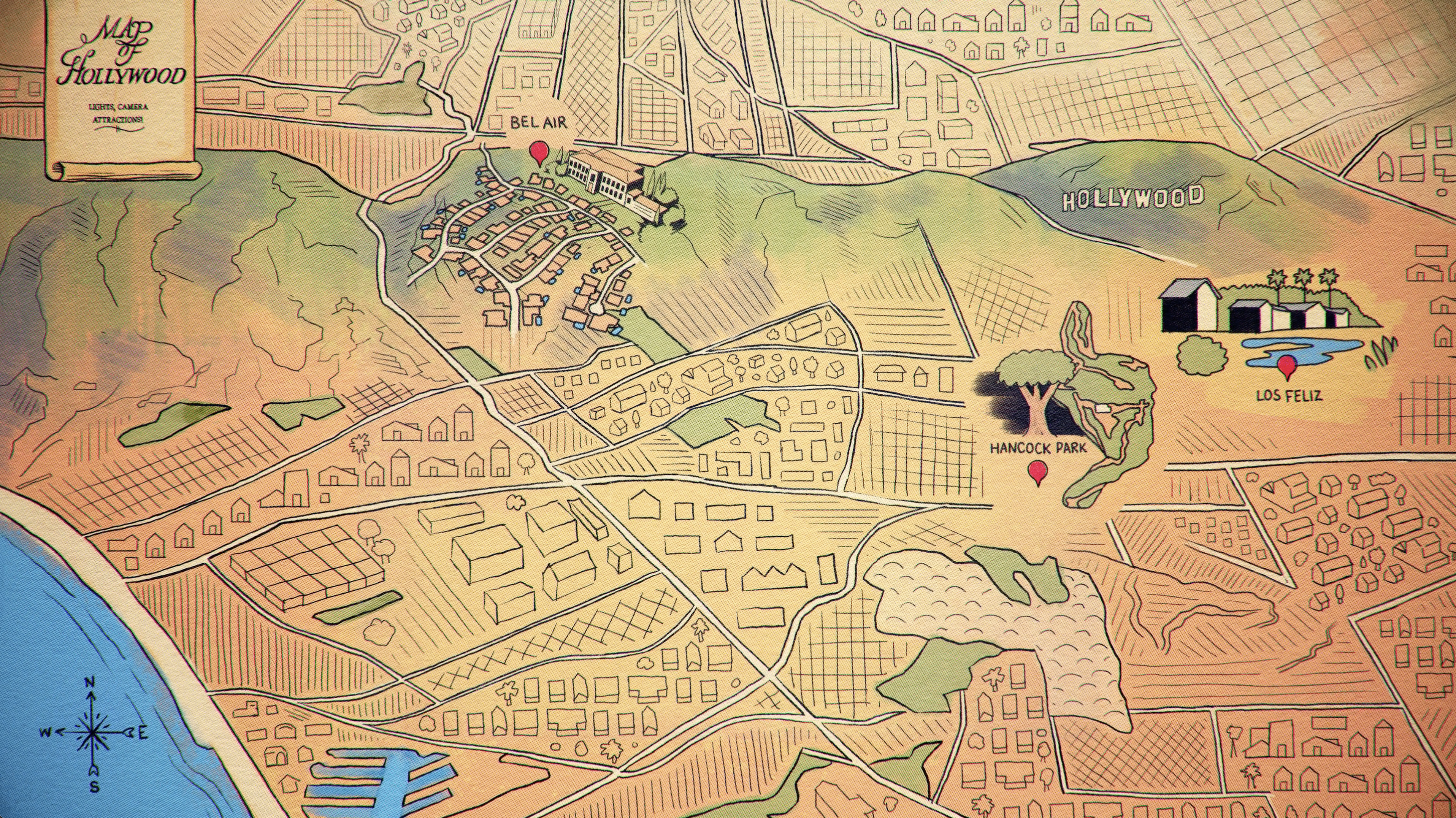
For each episode, we separated the work into specialized buckets vs general archival depending on the needs of the material. The look for simpler archival treatments was established early on and streamlined throughout the series. There were also a handful of more in depth explainers and 3D work required for each episode that we were able to dive into in tandem - these graphics called for a more custom touch, depending on the episode subject matter.
Some of the heavier treatments were parallax photos, where you separate the foreground for the background, and there's a little more movement to it all and some were fully 3D. These specialized graphics really ended up keeping the design fresh for each episode because we covered such a wide array of objects.
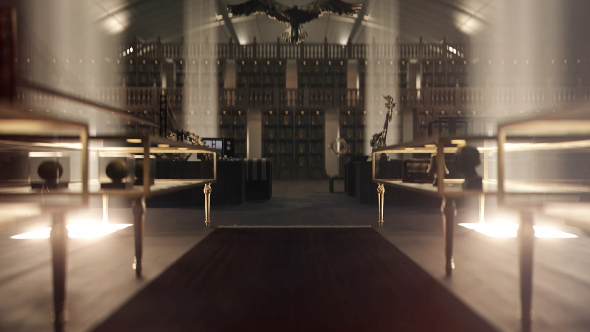
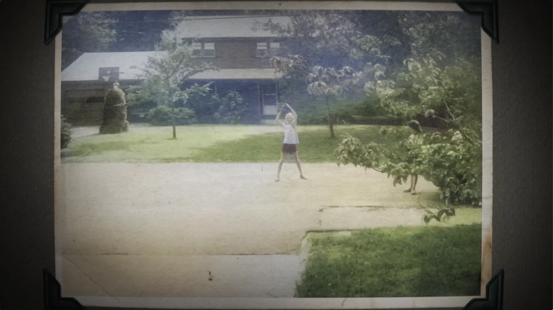
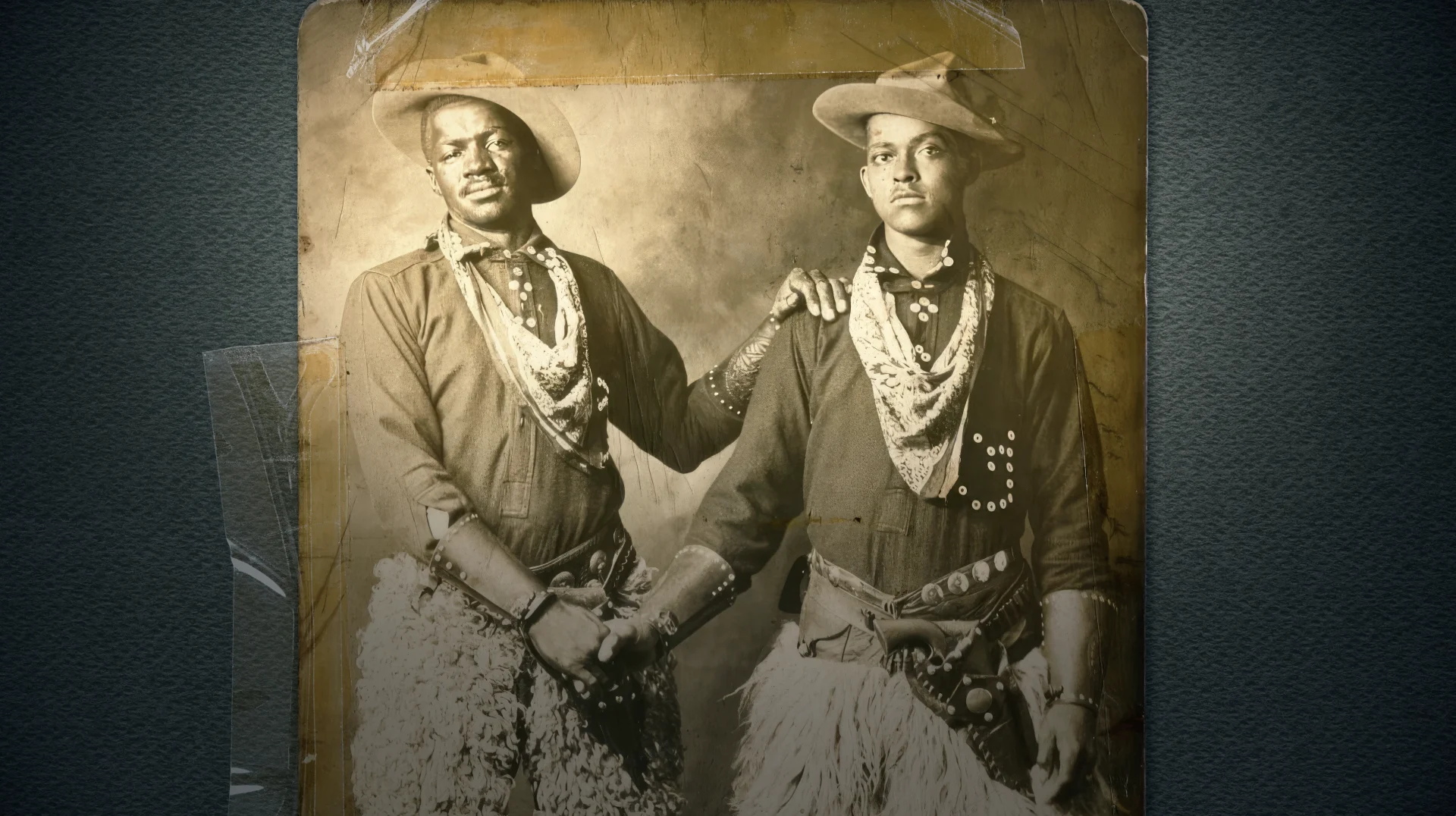

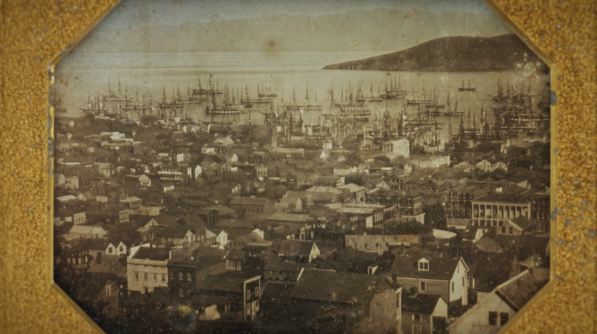
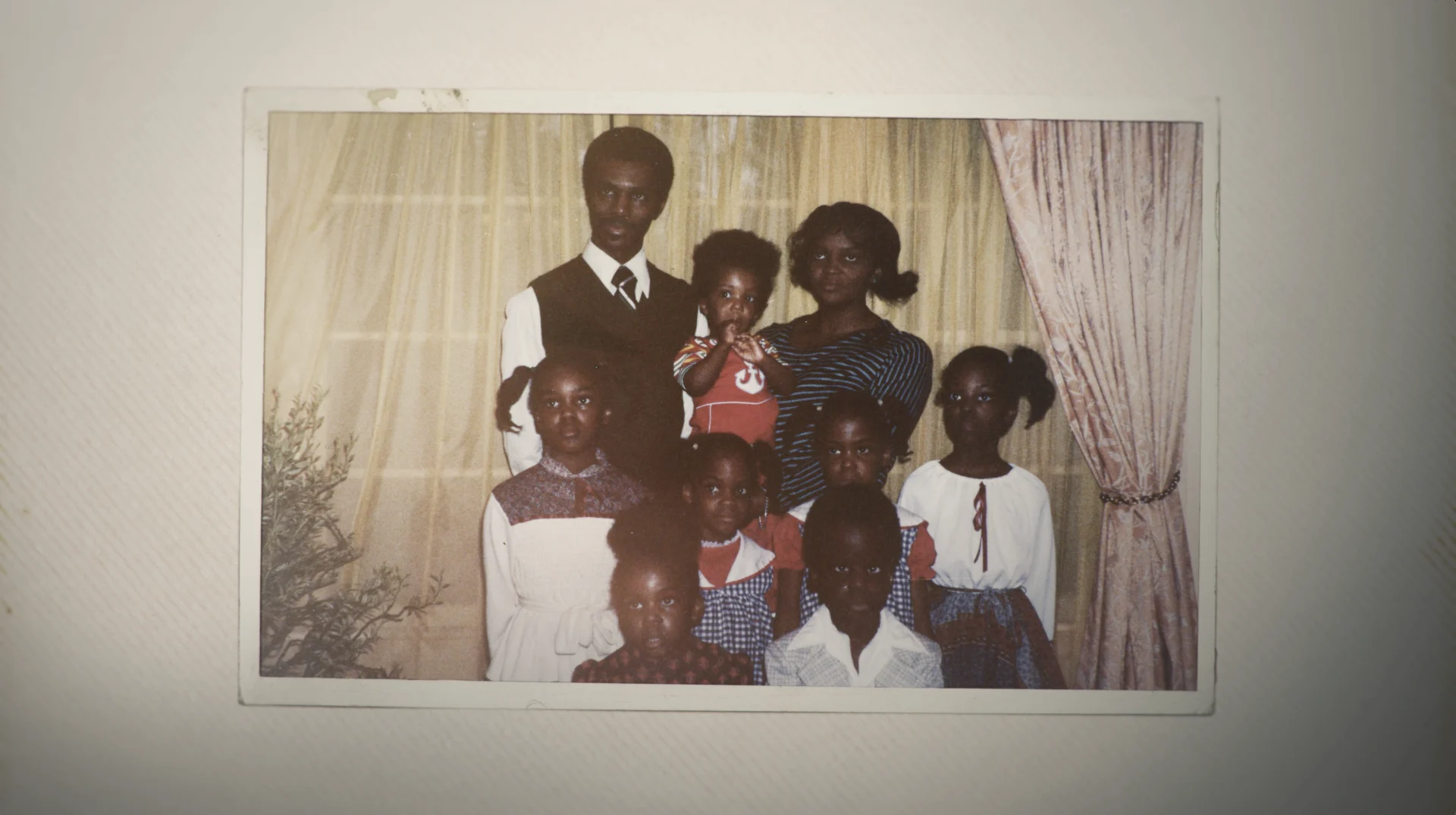

A favorite episode to work on for our team was the Hollywood episode, exploring how The Hollywood Sign is as much a marker of location as it is a marker of industry. First erected 100 years ago as “Hollywoodland,” the bold, mountain-bound letters are a bona fide fixture of Los Angeles’ landscape, and have impacted the way the city has expanded and the visual language of the films made in its shadow.
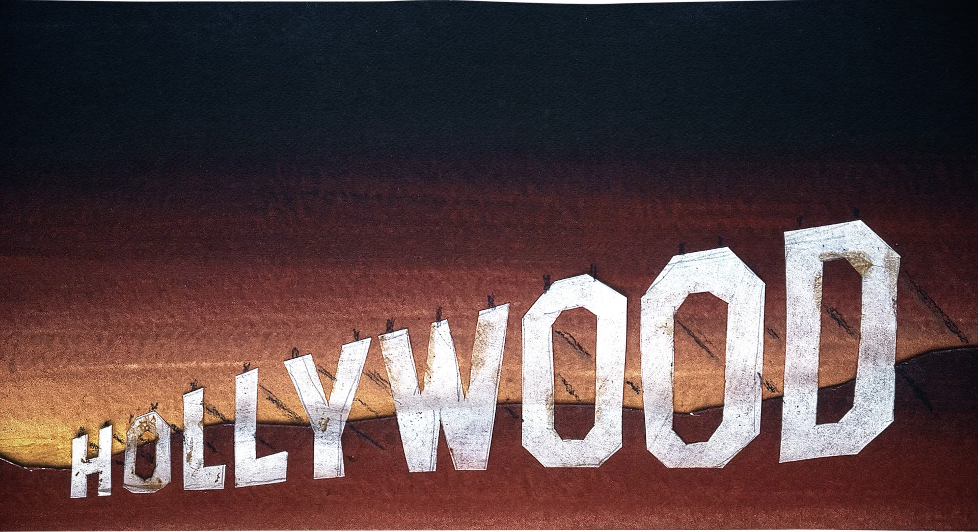
Designing a visual language that reflects the influence of this symbol and all the others featured throughout the series while also storytelling in a beautiful way kept us working on this project for about a year. In addition to Hollywood, the series also covers Fenway Park, the Gadsden Flag, the American Cowboy, the Statue of Liberty, the American Bald Eagle, Stone Mountain and the Golden Gate Bridge.
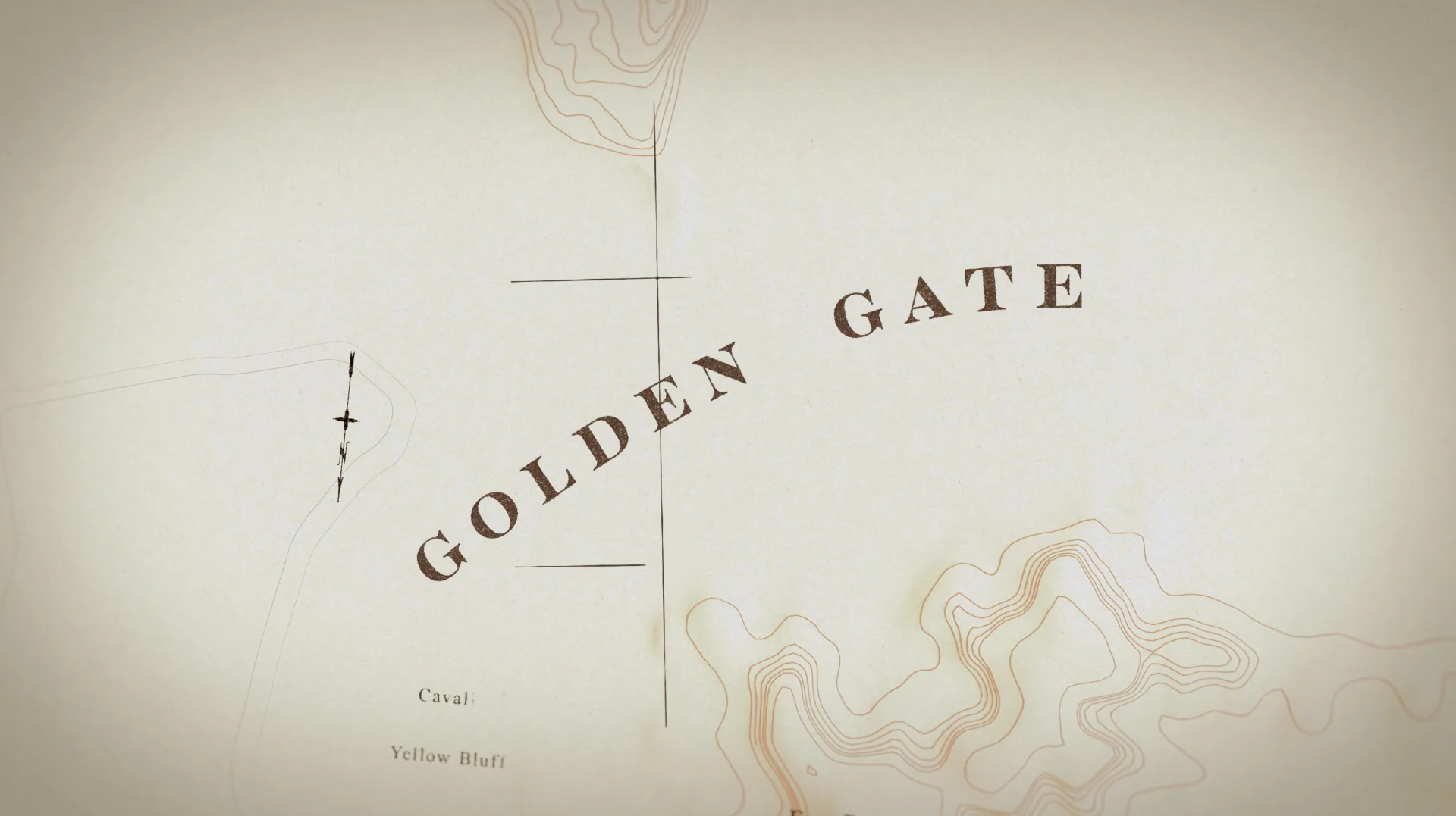
Once we had a few episodes under our belt and a better understanding of the icons we wanted to use, we were ready to tackle the title sequence. Nick Woythaler jumped in on that was able to design something big and all-encompassing that suited the show and the featured symbols.
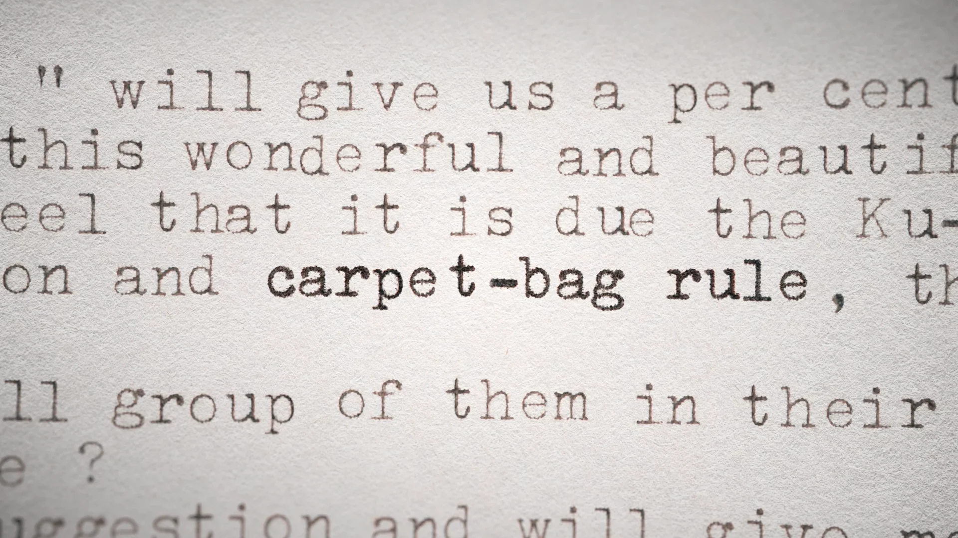
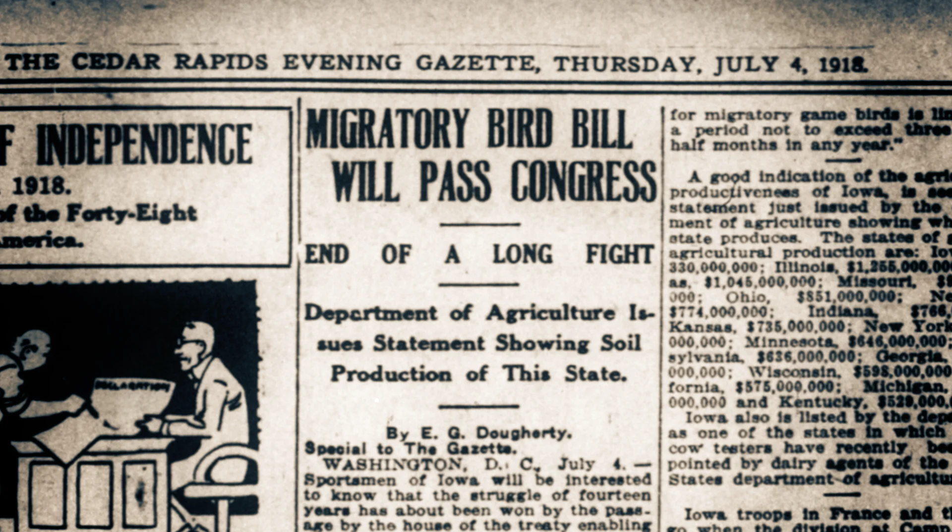
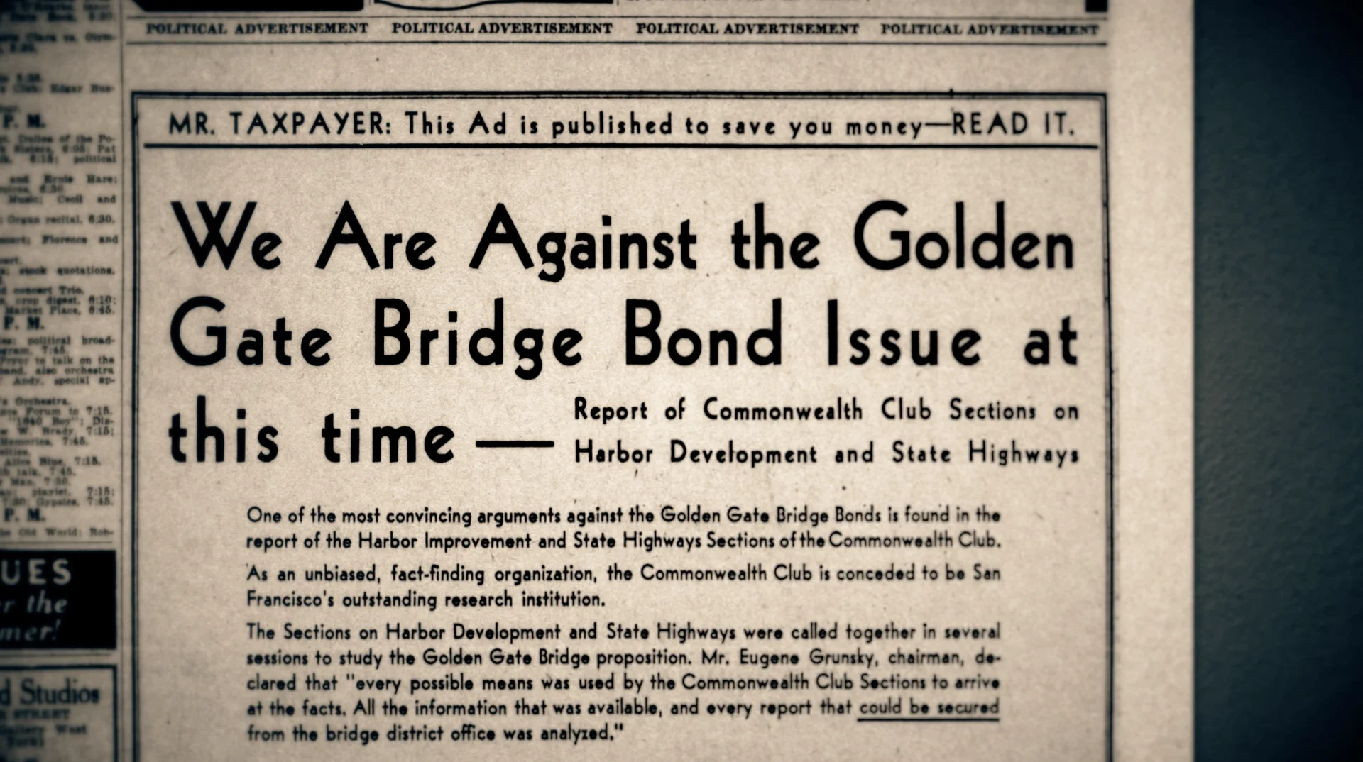

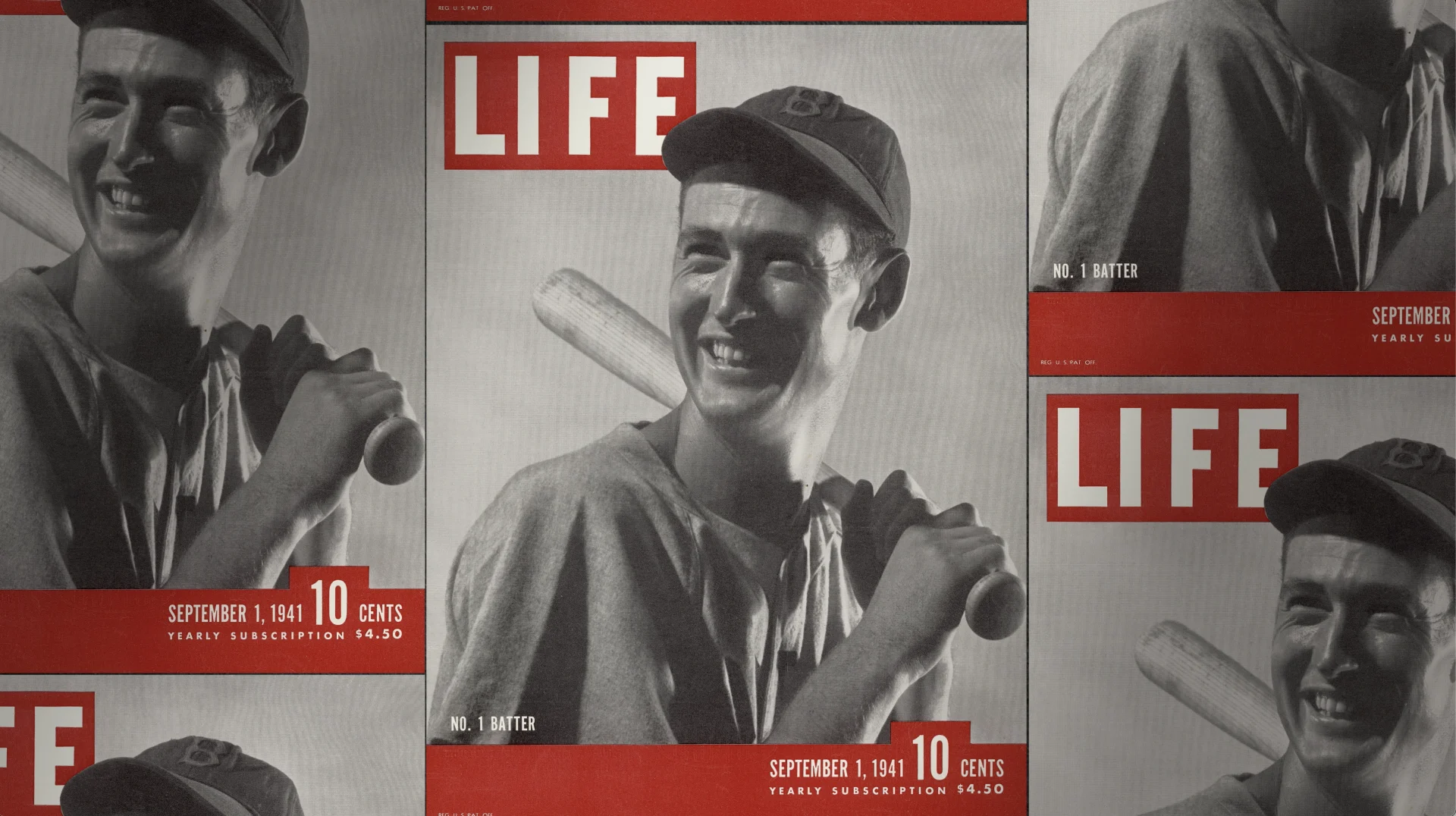
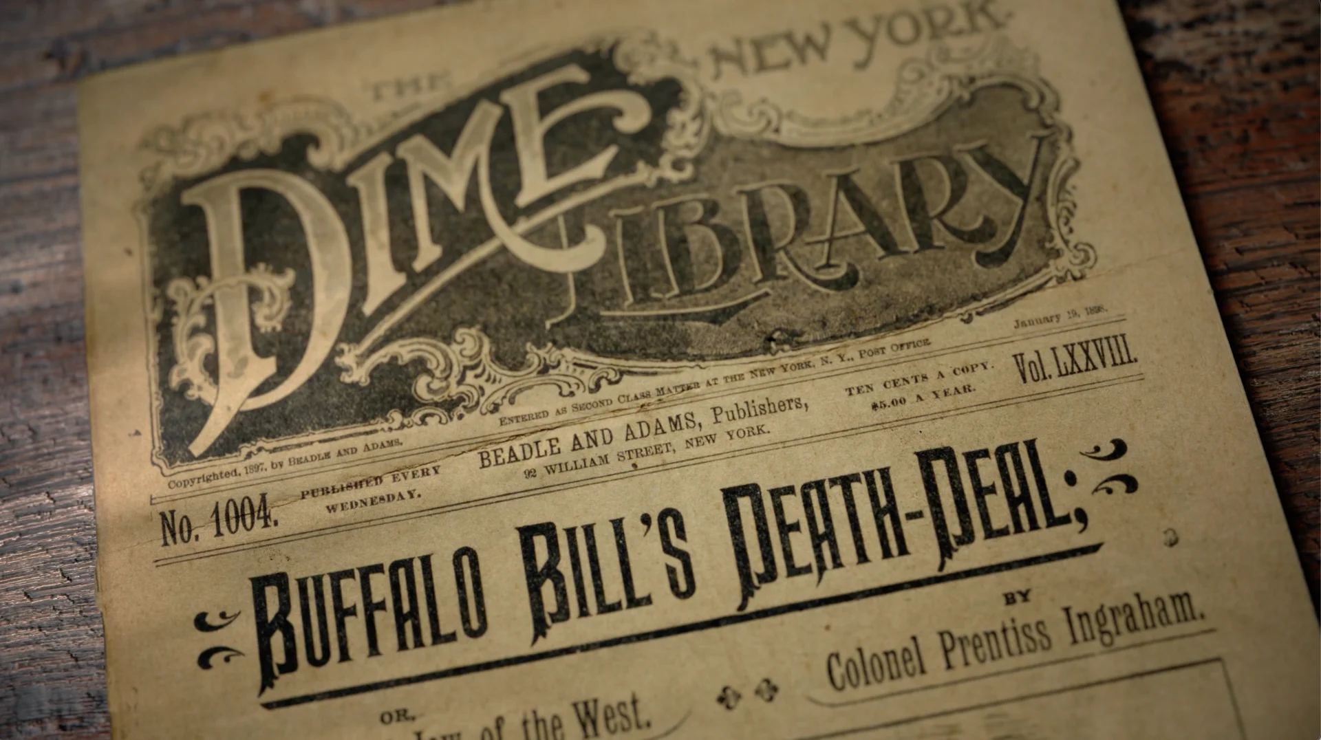
The series was spurred by Rubenstein’s insatiable curiosity and lifelong interest in American history, and we were thrilled to be able to design a design language that facilitated this storytelling and drive the series’ narrative and frame it through analysis, reflection, and counterpoint. Thank you to our partners at PBS and Show of Force for letting us be a part of this important series— these are the stories of the country’s history, and also the story of America today.
Props where props are due
Credits
Iconic America
Creative Director, Designer Mark ThompsonExecutive Vice President, Executive Producer Carson HoodSupervising Producer Kristen PritchettDesign Mark Thompson, Ivan Viaranchyk, Paddy Driscoll, Chris CarboniAnimation Ivan Viaranchyk, Liu Chia-Lung, Carl Dempsey, Tifé Odumosu, Paddy Driscoll, Elijah BenMain Title Design & Animation Nick Woythaler