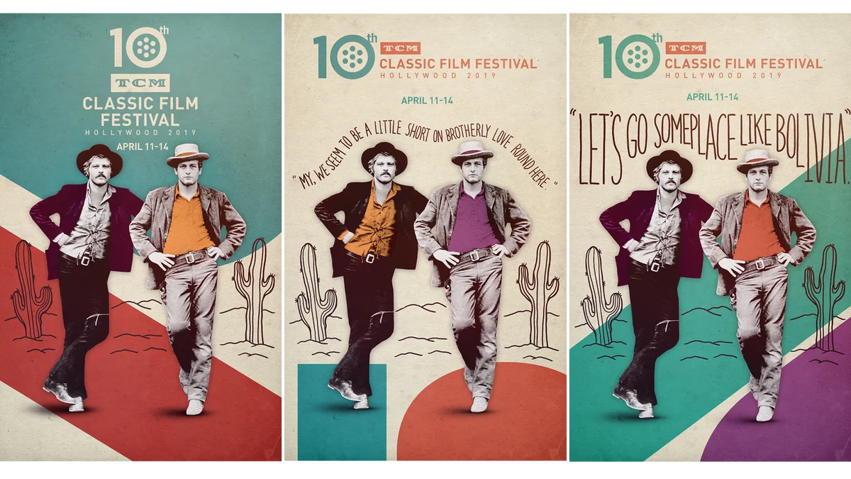
TCM
TCM Film Festival 2019
We helped brand the 2019 annual TCM Classic Film Festival event with our key art and promotional film, following their theme of “love in all its forms”.
View ProjectDefining Style
Client
NBC
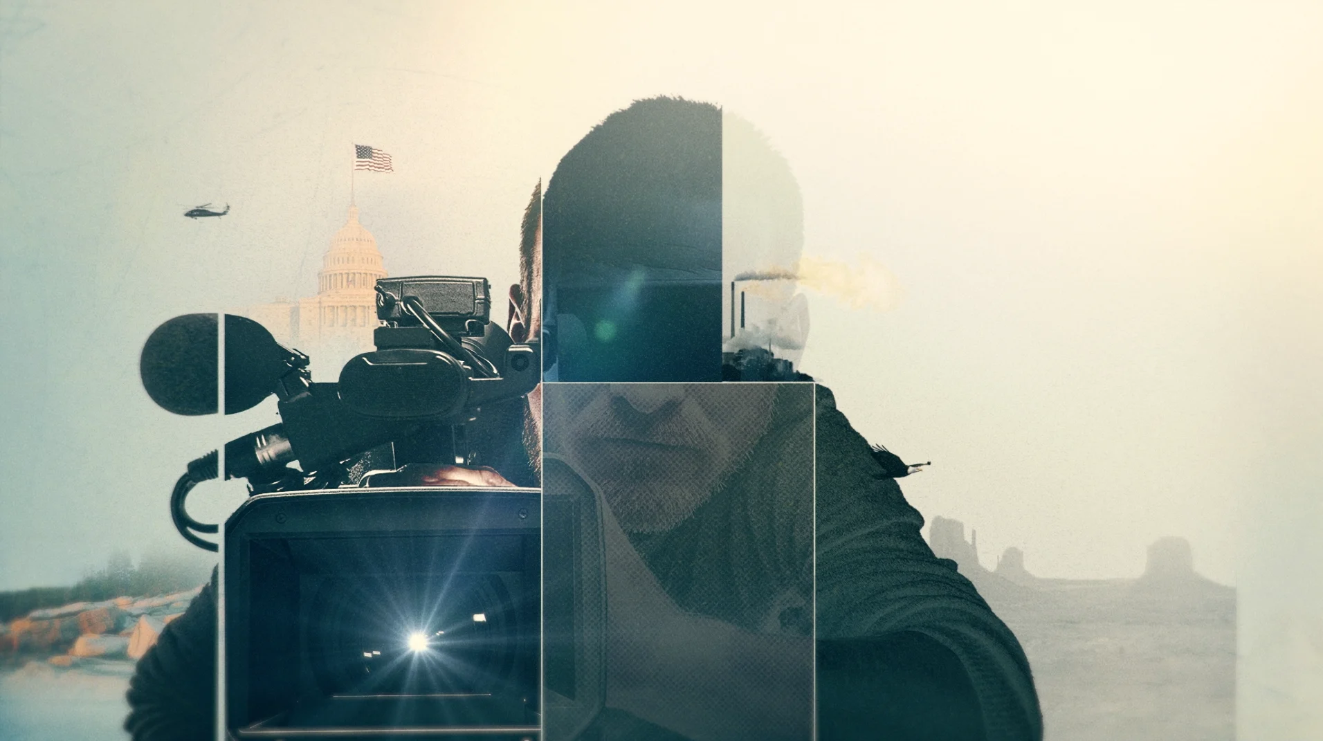
Meet the Press teamed up with the American Film Institute this year for their first ever MTP Film Festival in Washington DC. Our friends over at MSNBC came to us looking for a graphic language that would bring life to the topics each documentary was tackling, supporting their ideas while bringing the whole event together in one unified design.
Exploration
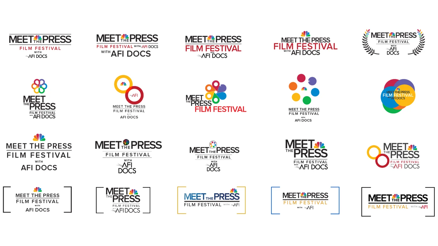
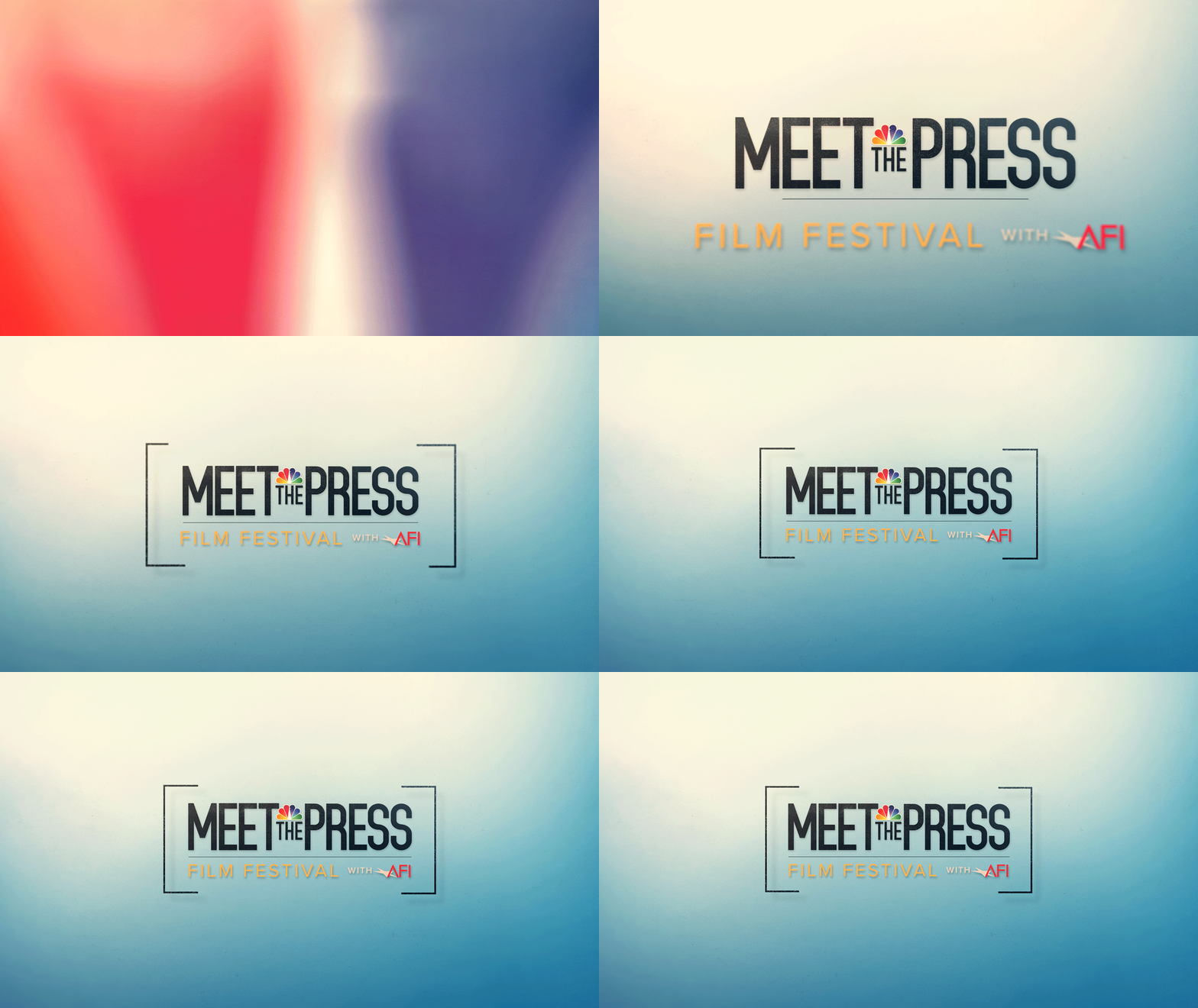
We began by looking at logo layouts for the MTP / AFI collaboration, and finally landed on one we felt both modernized and simplified the two logos when brought into the same space.
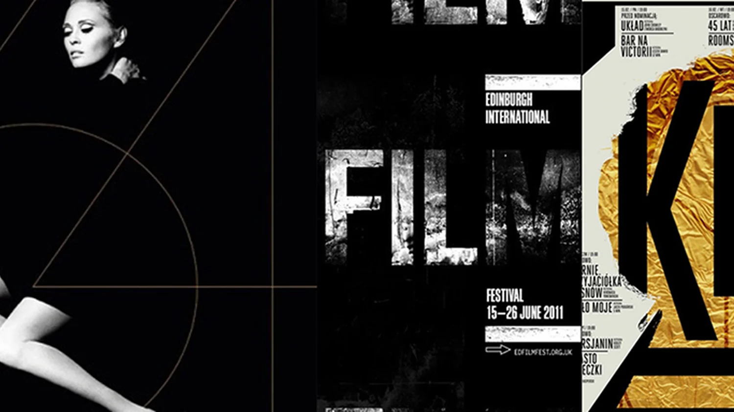
At the same time, we searched to define our style and sent references along to collaborate and define our graphic approach.

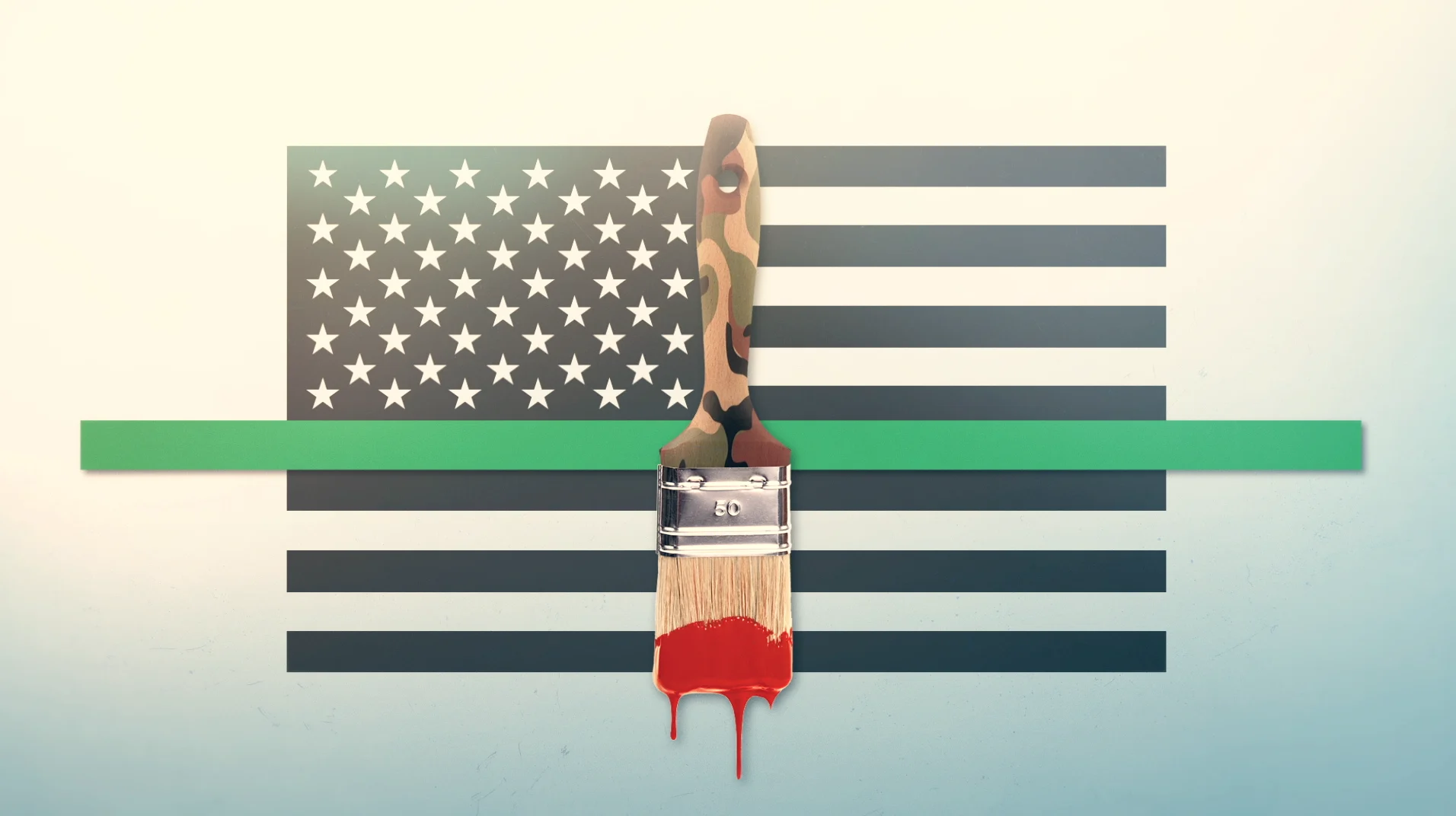
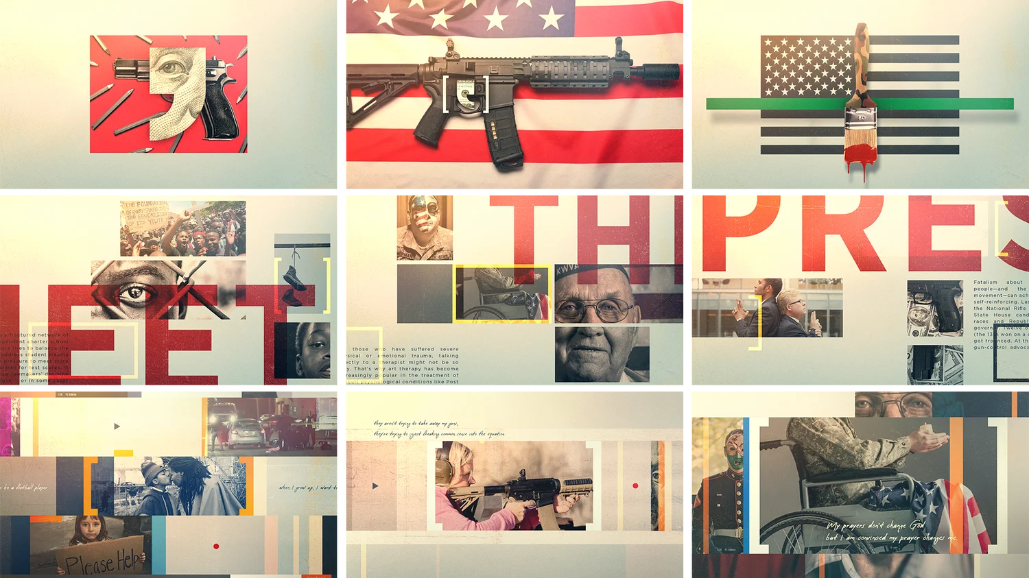
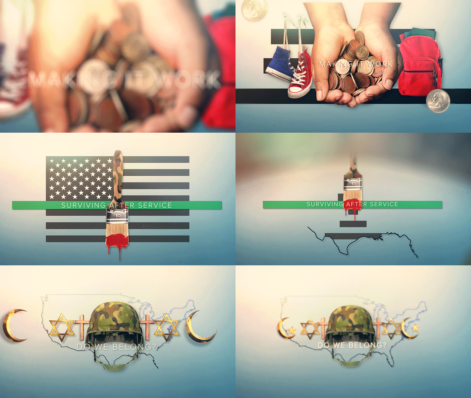
Once we came up with a style, we went after design — each frame graphically expressing important issues including healthcare, race, inequality, pride, and mass incarceration.
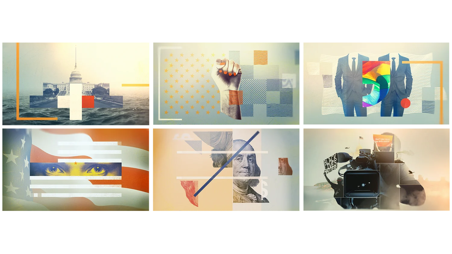
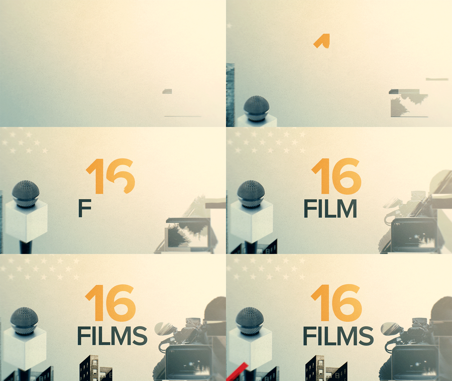
We built frames that could be easily translated into motion so that the animation felt seamless. By combining smooth animation with the stop-motion analog technique the end result rendered dynamic, life-like and relatable scenes that didn’t distract from, but rather, enhanced the stories we wanted to tell.

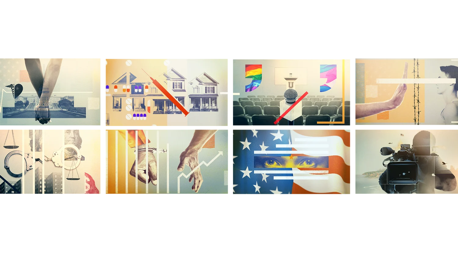
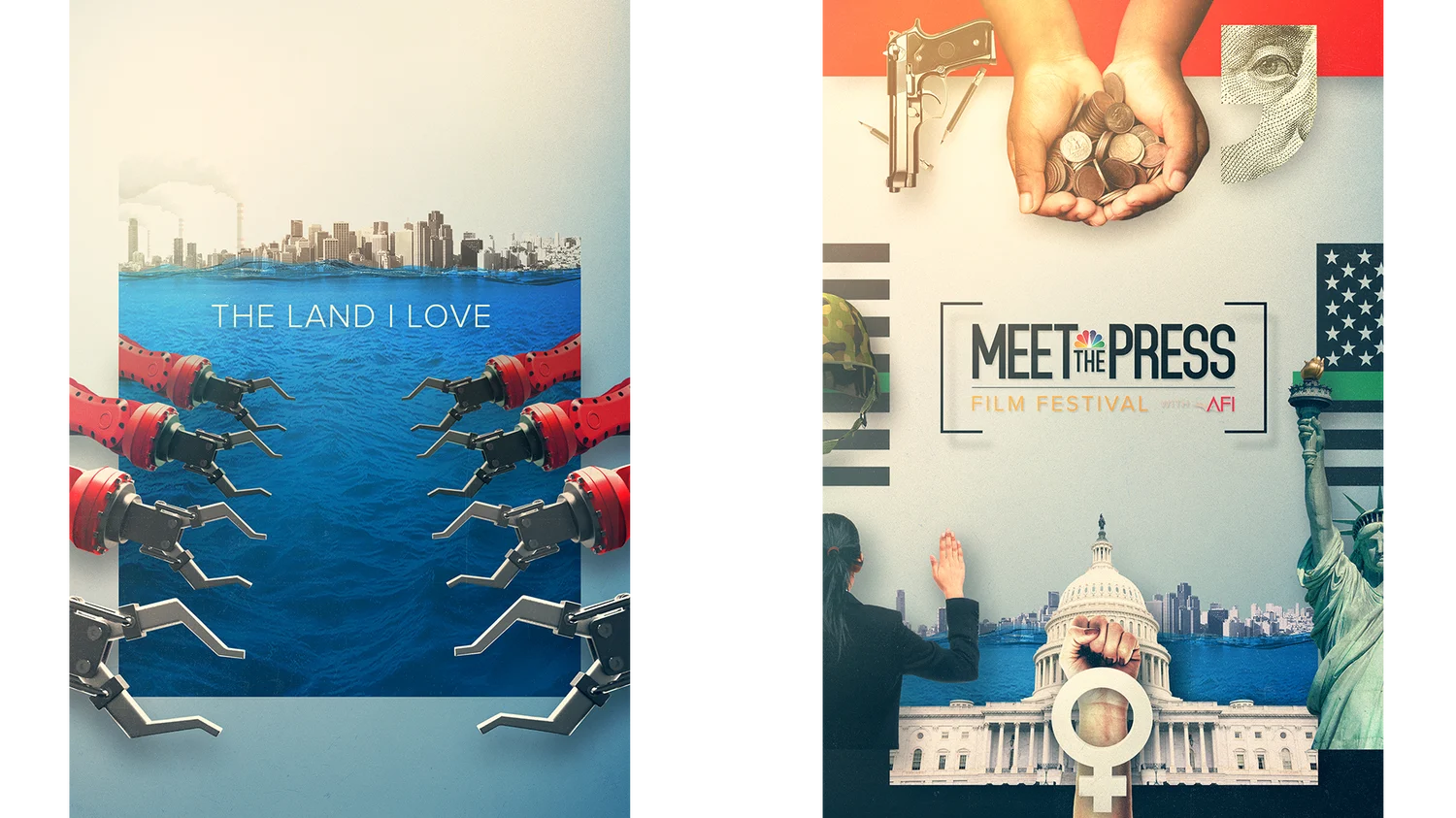
Each frame graphically expresses important issues including healthcare, race, inequality, pride, and mass incarceration. The film leader ran at the beginning of this year’s festival, accompanied by posters that populated the event. We also delivered a promo that ran in taxi’s across D.C.
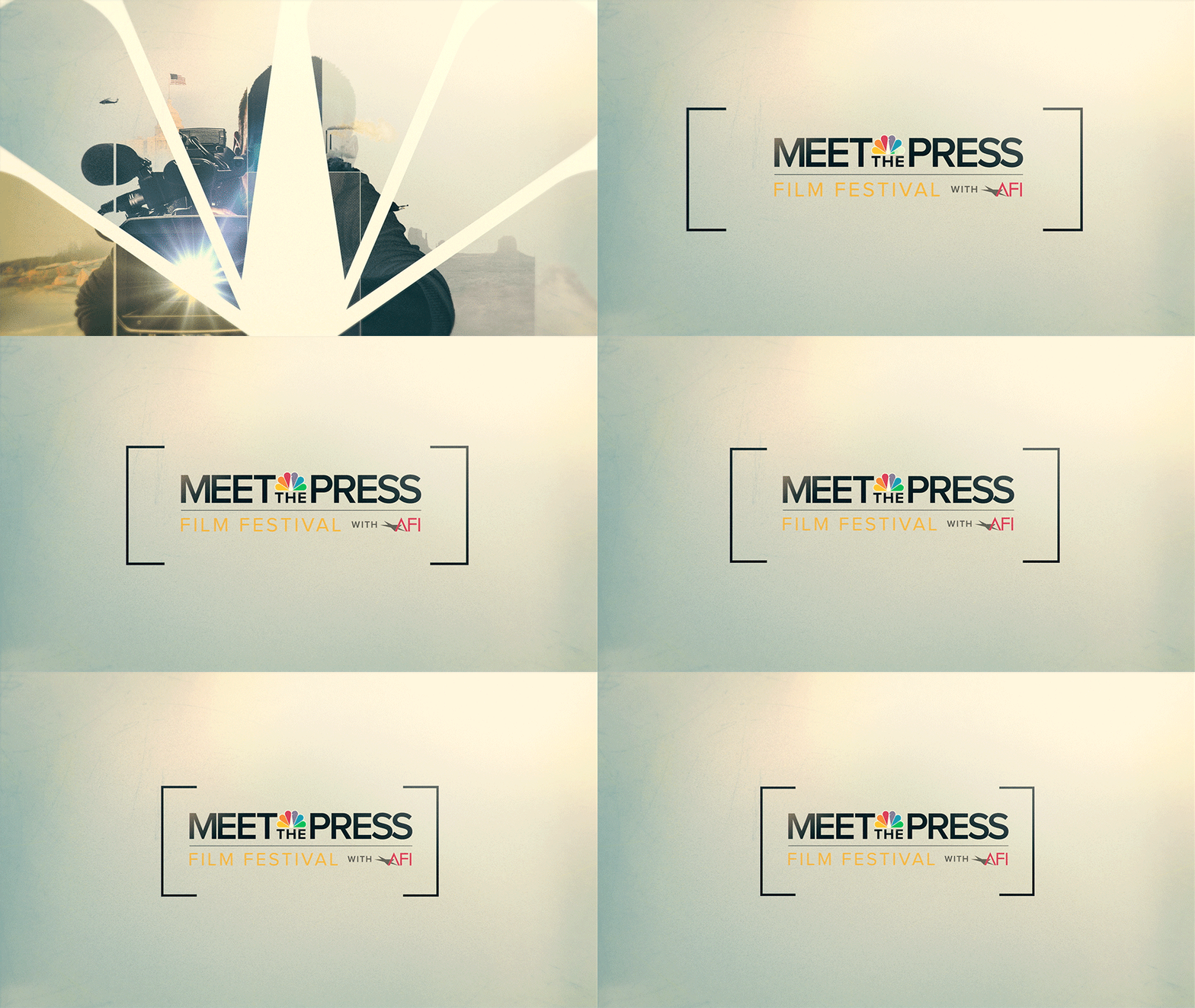
Thanks again to MSNBC for the great collaboration & opportunity, we look forward to next year.
-BGSTR
Refresh
For the 2nd annual Meet the Press Film Fest with AFI, our partners at NBC came back to us looking for a fresh take on our 2017 festival branding. As we began our approach to this year’s concepts, we wanted to take our original graphics to the next level, while staying true to the overall style and focusing on imagery that would best represent the festival’s themes.
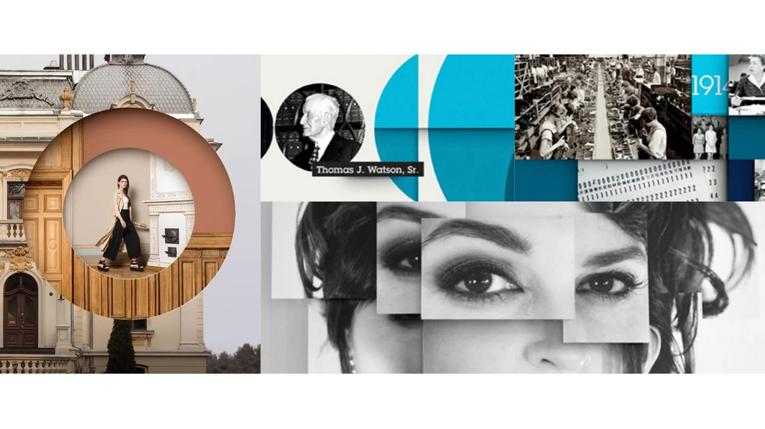
This design concept gave us the flexibility to utilize negative space mixed with full frame imagery in order to convey complex as well as simplistic story elements.
We quickly nailed down our first concept, which used bold design elements and iconography, layered together in a three-dimensional collage. This concept gave us the flexibility to utilize negative space mixed with full frame imagery, conveying complex as well as simplistic story elements. The design kept with the subject matter call-outs from our previous branding, yet stripped it down to the bare minimum to make each icon truly stand out.
When jumping into key art, we were given the opportunity to really expand upon our print portfolio, translating our design into individual posters, with each documentary’s main subject represented on its own. Alongside this, we delivered all digital assets for the website and for social.

Our film leader and promo followed along with the collage-like feel, transitioning seamlessly from one issue to another in a rich, layering motion that could draw focus into the depth of each subject.
-BGSTR