Playing On Up
Super League: The War for Football
Client
All Rise Films, AppleTV+
In the Apple TV Plus original series, Super League: The War for Football, the high stakes battle initiated by the attempt to set up a new European super-league is documented from start to its explosive finish. We designed the four-part series to graphically tell the story of the breakaway league and the drama that threatened to upend the future of European football.


Chess Pieces
Super League: The War for Football
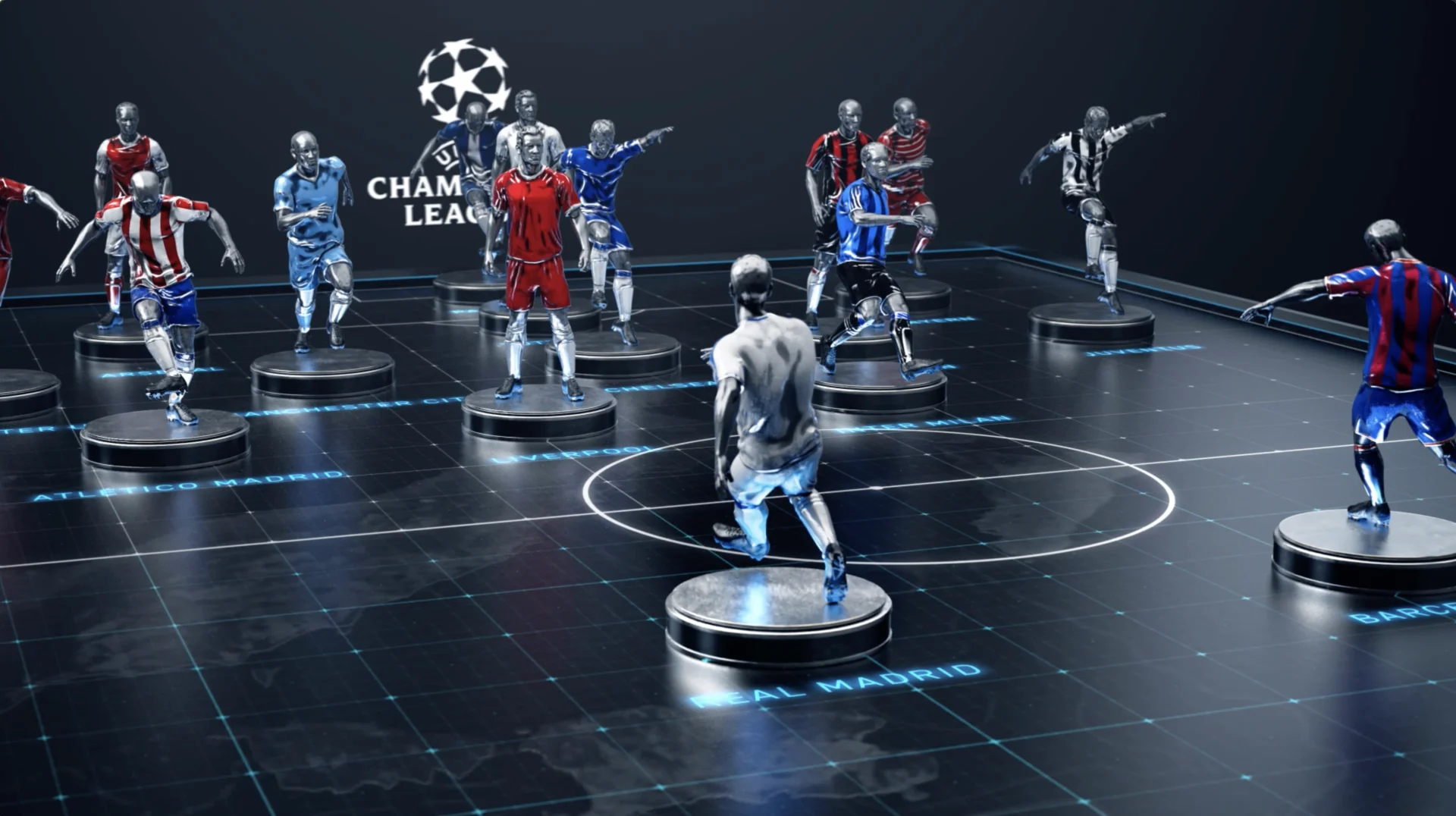
As self-admitted sports fanatics, the BGSTR team was familiar with the story of the Super League, so we were excited to dive deeper into the story in a creative way. Once we opened up the hood and dove into the elements of the documentary, we started to understand how quickly every piece of the Super League moved from inception to implosion. From information exchanging hands, players moving teams and money driving all the decisions— each element was like a chess piece being moved around a board— a concept we latched on to and incorporated into our design direction.


In order to represent the changing battlefield through out the series, we crafted player game pieces to represent a team's allegiance at any given time in the show. The pieces were meant to evoke, both the heroic nature of the players involved yet also demonstrate to some it was all just a game.
Even in very early cuts of the show we could see that Jeff (Zimbalist, director) and his team were crafting an elegant take on this sports story. It plays part espionage thriller, part castle intrigue with family backstabbing— our task was to deliver on something that hit on all those levels. In that sense, our approach was to create something elevated, with touches of epic yet with clear storytelling… oh and a touch of drama
The battle continues...
Title Sequence
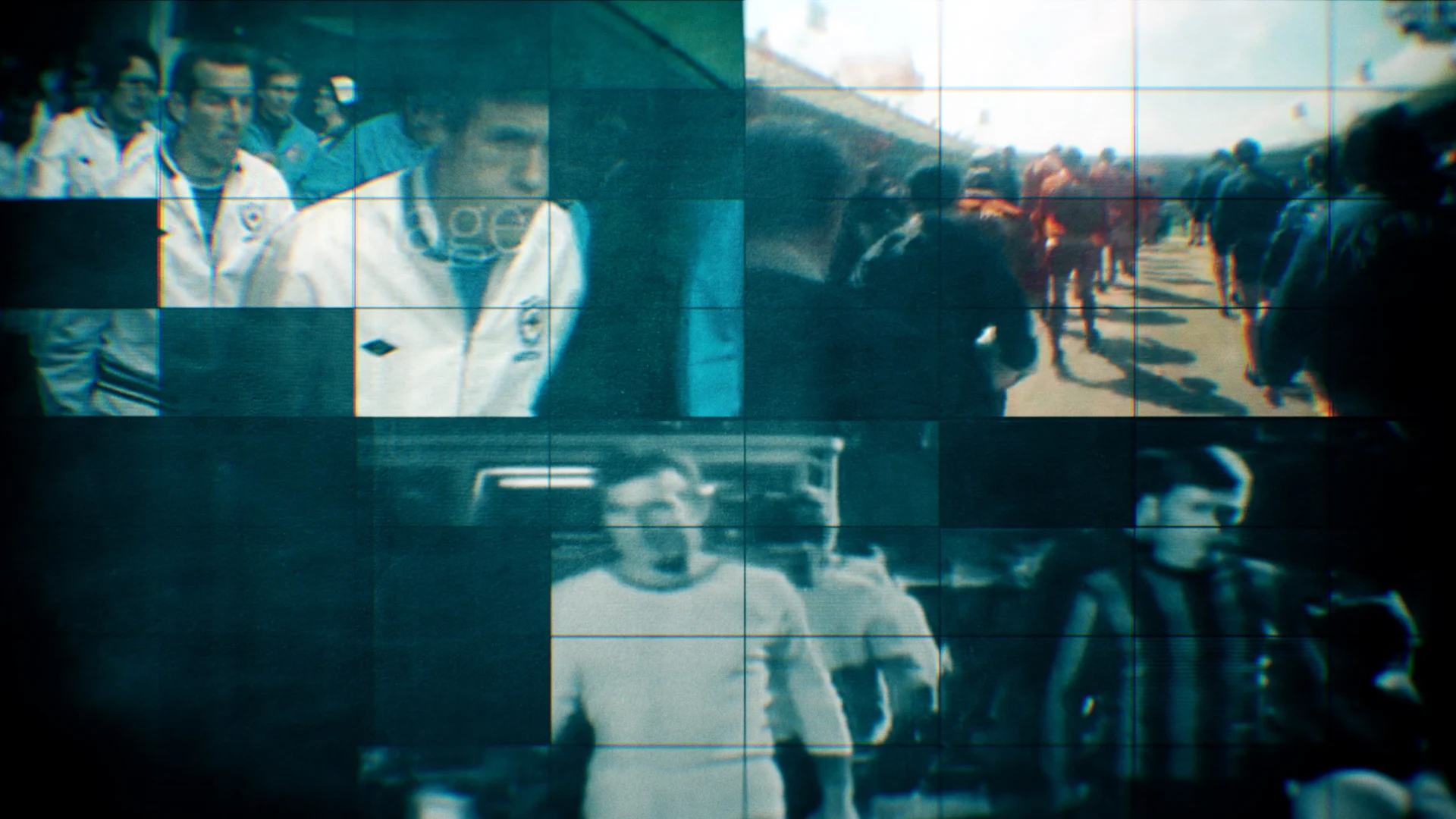
The title sequence sets the tone for the series. It's designed to reflect both the rapid evolution of the history of the sport and the complexity of issues in the series. We were presented an editorial framework of images and footage and were tasked with creating a visual architecture to tame these disparate elements into a fast pace start of the series.


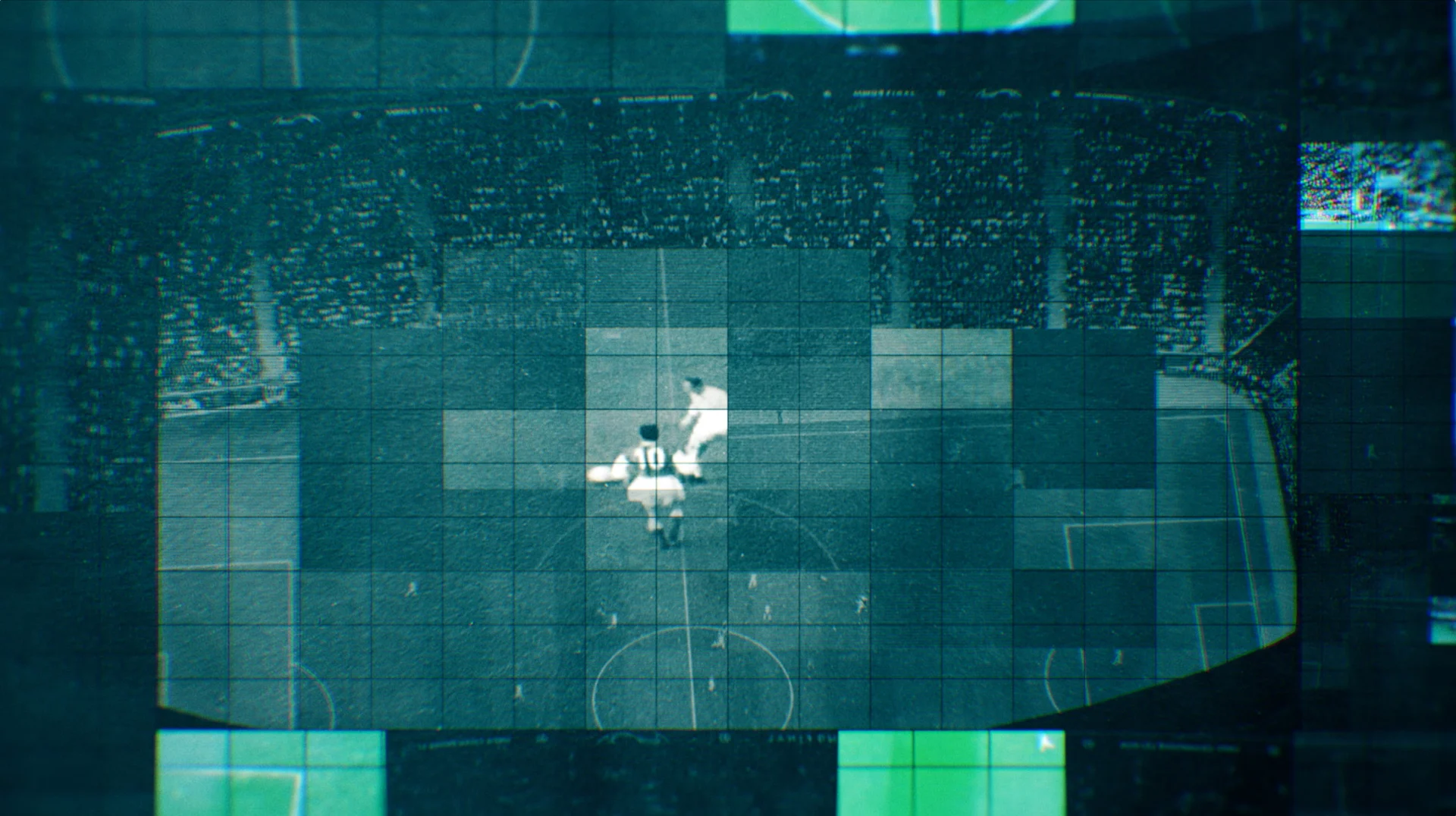

We designed a grid system within the title sequence to show multiple things to viewers simultaneously, exaggerate brightness and reduce lighting in certain spots and draw the viewers’ eye. The result is an elegant open that conveys the high-stakes battle around the breakaway league.

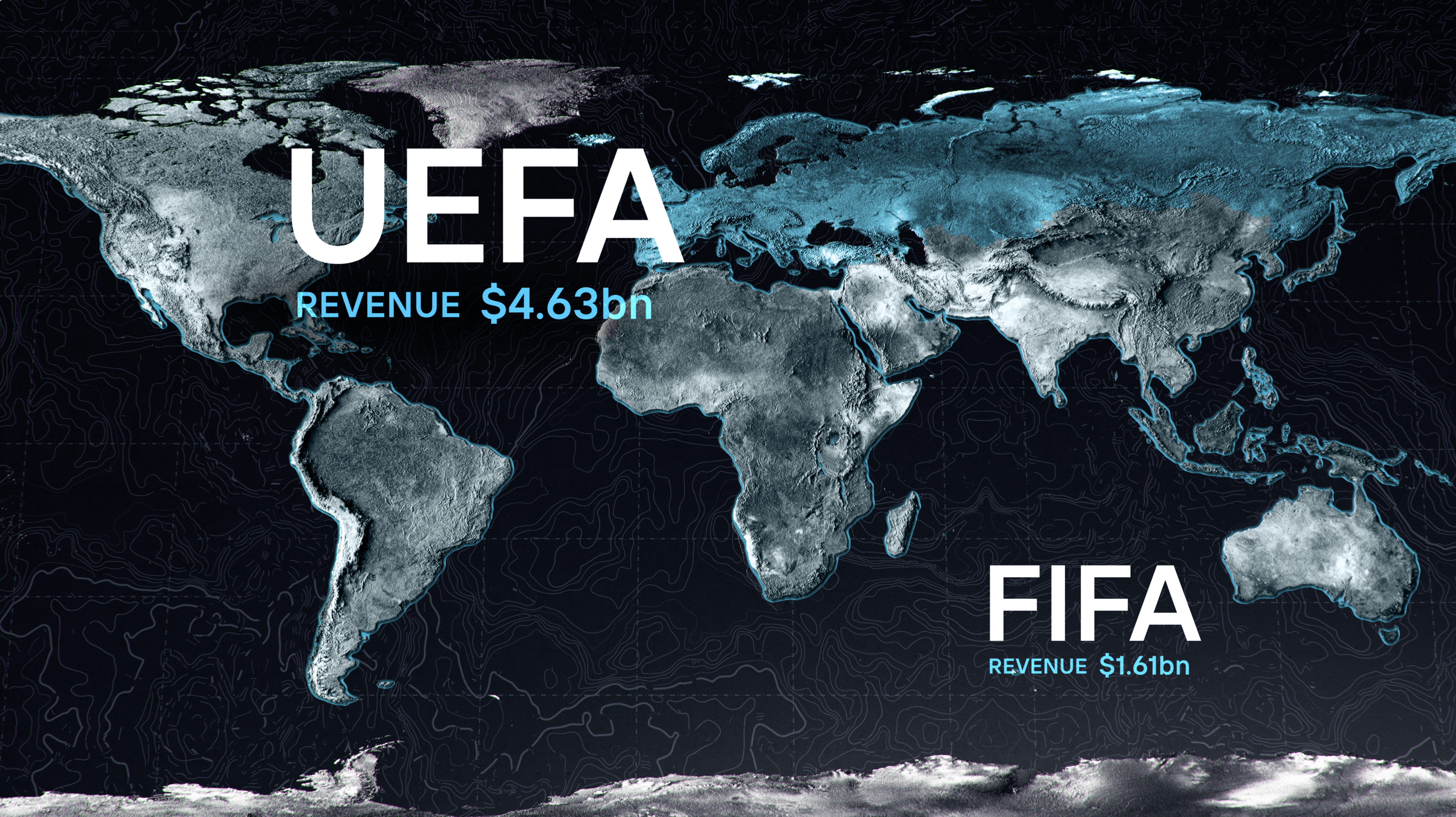
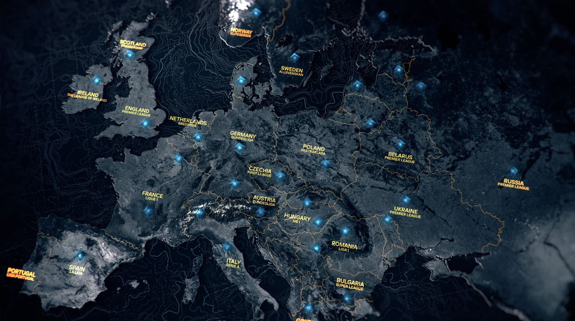
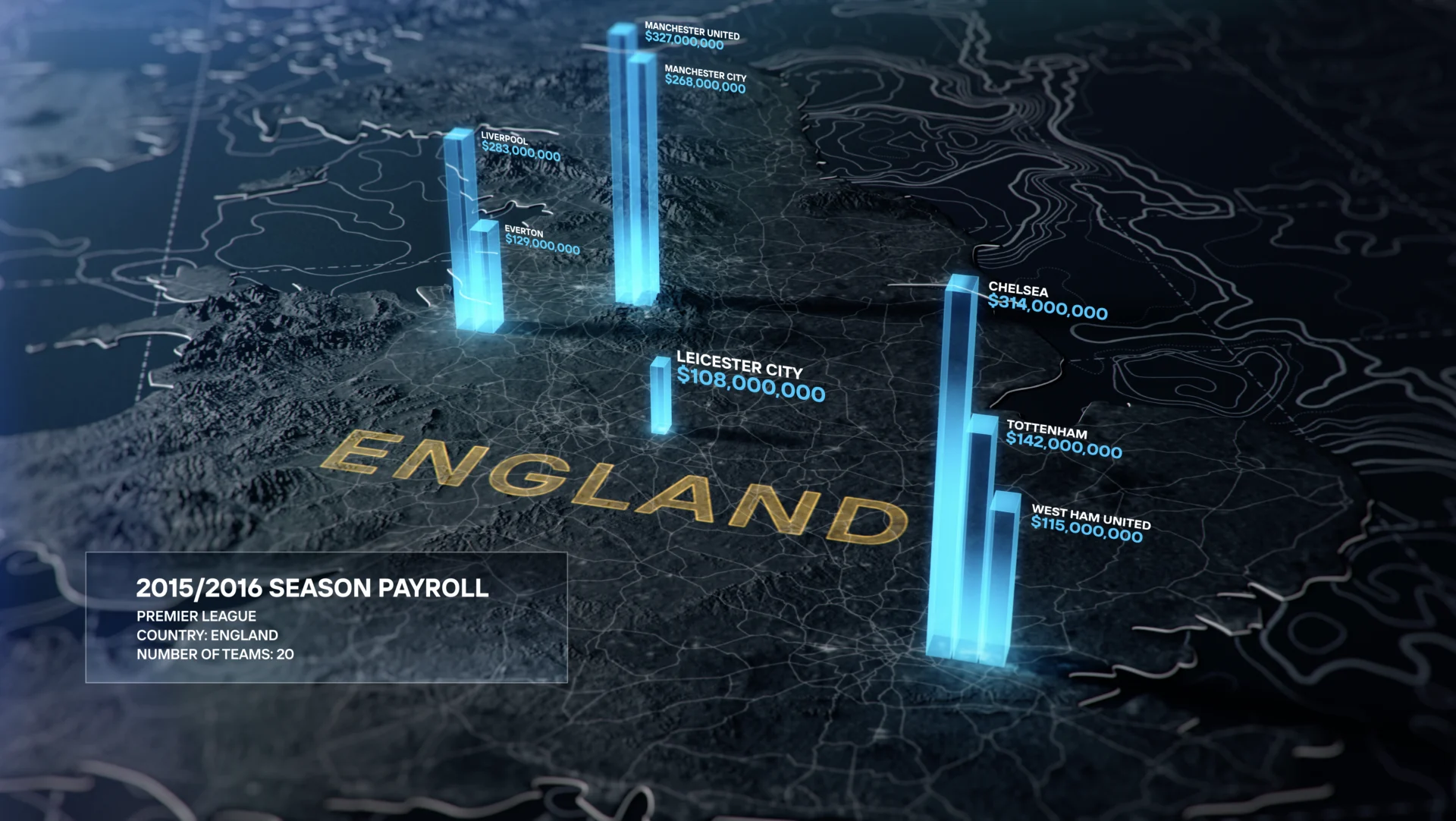
The web of information that comprises the story of the Super League necessitated several other graphic elements for our design.
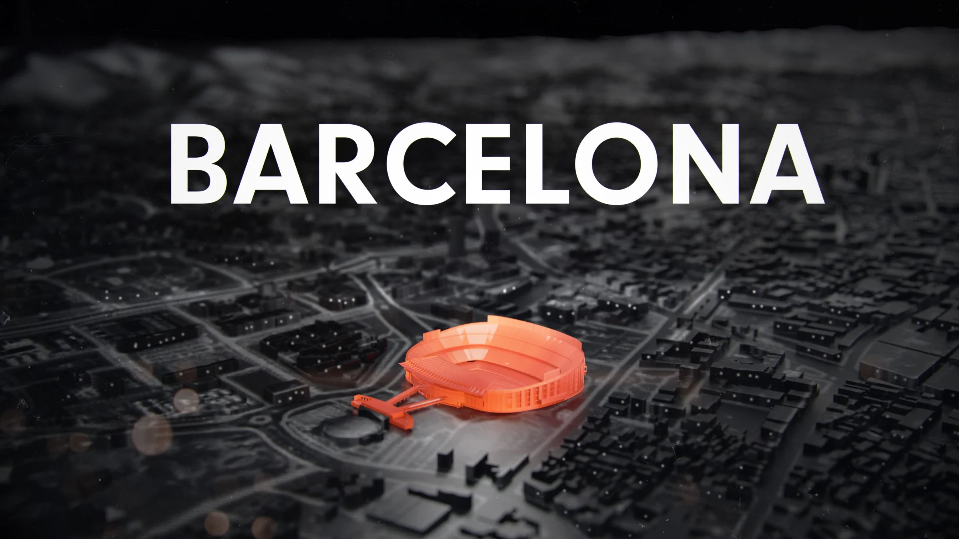
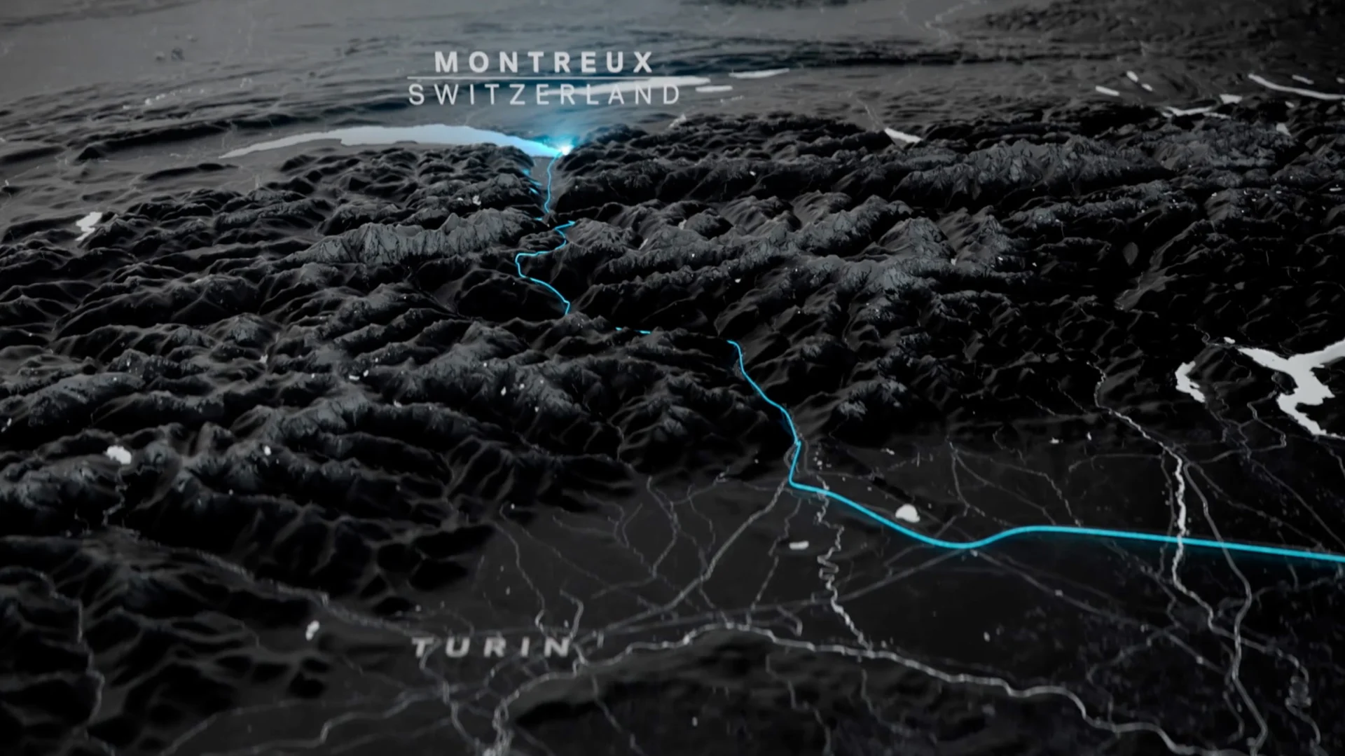
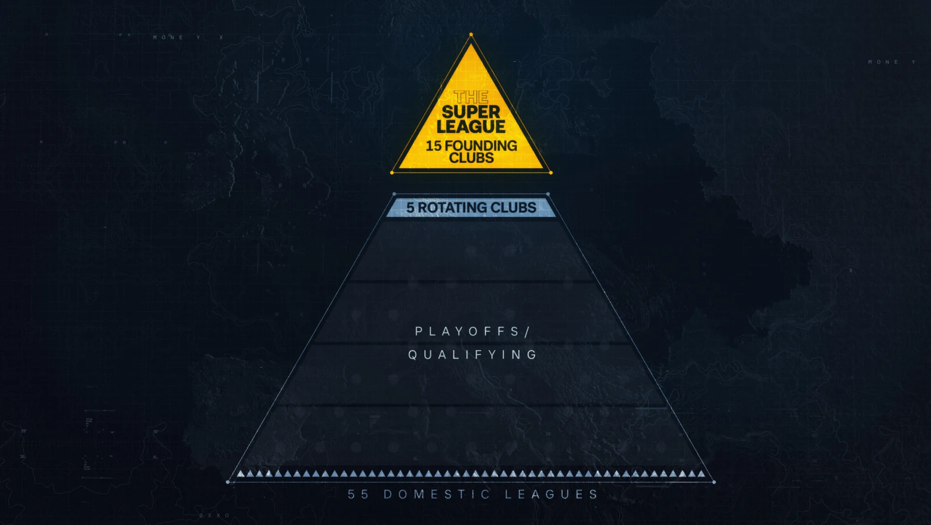
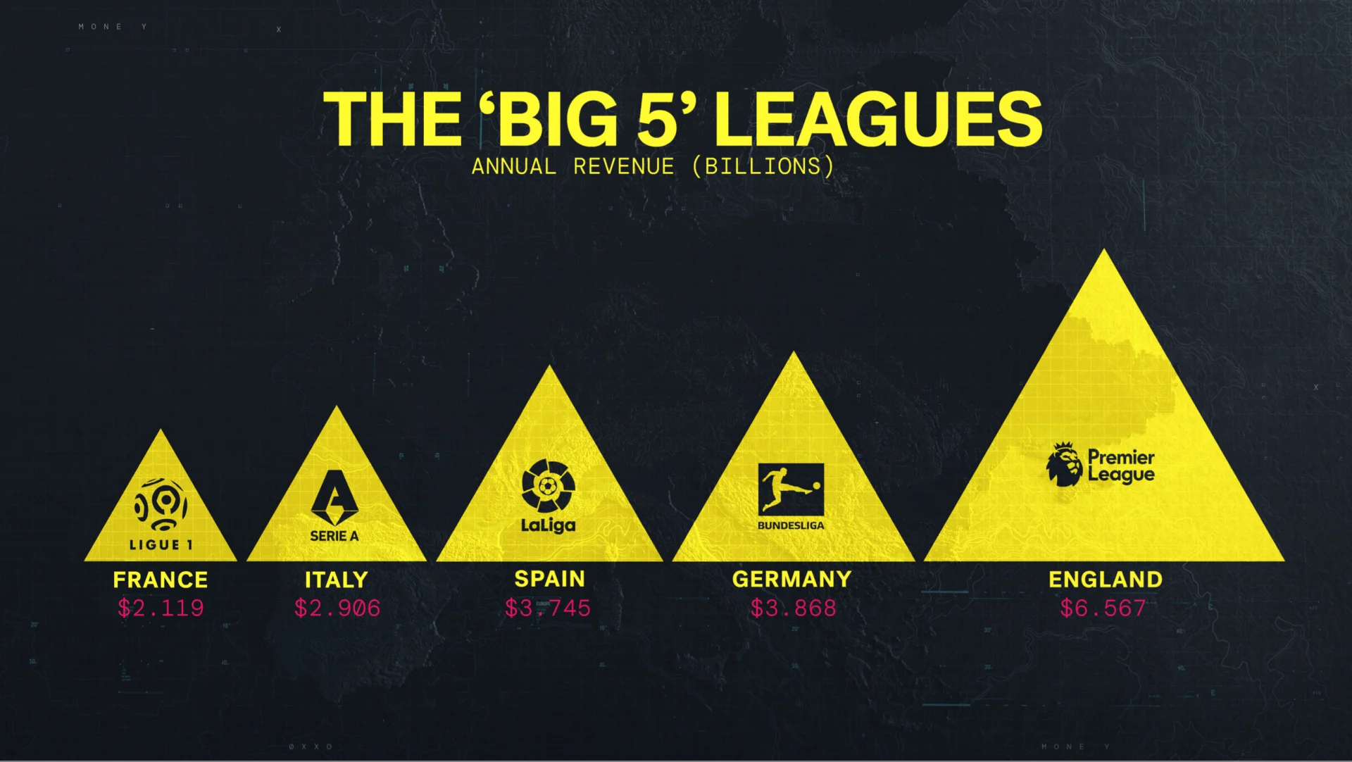
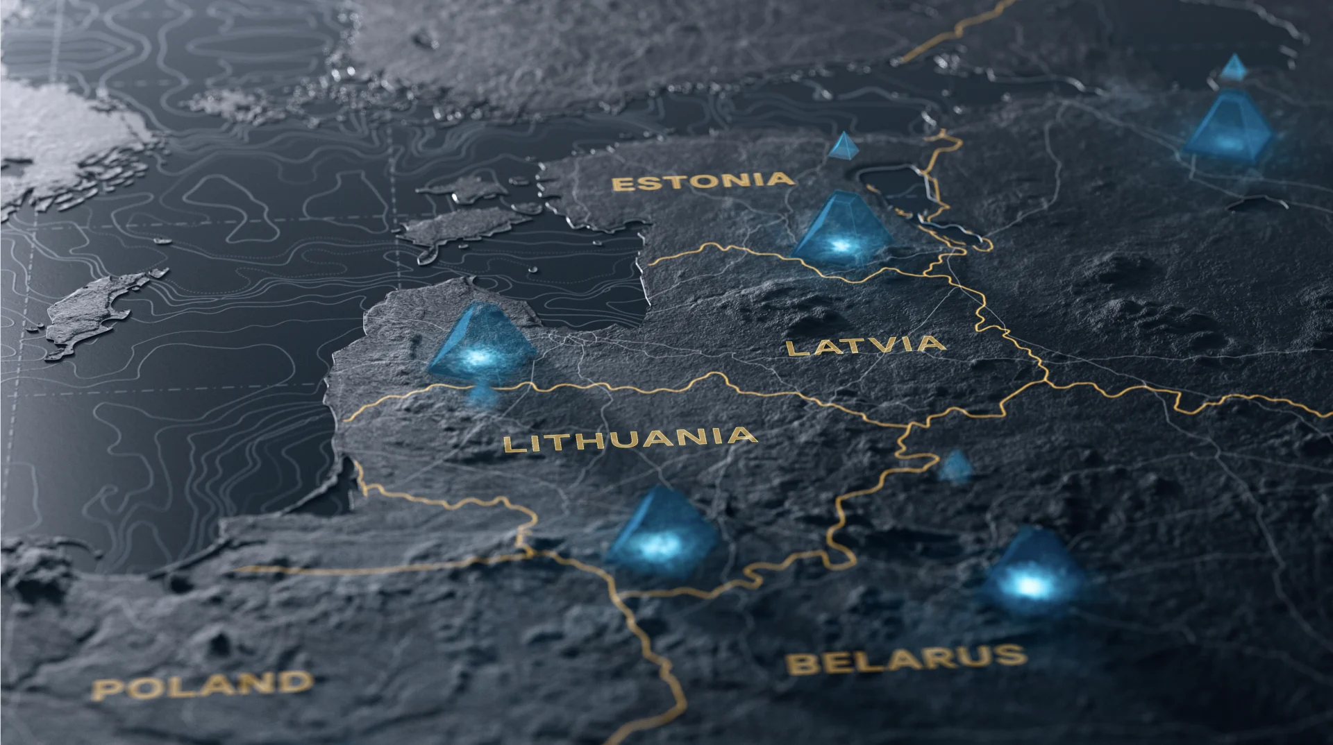
We designed a series of maps based on the idea of the sport of football’s stronghold on Europe and the looming presence of the Champions League and then the potential for the Super League. The map ended up being the base for all of the other graphics that we were creating—scorecards, cities, votes and the relevance of the pyramid system to the Super League.
We designed a set of pyramid graphics to represent the idea of relegation from the Champions League that the creation of the Super League was looking to destroy. The topic of relegation was extremely important to the show’s narrative, ultimately being the deciding factor for the clubs’ decision not to join the league. We kept the look and feel of the other graphics we’d designed and incorporated the idea of promotion and relegation and the importance of the hope it gives to fans.


At BigStar, sports projects appeal to us because they combine the creative, technical, and human elements that enhance storytelling. This type of personal storytelling is in our brand DNA, and lets us really flex our creative muscles.
Props where props are due
Credits
Super League
Founder, Executive Creative Director Josh NortonExecutive Vice President, Executive Producer Carson HoodVice President, Head of Production Virgil ConklinCreative Director, Designer Mark ThompsonDesign Director Ross HendersonAnimation Director Casey DroginDesign Nick Woythaler, Ivan ViaranchykAnimation Brian Landisman, Addy Afzali