Wallin Chambers Entertainment
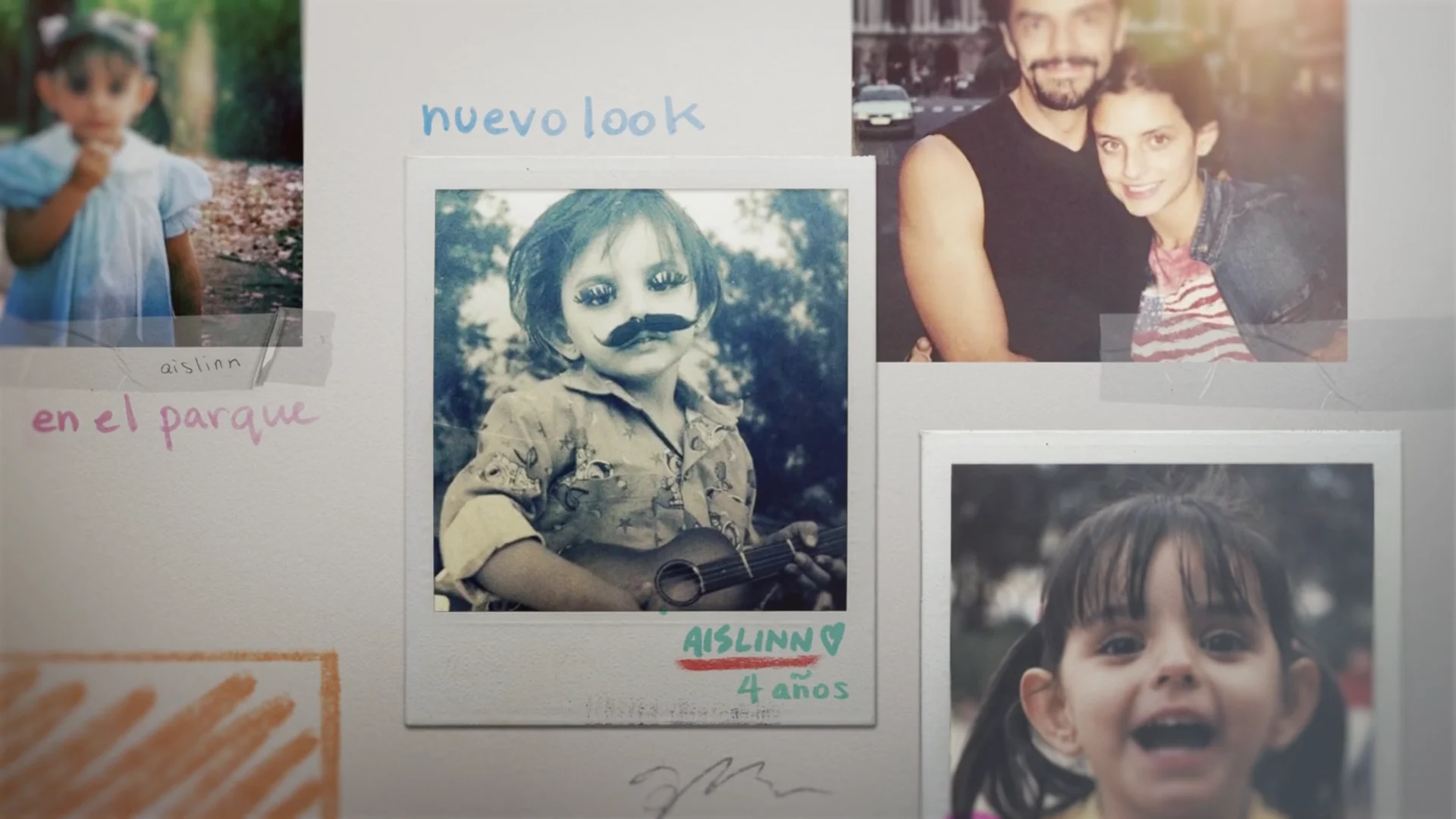
De Viaje Con Los Derbez
We had a great time developing the look for this Spanish-language series alongside the Wallin Chambers team.
View Projectget lost in
Client
Nickelodeon
Tasked with rebranding the hit 1990s British game show, The Crystal Maze, we teamed up with the folks at Nickelodeon to give the new series a slick, branded look. Our first big step was upgrading the iconic logo from the bottom up. We re-vamped the fonts, rendering, and overall environment to fit in with Nickelodeon's signature young, modern vibe.


Once we landed on a logo it was off to the races, starting with a custom show open. Rendering in Octane and using the freshly upgraded crystal -- the focal point of our new logo -- we created a show open that fully encompasses the energy of the show and its players.
With our logo and show open in place, we pushed forward to build out the rest of the show package - most importantly with maze maps and transitions. Each map would not only introduce the viewer to the section of the maze each contestant is in, but also implement transitions, showing when one contestant conquered a section and moved on the the next.
Finally, with contestant team bios, countdown clocks and other dynamic type, we sealed the show package off with high-end rendering style and a refreshing new look at the brand.
