icons among us

The Way I See It

Client

Ace Content / Jaywalker Pictures

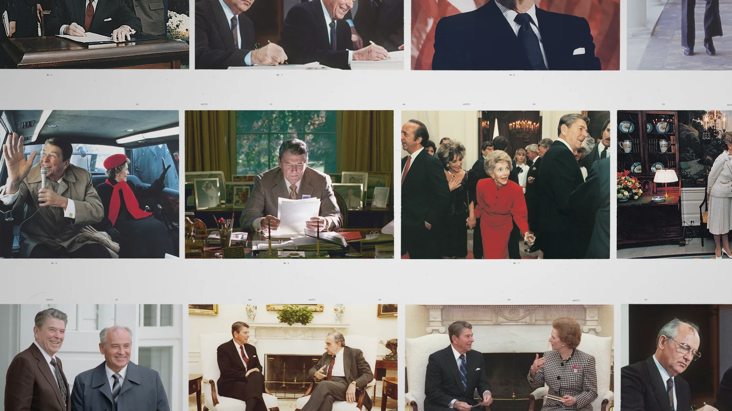
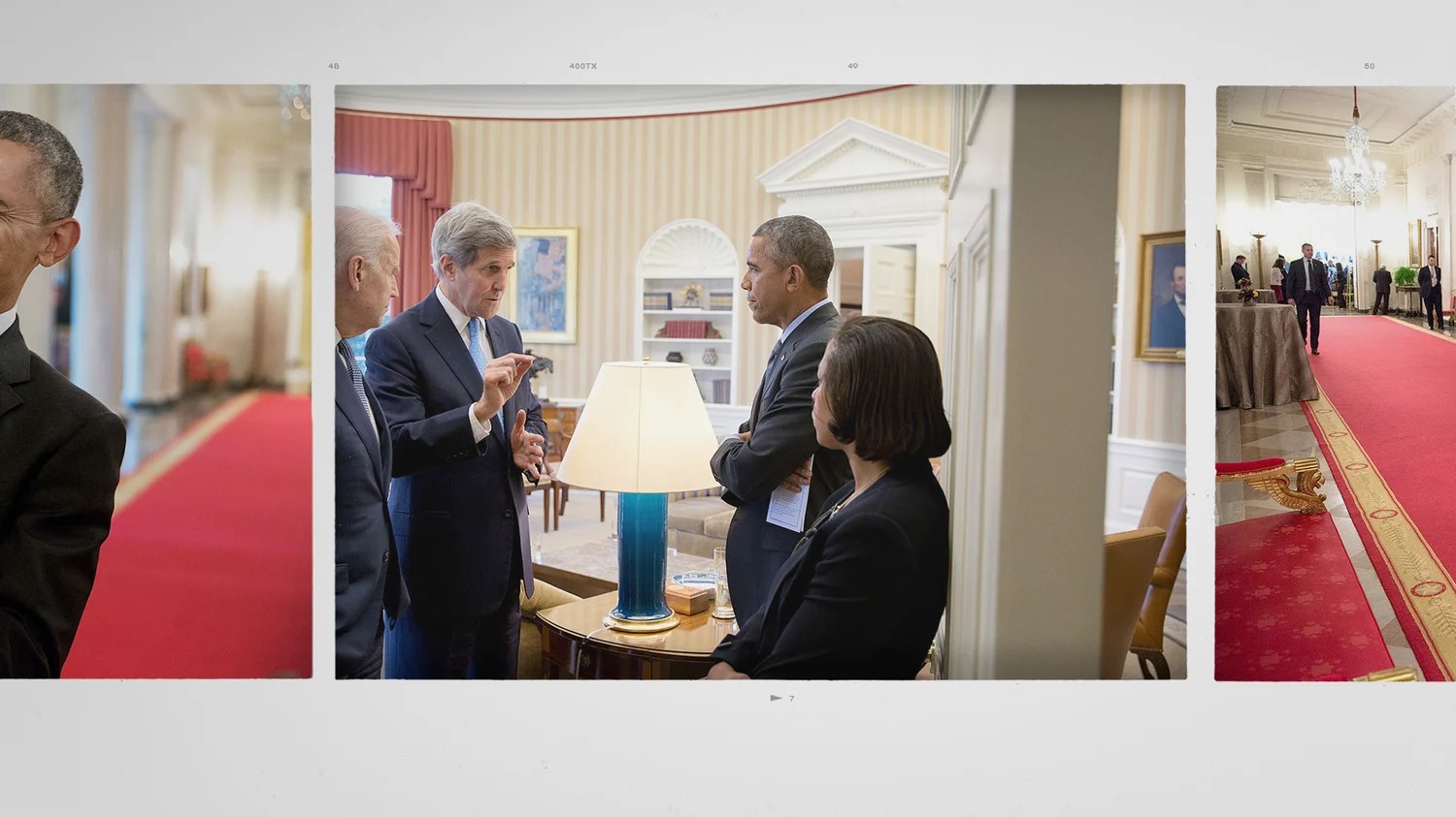
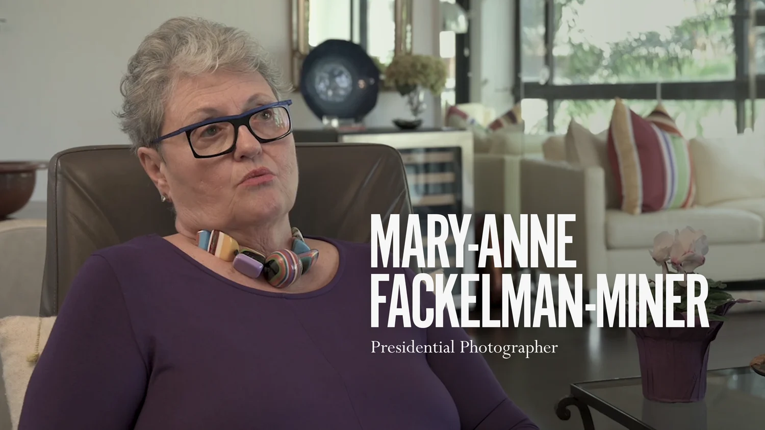
Pete Souza’s legendary career as a photographer is the focus of the documentary, The Way I See It. We designed a graphics package to help chronicle his photographic perspective of his career as the official White House Photographer for two presidencies and his legacy.

The Way I See It
Selected as one of the year's top ten docs to watch.
Savannah Film Fest

Exploration

Graphics Package

Graphics Package

We needed to preserve the integrity and intention of the photos Pete has captured over the years. Our design director, Ross Henderson, was brought on the case to carefully consider a graphic treatment for the film while complimenting the visually arresting nature of Pete’s art and storytelling.

To do this, we explored many avenues that all had a similar feeling but obvious tonal differences. With the working title “SHADE” in hand (the title of Pete’s book), we wanted a bold, sophisticated and “in-your-face” typesetting to reflect Pete’s social presence, while also upholding the professionalism and artistry of Pete’s job.

While Pete’s pictures tell a thousand words, it was our job to thread the needle with a cohesive look for the title sequence, social media layouts, photo mortises & film package typography.

Logo Exploration with working title "SHADE"
01/04

This could be expressed in large CAPS or italicized type, mixes of tracking and kerning, size and scale interplay and so on. We considered it all, and presented a robust exploration of the title, locators, l3rds, social media treatments, and photo mortises.

After the first round, we were locked.

With our look & materials in place, we began to envision the animation through Pete’s lens. Using a clean, poignant approach, our social animations stayed true to the interface, but brought emphasis to key words and phrases to act as snapshots of Pete’s personality.

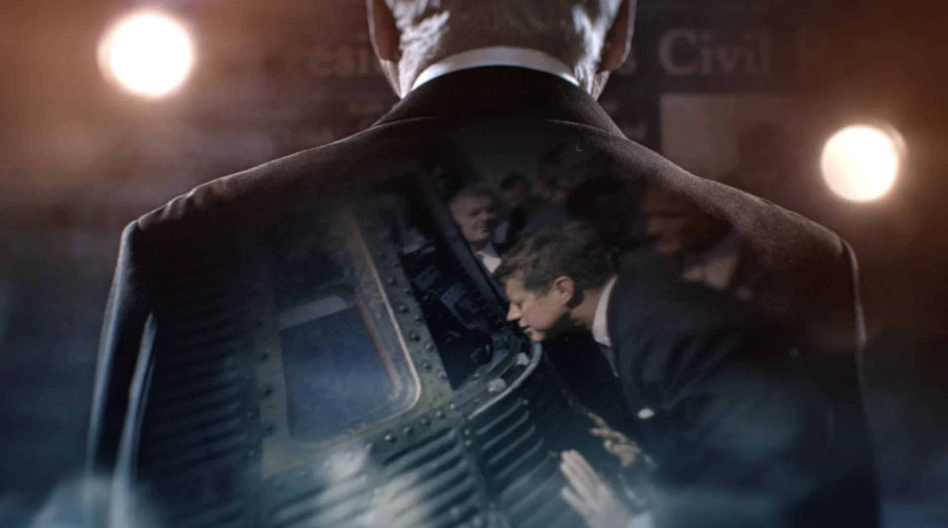
For the open, we began the process of selecting and editing moments that had been developed through Pete’s career, working closely with Jaywalker & Ace to nail the narrative and frame the best moments. We locked the title “The Way I See It”, honed in the color animation on the typography, and sent it to air.

Along with various toolkits delivered, we also created the end credit sequence and over 30 social & bespoke sequences.

As a bonus, Jaywalker wanted to bring their logo design to life for the premiere. We explored a few different animation & color techniques, but it was Lung that rendered the winning style, and brought the animated film leader into completion.

The way we see it, it was a story we loved to help develop with such an amazing team at Ace & Jaywalker.

Props where props are due

Credits

Thanks to the team at BGSTR for pulling it together.

Credits
  • Executive Creative Director
    Josh Norton
  • Executive Vice President, Executive Producer
    Carson Hood
  • Producers
    Virgil Conklin & Shannon Hall
  • Design Director
    Ross Henderson
  • Animators
    Liu Chialung, Brian Landisman, Casey Drogin, Ivan Viaranchyk

Up next

Related Projects

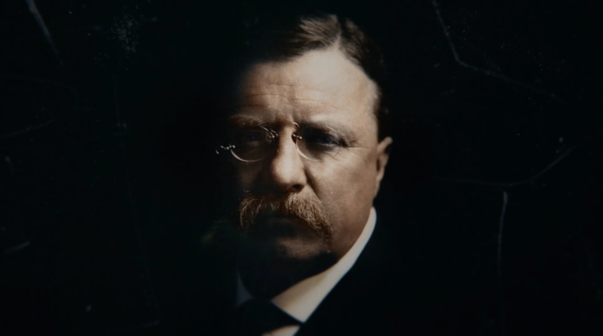
Theodore Roosevelt: A champion of social justice, a passionate conservationist, and the self-proclaimed “bull moose.” For History’s five-hour television event Theodore Roosevelt, we designed maps, treated photos, and more to characterize and chronicle a panoramic portrait of the first modern President of the United States.

History Channel

Theodore Roosevelt

Theodore Roosevelt: A champion of social justice, a passionate conservationist, and the self-proclaimed “bull moose.” For History’s five-hour television event Theodore Roosevelt, we designed maps, treated photos, and more to characterize and chronicle a panoramic portrait of the first modern President of the United States.

View Project
We designed a cinematic title sequence for The HISTORY Channel’s new series The American Presidency with Bill Clinton to introduce each episode and underscore the series' premise: an elevated exploration of the history of the American presidency and the struggle for a more perfect union across six themed episodes.

History Channel

The American Presidency with Bill Clinton

We designed a cinematic title sequence for The HISTORY Channel’s new series The American Presidency with Bill Clinton to introduce each episode and underscore the series' premise: an elevated exploration of the history of the American presidency and the struggle for a more perfect union across six themed episodes.

View Project
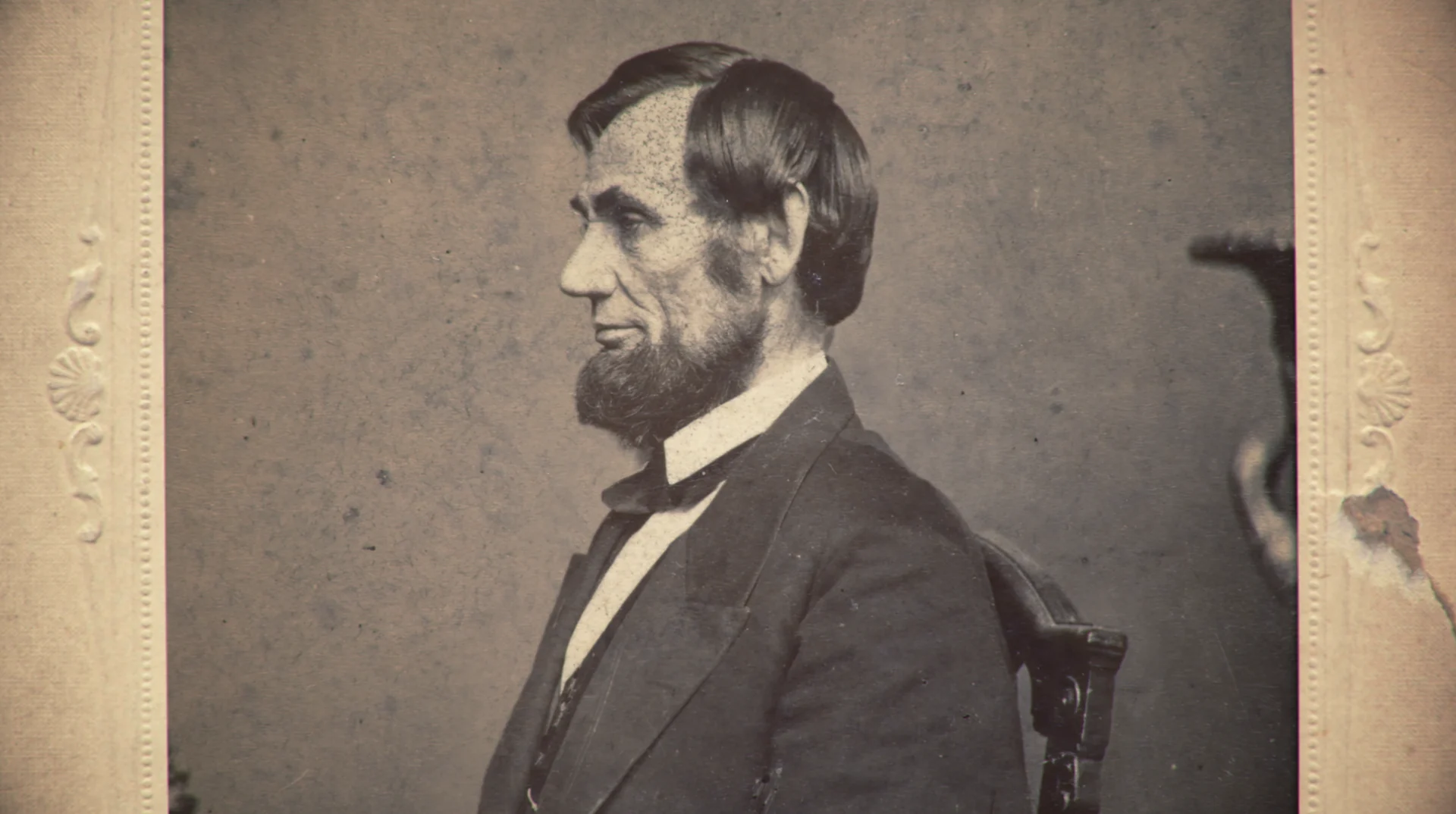
Our film design for The HISTORY Channel's 3-part documentary ‘Abraham Lincoln’ debuted over President's Day weekend. We worked methodically to have our design match the era the 16th president lived in-- recreating and treating vintage portraits as well as creating photo-real maps to enhance the visual narrative of the film.

History Channel

Lincoln

Our film design for The HISTORY Channel's 3-part documentary ‘Abraham Lincoln’ debuted over President's Day weekend. We worked methodically to have our design match the era the 16th president lived in-- recreating and treating vintage portraits as well as creating photo-real maps to enhance the visual narrative of the film.

View Project
0:00
-0:00