TCM
TCM Network IDs
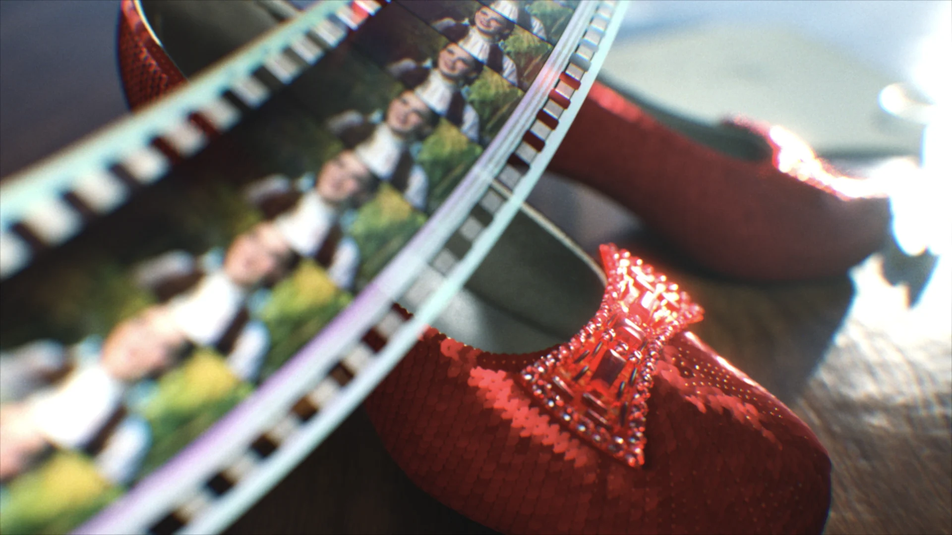
In an effort to elevate the already classic TCM Network brand, we partnered with the good folks at Turner to create a series of five new TCM IDs, all centered around a crucial aspect of filmmaking.
View ProjectSeal it with a Kiss
Client
TCM
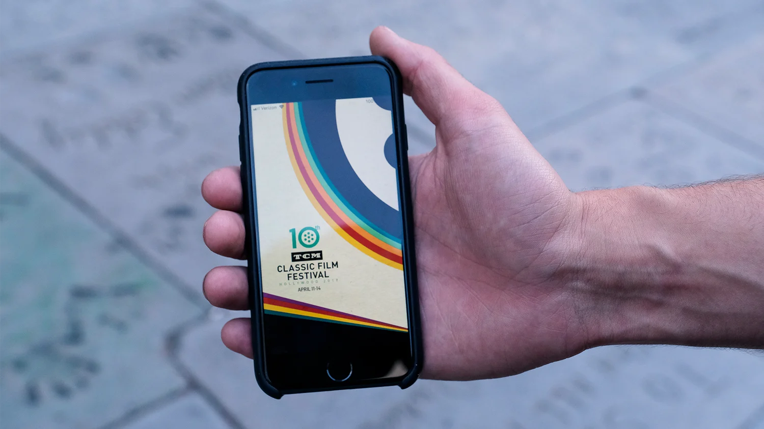
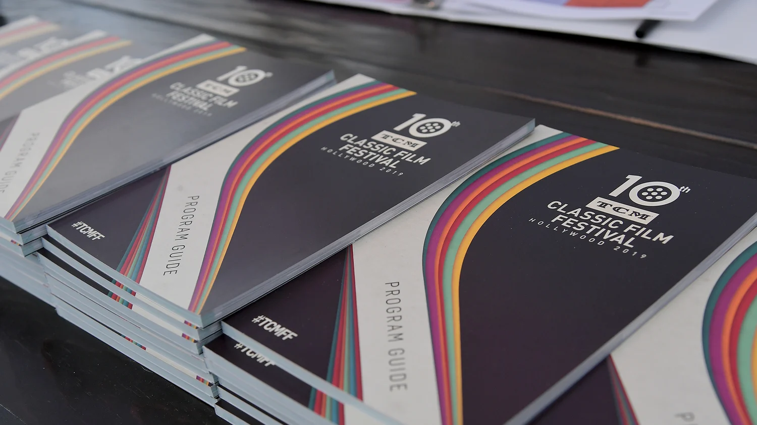
We helped brand the 2019 annual TCM Classic Film Festival event with our key art and promotional film, following their theme of “love in all its forms”. Keeping this subject matter in mind, our design concepts incorporated all things romantic and joyful, from bright, pop-art colors, to illustrative film characters to graphic shapes.
Classic Pop
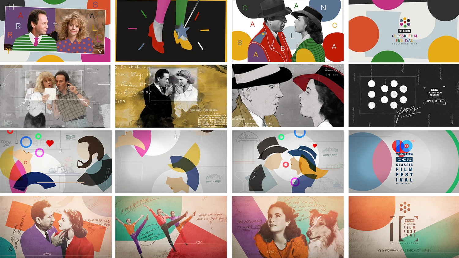
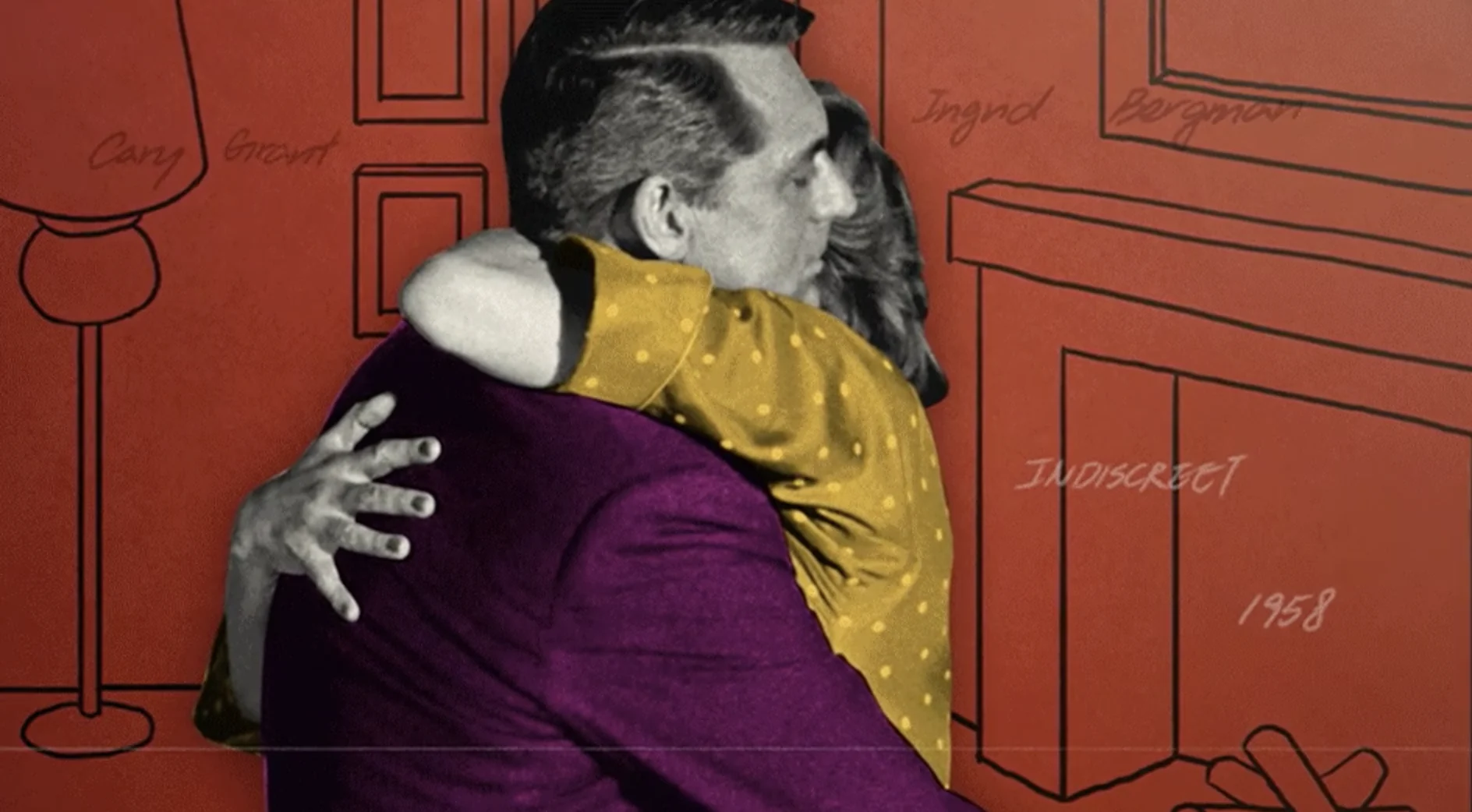
Landing on an approach designed by Carol Cai, our style was centered around comedic and loving moments from each of this year’s featured classic films. Using cut-outs of all our favorite characters, brought to life with bright pops of color, we drew specialized illustrations for each environment, making every moment feel unique and heart-warming.
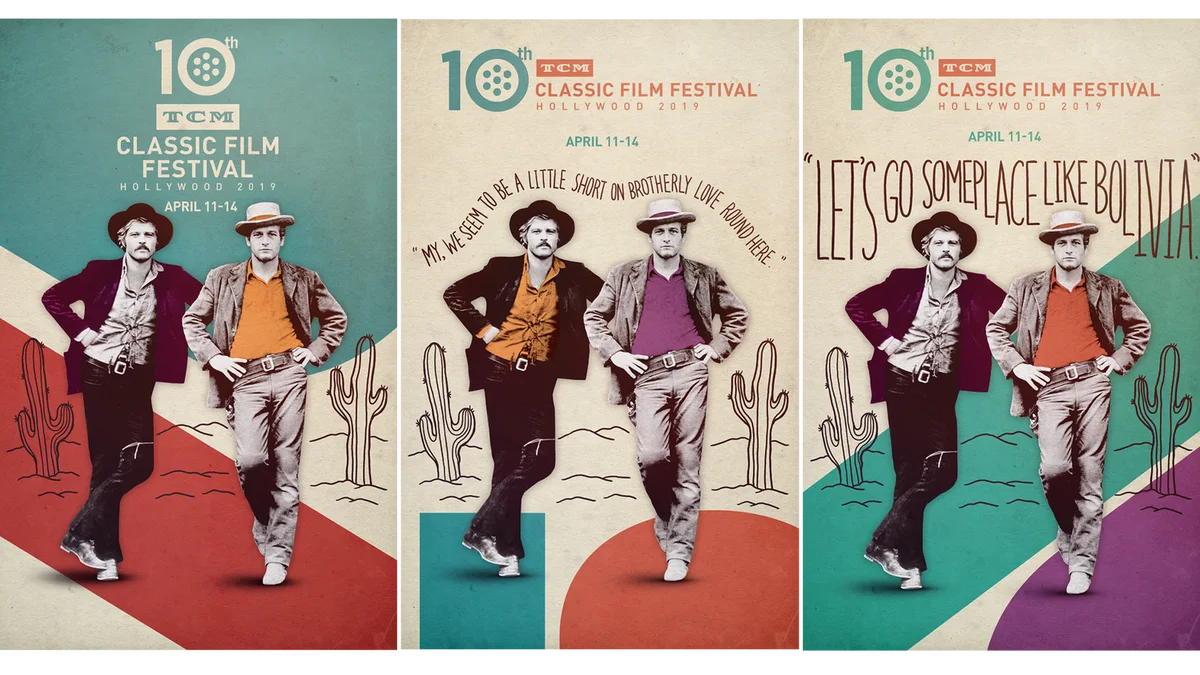
Our initial key art reflected this same concept, structured around relevant film quotes.
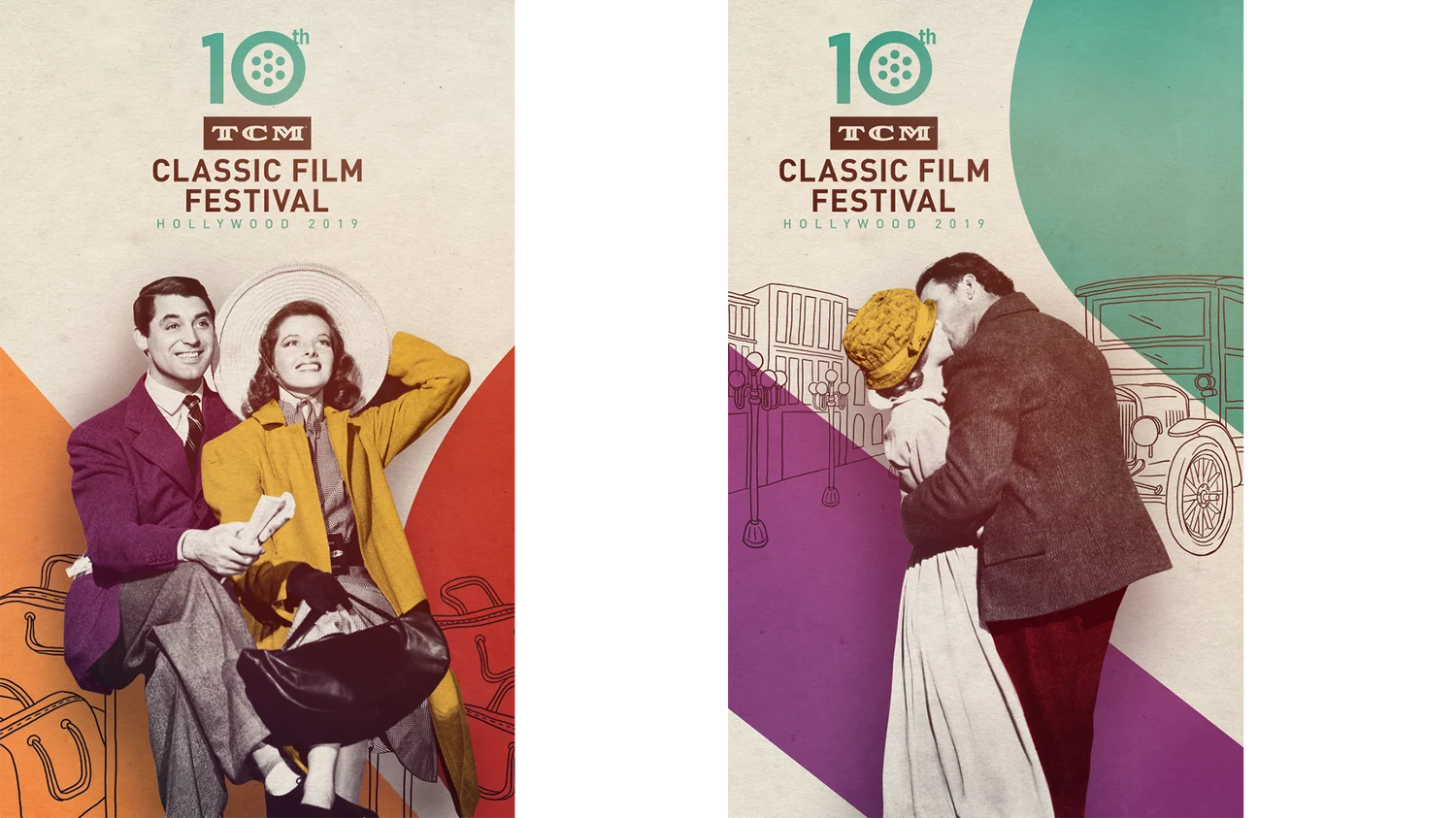
Ultimately we felt the designs worked best without the type, having the characters come first and foremost.


Using paper-like layers, tactile textures, small illustrative type-sets, and the TCM logo itself across the board, our animations have an intricately layered feel. The in-theater graphics peel back or connect these layers in a way that reveals famous scenes organically, while our ID’s use the rotating motion of the logo to transition in and out of loving moments with a wash of color.
By layering paper-like and tactile textures, small illustrative type-sets and the TCM logo, we created a level of intricacy for each moment and a celebratory cohesion to the event branding as a whole.
And of course, we couldn't forget to include the fans - an essential part of the shared cinematic experience.
Lastly, our solicitation spots play with these elements in an origami-like motion, folding and unfolding each piece to reveal pertinent information, all leading up to the final endpage.
