Endurance
Over 100 years ago, polar explorer Ernest Shackleton kept his 27-man crew alive for over a year after they lost their ship to treacherous conditions where it lay untouched at the bottom of the Weddell Sea for over a century until a team of modern-day explorers set out to find the sunken ship.
'Endurance' is a full-length feature film from National Geographic Documentary Films that tells the inspiring stories of these two landmark expeditions, bound by their shared grit and determination. Directed by Chai Vasarhelyi, Jimmy Chin and Natalie Hewit, BGSTR was brought in to design the film's graphics, which features thousands of 3D scans shot by a 4K camera deployed to a depth of nearly 10,000 feet.
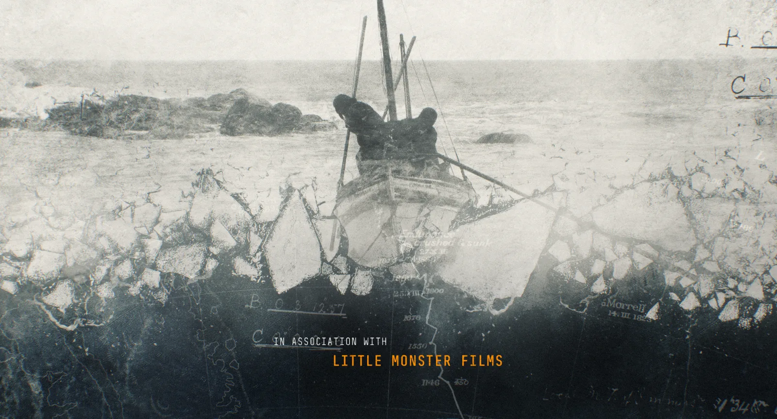
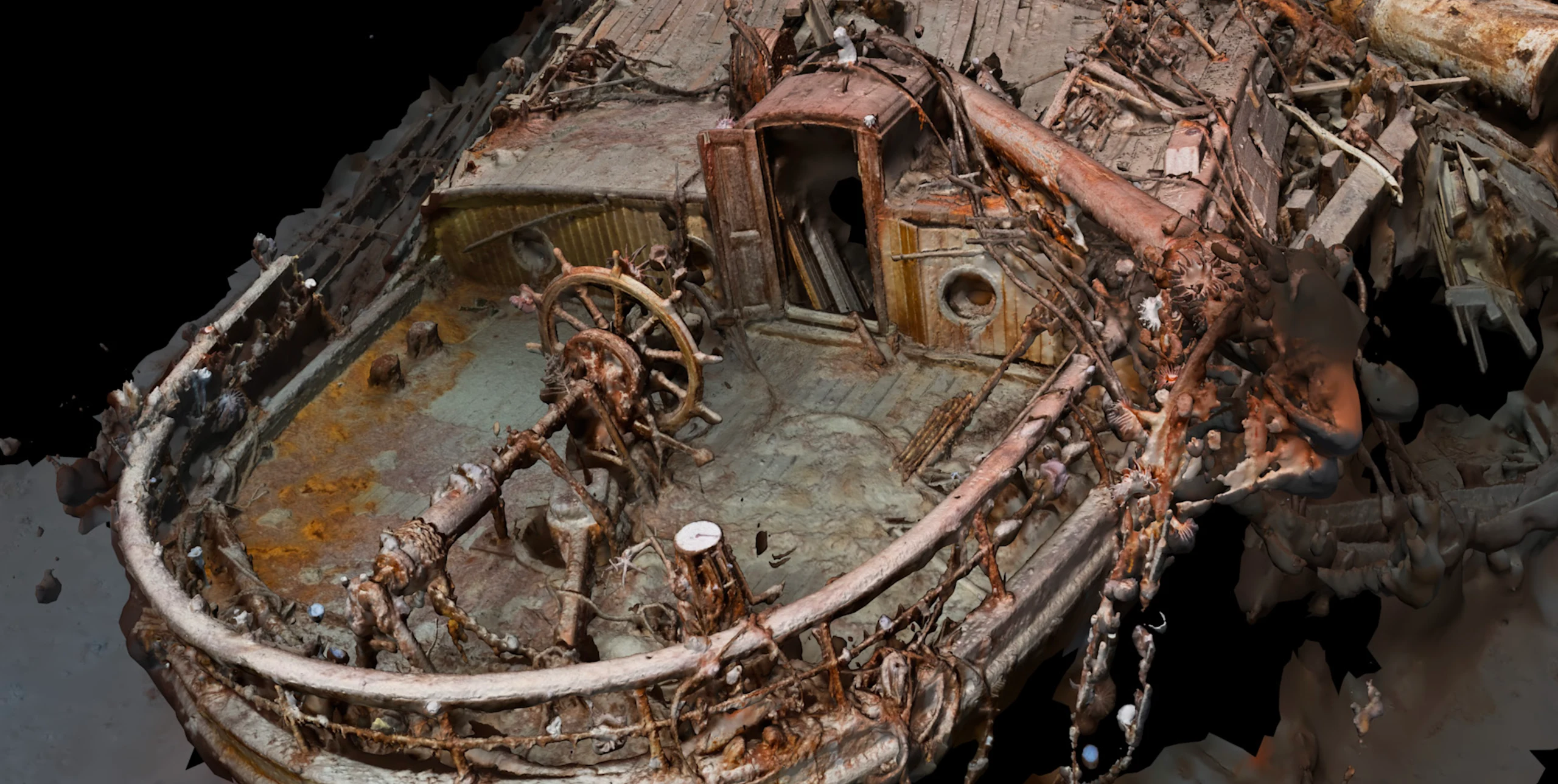
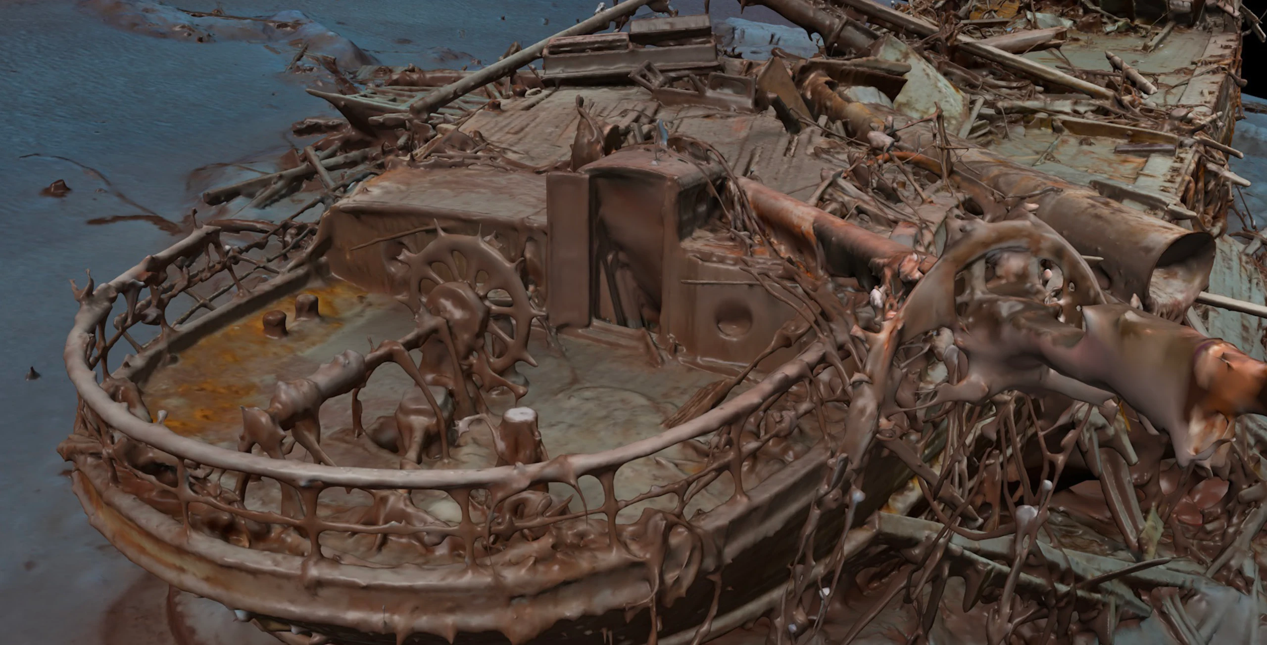
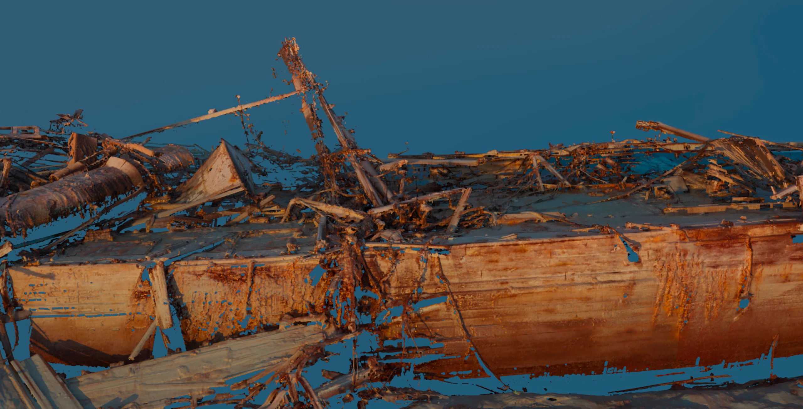
Exploring the two ships' unique journeys a century apart and accurately intertwining their stories was a key focus of our design throughout the project, but it is probably the most visible in the title sequence. We found our design style and began by selecting the key imagery we needed to represent Shackleton’s original voyage, the return in 2022 and the geographic location of the sunken ship. We used high-resolution photography to create a 3D model of the ship’s wreckage, making for really compelling visuals.
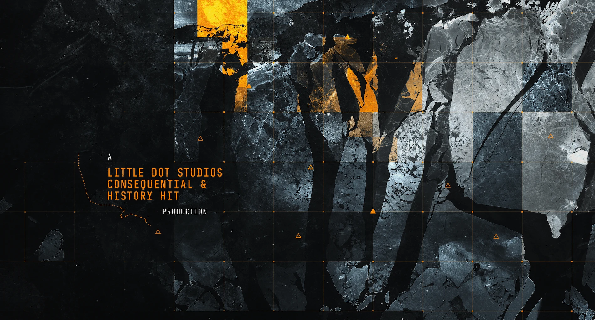
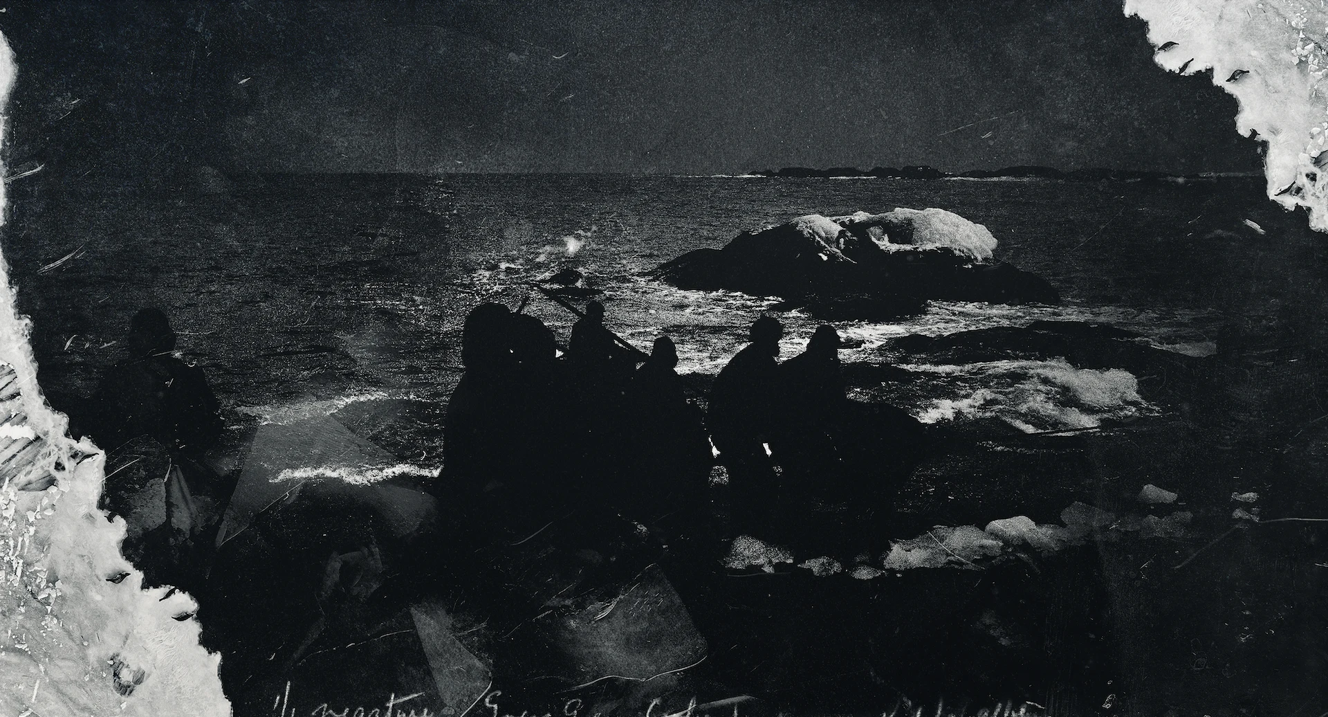
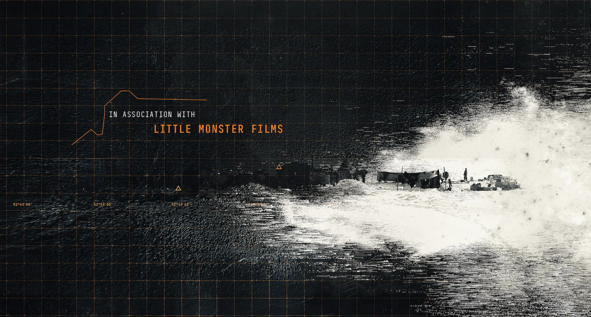
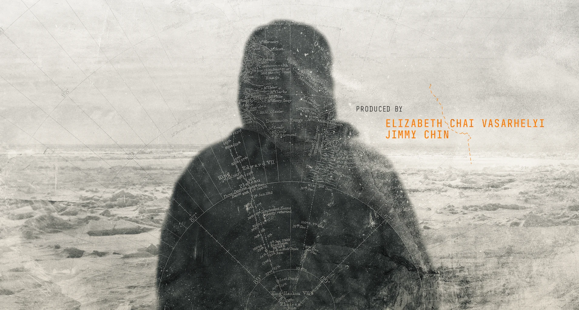
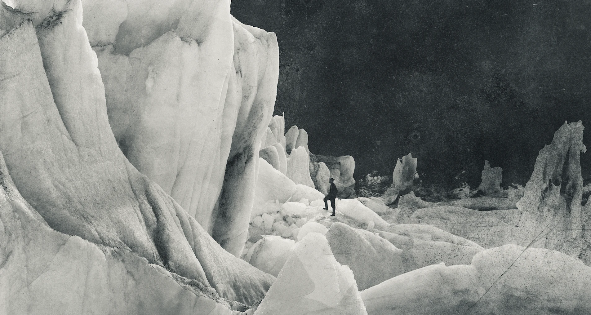
Title Sequence Design Exploration
Once we established the sequencing of the open, we developed the logo using the working title of the film. Underwater, encased in ice, subtle, bold— we played with variations of lockup combinations until we found one that perfectly captured the tone of the film.
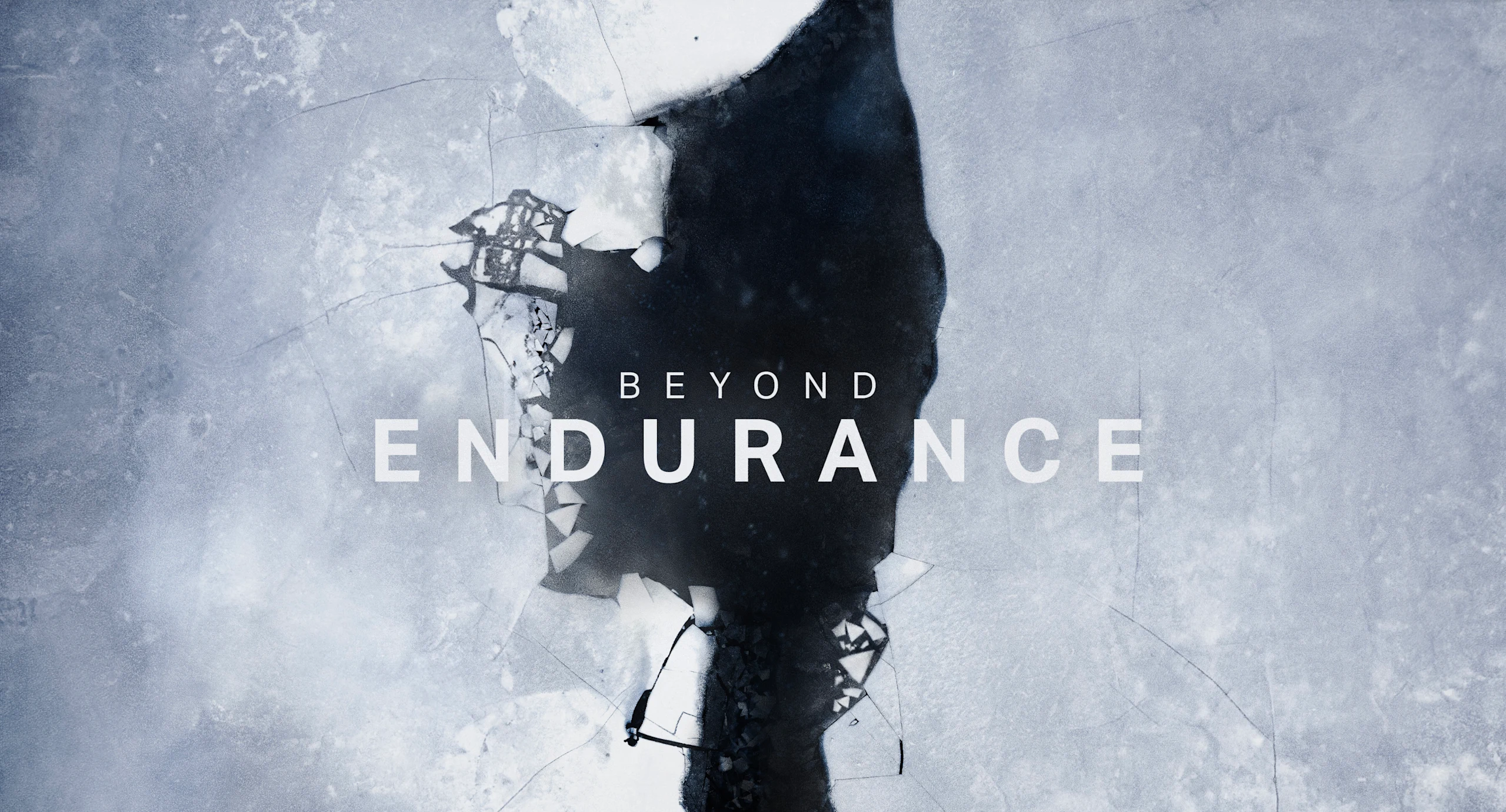
Logo Exploration
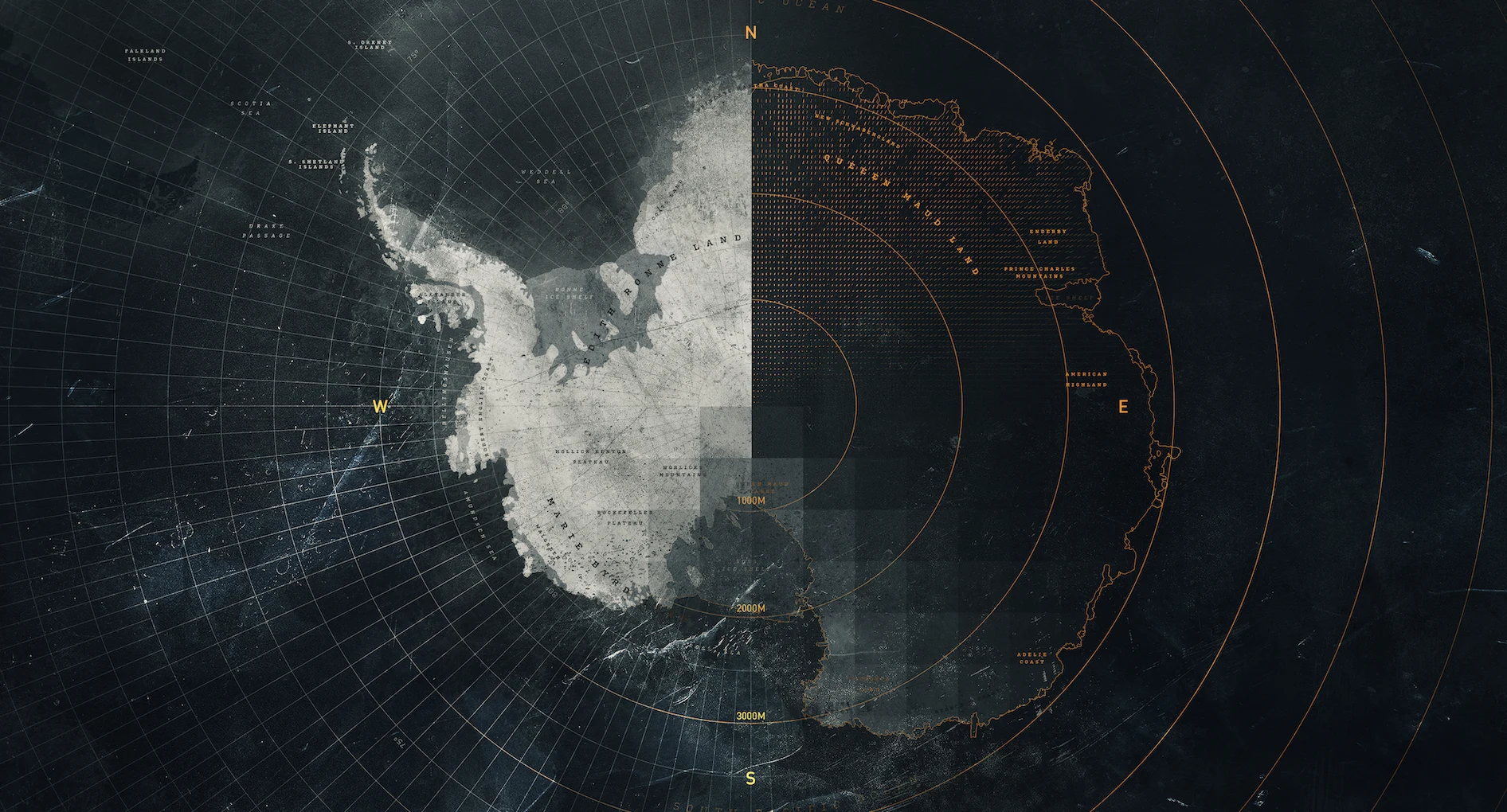
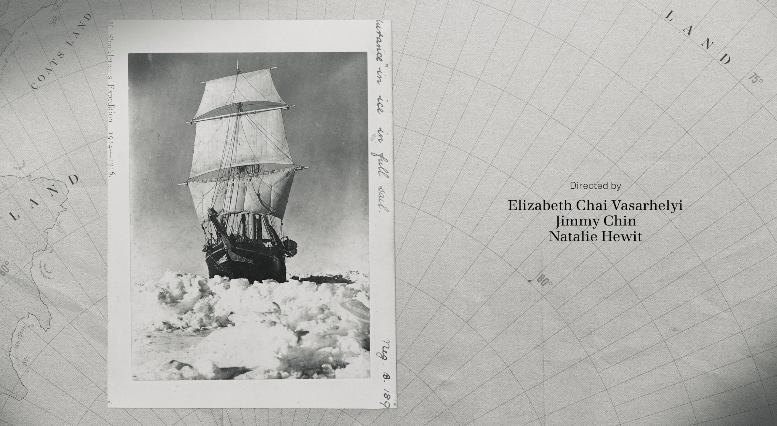
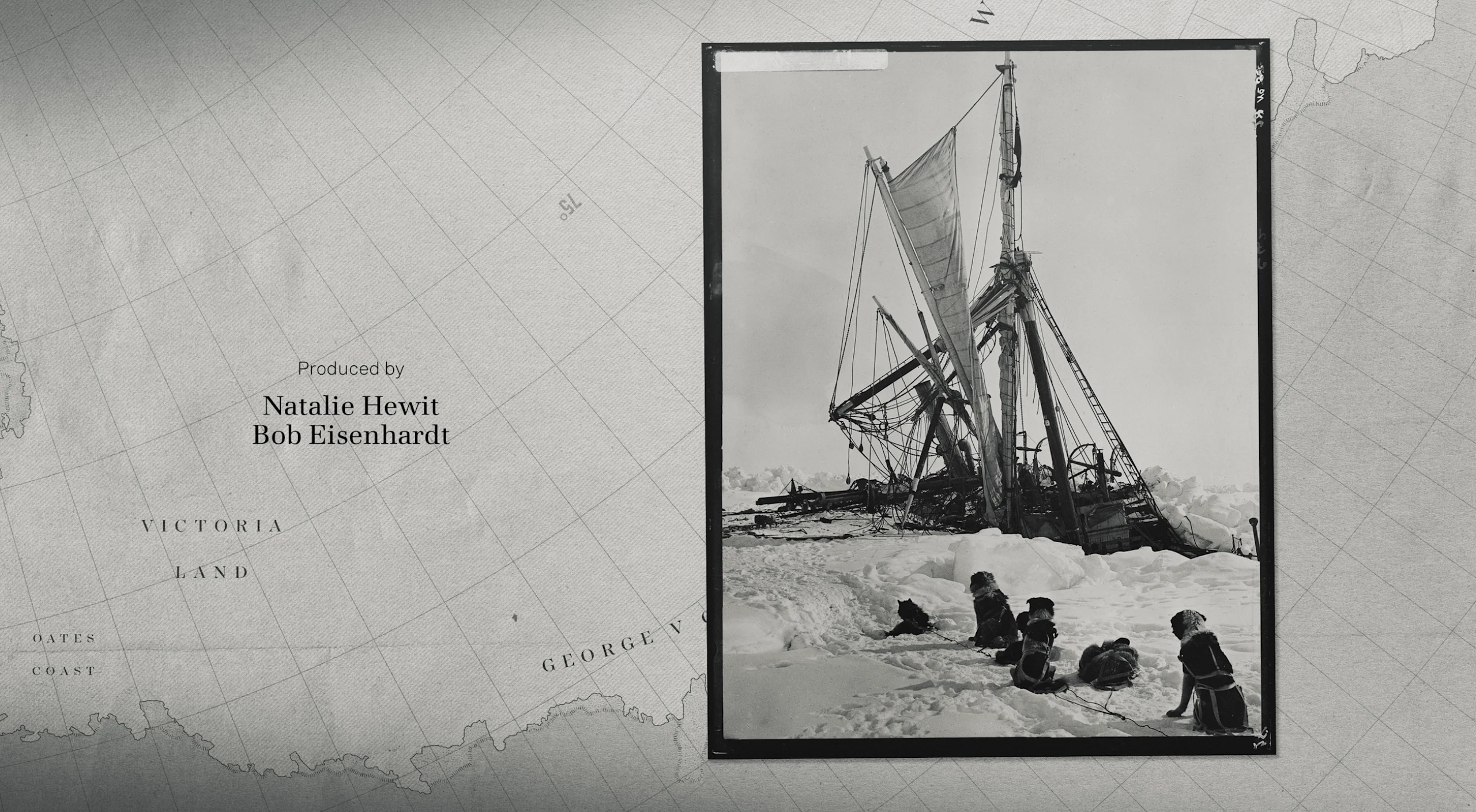
A major decision we needed to cement early in the design process was the style of our maps and geolocators. We played with versions that ranged from photo-real to a vintage, hand-drawn version.
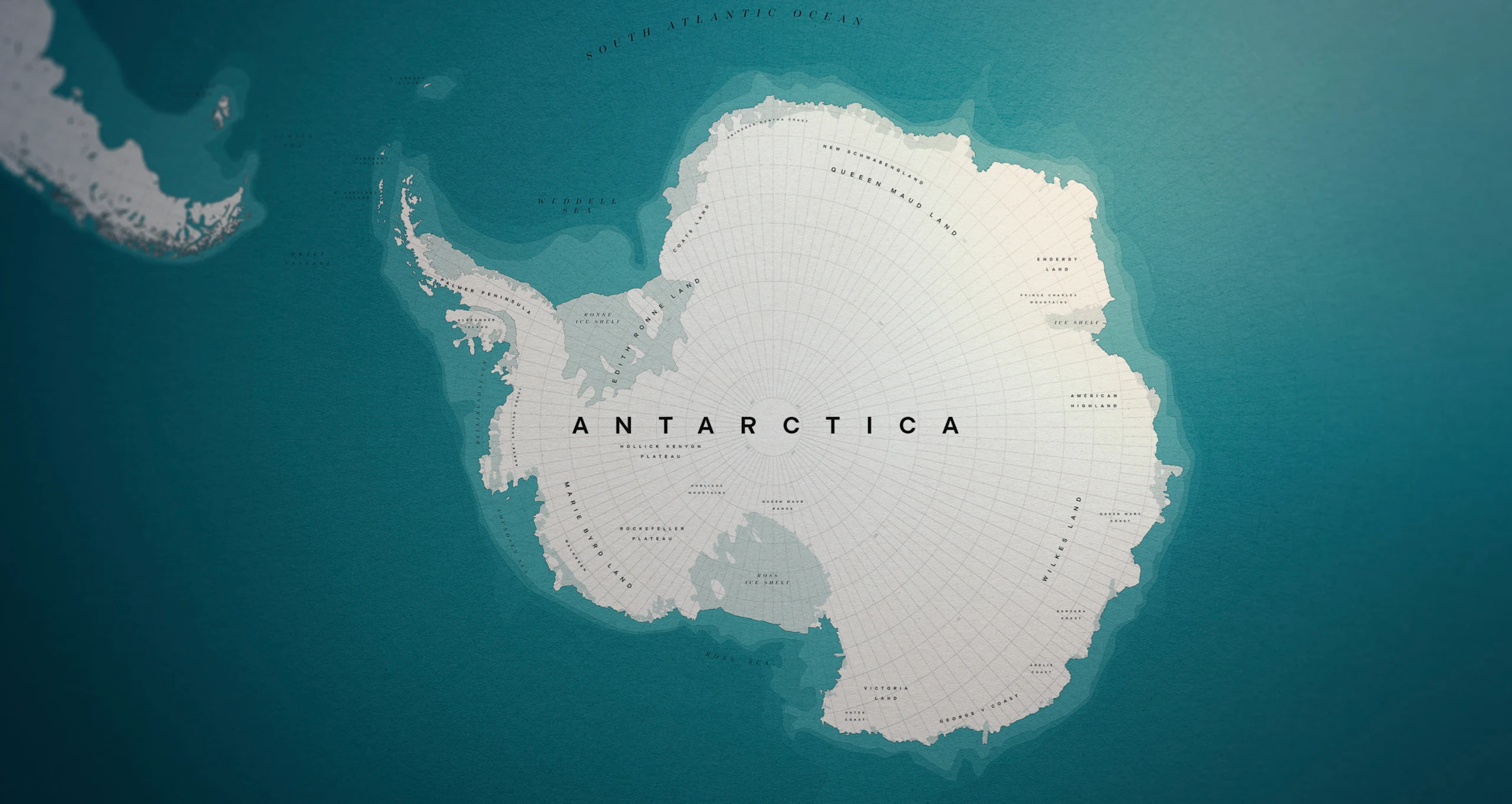
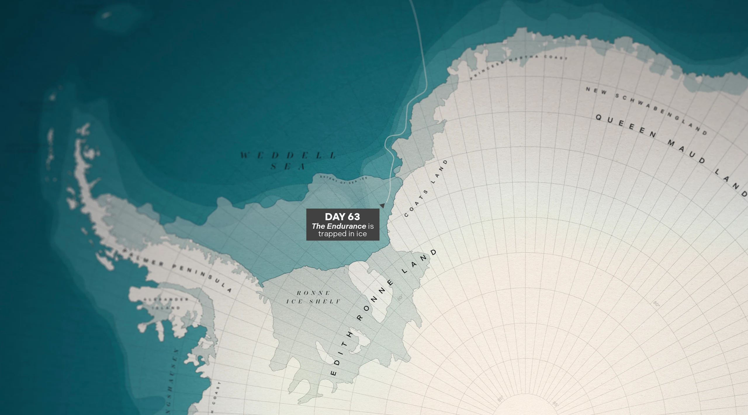
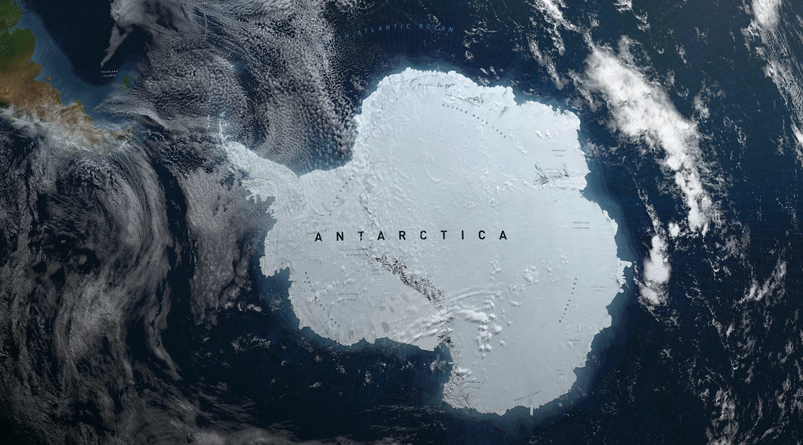
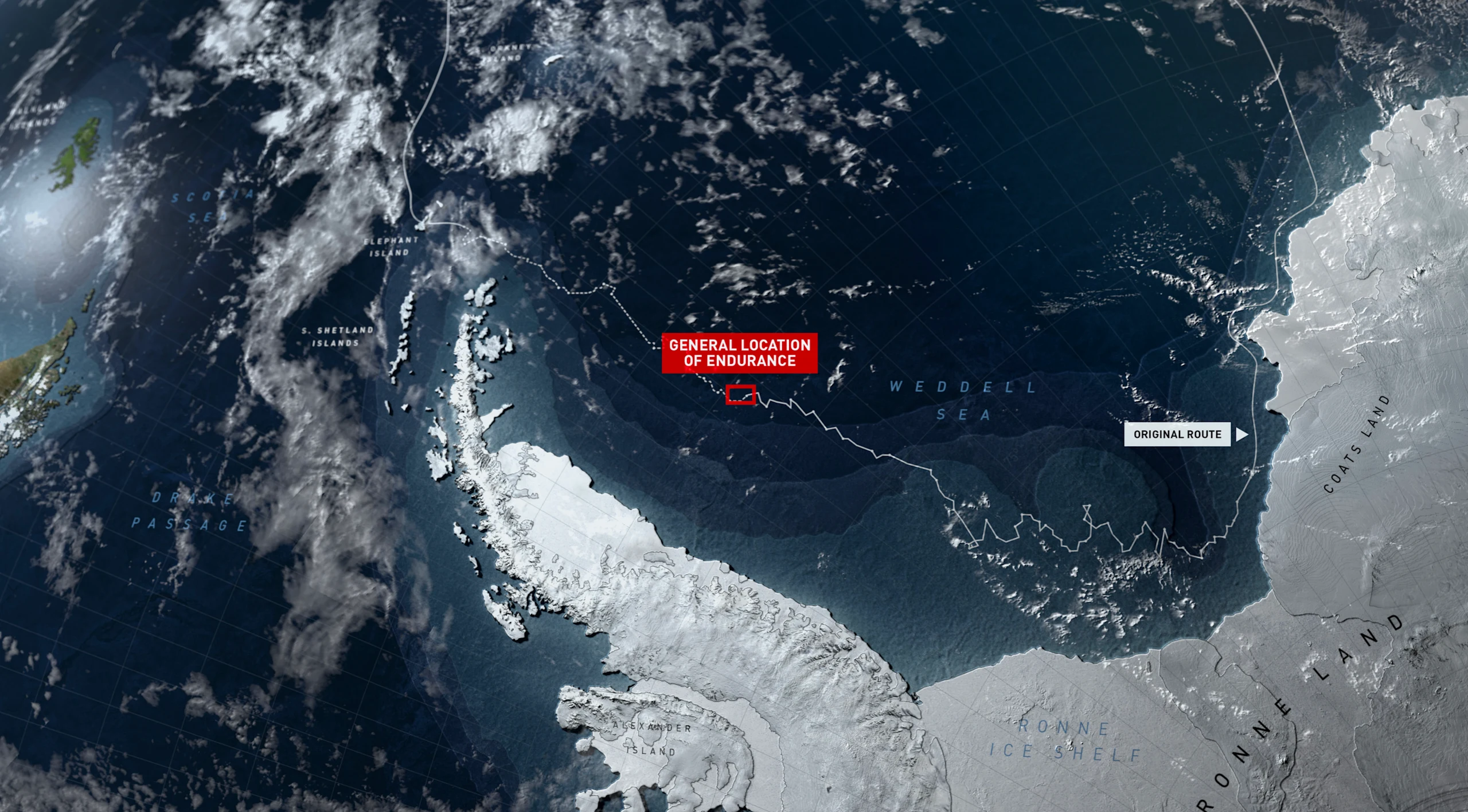
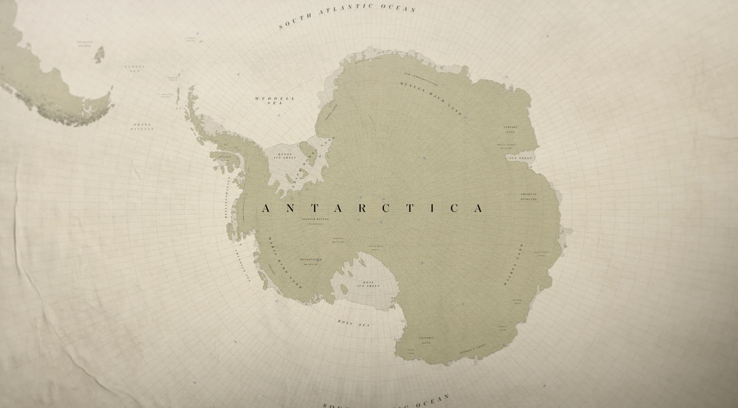
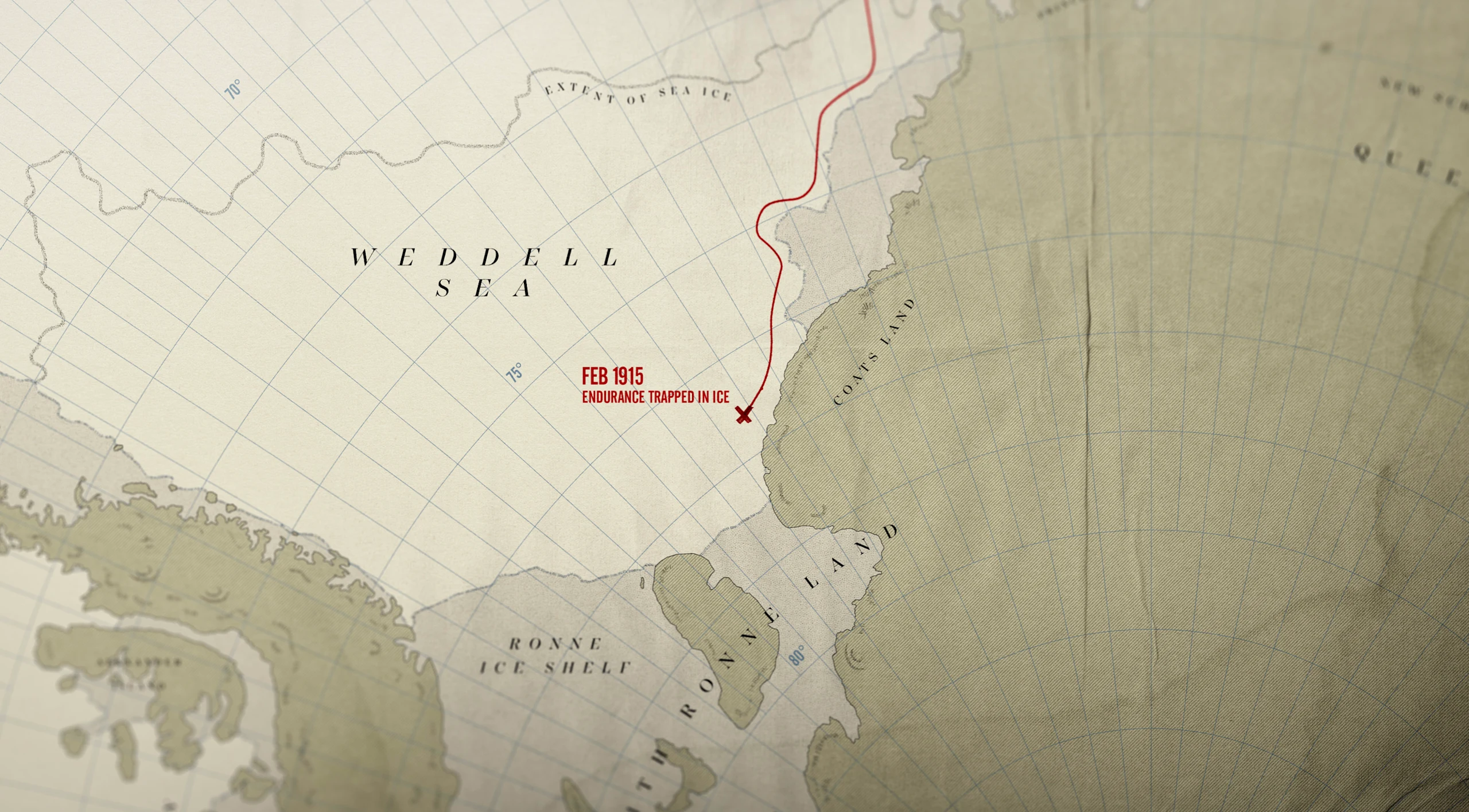
Map Design Exploration
Our clients preferred a blend of the styles we presented and so ultimately we landed on an archival look that shared some of the 3D characteristics of the design rounds.
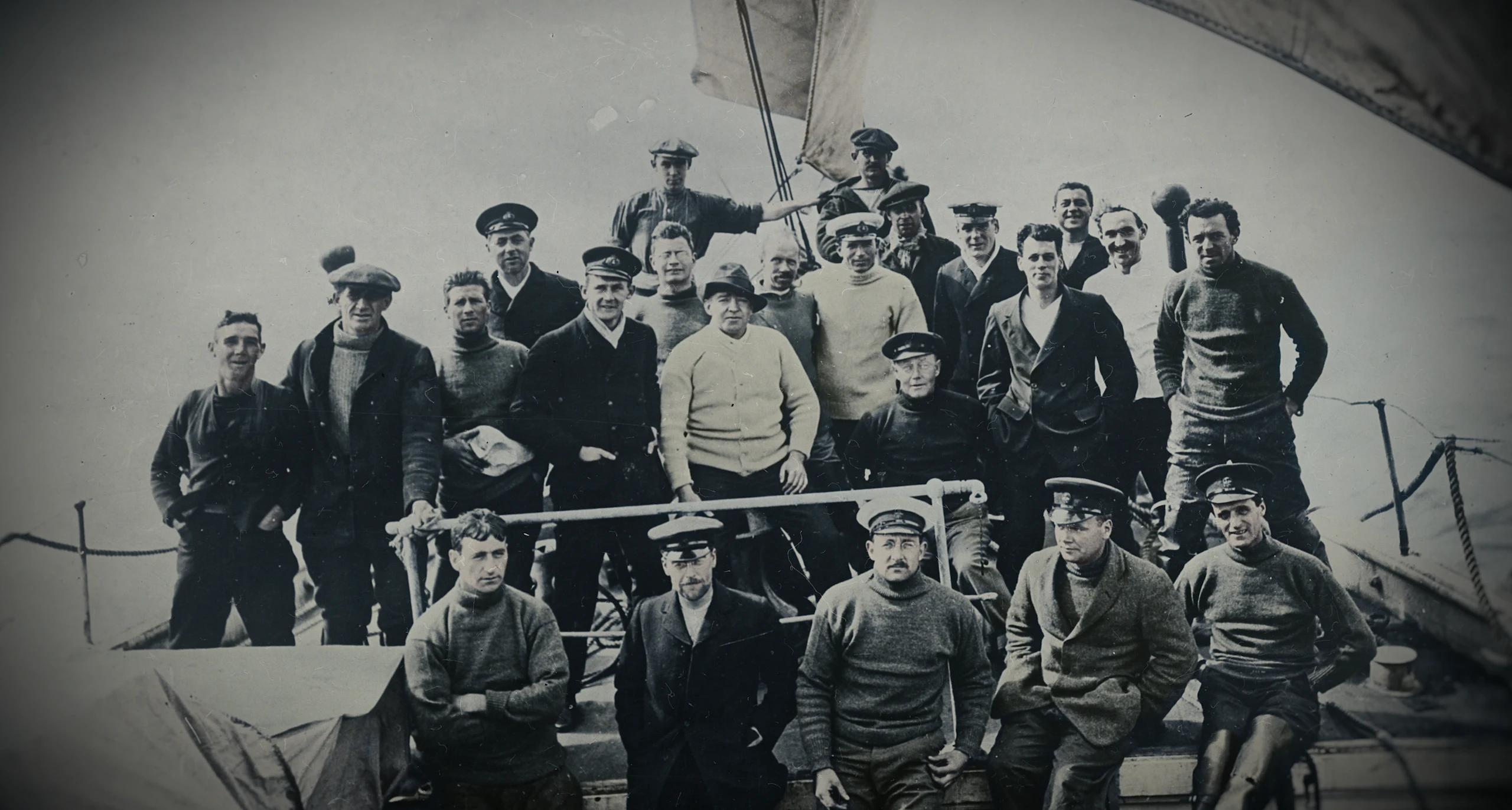
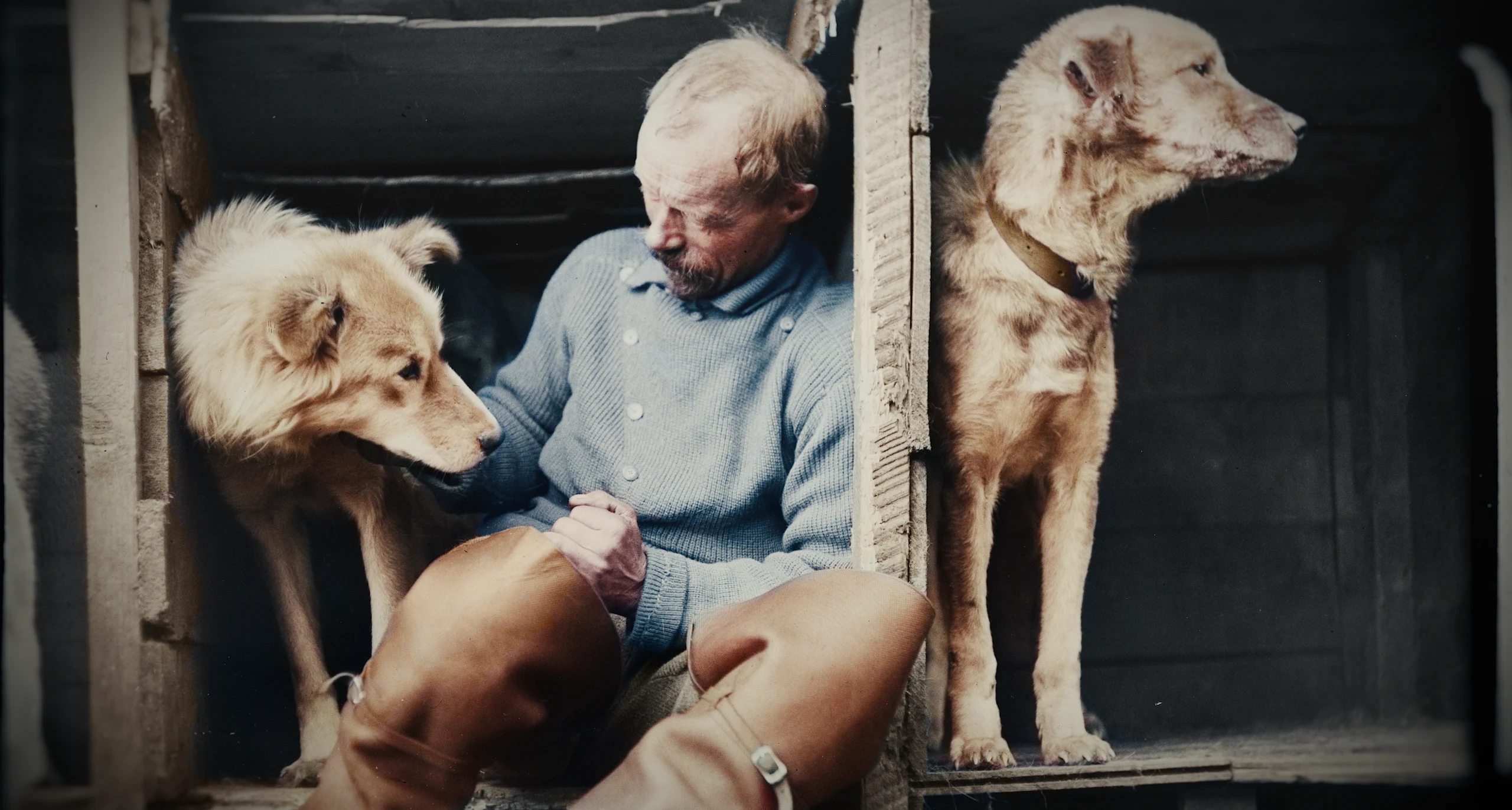
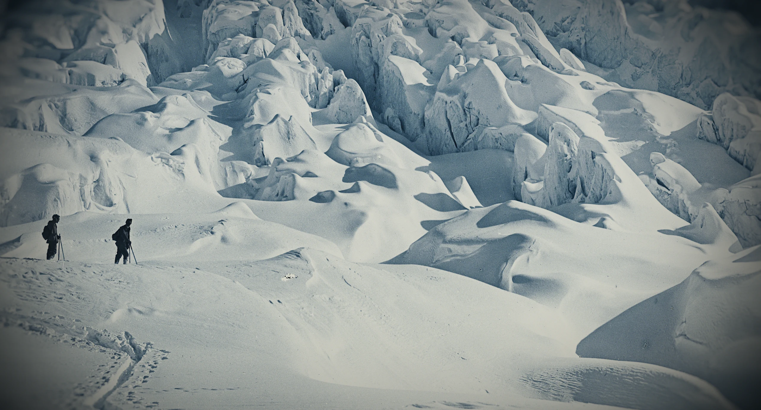
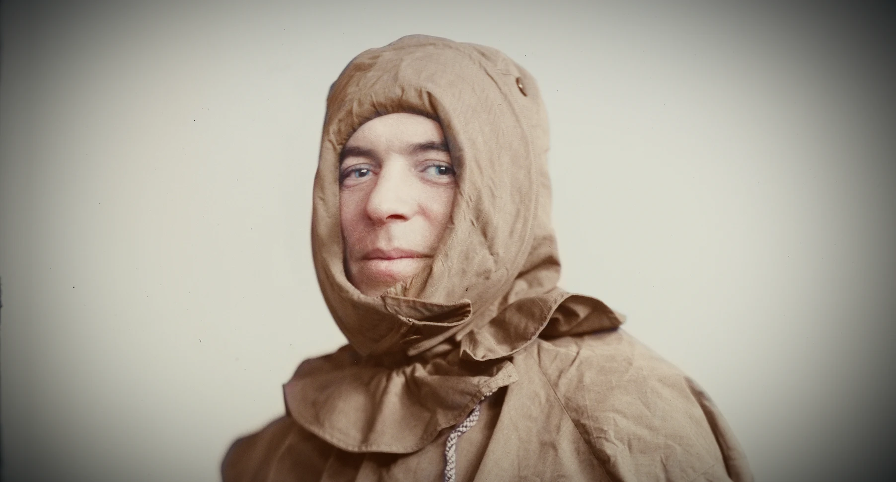
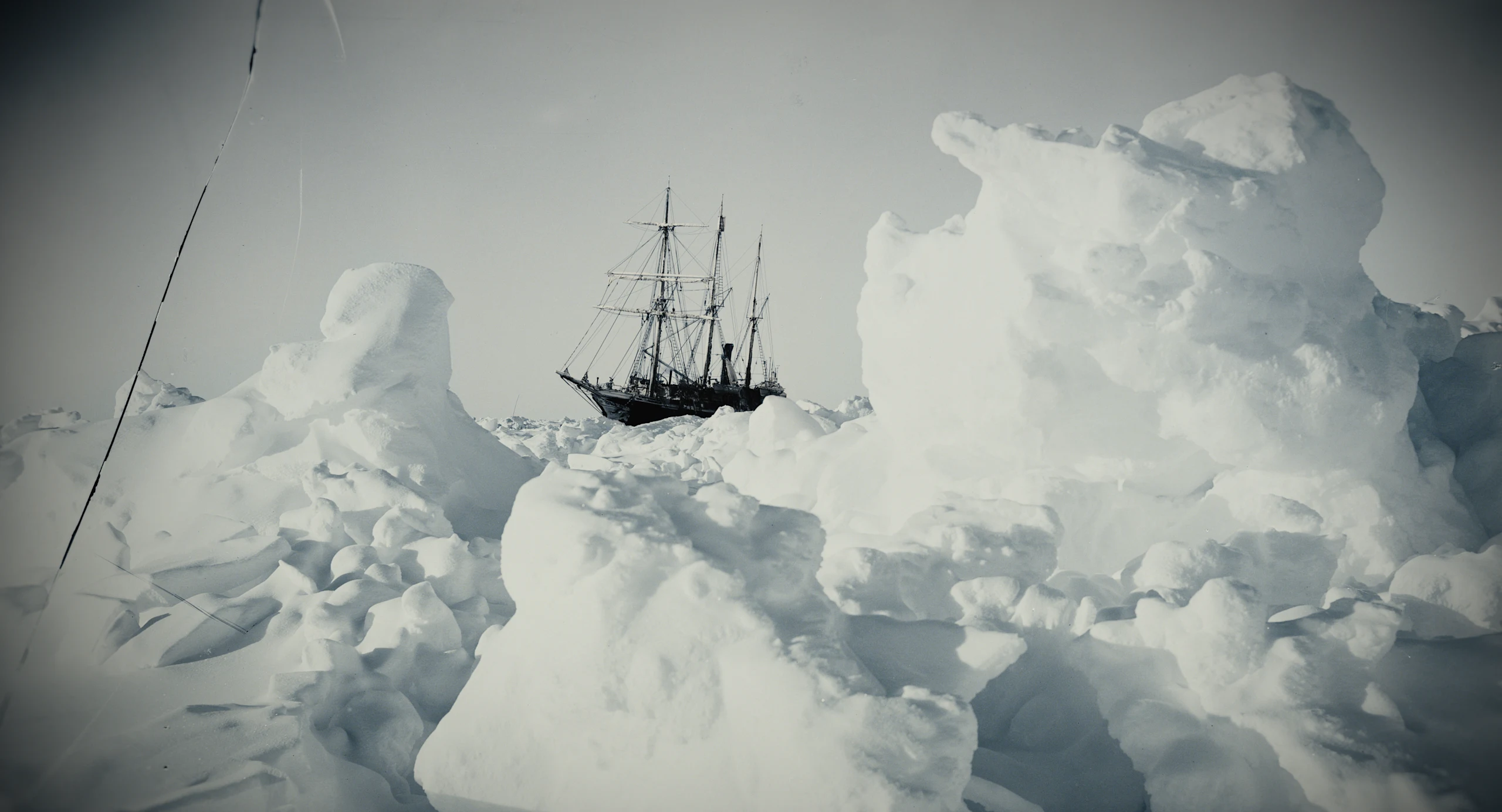
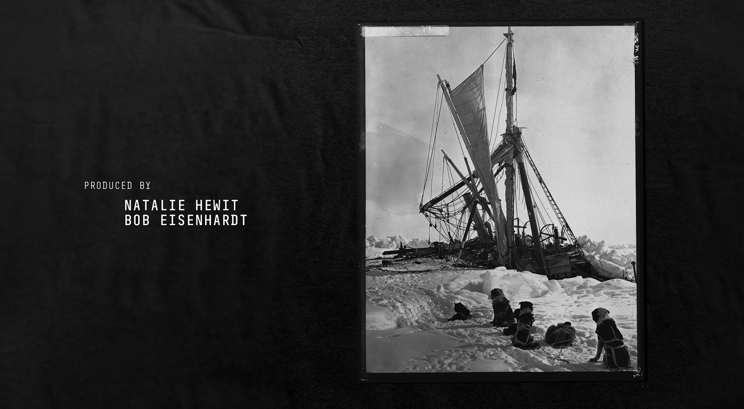
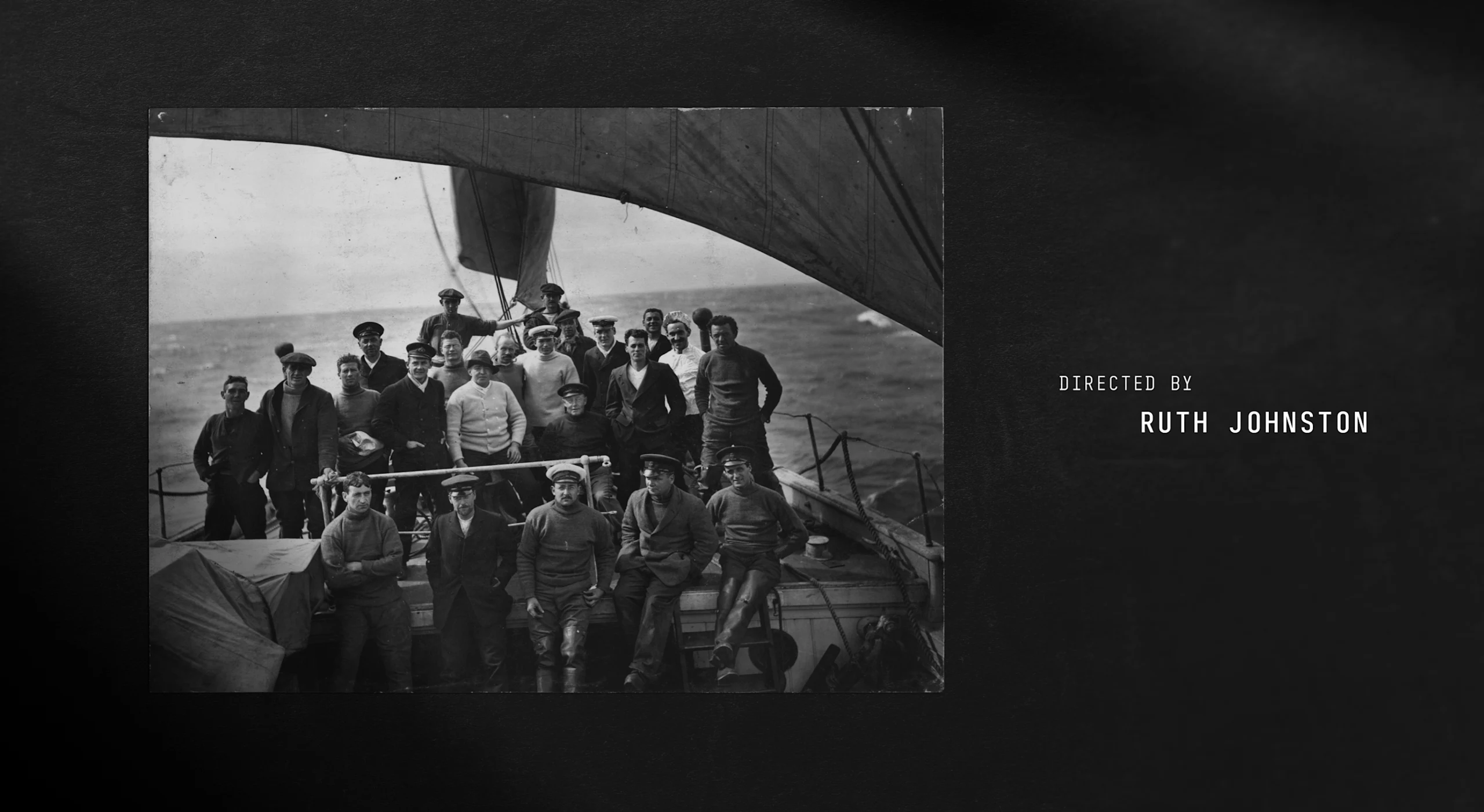
One of the more unique elements of this film was treating the archival photography with colorization to resonate with audiences. Film editor Bob Eisenhardt had enhanced the archival images from the initial voyage and wanted to make the story feel more immediate by using the photography to propel the story.
Archival Video Treatment Exploration
An agreement with BFI (the owners of the archival footage) explicitly forbade colorization of the archives, so we agreed that we would experiment with AI to color a sample. The result was impressive, and we were given the go ahead to explore more colorization. Unfortunately, the AI was not going to be as helpful as initially hoped for, and so we needed to find a new way because the enhanced photos were sure to be an anchor of the film.
“I’d been living with the black and white footage for six months and suddenly the images jumped off the screen. You can see that they’re eating peas for dinner and there was Shackleton in the middle of the scenes which you never really noticed before”
While the initial colorization test had worked, the BFI remained wary of affecting the integrity of the photos by changing them into something new and we needed an alternative to a packaged AI approach.
Colorization Finals
After extensive research into the colors aboard the ship and throughout the setting of the expedition, we were able to standardize the film's color palette. We determined that AI would not be of high enough fidelity to do the work due to the amount of control we needed and the level of consistency we needed with our end result.
To manually accomplish this, we developed a color wash technique that the BFI approved and allowed us to exactly match the details of the tactile nature of Shackleton’s century-old world.
Final Animations
A painstaking amount of effort was put into the accuracy of this project, but the end result captures a moment in history we truly could have only imagined. Working with this storied team of professionals always pushes us to the top of our game, so we were thrilled that they too were pleased with the results.
“A wash technique really allows the black and white imagery to create all the value and contrast difference within the frame. We're just simply adding colour rather than adding any other kind of visual information or overriding the black and white. We didn't want to create a highly saturated result. We wanted the material to still feel aged.”
Photogrammetry Ship Research and Development
We closed the film with a sequence that connects the archival footage and imagery of the ship underwater as it was found in the film. Our 3D sequenced ship gives the closing shot of the famous hull as it remains in its permanent position under the Weddell Sea.
Closing Sequence Motion Tests
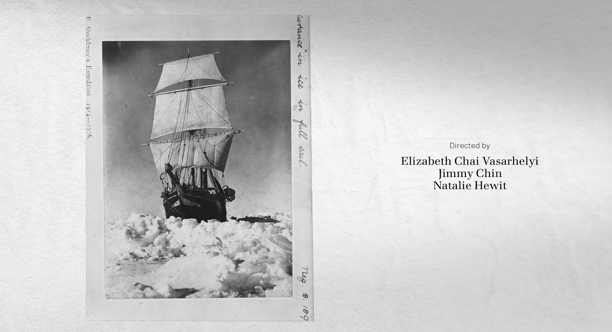
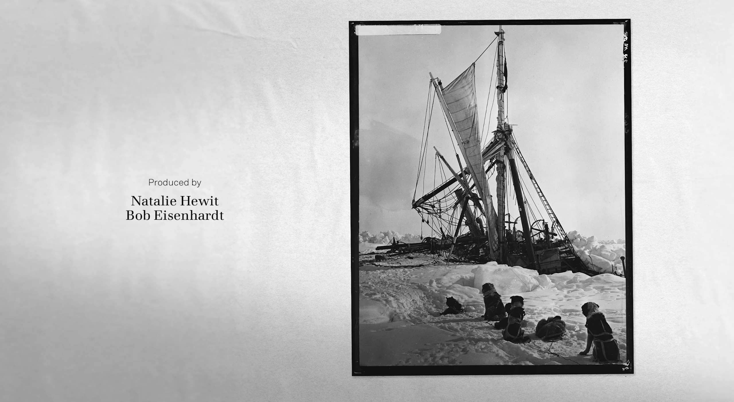
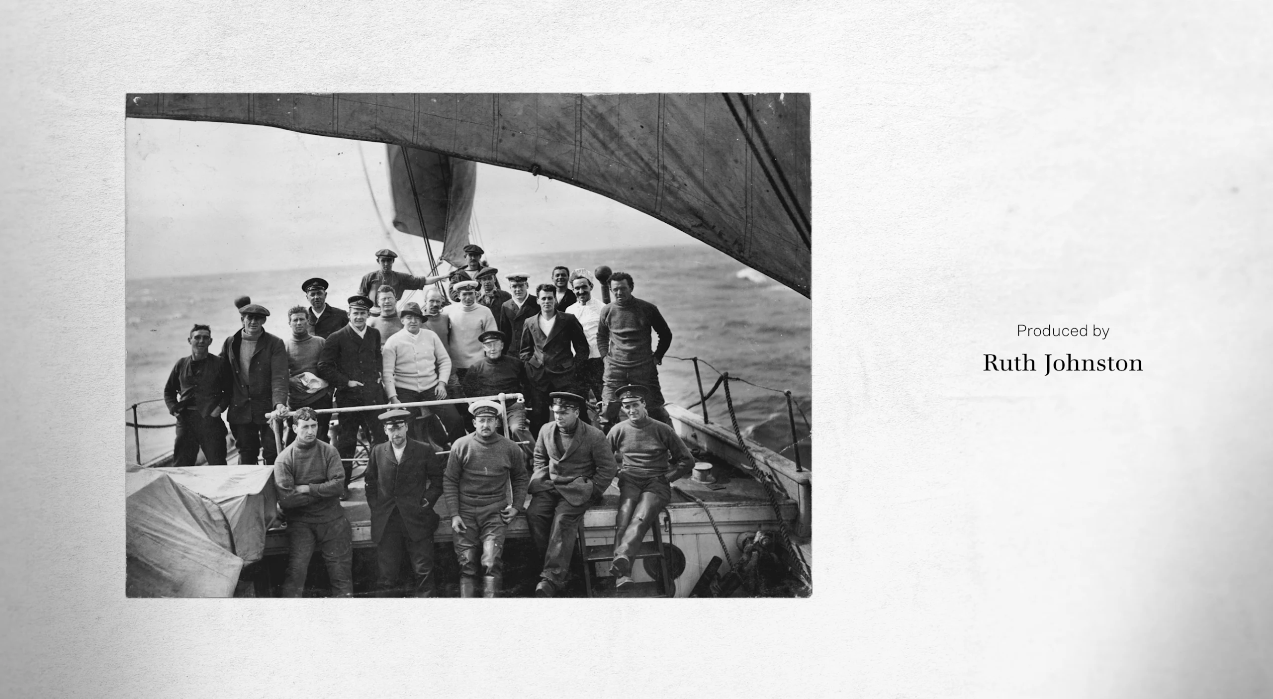
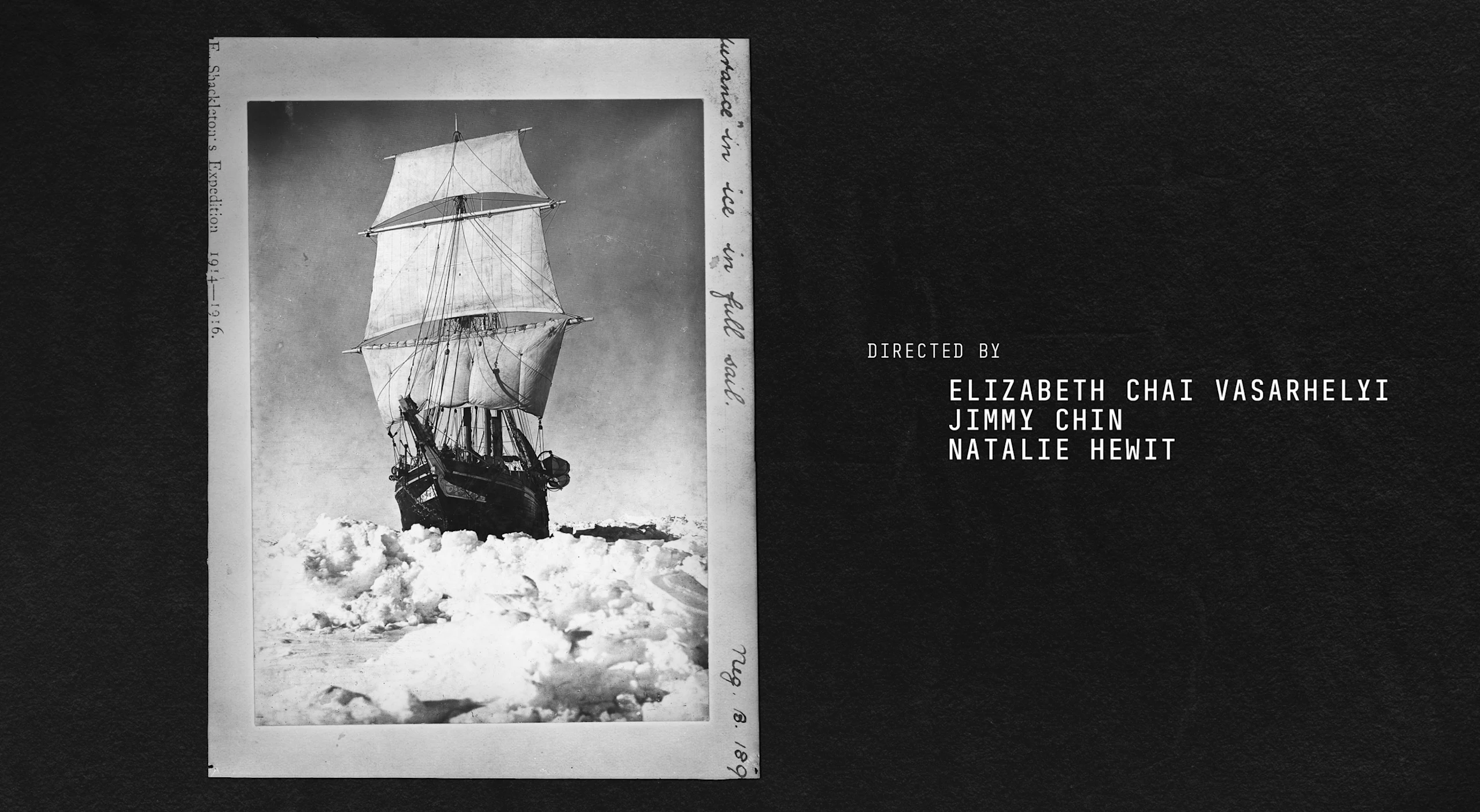
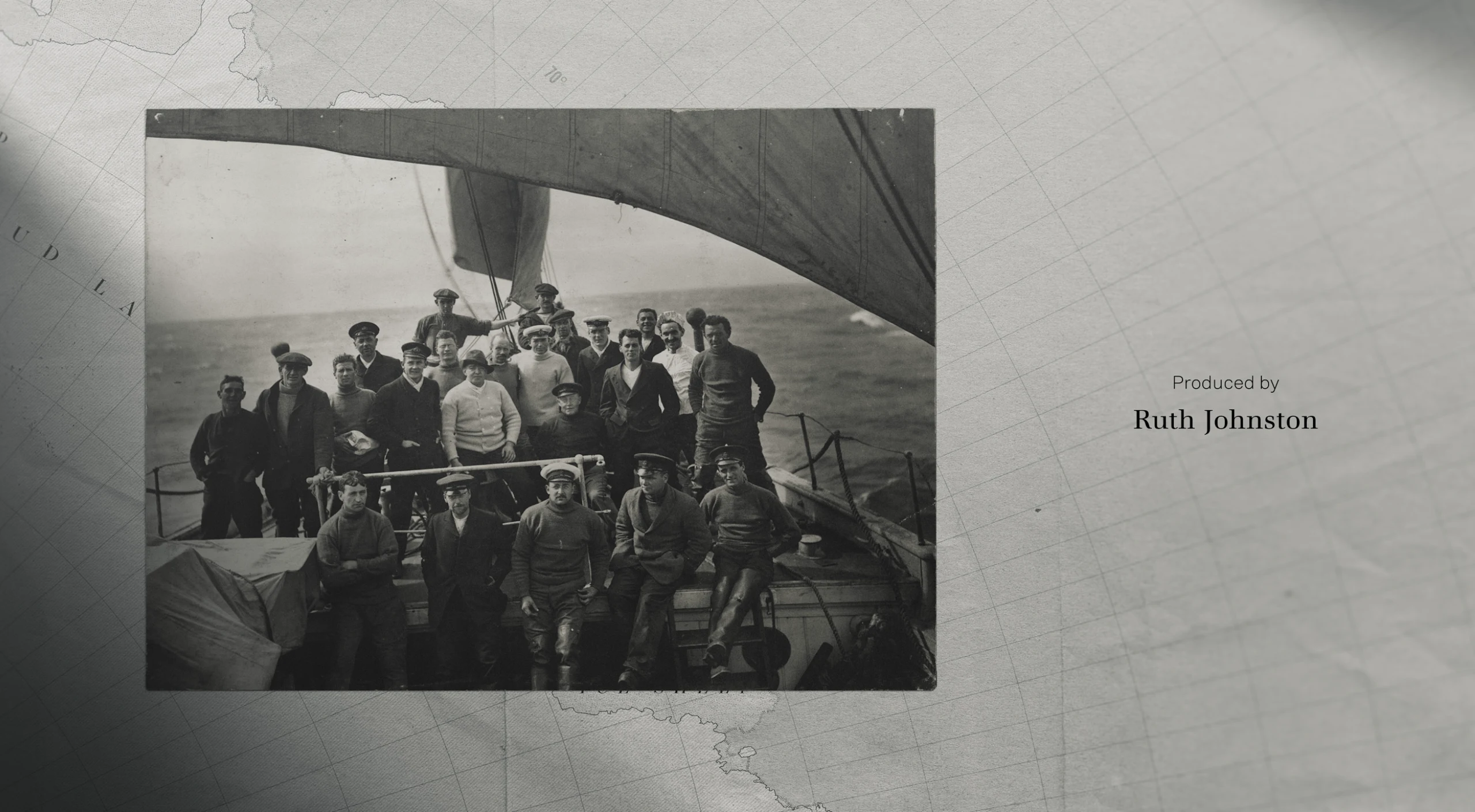
Main-on-End Design Exploration
Congratulations to our partners at Little Monster on creating such a beautiful and poignant film. Stream it now on Disney+.
Founder, Executive Creative Director
Josh Norton
Executive Vice President, Executive Producer
Carson Hood
Vice President, Head of Production
Virgil Conklin
Creative Director
Ross Henderson
Supervising Producer
Kristen Pritchett
Producer
Paulina Casey
Design
Riley Carson, Carol Cai
Main Title Animation
Carl Dempsey
Animation + Color Treatment
Chia-Lung Liu, Christopher Scales, Elijah Ben, Marvin Perez, Paul Volante, Nate Schmitt
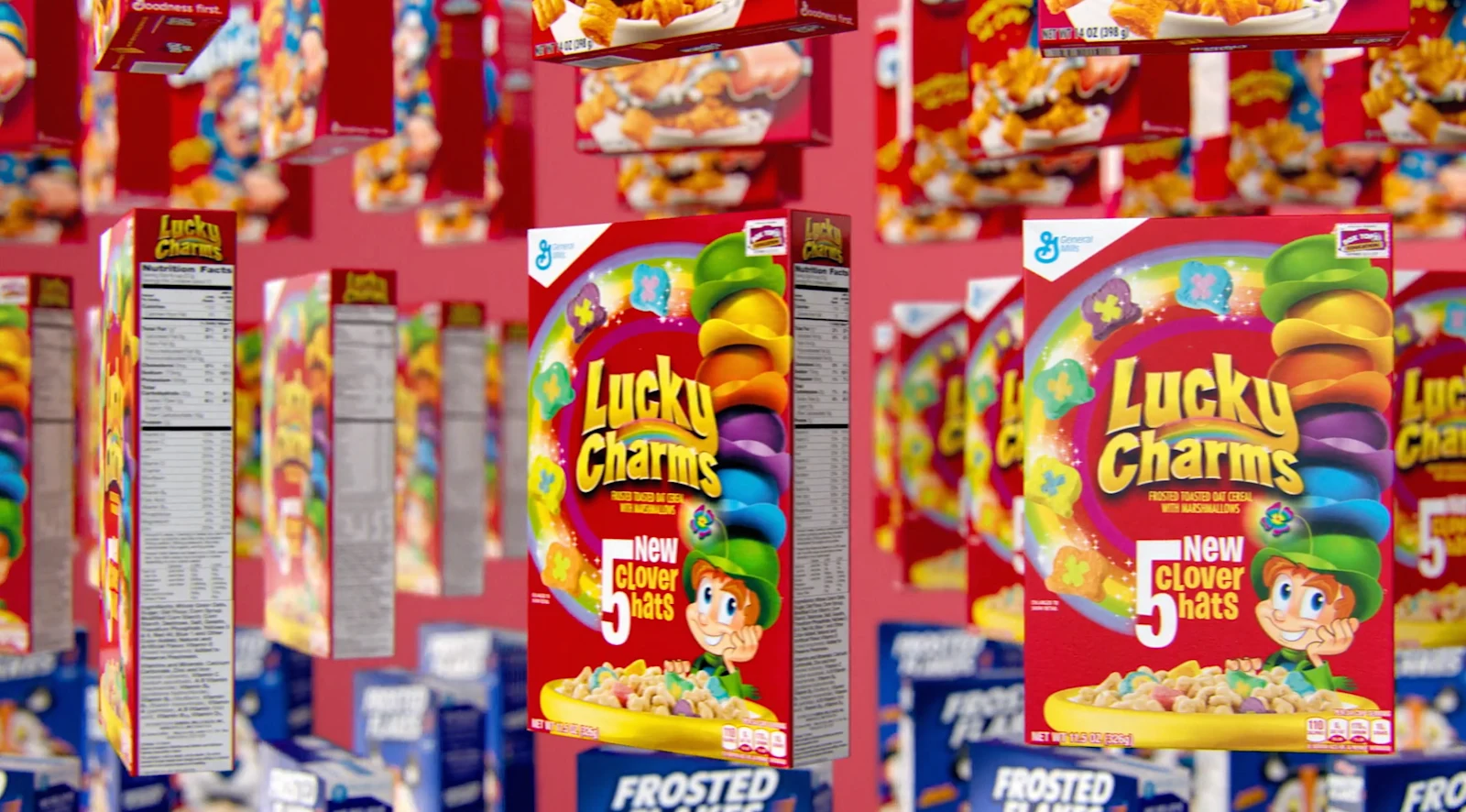
In 2008, BGSTR worked on the Oscar-nominated documentary Food Inc. and fifteen years later we got back together with the film’s creators to revisit the food system in the film’s sequel.
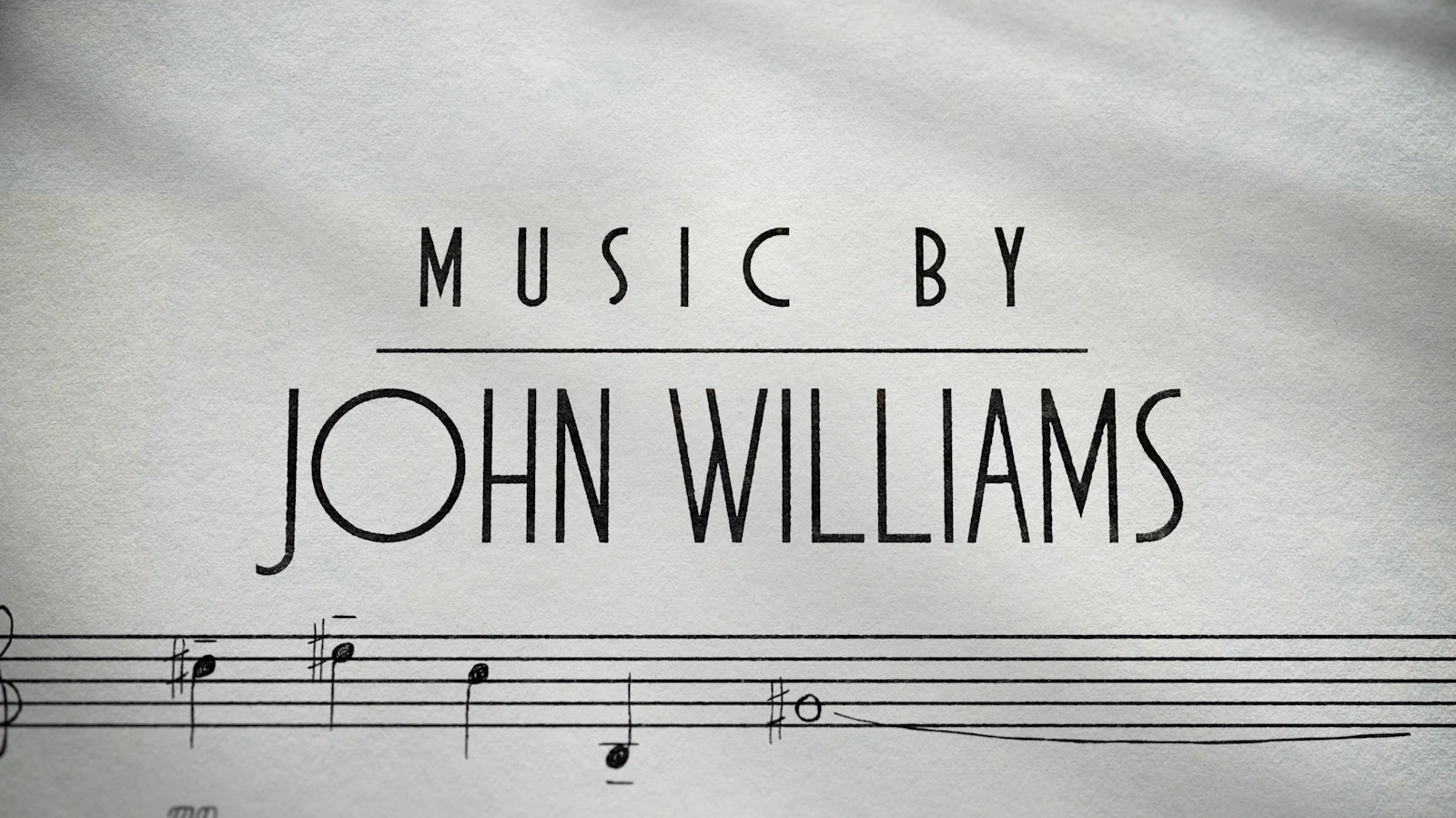
How did two repeating notes, escalating in succession, become one of the most recognizable film intros of all time? Would the most famous space-based trilogy of all time been as iconic without its genre-defining soundtrack? These questions and more are answered in 'Music by John Williams', the new Disney+ documentary that takes a look at the life and career of the legendary composer.
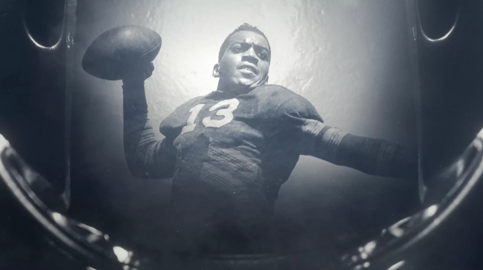
‘Evolution of the Black Quarterback’ is a three-part Prime Video docuseries that follows retired NFL Pro Bowl quarterback Michael Vick as he travels across America to explore the history and impact of Black quarterbacks on and off the field.