Jim Henson Idea Man
Academy Award winning filmmaker Ron Howard takes us into the mind of the singular creative visionary in ‘Jim Henson Idea Man’, the Disney+ feature-length documentary that premiered at Cannes. BGSTR designed the film’s graphics and title sequence for the film, touching on moments of Henson’s legacy spanning his entire life from his early years puppeteering to the worldwide success of Sesame Street, The Muppet Show, and beyond.
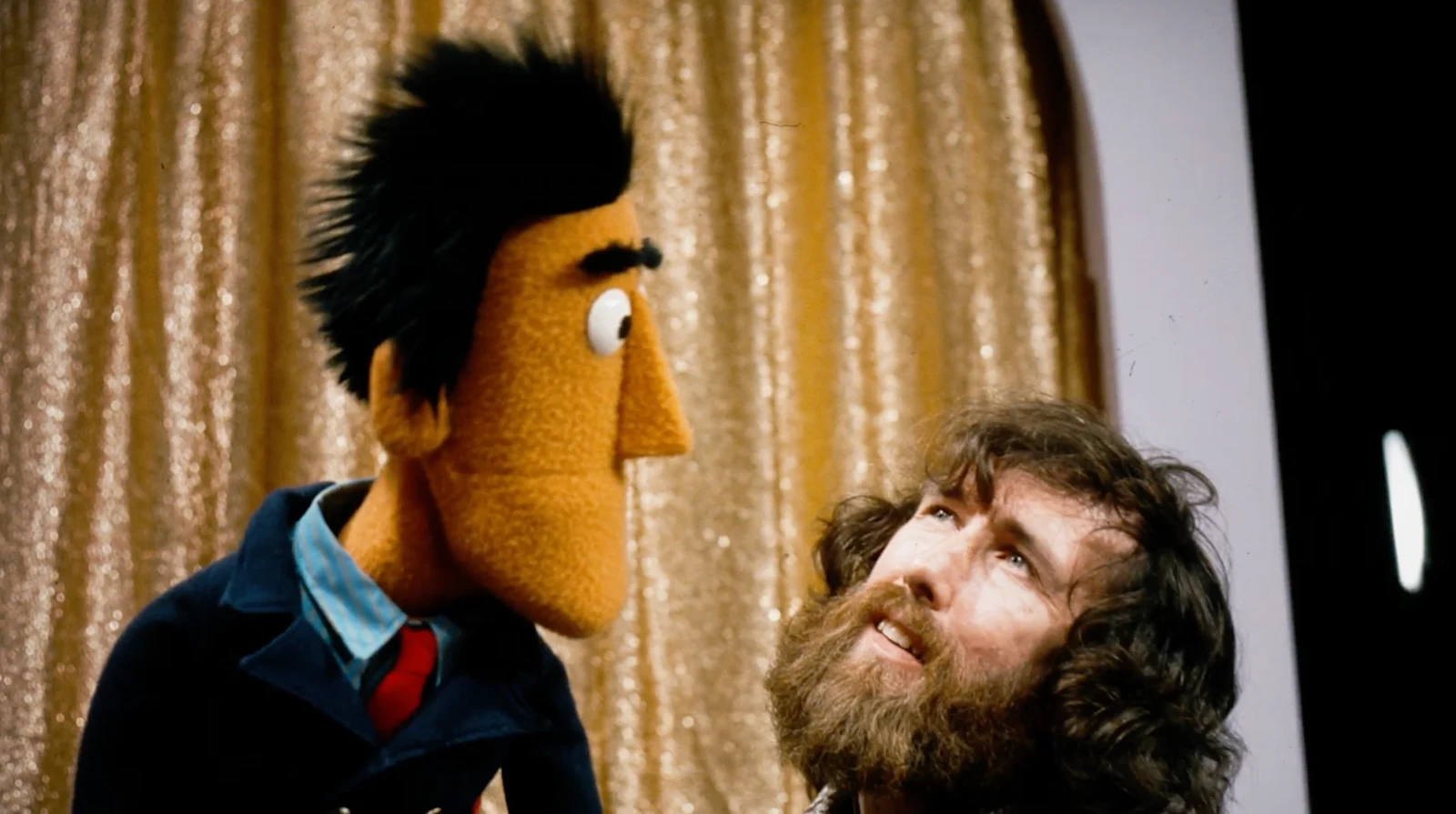
Our team at BGSTR had been hearing rumblings of a Jim Henson biopic since we’d come off ‘Light & Magic’ and were anxious to pitch on the opportunity once it started to see the light of day. Our presentation featured a short video piece around how we thought the graphics should be structured, which ultimately became the template for everything else we would do once we’d been awarded the job.
From the outset, we had a gut feeling about how to infuse Henson into all of the graphics. Knowing when to go heavy and when to show restraint was a key focus of ours from the beginning, so we developed some internal guidelines that helped guide our graphic development during the year-long filmmaking process.
One of the main guiding principles we ascribed to in our process was that you ‘can’t out-Jim Jim Henson’ so we wanted to make sure our graphics were clearly in service of storytelling or an homage to the original artist’s work. The BGSTR team is adept at building out narratives through graphics that match our reference material, and the ‘Idea Man’ title sequence is a great example of this style of visual storytelling.
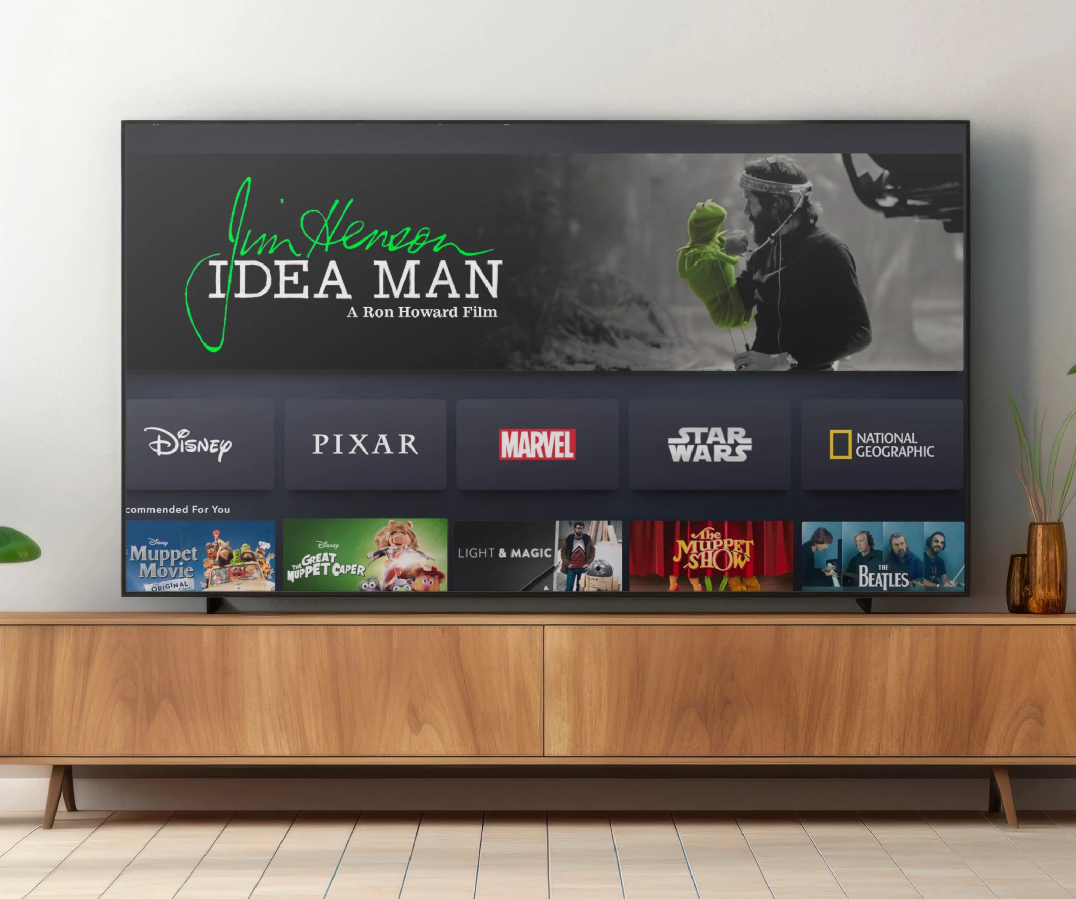
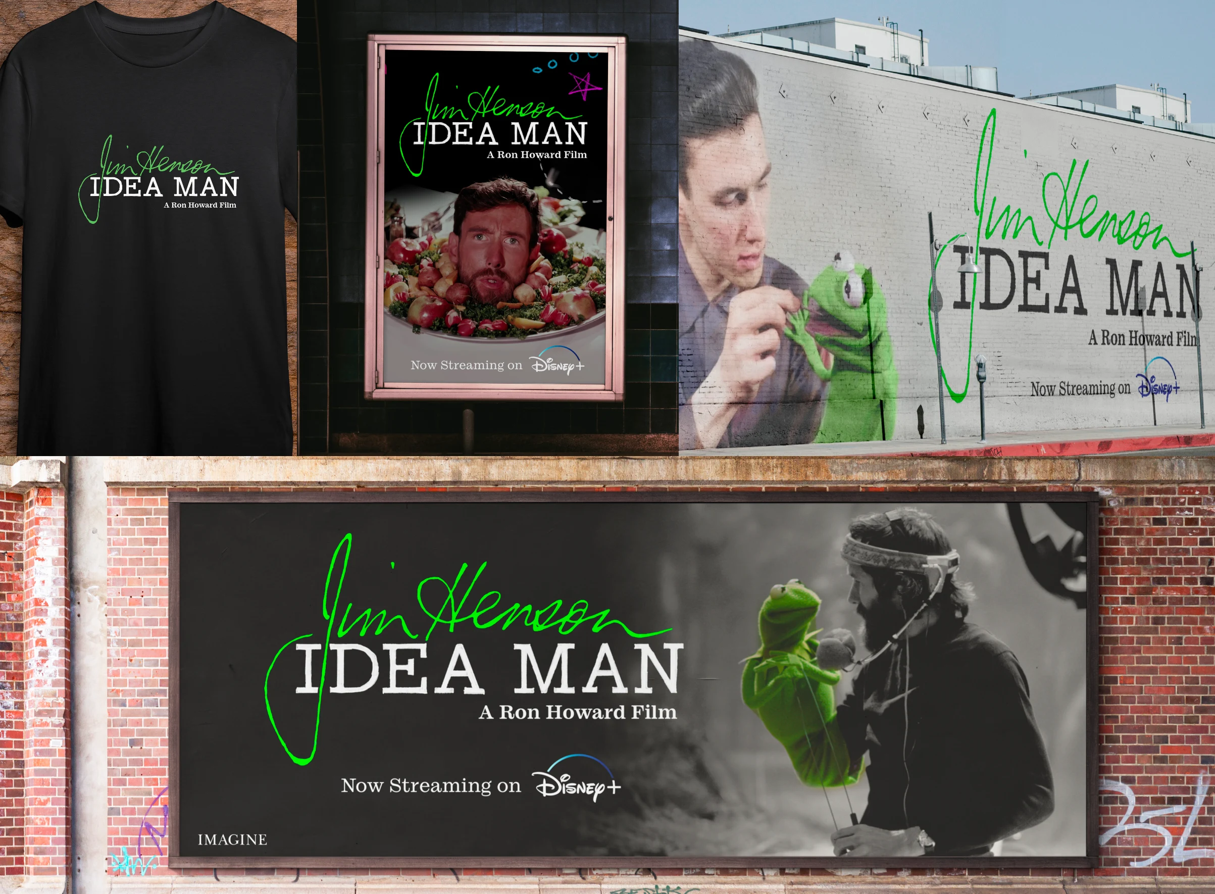
Title Mockups
On a foundational level, there were several components of our graphics that needed a more intensive touch from our artists. We started on the lower thirds early, as we were approached for a series of choices for fonts, logos and lockups, but knew we wanted our design to be something special.
“I was constantly looking for ways to honor Jim Henson’s aesthetic and sensibility and playfulness in the original footage, whether they were interviews or some of the animations that we did to help tell the story.”
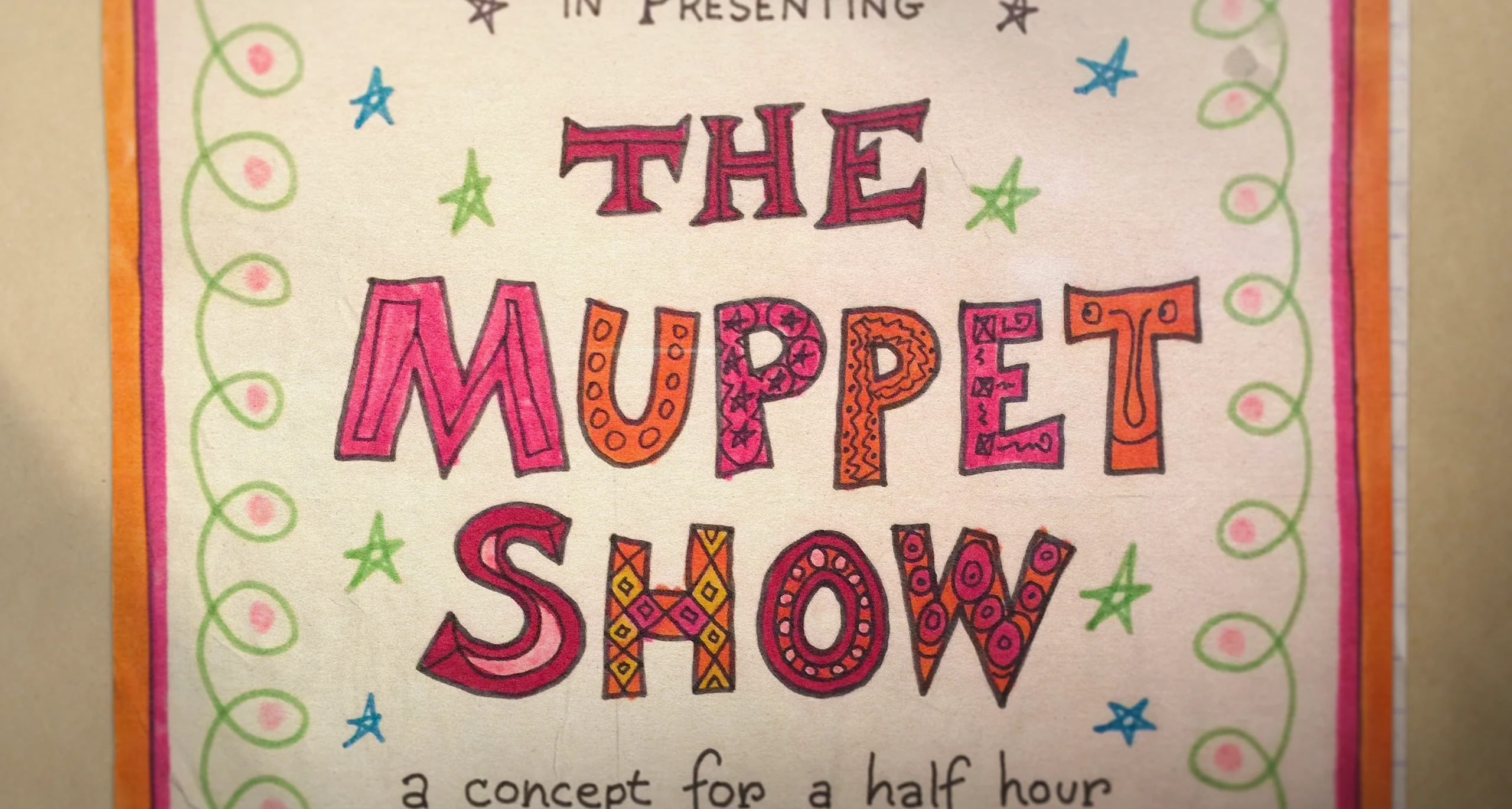
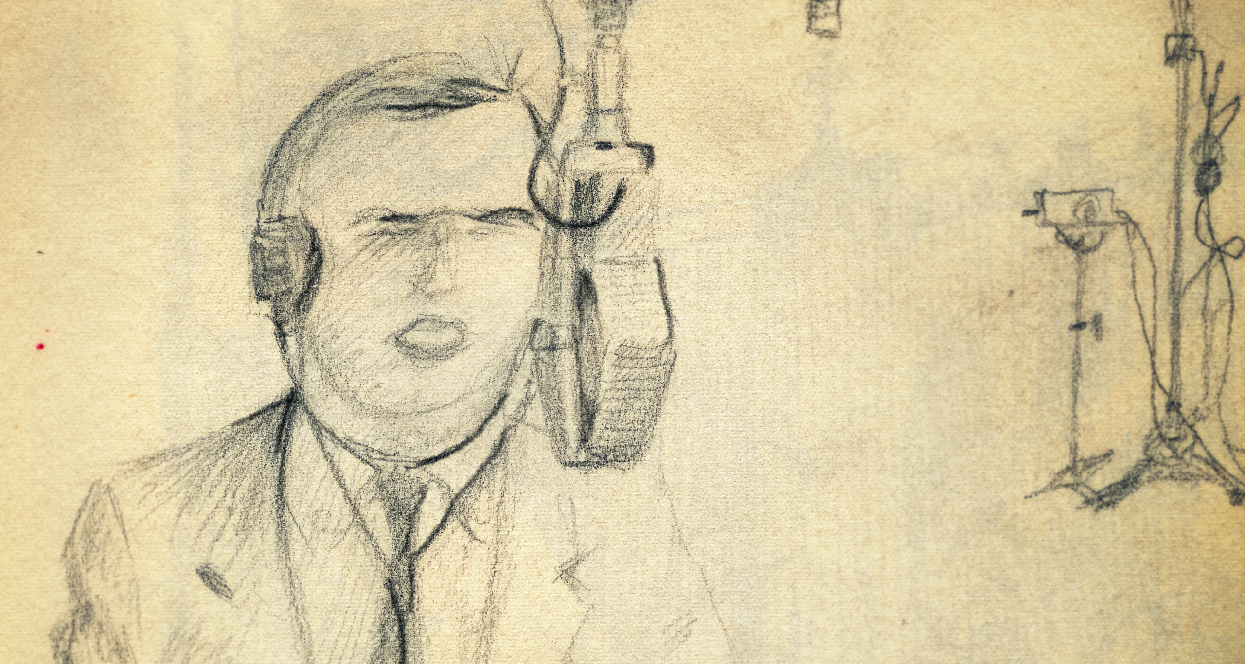
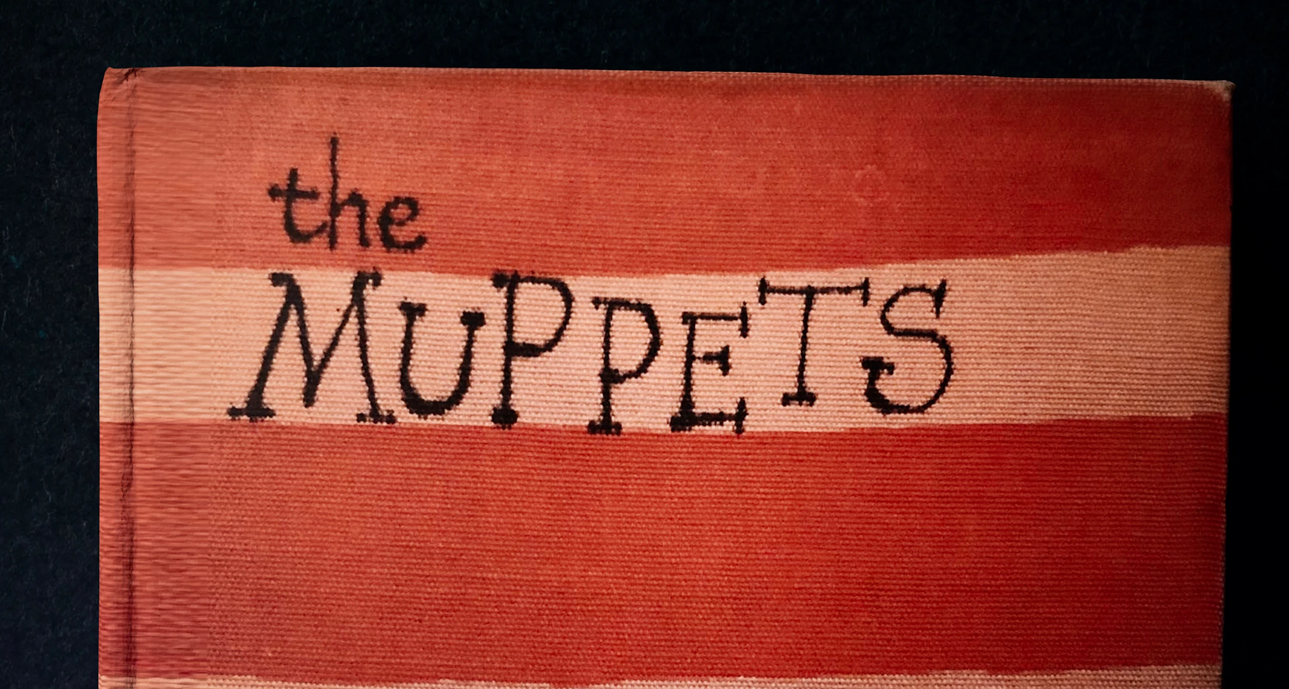
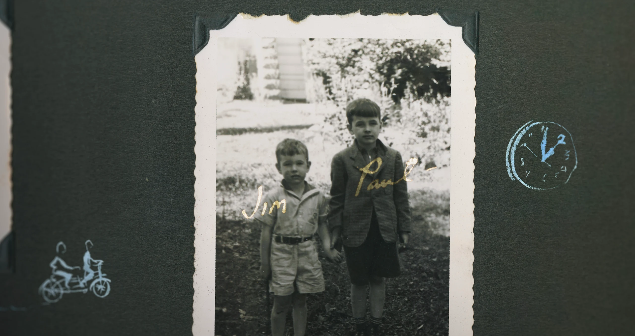
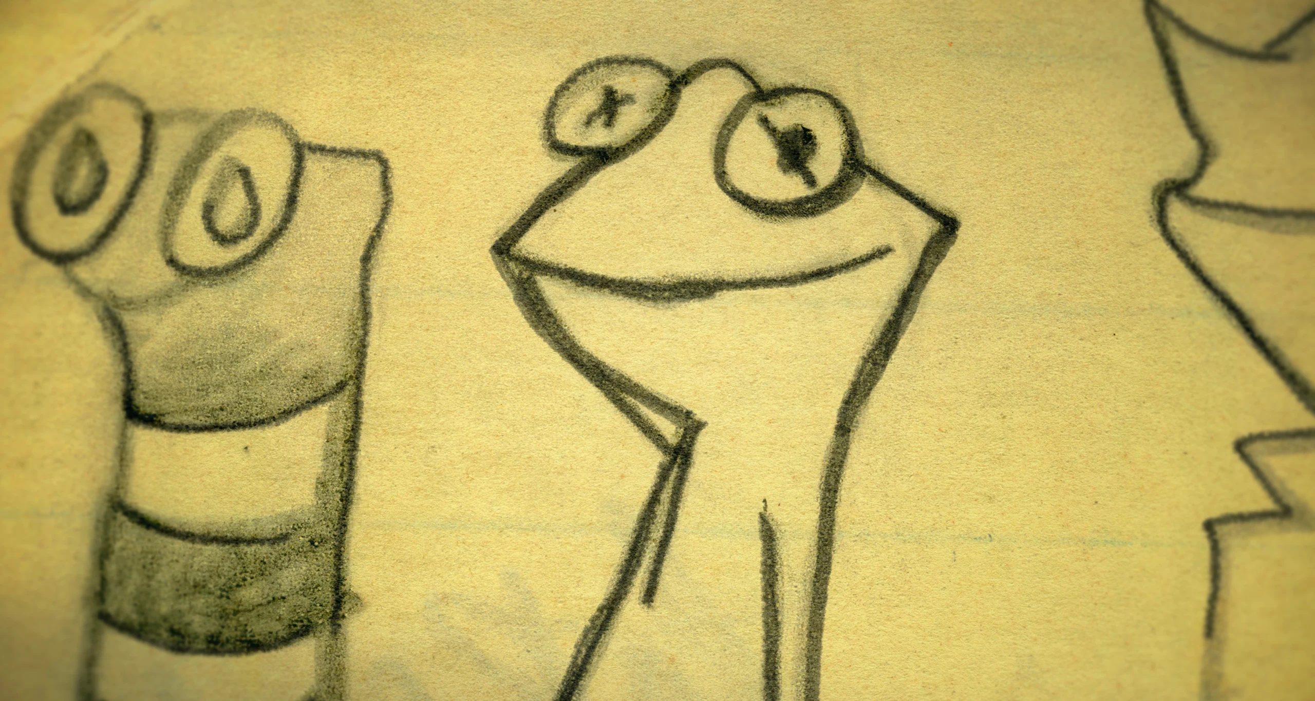
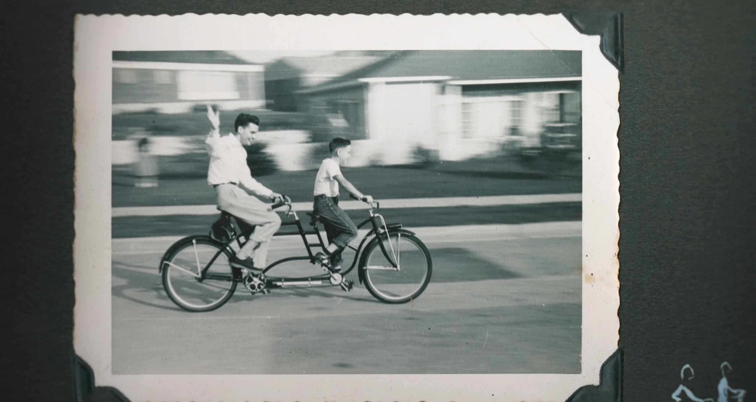
Design Exploration - Muppet Show pitch, Sketches, Red Book and Photo Treatments
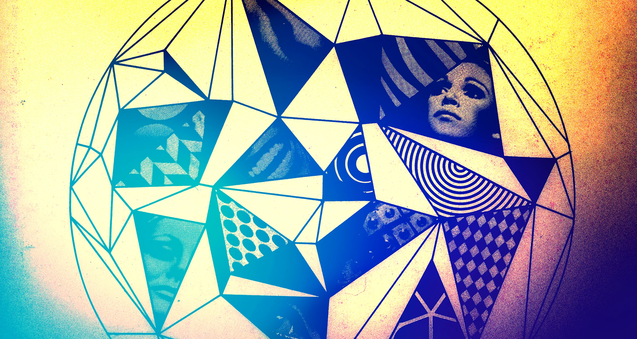
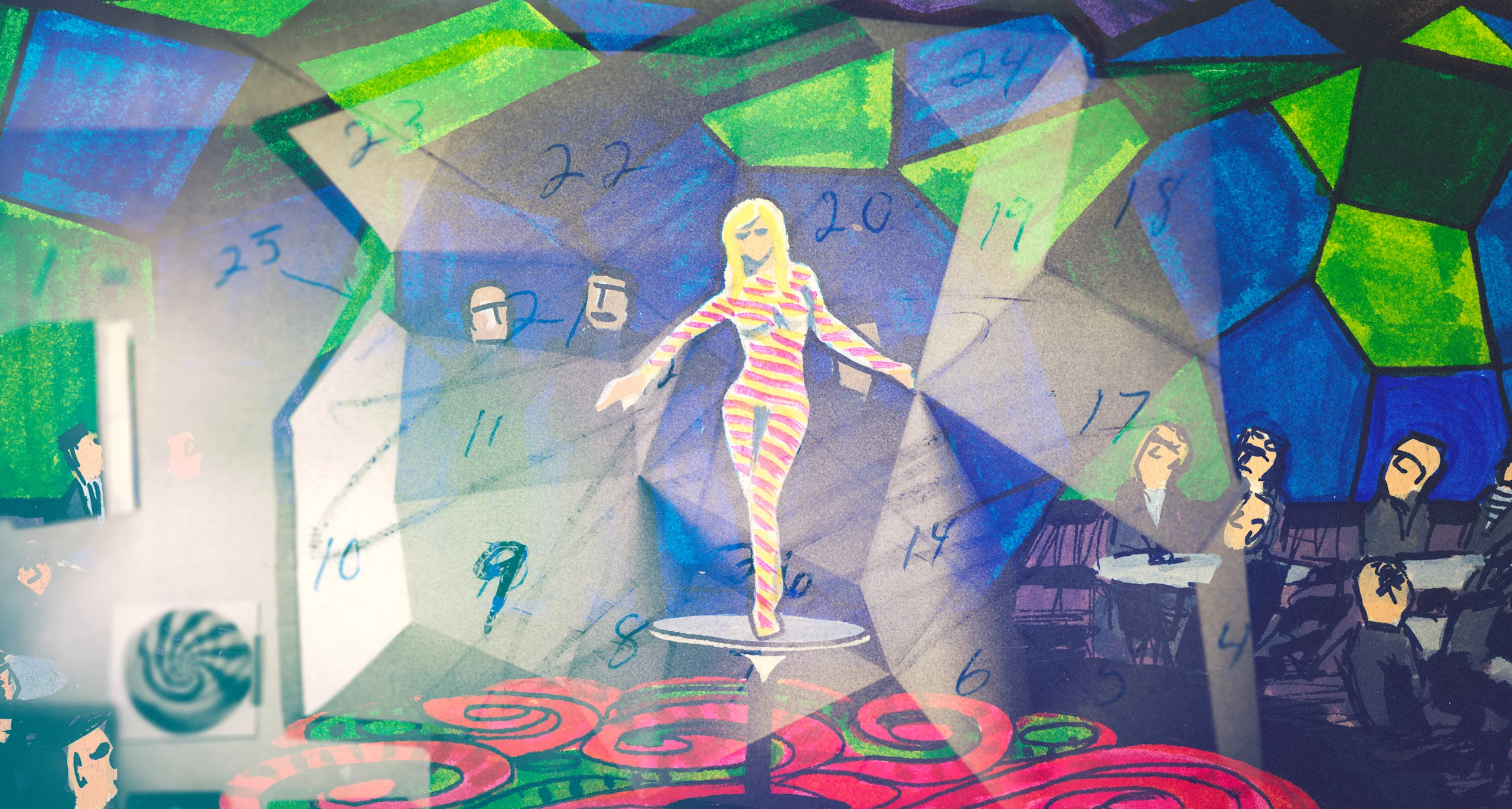
Design Exploration - Cyclia
We had been accomplishing a number of different specs practically, animating sketchbooks and journal entries from Henson’s archive— something we were very comfortable doing and that director Ron Howard felt was critical to unlocking the essence of Henson. We wanted to push that envelope even further to enhance the premium feel of the film, so we tried designing felt letters in stop motion.
Photo Treatments
When that didn’t quite fit, we created a font based on some early sketches and other things that Jim had done— and that’s where we landed. This font created the feel of Jim and infused him into the film. Did this choice require a little extra effort? Sure; but it’s better this way. It feels like Jim.
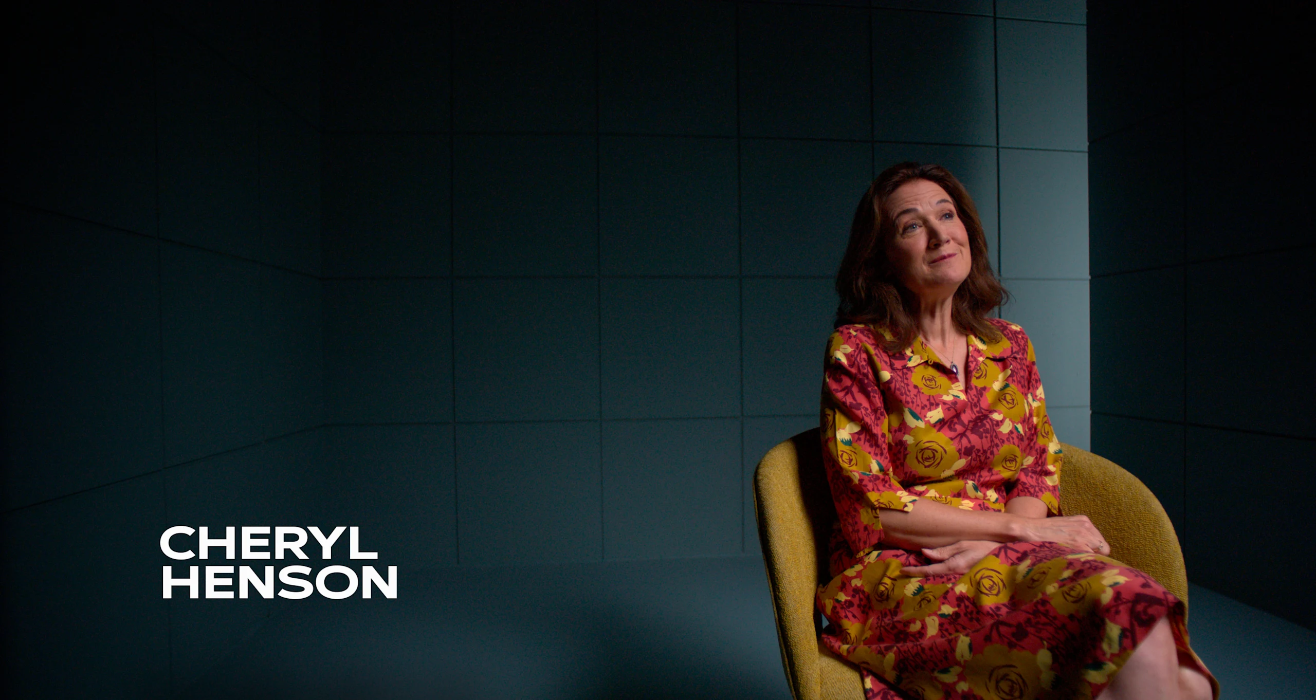
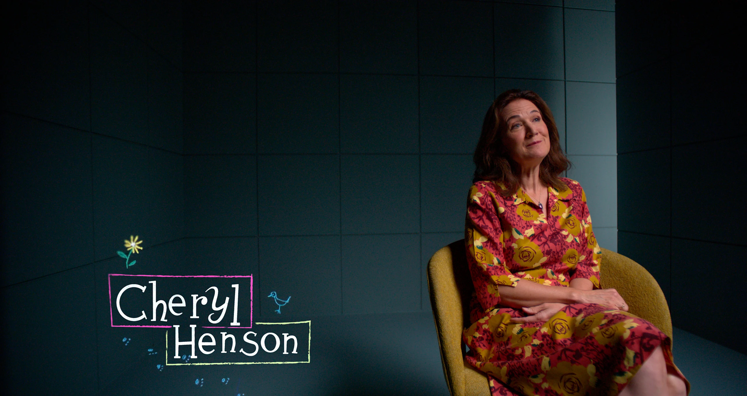
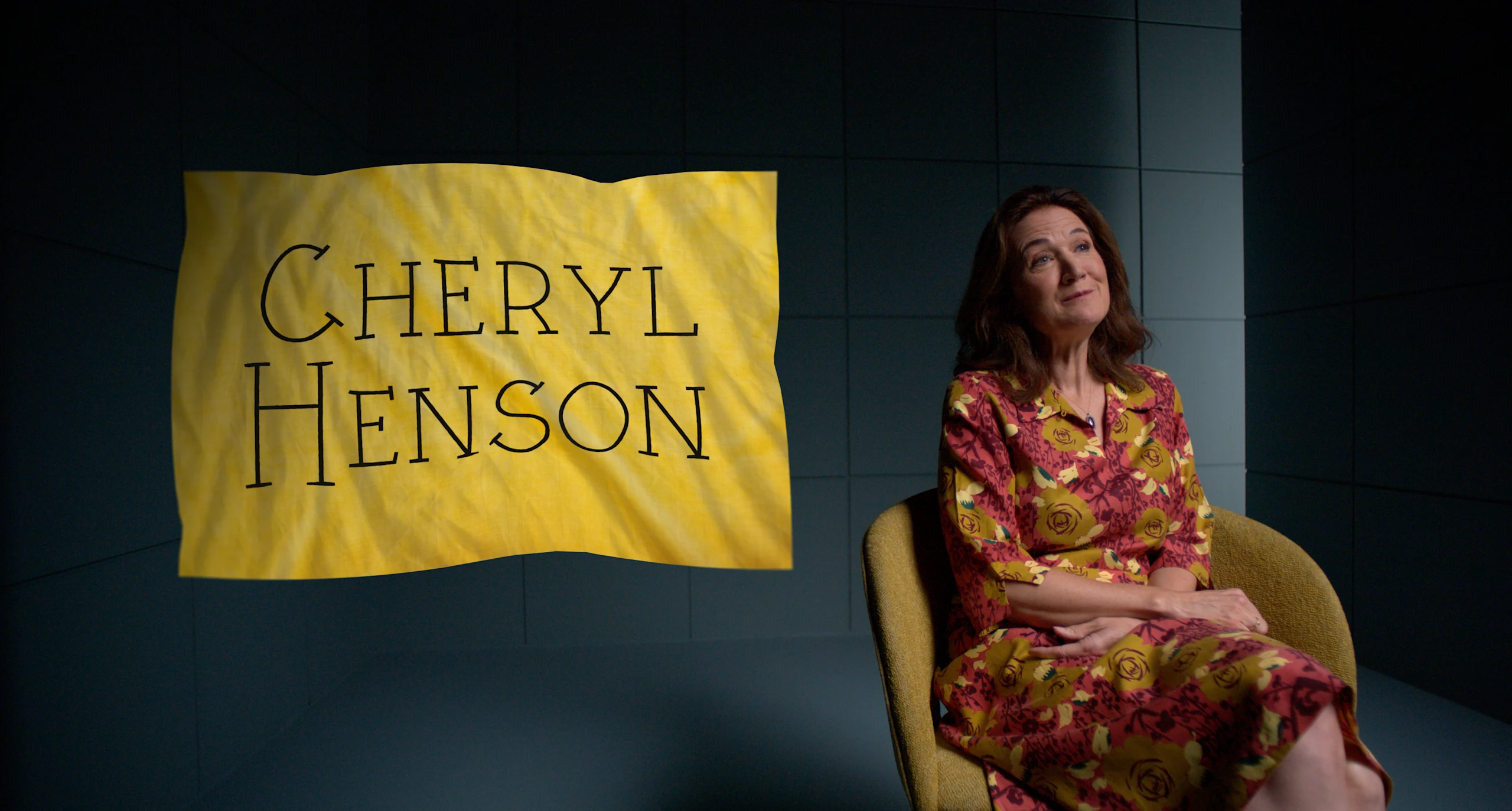
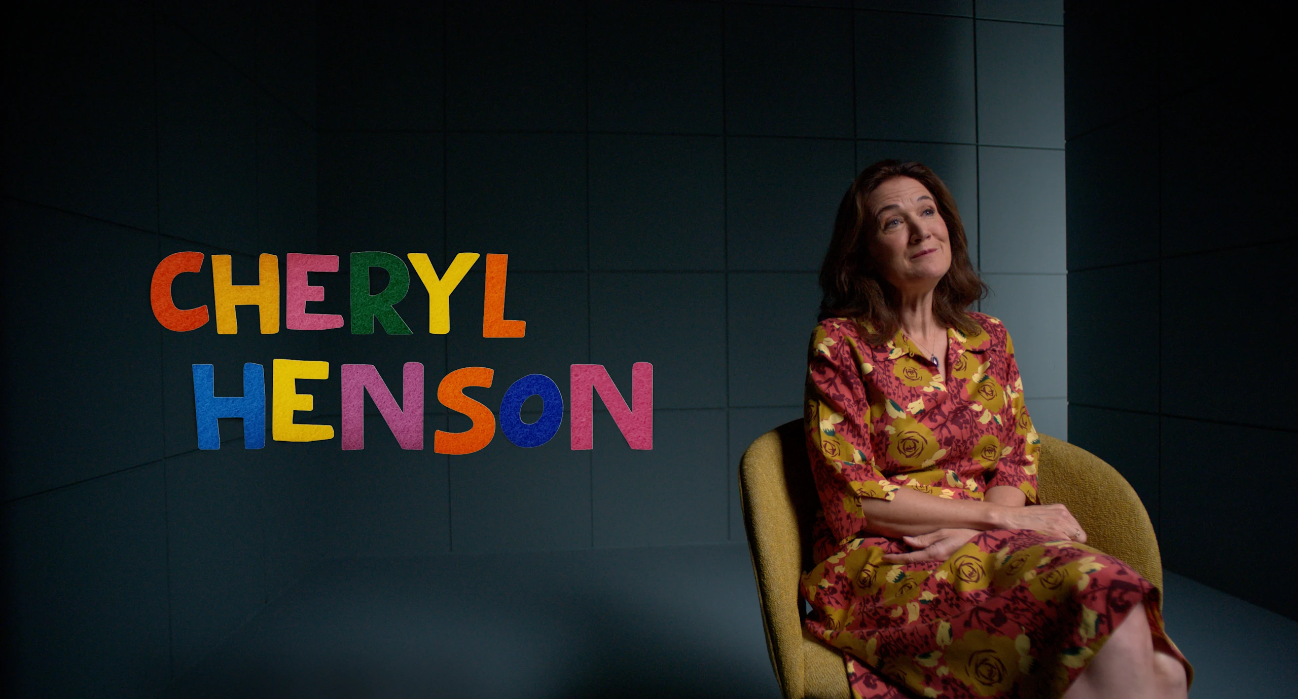
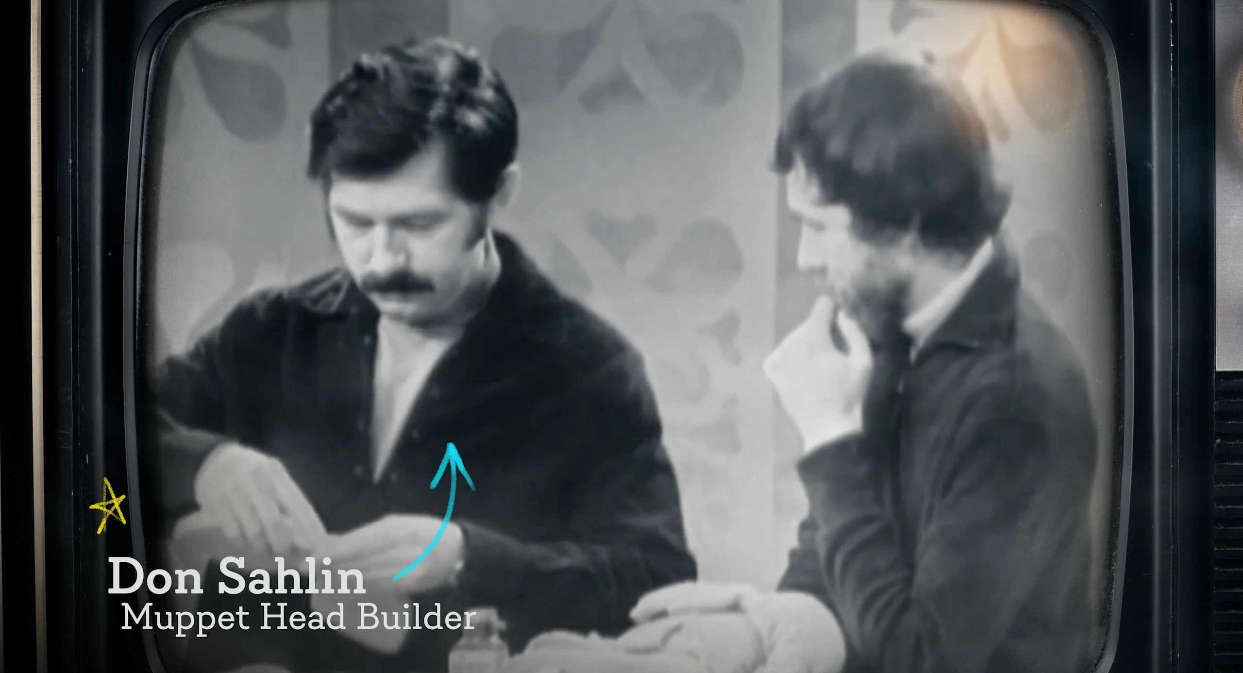
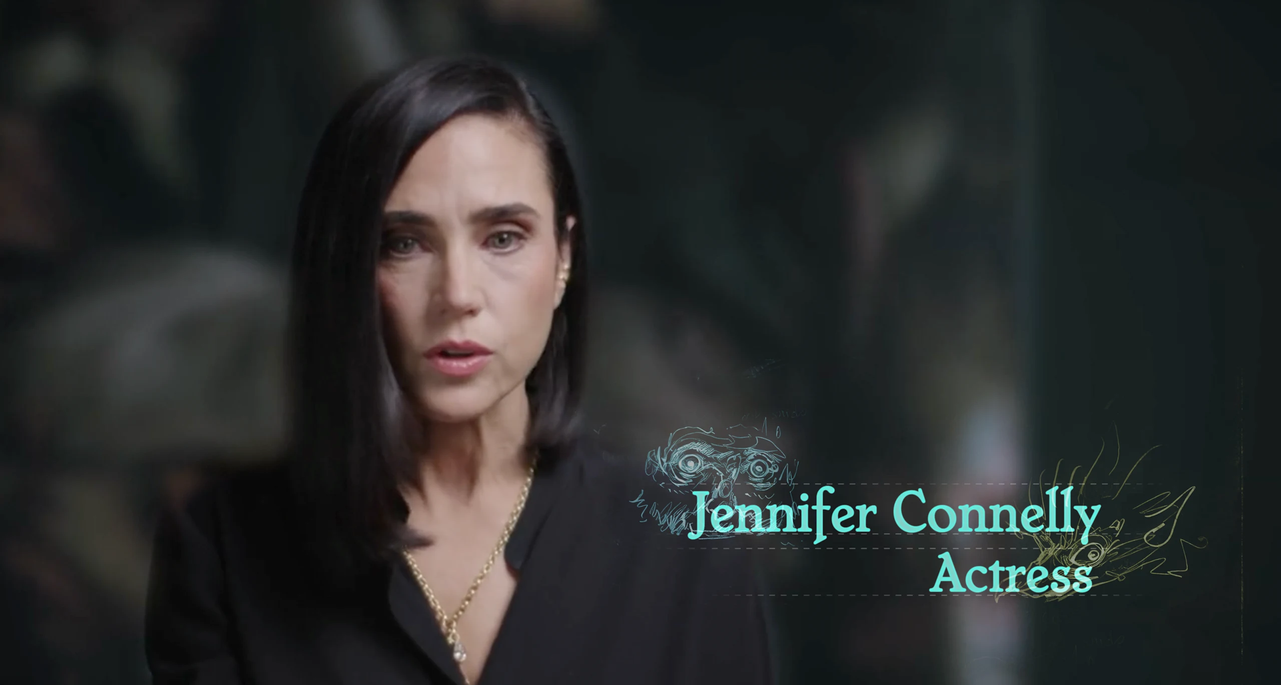
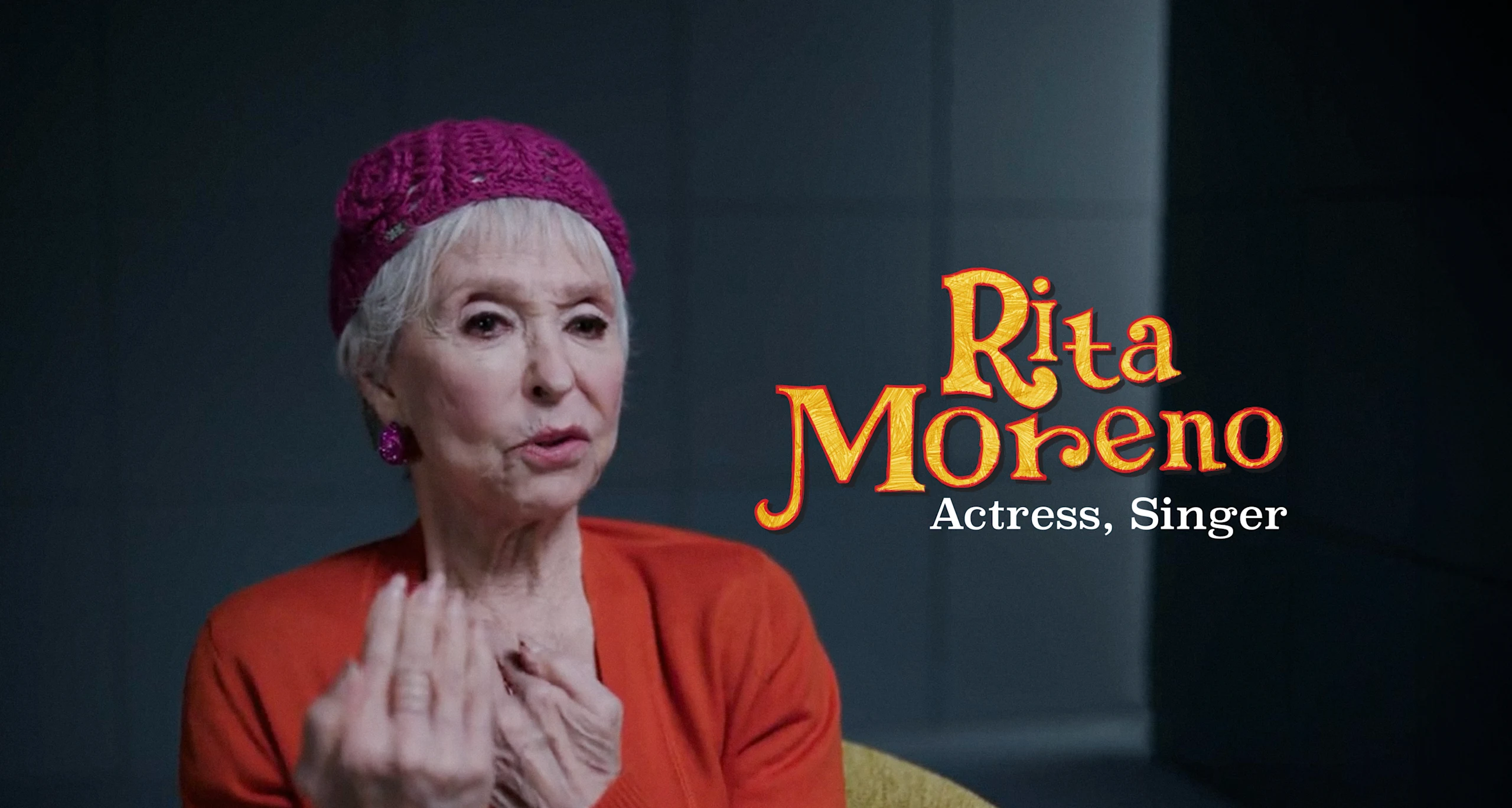
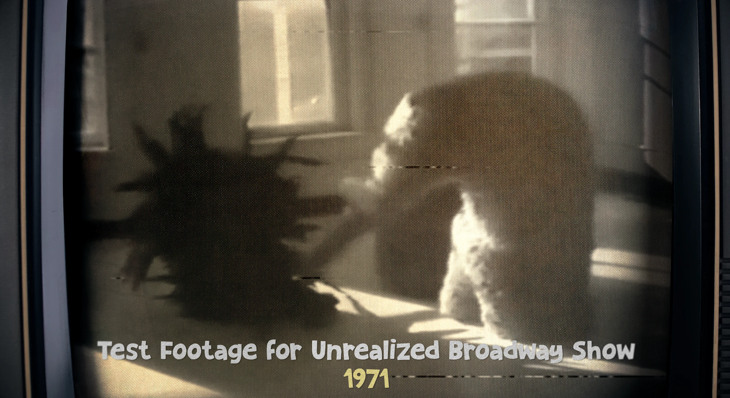
Type Exploration - Lower Thirds
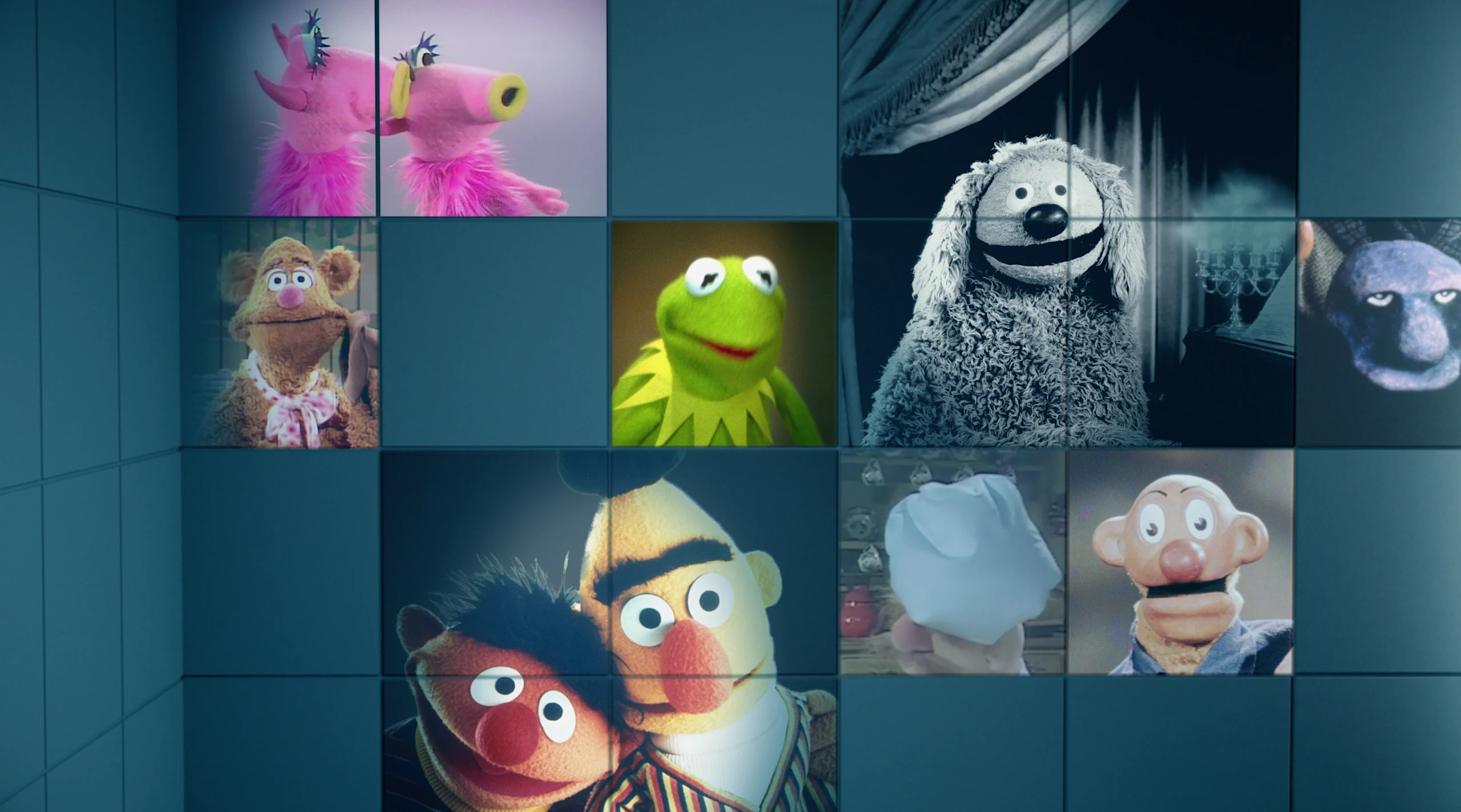
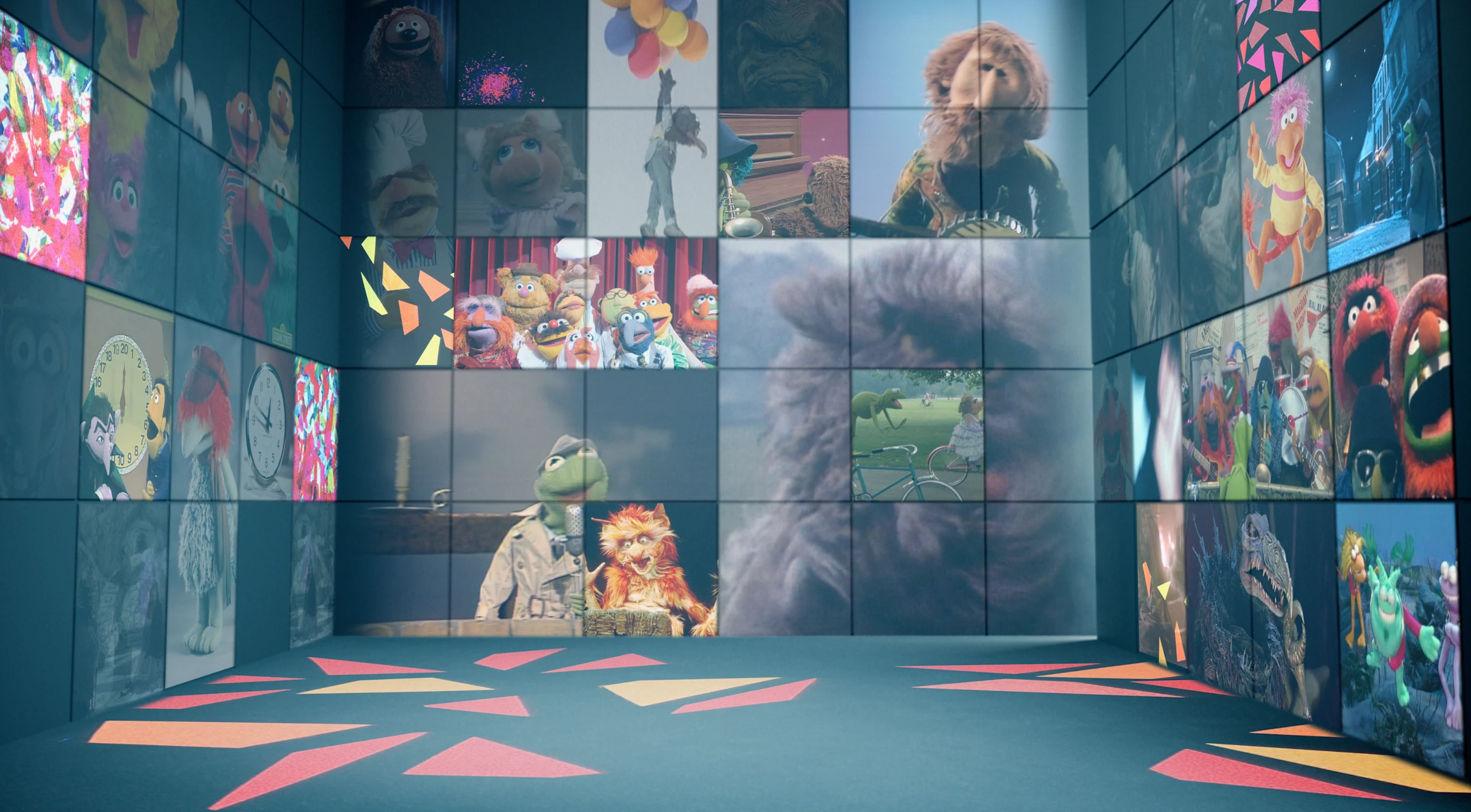
Another practical build out we used as a storytelling device was in the recreation of The Cube— which originally aired as part of a show called NBC Experiment in Television in 1969 and was used in the film for interviews. An early concept from the Imagine team, we wanted to weave the imagery seamlessly into the interviews to nail how that would look.
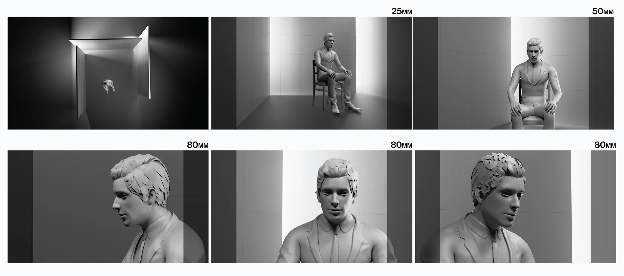
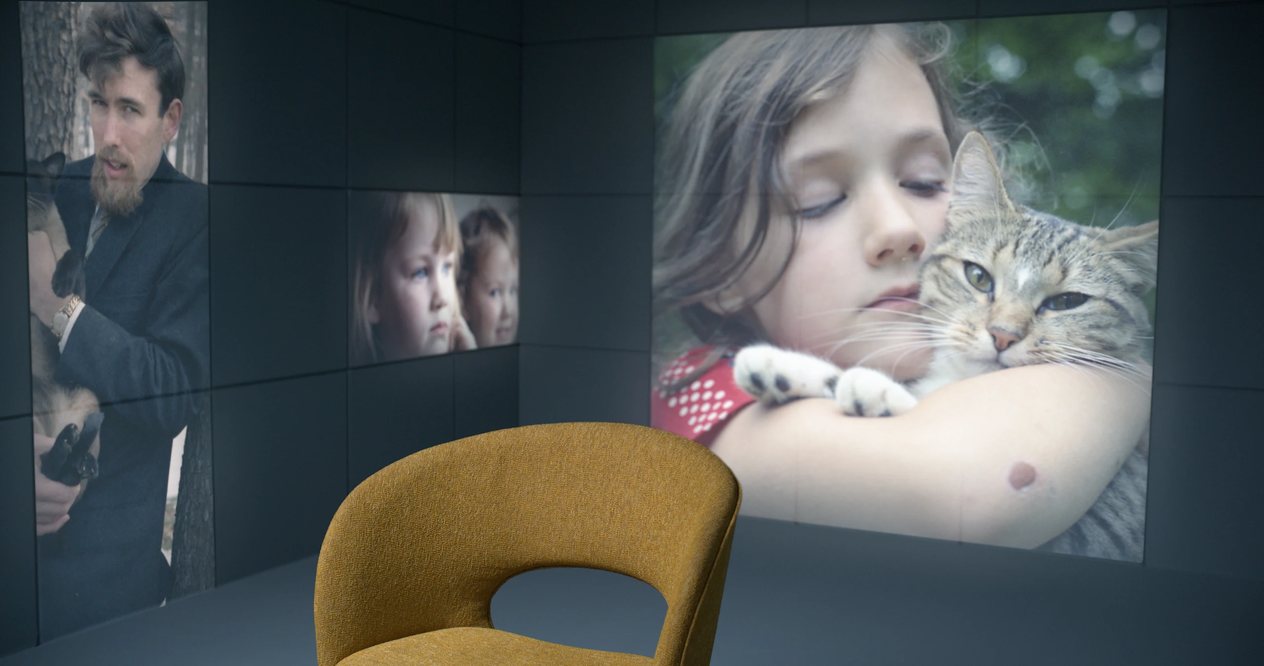
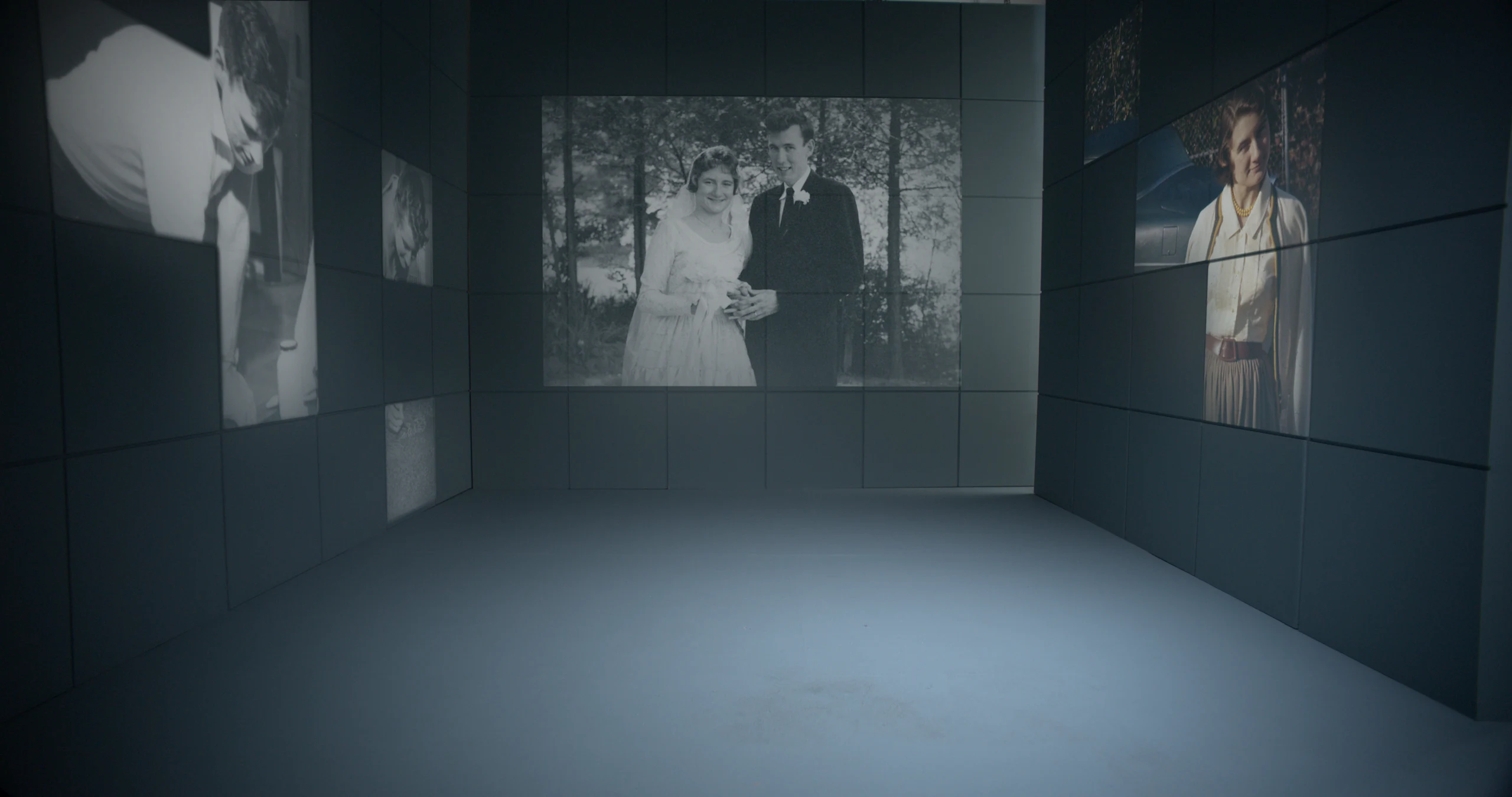
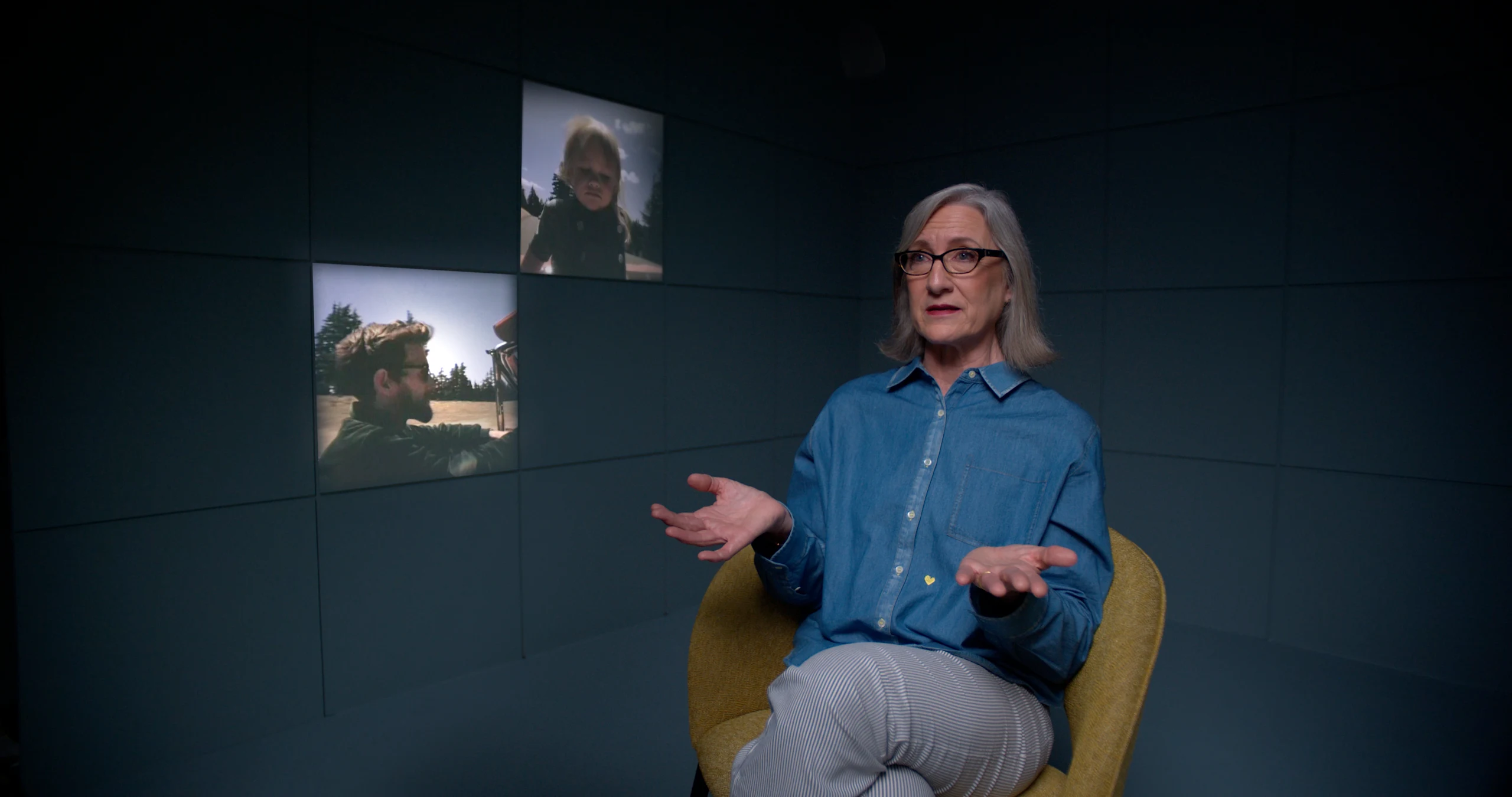
Cube Tests
We designed a simulated cube in 3D to give us the space to visually experiment with the design until we got it right. While focused on projecting onto the cube, we had to develop the right tone for the narrative— was the imagery Jim from beyond, or maybe showcasing a reel? Ultimately, we landed on The Cube conjuring up whatever the interview subject needs thematically at that point in the conversation. The combination of VFX and experiential design ended up being quite a large undertaking on a practical level, but the end result was the perfect storytelling device for the film— both referencing Henson’s creative mind and infusing his vision into the imagery.
Cube
This cube challenge was one of the larger puzzles to figure out on the film, but solving it reflected the success of our collaborative working style with the Imagine team. By this point in the project, we’d evolved into a creative rhythm that kept pace with the ambitious expectations of the team creating the film allowing us to incorporate feedback and edits into our design.
Toward the end of the film, the Imagine team wanted to end the documentary on a high note and asked us to come up with an appropriate epilogue. The request for some title cards got the BGSTR treatment and we added some nice flavor to the two-minute epilogue.
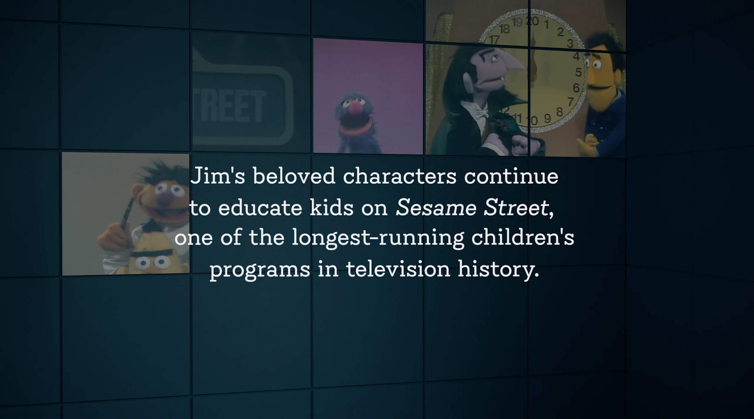
Epilogue Stills
Working on this film was an incredible experience— the passion people have for the person and his creation is evident and that creates a certain amount of pressure that luckily the BGSTR team thrives under. We approached the job like any other and applied our processes to them while allowing our team to do what they do best. As a result we ended up delivering a full set of premium graphics worthy of Jim Henson himself.
Henson Credits
Congratulations to our team both at Imagine and Screen Novelties. Stream ‘Jim Henson Idea Man’ on Disney+ now.
Creative Director, Designer
Mark Thompson
Executive Vice President, Executive Producer
Carson Hood
Vice President, Head of Production
Virgil Conklin
Producer
Jessica Rowley
Animation Director
Casey Drogin
Design
Ross Henderson, Muskaan Sethi
3D Design and Animation
Nick Woythaler, Leo Bai
Max Strizich, Ivan Viaranchyk, Momo Zhao, Carl Dempsey, Elijah Ben, Liu Chialung, Ayden Ackerman
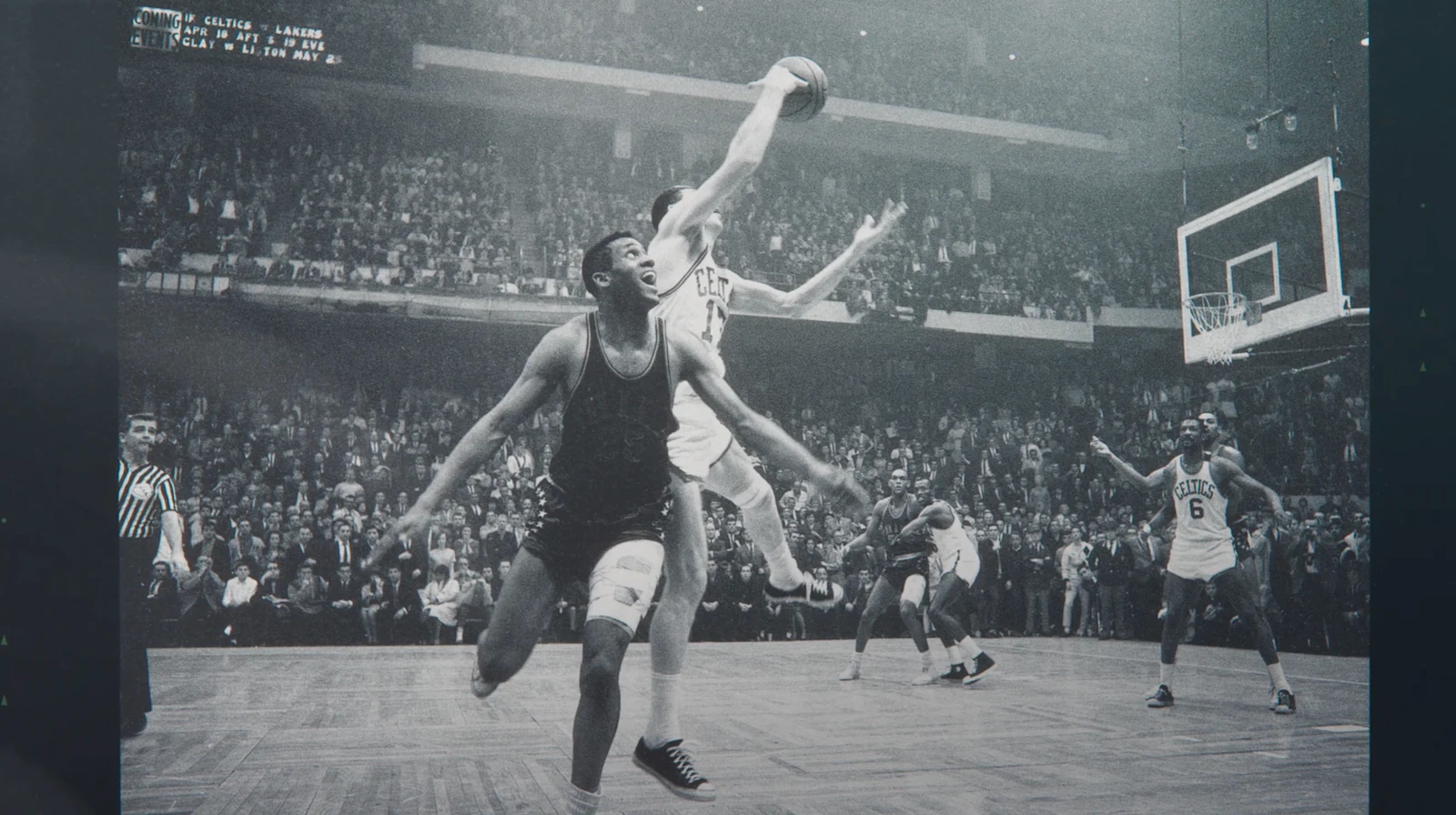
'Celtics City' is a new 9-part documentary from HBO Sports Documentaries chronicling the remarkable saga of the Boston Celtics, the NBA's winningest franchise. BGSTR designed the Bill Simmons-produced series to follow the team's founding as one of the league's original members to its triumphant 2024 championship.
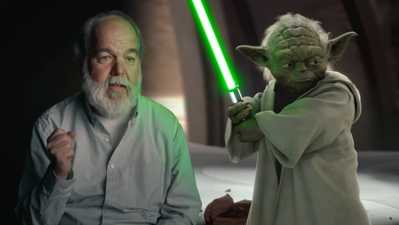
After the smash success of the first installment, Disney, Lucasfilm, and Imagine Documentaries linked up again to continue telling the story of Industrial Light & Magic, the company behind all visual effects for Star Wars and other legendary films.
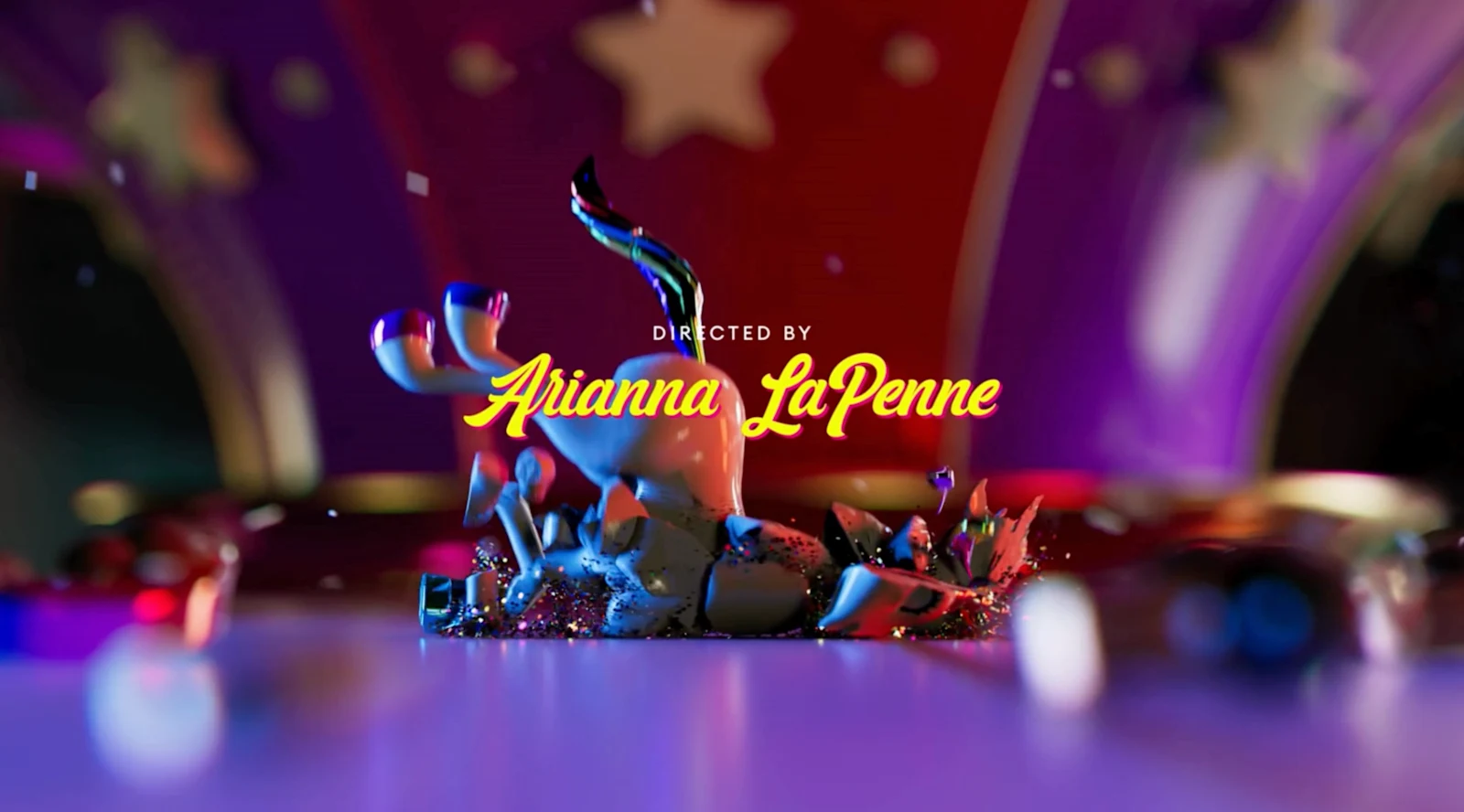
Was it all rainbows and unicorns or were those neon hues concealing something darker? 'Glitter and Greed: The Lisa Frank Story' takes a deeper look at the storied brand and its secrets in the four-part documentary from Prime Video and Maxine.