Warner Media
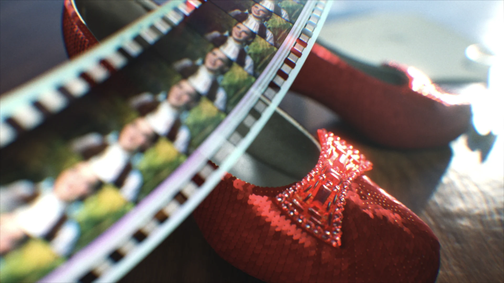
TNT Rebrand
We created a fresh new system for the TNT brand, designing a flexible and bold system with graphics that would translate through for all the network's programming.
View ProjectThe right amount of cheeky
Client
BBC America
What do you get when you take an iconic legacy brand ready for an update and a desire to infuse a healthy dose of levity? A BBC America brand refresh that is eye-catching, versatile, and just the right amount cheeky, or you might say, Brit-ish.


The BBC America brand has been around for a few decades and was primed for a brand update. Enter, our team at BigStar. There was a collective desire to translate the duality of the brand into one singular concept: Brit-ish. That concept was challenging, intriguing, and infused some of the signature cheeky British humor the network is known for into the final product. We got to really use our design to visualize that notion and explore the idea graphically.
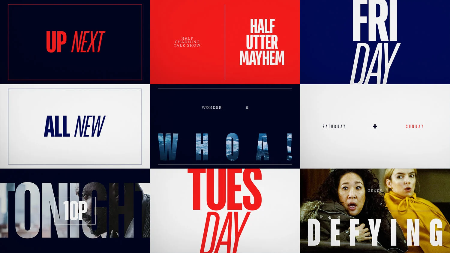
That ‘loud’ or American side of the brand used Bluescreen font and the ‘reserved’ British side was Nexa Slab to call out a more refined and sophisticated tone. Color wise, it was no coincidence for the Brit-ish theme we were playing up that both the American and British flag use the same red, white, and blue package. We took those colors and tweaked them away from primary, and then used them across the board.
The nature of this package required an intensive collaboration with the BBCA team; this project kept us on our toes, but to be honest, it’s one of our favorite places to be. We completed the full refresh delivering everything from the logo, to a robust toolkit and style guide, all the way through to the deliverable of all on-air packaging and promo assets.


Cheers to our partners at BBCA!

Props where props are due