refresh

SundanceTV Rebrand

Client

SundanceTV

Sundance TV is home to the network’s original programming, film favorites and must-watch series and was ready for a brand update to showcase its prestige storytelling. BigStar had previously partnered with the network’s sister brand, BBC America, for a successful rebrand and we were excited to bring that same collaborative spirit to Sundance.

SundanceTV Rebrand

Rebrand

Rebrand

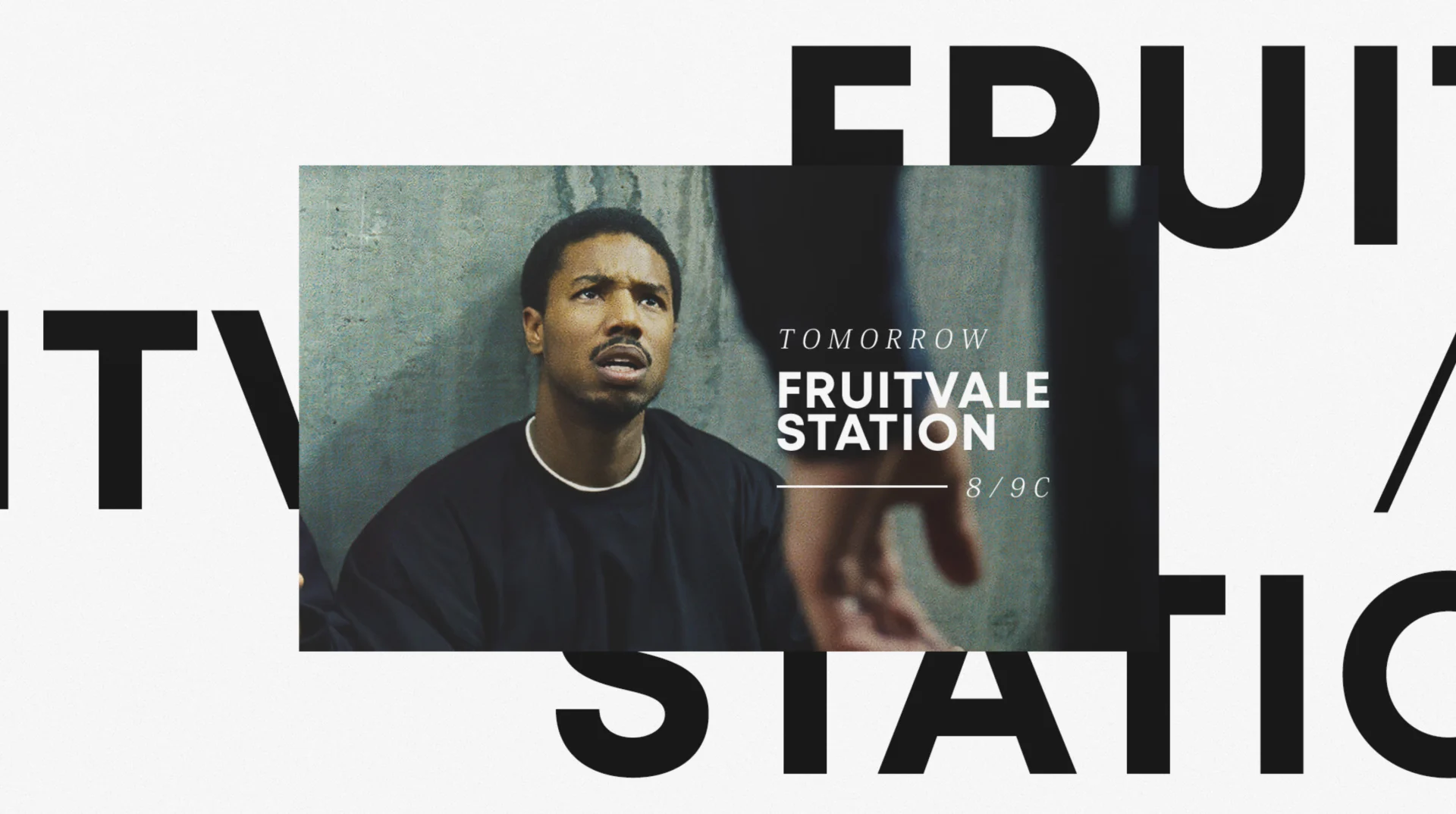
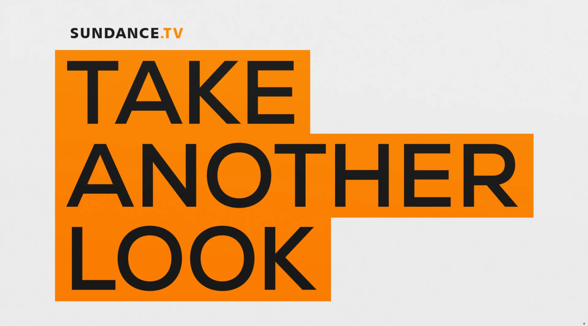
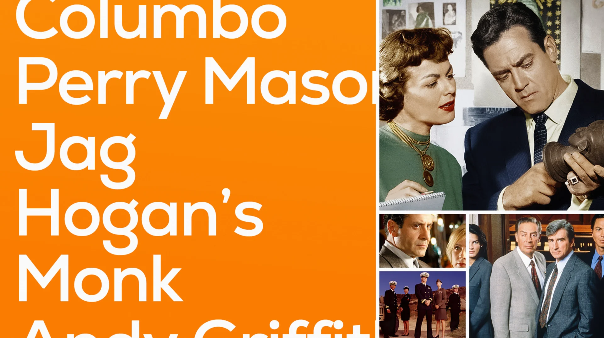
The Sundance team came in with a point of view and a position for where they wanted their brand to go, something we love from a partner. The concept focused on their tagline, “Take another look,” which was crafted to encourage viewers to check out some of the classic programming Sundance houses on its platform. We took this tagline to heart as part of our design ethos and turned it into four different design directions.

Design Exploration

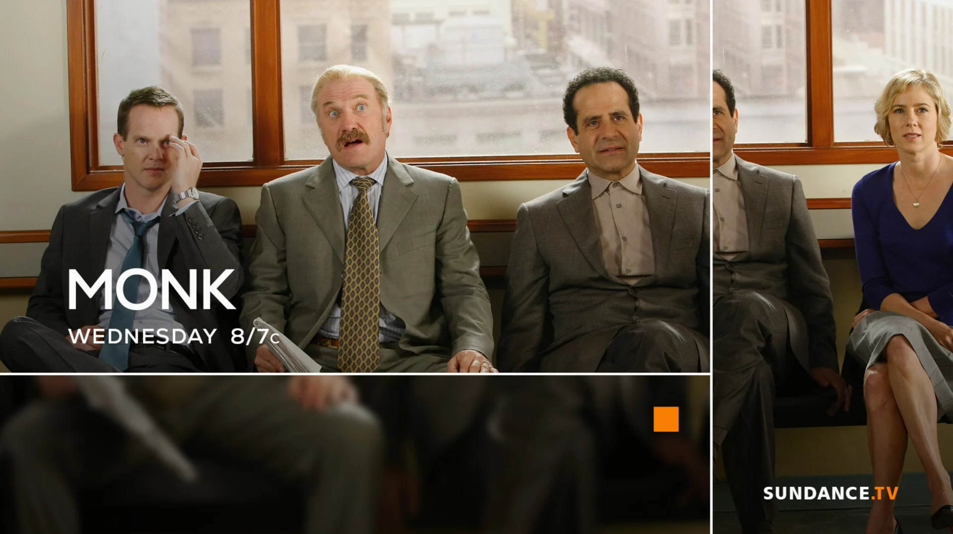
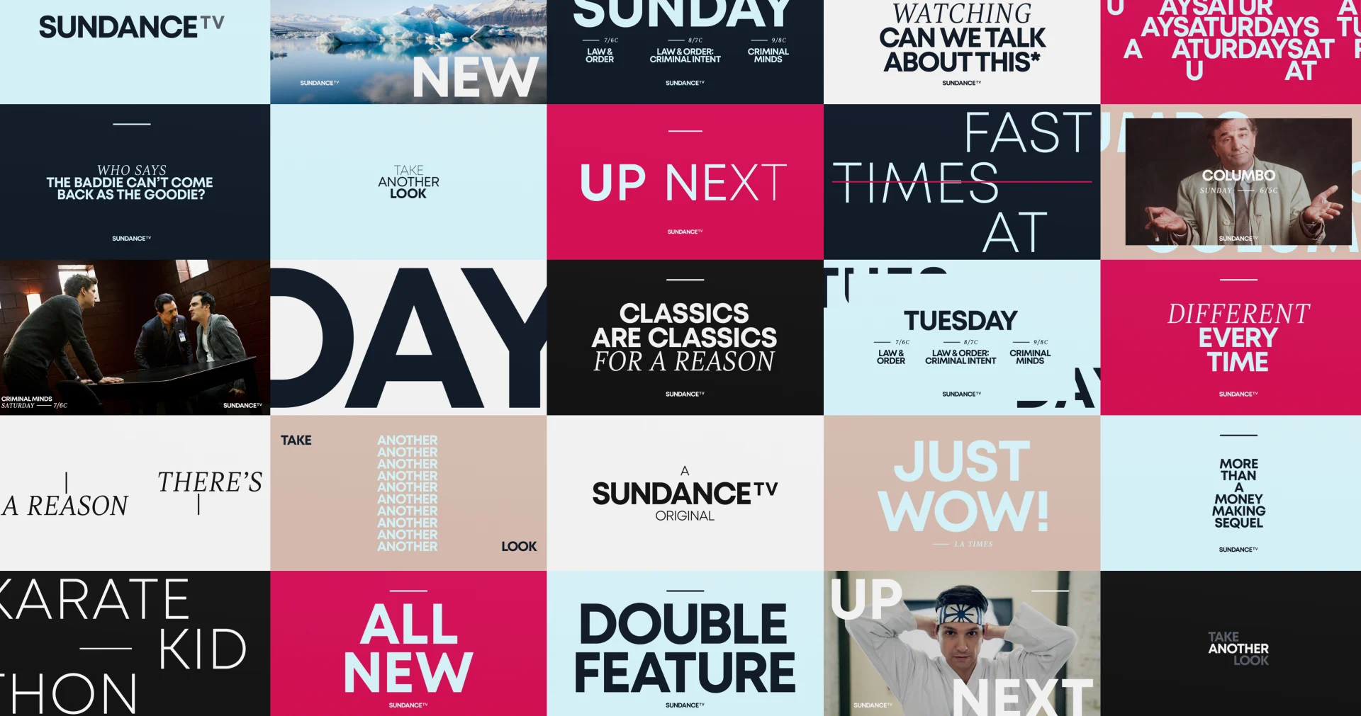
We translated the tagline visually, taking the idea of taking another look and creating a visual grammar that plays into that by using different shapes, different ways of framing, footage, focal length, typography and so on. Our goal was to distill everything that comprises the Sundance brand and represent them in different ways. After bringing the team a broad selection of designs, we whittled down the concepts to a direction we all really connected with and took it into production.

Design Exploration

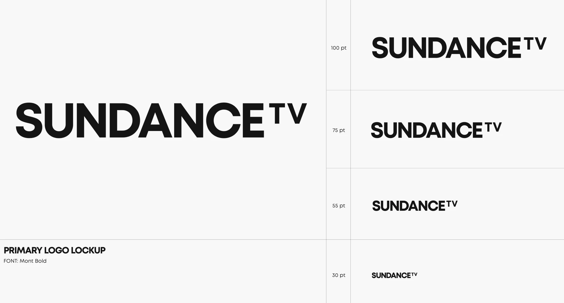
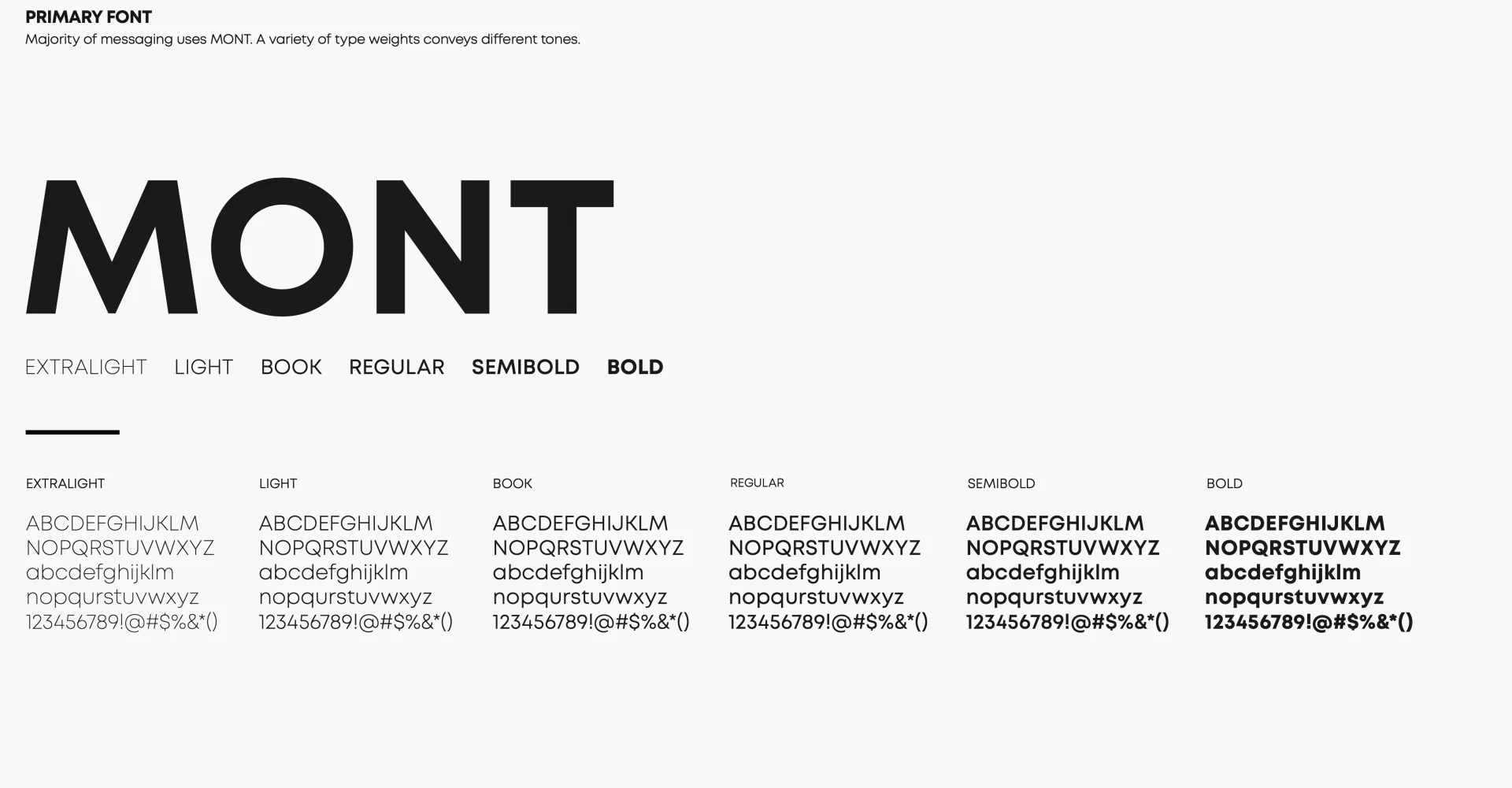
Ross Henderson was our design director for this project, lending his creative talent as well as overseeing the overall process and ensuring everything in the design phase stayed intact through to animation. A typography heavy project, the package Henderson delivered included one of our favorite Style Guides to date.

01/05
The motivation behind this brand aesthetic was the classic and timeless nature of the content on Sundance TV. Programming this good deserves to be watched again and again. We created a design and animation language that celebrates this repeated viewing experience.
Ross HendersonDesign Director

Rebrand (continued)

Rebrand (continued)

Senior 2D Animator Casey Drogin headed up the animation direction and was instrumental in figuring a lot of details out. At the end of the day, this package really ended up being about the typography and how it moves, expanding and contracting.

An interesting thing that emerged from this project was a change to our approach to developing a toolkit. We’re always looking to level up the toolkits we deliver to clients, and this particular project required an extensive fitting process that resulted in Chris and Casey developing a couple of new techniques. As a result, we designed one of our most seamless toolkits yet, and set a new standard for our toolkits going forward.

In the end, the design for the rebrand of Sundance TV really conveys the aesthetic the tagline “Take another look'' calls to mind. We were able to deliver a thorough and thoughtful package of BigStar-designed components to reintroduce Sundance to its growing audience.

Props where props are due

Credits

SundanceTV Rebrand
  • Executive Creative Director
    Josh Norton
  • Executive Vice President, Executive Producer
    Carson Hood
  • Head of Production
    Virgil Conklin
  • Design Director
    Ross Henderson
  • Animation Director
    Casey Drogin
  • Designer
    Doug Chang
  • Animation
    Paolo Garcia, Sung Do, Chris Scales

Up next

Related Projects

When Cooking Channel came to us looking for a brand refresh, we jumped at the opportunity to help cook something up with farm-fresh colors, shiny new cooking toolkits, and expressive flavors of language while retaining their original logo.

Cooking Channel

Cooking Channel Rebrand

When Cooking Channel came to us looking for a brand refresh, we jumped at the opportunity to help cook something up with farm-fresh colors, shiny new cooking toolkits, and expressive flavors of language while retaining their original logo.

View Project
We created a fresh new system for the TNT brand, designing a flexible and bold system with graphics that would translate through for all the network's programming.

Warner Media

TNT Rebrand

We created a fresh new system for the TNT brand, designing a flexible and bold system with graphics that would translate through for all the network's programming.

View Project
What do you get when you take an iconic legacy brand ready for an update and a desire to infuse a healthy dose of levity? A BBC America brand refresh that is eye-catching, versatile, and just the right amount cheeky, or you might say, Brit-ish.

BBC America

BBC America Rebrand

What do you get when you take an iconic legacy brand ready for an update and a desire to infuse a healthy dose of levity? A BBC America brand refresh that is eye-catching, versatile, and just the right amount cheeky, or you might say, Brit-ish.

View Project
0:00
-0:00