TNT Rebrand
We created a fresh new system for the TNT brand, designing a flexible and bold system with graphics that would translate through for all the network's programming.
“Working with Big Star is always a delight. They continually bring fresh design solutions that exceed expectations, and have a keen eye for branding and identity.”
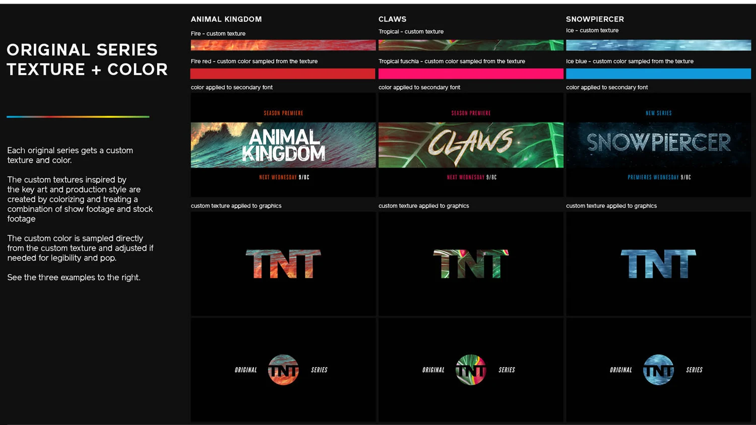
We started the design process by exploring fonts and endpage layouts, keeping in mind TNT's need to integrate a wide range of footage. Our hero font, League Gothic ultimately won the day, which led us to begin stress testing in a series of network anthem sizzles.
Once we had full buy-in, it was off to the races, building an entire system around the hero font.
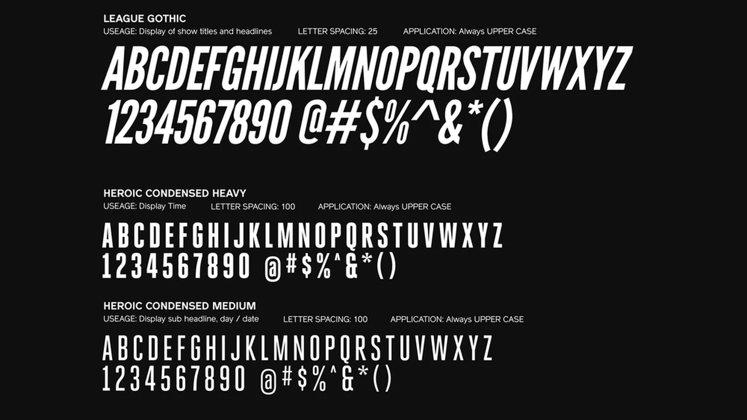
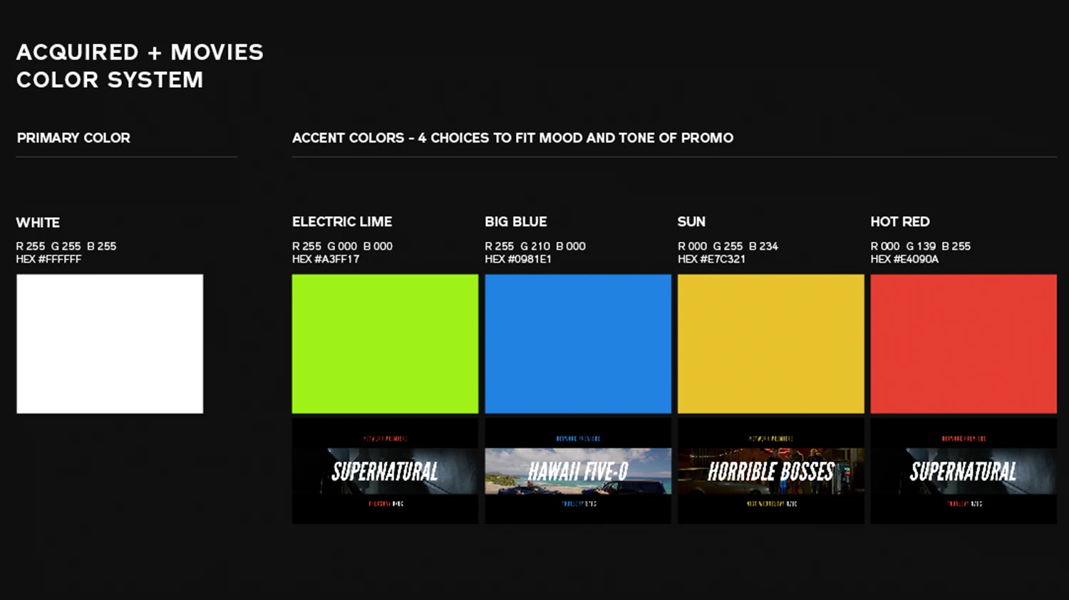
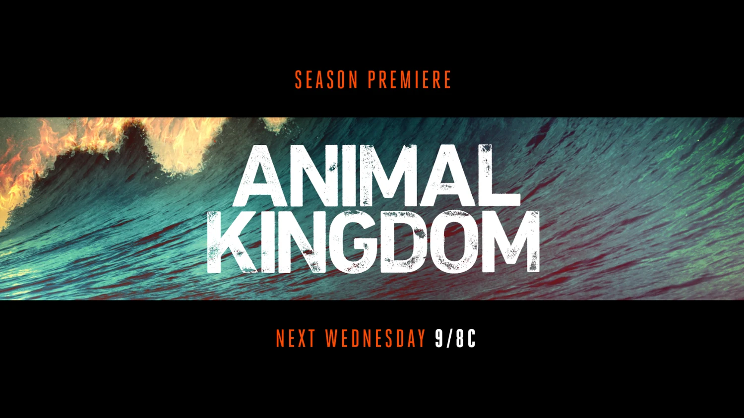
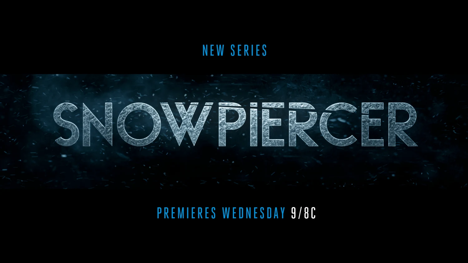
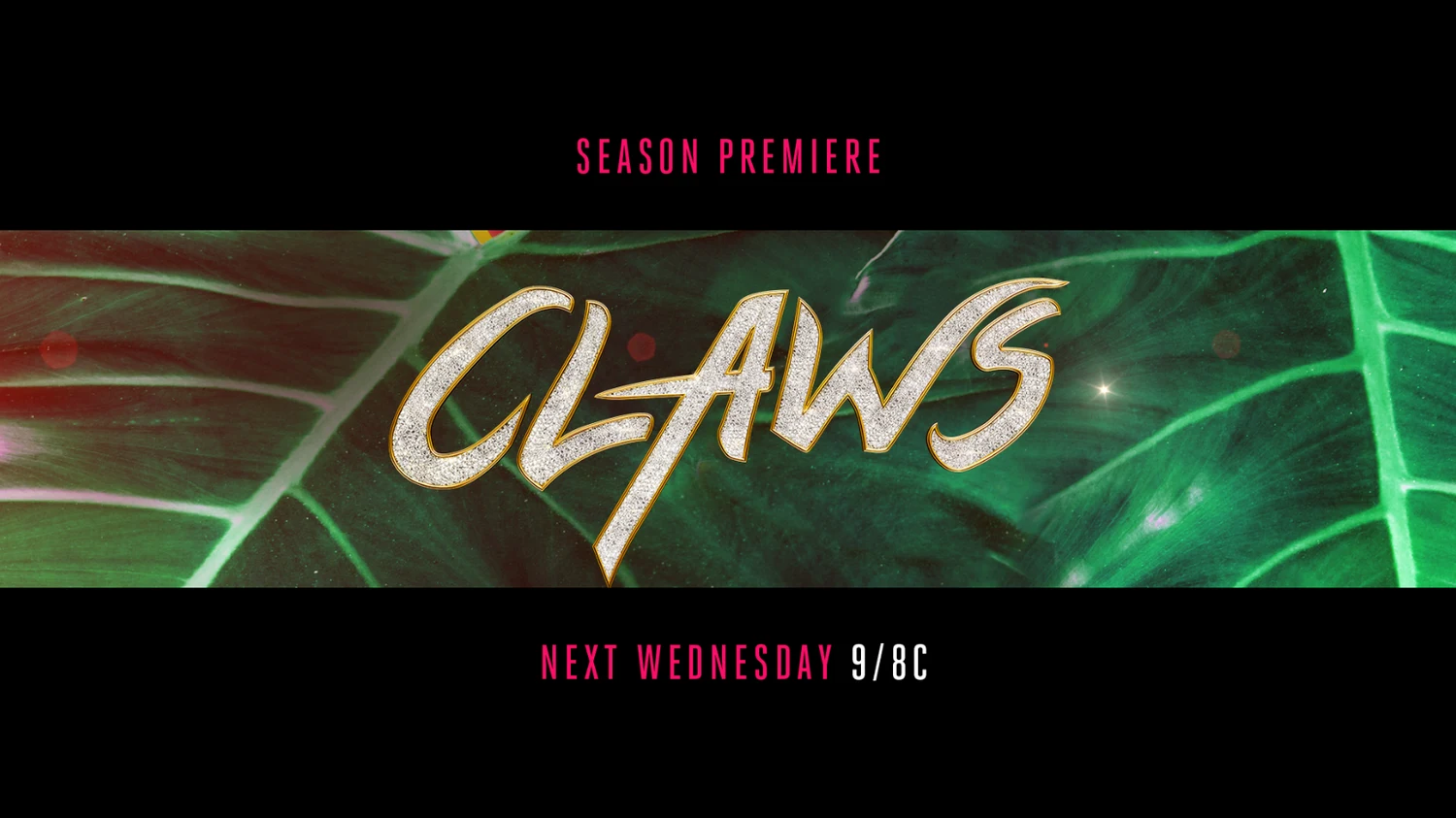
We explored texture and color extensively, ultimately landing on a system that pulls color and texture from the coinciding show or film footage.
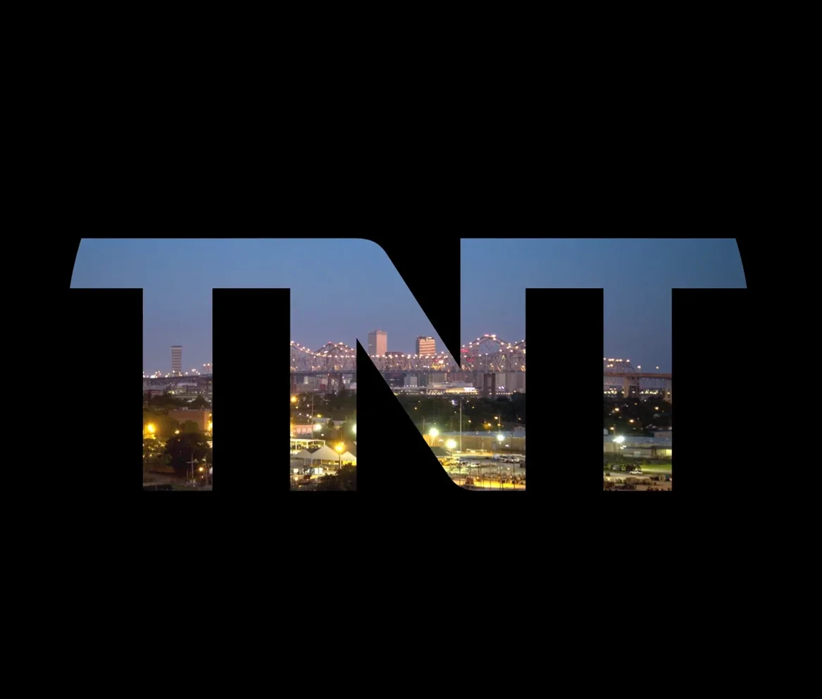
We also re-imagined the TNT logo, removing the circle and using only the letterforms as a “lens” into the variety of programming TNT offers. Filling in the TNT letterforms with our palette colors also added a quick pop of energy.
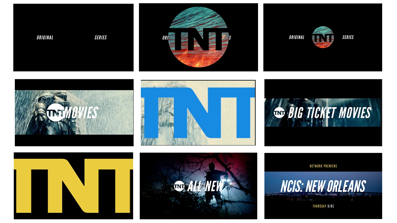
In addition to exploring secondary fonts for the endpage, the letterbox element came to life in animation- creating a framework for our font and endpage and giving the re-brand a cinematic point of view.
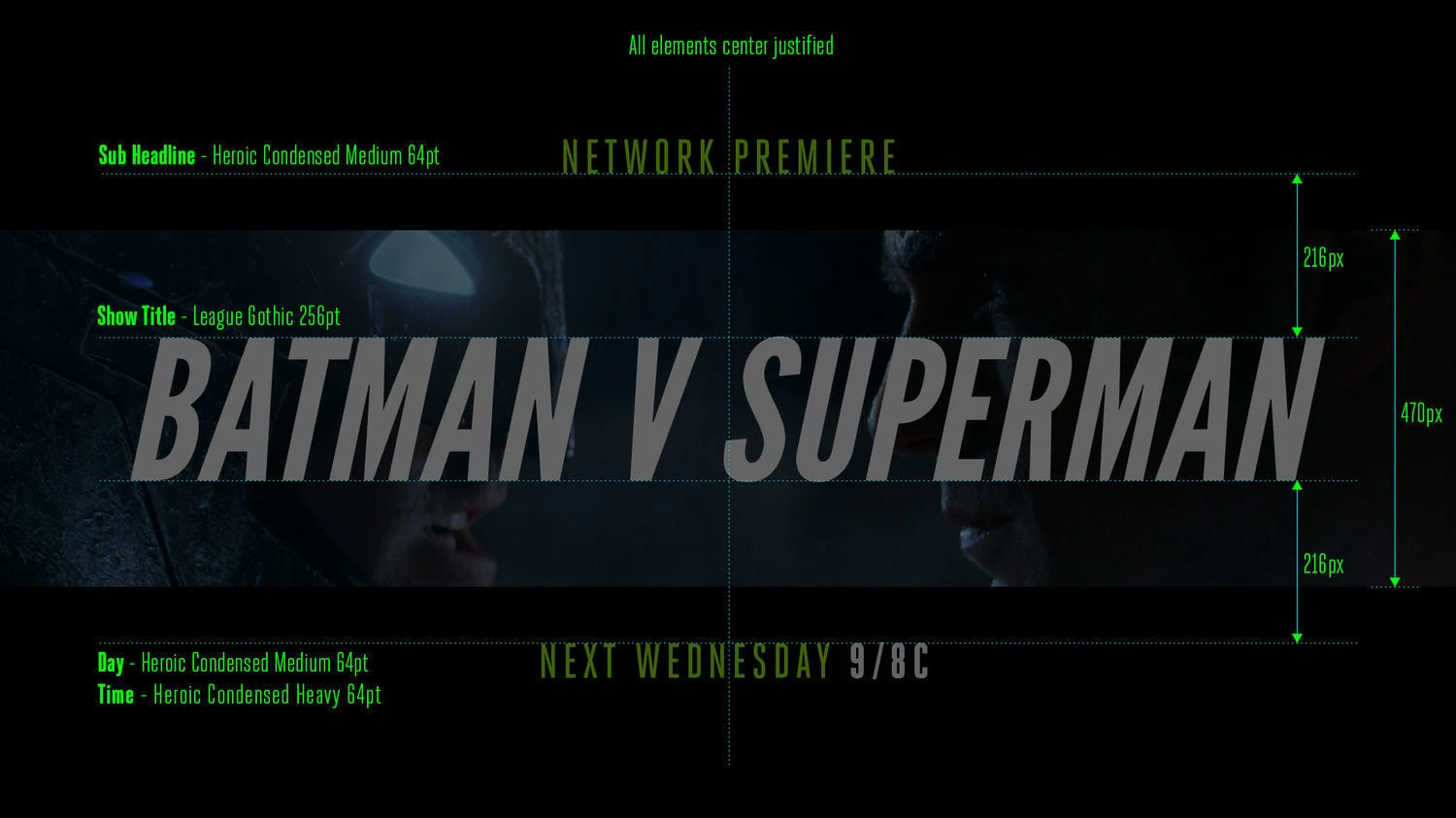
In the end, we delivered a fresh new brand, brand sizzles, style guide, and turnkey toolkits for all network promos. Thanks to our friends and collaborators at TNT and Warner Media!
Founder, Executive Creative Director
Josh Norton
Executive Vice President, Executive Producer
Carson Hood
Head of Production
Virgil Conklin
Design Director
Ross Henderson
Lead Designer
Doug Chang
Designers
John Leamy, Ann Kruetzkamp
Animators
Casey Drogin, Chris Scales, Brian Landisman
What do you get when you take an iconic legacy brand ready for an update and a desire to infuse a healthy dose of levity? A BBC America brand refresh that is eye-catching, versatile, and just the right amount cheeky, or you might say, Brit-ish.
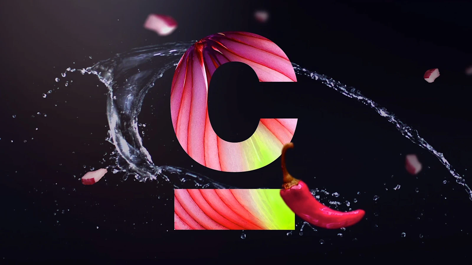
When Cooking Channel came to us looking for a brand refresh, we jumped at the opportunity to help cook something up with farm-fresh colors, shiny new cooking toolkits, and expressive flavors of language while retaining their original logo.

We helped brand the 2019 annual TCM Classic Film Festival event with our key art and promotional film, following their theme of “love in all its forms”.